Draws the dependency graph held in a gg_udependent object as a
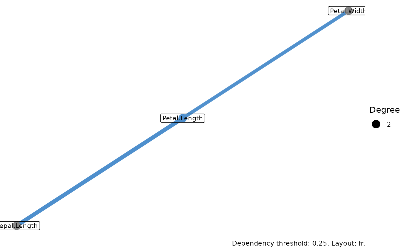
ggraph network. Node colour marks whether a variable made the signal
set, and the width and opacity of an edge tell you how strong the
dependency between its two variables is.
Usage
# S3 method for class 'gg_udependent'
plot(x, layout = "fr", ...)
Arguments
- x
A
gg_udependentobject fromgg_udependent.- layout
Character; the igraph/ggraph layout algorithm. Common choices are
"fr"(Fruchterman-Reingold, the default),"kk"(Kamada-Kawai),"stress","circle", and"grid".- ...
Not currently used.
Details
This plot needs the ggraph package, which is in Suggests
rather than installed for you. If it is missing, run
install.packages("ggraph").
A signal variable (selected = TRUE) gets a blue node
(#4e8fcd); the rest are grey (#888888). Node size grows
with degree. Edge width and opacity both grow with the raw dependency
weight I[i,j].
Reading the network
Each node is a variable; each edge is a cross-variable dependency
that cleared the threshold passed to gg_udependent. The
Fruchterman-Reingold layout (the default) places mutually connected
variables near each other, so the picture tends to show hubs and
the clusters around them rather than a tidy ring. The eye usually
goes first to the largest blue node: a variable that is both in
the signal set and connects to many others is a hub of the
dependency structure. Edges with wider, more opaque strokes are
stronger dependencies; thin, faint edges sit near the threshold and
are the ones that would disappear first if you raised it.
Grey, low-degree nodes are the ones UVarPro thinks are not
contributing much to the structure. (Truly isolated nodes are
dropped by gg_udependent() before the graph is drawn; what you
see is the connected component.) A cluster of mutually
connected variables is worth checking for redundancy; they may be
several views of the same underlying quantity.
What this tells you
Use the figure to pick a working set of variables: the hubs and their immediate neighbours are the candidates UVarPro flags as carrying structure. If a cluster of high-degree variables looks like it might be measuring the same thing, that is a cue to look at their pairwise correlations or fit them as a block rather than individually. The threshold and layout are recorded in the caption so a different choice is easy to spot in a later figure.
Examples
# \donttest{
if (requireNamespace("ggraph", quietly = TRUE)) {
  set.seed(42)
  uv <- varPro::uvarpro(iris[, -5], ntree = 50)
  plot(gg_udependent(uv))
}

# }
# }