library(ggplot2)
library(dplyr)
library(tidyr)
library(randomForestSRC)

if (requireNamespace("ggRandomForests", quietly = TRUE)) {
  library(ggRandomForests)
} else if (requireNamespace("pkgload", quietly = TRUE)) {
  pkgload::load_all(export_all = FALSE, helpers = FALSE, attach_testthat = FALSE)
} else {
  stop("Install ggRandomForests (or pkgload for dev builds) to render this vignette.")
}

theme_set(theme_bw())Random Forest Regression with ggRandomForests
2026-09-13
Source:vignettes/ggRandomForests-regression.qmd
Work in progress
This vignette is under active development. Code examples and narrative may change before the next release.
Introduction
Random forests (Breiman 2001) are a non-parametric ensemble method that requires no distributional or functional assumptions on how covariates relate to the response. The method builds a large collection of de-correlated decision trees via bootstrap aggregation (bagging) and random feature selection, then averages their predictions to smooth out the noise any single tree carries. The randomForestSRC package (Ishwaran and Kogalur 2026) provides a unified implementation for survival, regression, and classification forests.
ggRandomForests extracts tidy data objects from rfsrc fits and renders them with ggplot2 (Wickham 2016), making it straightforward to explore how a forest is constructed, which variables matter, and how the response depends on individual predictors.
This vignette demonstrates a complete random forest regression workflow on the Boston Housing data set (Harrison and Rubinfeld 1978; Belsley et al. 1980):
- Data exploration: EDA scatter panels, variable descriptions
- Growing the forest: fitting an RF, checking OOB error convergence
-
Variable selection: VIMP and minimal depth via
max.subtree() -
Dependence plots: variable dependence and partial dependence via
gg_variable()andgg_partial_rfsrc() - Variable interactions: conditioning plots and partial dependence surfaces
Data: Boston Housing Values
The Boston Housing data (Harrison and Rubinfeld 1978; Belsley et al. 1980) is a standard benchmark for regression. It contains data for 506 census tracts of Boston from the 1970 census. The objective is to predict the median value of owner-occupied homes (medv, in $1000s) from 13 predictors covering crime, zoning, industry, environmental quality, and housing characteristics. We use the copy from the MASS package (Venables and Ripley 2002).
data(Boston, package = "MASS")
Boston$chas <- as.logical(Boston$chas) # nolint: object_name_linter
st_labs <- c(
  crim    = "Crime rate by town",
  zn      = "Residential land zoned > 25k sq ft (%)",
  indus   = "Non-retail business acres (%)",
  chas    = "Borders Charles River",
  nox     = "Nitrogen oxides (10 ppm)",
  rm      = "Rooms per dwelling",
  age     = "Units built before 1940 (%)",
  dis     = "Distance to employment centers",
  rad     = "Highway accessibility index",
  tax     = "Property tax rate per $10,000",
  ptratio = "Pupil-teacher ratio",
  black   = "Proportion of Black residents",
  lstat   = "Lower status population (%)",
  medv    = "Median home value ($1000s)"
)
Exploratory data analysis
We plot each predictor against the response (medv), coloring by the sole categorical variable (chas, whether the tract borders the Charles River). A loess smooth highlights the marginal trend.
dta <- Boston |>
  pivot_longer(c(-medv, -chas), names_to = "variable", values_to = "value")

ggplot(dta, aes(x = medv, y = value, color = chas)) +
  geom_point(alpha = 0.4) +
  geom_smooth(aes(x = medv, y = value), color = "gray30",
              inherit.aes = FALSE, se = FALSE) +
  labs(y = "", x = st_labs["medv"]) +
  scale_color_brewer(palette = "Set2") +
  facet_wrap(~variable, scales = "free_y", ncol = 3)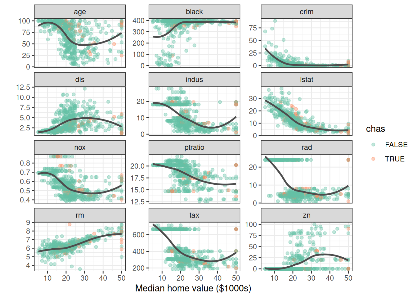
Even from this simple view, two relationships stand out: medv against lstat (lower status %) and medv against rm (rooms per dwelling). Keep those two in mind. We expect the random forest to rank them as the most important predictors, and the rest of the vignette comes back to check.
Growing a Random Forest
We grow a regression forest using all 13 predictors. The rfsrc() function detects the regression family from the continuous response.
set.seed(42)
rfsrc_Boston <- rfsrc(medv ~ ., data = Boston, # nolint: object_name_linter
                      ntree = 100, importance = TRUE, err.block = 5)
rfsrc_Boston
#> Sample size: 506
#> Number of trees: 100
#> Forest terminal node size: 5
#> Average no. of terminal nodes: 67.06
#> No. of variables tried at each split: 5
#> Total no. of variables: 13
#> Resampling used to grow trees: swor
#> Resample size used to grow trees: 320
#> Analysis: RF-R
#> Family: regr
#> Splitting rule: mse *random*
#> Number of random split points: 10
#> (OOB) R squared: 0.8647388
#> (OOB) Requested performance error: 11.44130184The forest grew 100 trees, splitting on 5 randomly selected candidate variables at each node, and stopping at a minimum terminal node size of 5.
OOB error convergence
gg_e <- gg_error(rfsrc_Boston)
gg_e <- gg_e |> filter(!is.na(error))
class(gg_e) <- c("gg_error", class(gg_e))
plot(gg_e)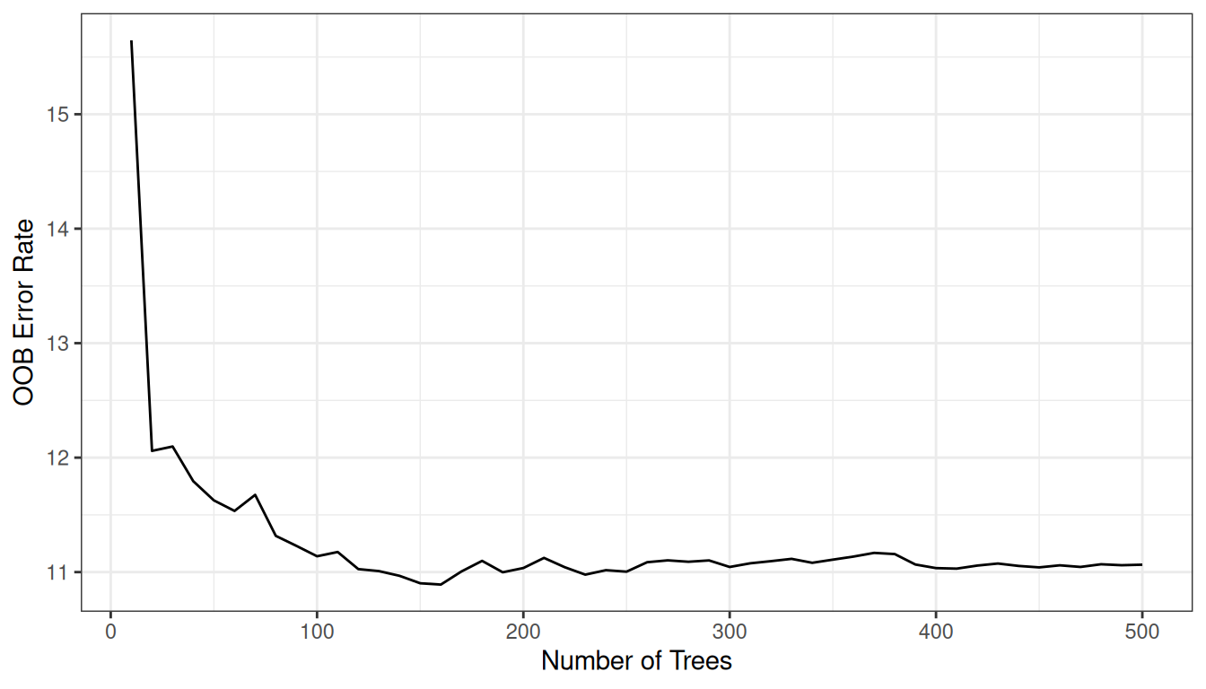
The error falls steeply over the first 20 trees and changes little after that, so the 100 we grew are enough for reliable predictions.
OOB predictions
plot(gg_rfsrc(rfsrc_Boston), alpha = 0.5) +
  coord_cartesian(ylim = c(5, 49))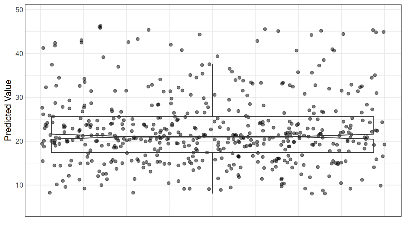
Each point is a single tract’s OOB prediction. The distribution is a sanity check; we are more interested in the why behind these predictions.
Variable Selection
Variable importance (VIMP)
VIMP, computed by randomForestSRC, measures the increase in OOB prediction error when a variable’s values are randomly permuted across the out-of-bag observations (Breiman 2001). Permutation severs the variable’s link to the response on purpose: if breaking that link hurts accuracy, the variable is carrying real signal. Large positive values mean the variable is essential; negative values suggest it is no more informative than noise.
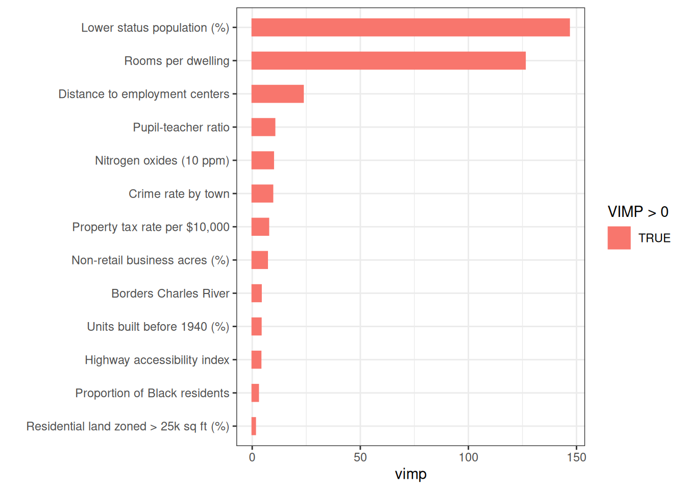
lstat and rm dominate, with a clear gap to the remaining predictors. All VIMP values are positive, so every predictor contributes at least marginally.
The permutation approach contrasts with varPro release-rule importance (Lu and Ishwaran 2024), available through gg_varpro(). Rather than perturbing data synthetically, varPro compares local estimators on the observed data directly. Because the two methods measure different things, a variable can rank high under one and low under the other. When they agree, the evidence is strong; when they disagree, that disagreement itself is worth investigating, pointing either to a variable whose effect is highly non-linear or to one that matters only in combination with others.
Minimal depth
Minimal depth (Ishwaran et al. 2010) ranks variables by how close to the root node they first split, on average. Variables that partition large portions of the population early are considered most important.
md_Boston <- max.subtree(rfsrc_Boston) # nolint: object_name_linterThe threshold is 3.01, selecting 6 variables: crim, nox, rm, dis, ptratio, lstat.
Both VIMP and minimal depth agree on the dominance of lstat and rm. We use the minimal depth top variables for the remainder of the analysis.
xvar <- md_Boston$topvarsSHAP Analysis
VIMP and varPro both rank how much a variable matters, averaged over the whole forest. They cannot tell you how much a variable mattered for one specific tract’s prediction. That requires a different kind of accounting. SHAP (SHapley Additive exPlanations) borrows an idea from cooperative game theory: treat the 13 predictors as players splitting a payout, and ask how much each one contributed to this tract’s predicted medv, averaged fairly over every order the players could have joined the game. The result is a signed contribution per predictor per tract, and those contributions add up exactly: the forest’s overall average prediction (the baseline) plus the sum of one tract’s contributions equals that tract’s actual predicted value. No other importance measure in this vignette makes that promise.
gg_shap() computes these contributions by calling kernelshap, which needs one prediction per predictor per background draw, per tract explained. Scoring all 506 tracts is expensive, so we explain a random sample of 25 instead, plenty to see the patterns at a fraction of the cost.
SHAP importance
Averaging the absolute contribution of each variable across the 25 tracts gives a ranking directly comparable to VIMP.
plot(gg_shp, type = "importance")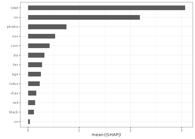
lstat and rm come out on top again, same as VIMP and minimal depth. Three different mechanisms, one answer. That agreement is reassuring, but it’s the next two plots where SHAP earns its keep.
SHAP beeswarm
The beeswarm plot is one dot per tract per variable: its horizontal position is the SHAP contribution (negative pulls the prediction down, positive pushes it up), and its color is that tract’s value for the variable, scaled low to high within each row so the pattern doesn’t get washed out by variables on very different scales.
plot(gg_shp, type = "beeswarm")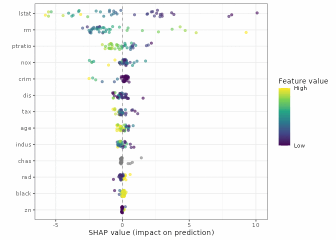
lstat shows a clean color gradient: the yellow (high lower-status population) dots sit on the negative side, the purple (low) dots on the positive side. rm runs the other way. Both track what the EDA scatterplot already hinted at, but now stated as a contribution to an individual prediction rather than a marginal trend.
SHAP dependence
Plotting one variable’s SHAP contribution against its own value is the closest SHAP gets to a partial dependence plot, tract by tract instead of averaged.
plot(gg_shp, type = "dependence", xvar = "lstat")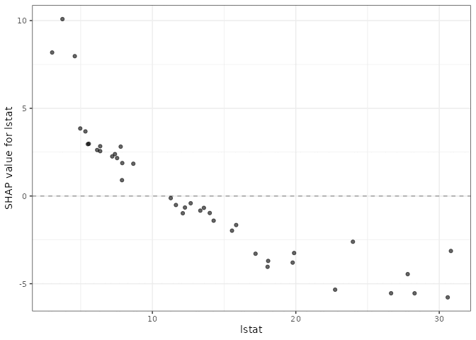
The downward slope matches the sign of the correlation directly: tracts with more lower-status population get pulled below the baseline prediction, tracts with less get pushed above it. The next section asks the same question a second way, partial dependence averaged over the whole forest instead of tract by tract, and the two views should agree on the shape even though they’re built from entirely different mechanics.
Variable Dependence
Variable dependence plots
Variable dependence shows each tract’s OOB predicted medv plotted against a predictor, with a loess smooth indicating the trend.
gg_v <- gg_variable(rfsrc_Boston)

plot(gg_v, xvar = xvar, panel = TRUE, alpha = 0.5) +
  labs(y = st_labs["medv"], x = "")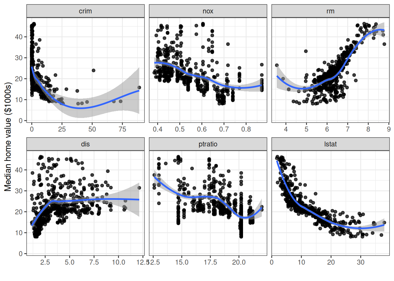
The panels confirm what EDA suggested: medv decreases sharply with lstat and increases with rm, both in strongly non-linear ways. The remaining variables show weaker but still discernible trends.
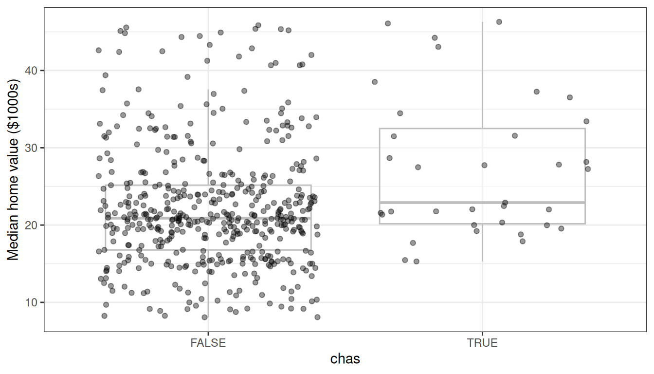
Most tracts do not border the Charles River, and the predicted value distributions largely overlap, consistent with chas ranking last by minimal depth. VIMP ranks it fifth, so here the two measures disagree.
Partial dependence
Partial dependence integrates out the effects of all other covariates, giving a risk-adjusted view of each predictor’s marginal effect (Friedman 2001):
We use gg_partial_rfsrc(), which calls randomForestSRC::partial.rfsrc() directly and returns a gg_partial_rfsrc object. The quickest path to a figure is plot(pd), which sorts out continuous and categorical variables for you. When you want to control the layout yourself, the underlying data is in pd$continuous.
pd <- gg_partial_rfsrc(rfsrc_Boston, xvar.names = xvar)

# Quick S3 plot — works out of the box for the standard regression case
plot(pd)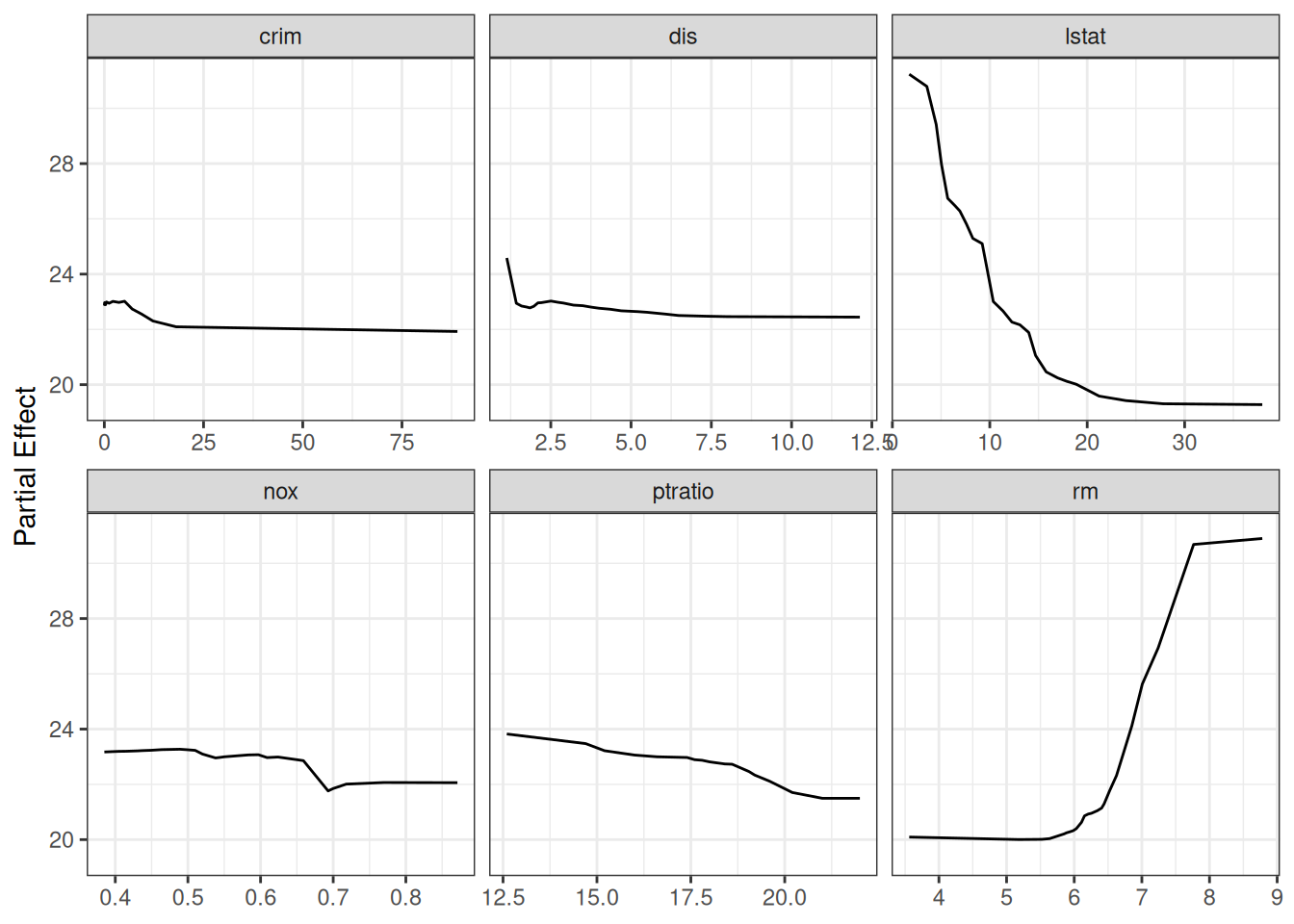
For a publication-ready layout with custom axis labels, access the underlying data frame directly:
ggplot(pd$continuous, aes(x = x, y = yhat)) +
  geom_line(color = "steelblue", linewidth = 1) +
  facet_wrap(~name, scales = "free_x") +
  labs(y = st_labs["medv"], x = "") +
  theme_bw()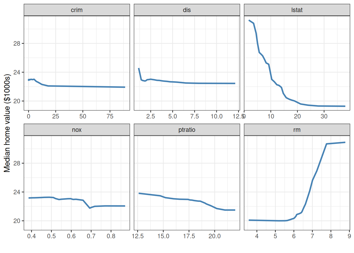
lstat falls steeply up to about 10 percent and then levels off, while rm stays flat up to about 6.5 rooms and then climbs sharply to about 7.8. Shapes like these are awkward to capture with a simple parametric transform, since you would have to guess the form in advance, but the random forest picks them up on its own.
Variable Interactions and Conditioning Plots
Conditioning on a categorical variable
The simplest coplot conditions on a categorical variable. Here we examine medv vs. lstat, split by Charles River status:
gg_v$chas_label <- ifelse(gg_v$chas, "Borders Charles River",
                          "Does not border")

plot(gg_v, xvar = "lstat", alpha = 0.5) +
  labs(y = st_labs["medv"], x = st_labs["lstat"]) +
  theme(legend.position = "none") +
  facet_wrap(~chas_label)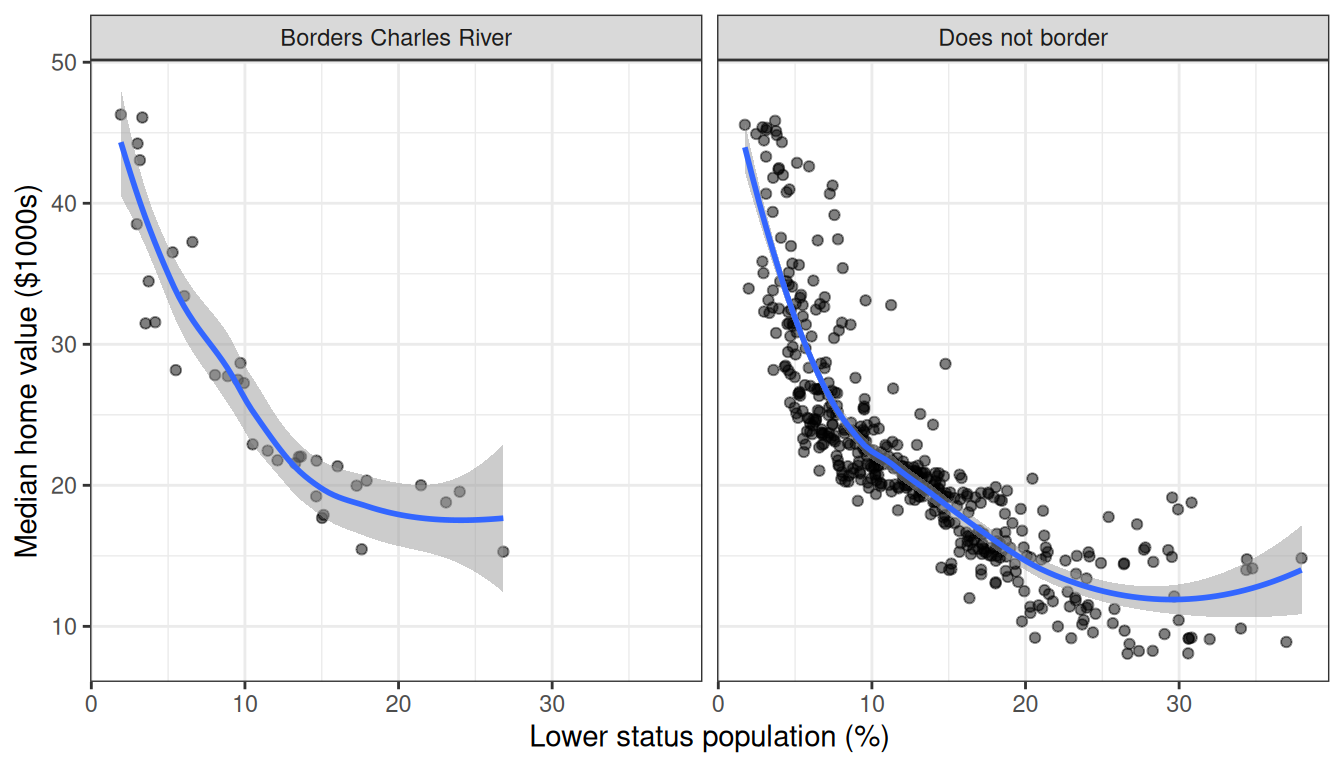
The decreasing trend holds in both groups, with slightly higher values along the Charles River at every lstat level.
Conditioning on a continuous variable
To investigate the lstat–rm interaction, we bin rm into six quantile groups using quantile_pts() and facet:
rm_pts <- quantile_pts(rfsrc_Boston$xvar$rm, groups = 6, intervals = TRUE)
gg_v$rm_grp <- cut(rfsrc_Boston$xvar$rm, breaks = rm_pts)
levels(gg_v$rm_grp) <- paste("rm in", levels(gg_v$rm_grp))

plot(gg_v, xvar = "lstat", alpha = 0.5) +
  labs(y = st_labs["medv"], x = st_labs["lstat"]) +
  theme(legend.position = "none") +
  scale_color_brewer(palette = "Set3") +
  facet_wrap(~rm_grp)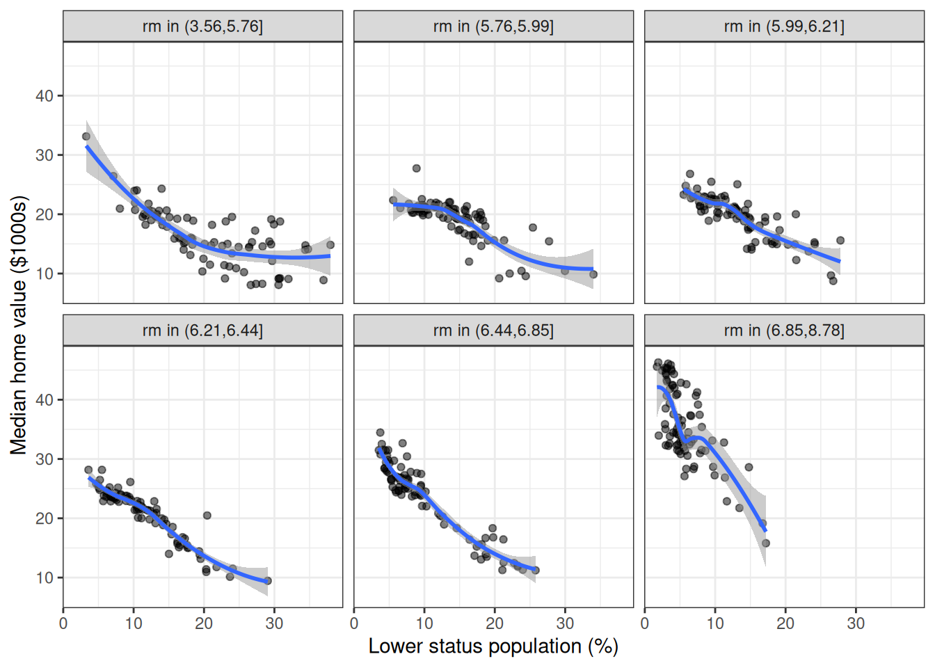
Median values decrease with lstat within every rm group, but the intercept shifts upward with more rooms. Smaller homes in low-lstat (high-status) neighborhoods still command high prices.
The complement view (medv vs. rm, conditional on lstat groups) completes the picture:
lstat_pts <- quantile_pts(rfsrc_Boston$xvar$lstat, groups = 6,
                          intervals = TRUE)
gg_v$lstat_grp <- cut(rfsrc_Boston$xvar$lstat, breaks = lstat_pts)
levels(gg_v$lstat_grp) <- paste("lstat in", levels(gg_v$lstat_grp))

plot(gg_v, xvar = "rm", alpha = 0.5) +
  labs(y = st_labs["medv"], x = st_labs["rm"]) +
  theme(legend.position = "none") +
  scale_color_brewer(palette = "Set3") +
  facet_wrap(~lstat_grp)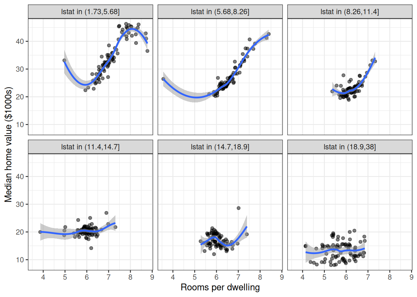
The rm effect is strongest in low-lstat tracts (the top row of panels) and nearly flat in high-lstat tracts (the bottom row), confirming a meaningful interaction.
Partial Dependence Surface
To visualize the joint partial dependence of medv on lstat and rm, we compute partial dependence on a grid: 6 values of rm, each evaluated at 25 points along lstat.
rm_grid <- quantile_pts(rfsrc_Boston$xvar$rm, groups = 6)

# newx only sets the evaluation grid: the lstat quantile points, and the
# distinct rm values to condition on through xvar2.name. The average itself
# always runs over the training data, so overwriting newx$rm alone would
# change nothing.
newx <- rfsrc_Boston$xvar
newx$rm <- rep_len(rm_grid, nrow(newx))

pd_surface <- gg_partial_rfsrc(rfsrc_Boston, xvar.names = "lstat",
                               xvar2.name = "rm", newx = newx)
surface_df <- pd_surface$continuous
surface_df$rm <- surface_df$grp
ggplot(surface_df, aes(x = x, y = yhat, color = factor(round(rm, 2)))) +
  geom_line(linewidth = 1) +
  scale_color_viridis_d(name = "Rooms per\nDwelling") +
  labs(x = st_labs["lstat"], y = st_labs["medv"]) +
  theme_bw()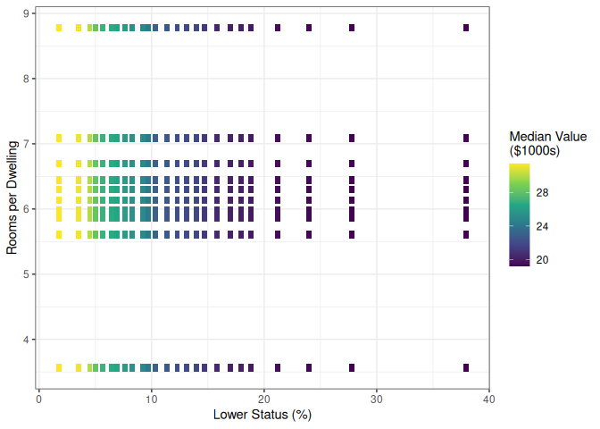
Each line is one value of rm, held fixed for every tract while lstat sweeps its range. Two things stand out. The four lowest lines, rm from 3.6 to 6.4 rooms, nearly coincide; the room effect only appears above that, averaging about 2 thousand dollars more at 6.75 rooms and another 5.5 at 8.8, with the larger gaps at low lstat. That is the threshold the one-variable partial dependence curve for rm showed. And the lines are close to parallel. Value falls by about 12 thousand dollars as lstat climbs from 2 to 38 percent at every rm up to 6.75, and by 14.5 at 8.8 rooms, with most of the drop coming before lstat reaches 15 percent.
So the interaction the forest itself carries between lstat and rm is modest: holding everything else as observed, moving from the smallest to the largest homes adds 10.4 thousand dollars at the low end of the lstat axis, 2 percent, and 8.1 at the high end, 38 percent. The coplots above suggested something stronger, and the two views answer different questions. A coplot conditions on tracts that exist, and large homes in high-lstat tracts are rare, so each panel mixes the rm effect with everything else that differs between those tracts. Partial dependence scores every tract at every (lstat, rm) pair, which isolates the forest’s response to the two variables but also scores combinations the data never contain, such as nine-room homes in the poorest tracts.
Conclusion
We have walked a full random forest regression analysis with randomForestSRC and ggRandomForests, and the pieces line up:
-
gg_error()showed the OOB error settling within the first 20 of the 100 trees. - VIMP (
gg_vimp()) and minimal depth (max.subtree()) agreed on the same story:lstatandrmdominate, with a clear gap to everything else. -
gg_variable()traced strongly non-linear predictor–response curves, the same shapes the raw-data EDA hinted at. - Partial dependence from
gg_partial_rfsrc()gave the risk-adjusted version of those curves: steep then flat forlstat, threshold-like forrm. - Conditioning plots suggested an
lstat–rminteraction. The partial dependence surface shows the forest’s own version is modest: the two effects are close to additive, with the room-size effect only slightly larger in high-status tracts.
Notice the pattern in all of this. Each gg_*() function returns a tidy object (often a data frame, sometimes a small list of data frames); the plotting is a separate step. Use the package’s plot() methods when the default figure is what you want, and reach for ggplot2 directly when it is not.
References
Belsley, David A., Edwin Kuh, and Roy E. Welsch. 1980. Regression Diagnostics: Identifying Influential Data and Sources of Collinearity. John Wiley & Sons. https://doi.org/10.1002/0471725153.
Breiman, Leo. 2001. “Random Forests.” Machine Learning 45 (1): 5–32. https://doi.org/10.1023/A:1010933404324.
Friedman, Jerome H. 2001. “Greedy Function Approximation: A Gradient Boosting Machine.” The Annals of Statistics 29 (5): 1189–232. https://doi.org/10.1214/aos/1013203451.
Harrison, David, and Daniel L. Rubinfeld. 1978. “Hedonic Housing Prices and the Demand for a Clean Environment.” Journal of Environmental Economics and Management 5 (1): 81–102. https://doi.org/10.1016/0095-0696(78)90006-2.
Ishwaran, Hemant, and Udaya B. Kogalur. 2026. Fast Unified Random Forests for Survival, Regression, and Classification (RF-SRC). https://cran.r-project.org/package=randomForestSRC.
Ishwaran, Hemant, Udaya B. Kogalur, Eiran Z. Gorodeski, Andy J. Minn, and Michael S. Lauer. 2010. “High-Dimensional Variable Selection for Survival Data.” Journal of the American Statistical Association 105 (489): 205–17. https://doi.org/10.1198/jasa.2009.tm08622.
Lu, M., and H. Ishwaran. 2024. “Model-Independent Variable Selection via the Rule-Based Variable Priority.” arXiv Preprint. https://arxiv.org/abs/2409.09003.
Venables, William N., and Brian D. Ripley. 2002. Modern Applied Statistics with S. 4th ed. Springer. https://doi.org/10.1007/978-0-387-21706-2.
Wickham, Hadley. 2016. ggplot2: Elegant Graphics for Data Analysis. 2nd ed. Springer. https://doi.org/10.1007/978-3-319-24277-4.