Validates a patient-level data frame, computes per-x-value summary
statistics (mean or median), and returns an hv_trends object.
Call plot.hv_trends on the result to obtain a bare
ggplot2 trend plot (LOESS smooth + annual summary points) that you
can decorate with colour scales, axis limits, and theme_hv_manuscript.
Usage
hv_trends(
  data,
  x_col = "year",
  y_col = "value",
  group_col = "group",
  summary_fn = c("mean", "median")
)
Arguments
- data
Patient-level data frame (one row per patient).
- x_col
Name of the numeric/integer time column (e.g. surgery year). Default
"year".- y_col
Name of the continuous outcome column. Default
"value".- group_col
Name of the grouping column, or
NULLfor a single group. Default"group".- summary_fn
Function used to compute the per-x-point estimate:
"mean"or"median". Default"mean".
Value
An object of class c("hv_trends", "hv_data"); call
plot() on the result to render the figure — see
plot.hv_trends. The list contains:
$dataThe original patient-level data frame.
$metaNamed list:
x_col,y_col,group_col,summary_fn,n_obs,n_groups.$tablesList with one element:
summary— a data frame of per-x (per-group) summary statistics used for the point overlay.
See also
plot.hv_trends to render as a ggplot2 figure,
theme_hv_manuscript for the publication theme,
sample_trends_data for example data.
Other Temporal trends:
plot.hv_trends()
Examples
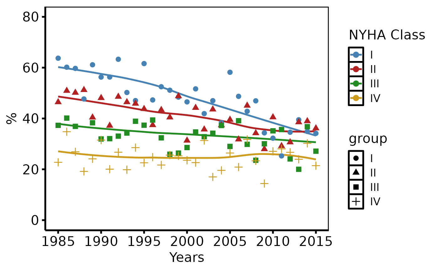
dta <- sample_trends_data(n = 600, year_range = c(1985L, 2015L),
  groups = c("I", "II", "III", "IV"))

# 1. Build data object
tr <- hv_trends(dta, summary_fn = "median")
tr  # prints observation and group counts
#> <hv_trends>
#>   N obs       : 600  (4 groups)
#>   x / y       : year / value
#>   Group col   : group
#>   Summary fn  : median

# 2. Bare plot -- undecorated ggplot returned by plot.hv_trends
p <- plot(tr)

# 3. Decorate: colour palette, axis scales, labels, theme
p +
  ggplot2::scale_colour_manual(
    values = c(I = "steelblue", II = "firebrick",
               III = "forestgreen", IV = "goldenrod3"),
    name = "NYHA Class"
  ) +
  ggplot2::scale_x_continuous(limits = c(1985, 2015),
                              breaks = seq(1985, 2015, 5)) +
  ggplot2::scale_y_continuous(limits = c(0, 80),
                              breaks = seq(0, 80, 20)) +
  ggplot2::coord_cartesian(xlim = c(1985, 2015), ylim = c(0, 80)) +
  ggplot2::labs(x = "Years", y = "%") +
  theme_hv_poster()