Overview
This guide maps every SAS template in the HVTI statistics group template library to its R equivalent in the hvtiPlotR package. If you know the SAS template name (e.g., tp.np.afib.ivwristm.avrg_curv.binary.sas), look it up in the table below and jump to the corresponding section for a working R example.
The guide is organized by template family (the two-letter prefix after tp.). We add new ports as they become available.
Key concepts for SAS users
Two concepts trip up most SAS users on first contact. First, R does not have a device= / GOPTIONS call that sets the output context globally; you pick a theme function and append it to each plot. Second, the constructor never writes a file – you have to call print() or assign the result to an object and save separately. Everything else follows from these two facts.
ggplot2 builds plots in layers. Instead of one macro call with many color=, xaxis=, and footnote= options, you chain + operations:
The theme_hv_*() functions replace SAS device= / style options. Use theme_hv_ppt_dark() for PowerPoint slides on dark backgrounds, theme_hv_ppt_light() for light/transparent slides, theme_hv_manuscript() for journal figures, and theme_hv_poster() for conference posters.
Functions return a ggplot object; they do not display it. Call the plot object at the top level (or use print()) to render it, or save with ggsave() / save_ppt().
Pre-fitted models, not raw data. Most functions accept the output of a statistical model (curve datasets, probability estimates) rather than individual patient records — mirroring the SAS workflow where %decompos() or %kaplan computes estimates and a separate template step produces the figure.
Nonparametric temporal trends (tp.np.*)
All tp.np.* templates share a common SAS workflow:
- Fit patient-specific temporal profiles with
%decompos().
- Average profiles across patients with
PROC SUMMARY → mean_curv dataset.
- Optionally compute bootstrap confidence intervals →
boots_ci dataset.
- Compute binned patient-level summaries (deciles/quintiles) →
means dataset.
- Call the plotting template.
The R port replaces step 5. Steps 1–4 still run in SAS; export the resulting datasets to CSV and read them into R:
curve_data <- read.csv("mean_curv.csv")   # or boots_ci if CI bands are needed
data_pts   <- read.csv("means.csv")       # optional binned data points
SAS column name mapping
iv_echo / iv_wristm / iv_fyrs
|
x_col |
Time variable |
prev / mnprev / _p_ / est
|
estimate_col |
Curve estimate |
cll_p68 / cll_p95
|
lower_col |
CI lower band |
clu_p68 / clu_p95
|
upper_col |
CI upper band |
Grouping variable (e.g., group) |
group_col |
NULL for single curve |
mtime / mmtime (means dataset) |
dp_x_col |
Binned point x |
mprev / mnprev (means dataset) |
dp_y_col |
Binned point y |
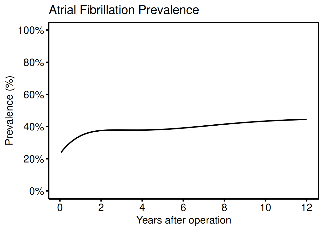
Average curve — binary outcome
Ports: tp.np.afib.ivwristm.avrg_curv.binary.sas, tp.np.afib.ivwristm.pt_specific.binary.sas, tp.np.tr.icdpr.avg_curv.sas
dat     <- sample_nonparametric_curve_data(
  n            = 500,
  time_max     = 12,
  outcome_type = "probability"
)
dat_pts <- sample_nonparametric_curve_points(n = 500, time_max = 12)

# Minimal plot
plot(hv_nonparametric(dat)) +
  scale_x_continuous(breaks = seq(0, 12, 2)) +
  scale_y_continuous(
    limits = c(0, 1),
    breaks = seq(0, 1, 0.2),
    labels = scales::percent
  ) +
  labs(
    x     = "Years after operation",
    y     = "Prevalence (%)",
    title = "Atrial Fibrillation Prevalence"
  ) +
  theme_hv_poster()
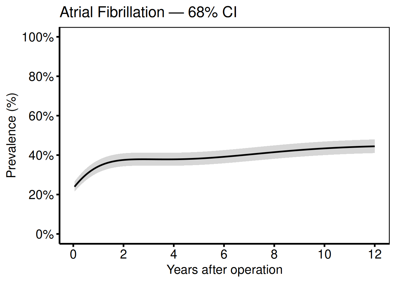
Add 68% CI bands (one standard error; matches SAS boots_ci with cll_p68 / clu_p68):
plot(hv_nonparametric(
  dat,
  lower_col = "lower",
  upper_col = "upper"
)) +
  scale_x_continuous(breaks = seq(0, 12, 2)) +
  scale_y_continuous(
    limits = c(0, 1),
    breaks = seq(0, 1, 0.2),
    labels = scales::percent
  ) +
  labs(
    x     = "Years after operation",
    y     = "Prevalence (%)",
    title = "Atrial Fibrillation — 68% CI"
  ) +
  theme_hv_poster()
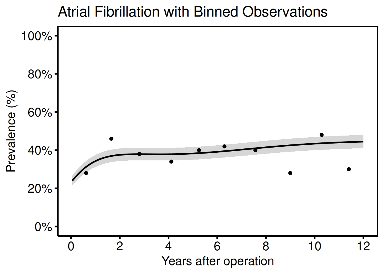
Add binned data summary points (matches the SAS means dataset):
plot(hv_nonparametric(
  dat,
  lower_col   = "lower",
  upper_col   = "upper",
  data_points = dat_pts
)) +
  scale_x_continuous(breaks = seq(0, 12, 2)) +
  scale_y_continuous(
    limits = c(0, 1),
    breaks = seq(0, 1, 0.2),
    labels = scales::percent
  ) +
  labs(
    x     = "Years after operation",
    y     = "Prevalence (%)",
    title = "Atrial Fibrillation with Binned Observations"
  ) +
  theme_hv_poster()
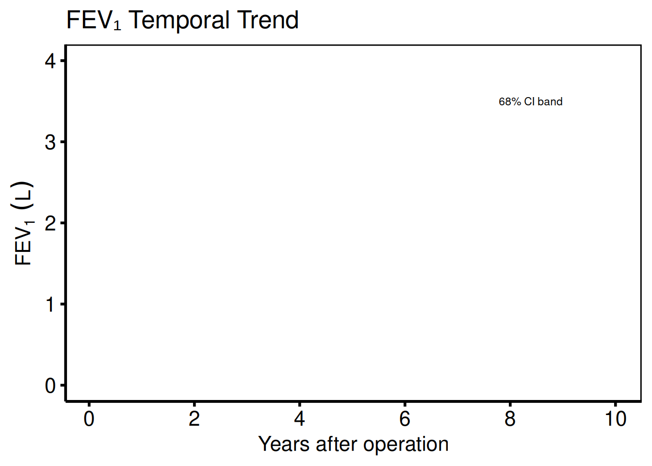
Continuous outcome
Ports: tp.np.fev.double.univariate.continuous.sas, tp.np.fev.u.trend.continuous.sas
For continuous outcomes (FEV1, AV peak gradient) set outcome_type = "continuous". The y-axis label and scale change accordingly; everything else is identical.
dat_cont     <- sample_nonparametric_curve_data(
  n            = 400,
  time_max     = 10,
  outcome_type = "continuous"
)
dat_cont_pts <- sample_nonparametric_curve_points(
  n            = 400,
  time_max     = 10,
  outcome_type = "continuous"
)

plot(hv_nonparametric(
  dat_cont,
  lower_col   = "lower",
  upper_col   = "upper",
  data_points = dat_cont_pts
)) +
  scale_x_continuous(breaks = seq(0, 10, 2)) +
  scale_y_continuous(limits = c(0, 4)) +
  labs(
    x     = "Years after operation",
    y     = expression(FEV[1] ~ (L)),
    title = "FEV\u2081 Temporal Trend"
  ) +
  annotate("text",
    x = 9, y = 3.5,
    label = "68% CI band",
    hjust = 1, size = 3
  ) +
  theme_hv_poster()
Multi-group comparison
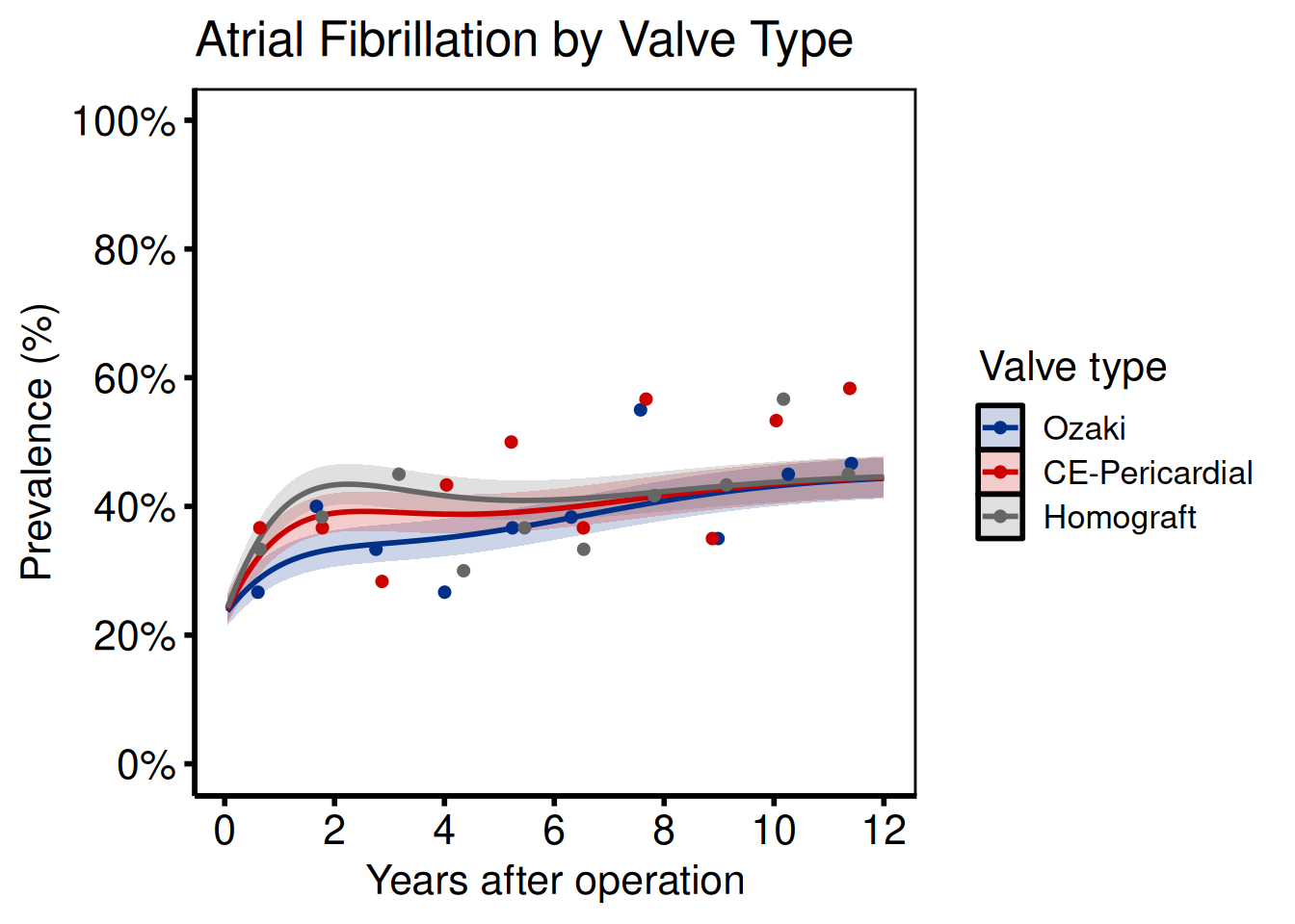
Ports: tp.np.afib.mult.avrg_curv.binary.sas, tp.np.afib.mult.pt_spec.binary.sas, tp.np.avpkgrad_ozak_ind_mtwt.sas, tp.np.fev.multivariate.continuous.sas
Provide a named vector to groups when generating sample data, or set group_col when supplying your own curve data.
grp_def <- c("Ozaki" = 0.7, "CE-Pericardial" = 1.1, "Homograft" = 1.4)
dat_grp     <- sample_nonparametric_curve_data(
  n        = 600,
  time_max = 12,
  groups   = grp_def
)
dat_grp_pts <- sample_nonparametric_curve_points(
  n        = 600,
  time_max = 12,
  groups   = grp_def
)

plot(hv_nonparametric(
  dat_grp,
  group_col   = "group",
  lower_col   = "lower",
  upper_col   = "upper",
  data_points = dat_grp_pts
)) +
  scale_colour_manual(
    values = c("Ozaki" = "#003087", "CE-Pericardial" = "#CC0000", "Homograft" = "#666666")
  ) +
  scale_fill_manual(
    values = c("Ozaki" = "#003087", "CE-Pericardial" = "#CC0000", "Homograft" = "#666666")
  ) +
  scale_x_continuous(breaks = seq(0, 12, 2)) +
  scale_y_continuous(
    limits = c(0, 1),
    breaks = seq(0, 1, 0.2),
    labels = scales::percent
  ) +
  labs(
    x      = "Years after operation",
    y      = "Prevalence (%)",
    colour = "Valve type",
    fill   = "Valve type",
    title  = "Atrial Fibrillation by Valve Type"
  ) +
  theme_hv_poster()
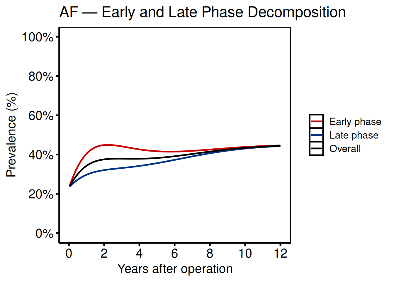
Phase decomposition
Ports: tp.np.afib.ivwristm.pt_spec_phases.binary.sas, tp.np.tr.ivecho.u.phases.sas
Phase plots separate the early (bell-shaped, incomplete hazard) and late (Weibull CDF, complete hazard) components. Supply a group_col whose levels label the phases.
dat_phase <- sample_nonparametric_curve_data(
  n      = 500,
  groups = c("Early phase" = 1.5, "Late phase" = 0.6, "Overall" = 1.0)
)

plot(hv_nonparametric(
  dat_phase,
  group_col = "group"
)) +
  scale_colour_manual(
    values = c("Early phase" = "#CC0000",
               "Late phase"  = "#003087",
               "Overall"     = "black")
  ) +
  scale_linetype_manual(
    values = c("Early phase" = "dashed",
               "Late phase"  = "dashed",
               "Overall"     = "solid")
  ) +
  scale_x_continuous(breaks = seq(0, 12, 2)) +
  scale_y_continuous(
    limits = c(0, 1),
    breaks = seq(0, 1, 0.2),
    labels = scales::percent
  ) +
  labs(
    x      = "Years after operation",
    y      = "Prevalence (%)",
    colour = NULL,
    title  = "AF — Early and Late Phase Decomposition"
  ) +
  theme_hv_poster()
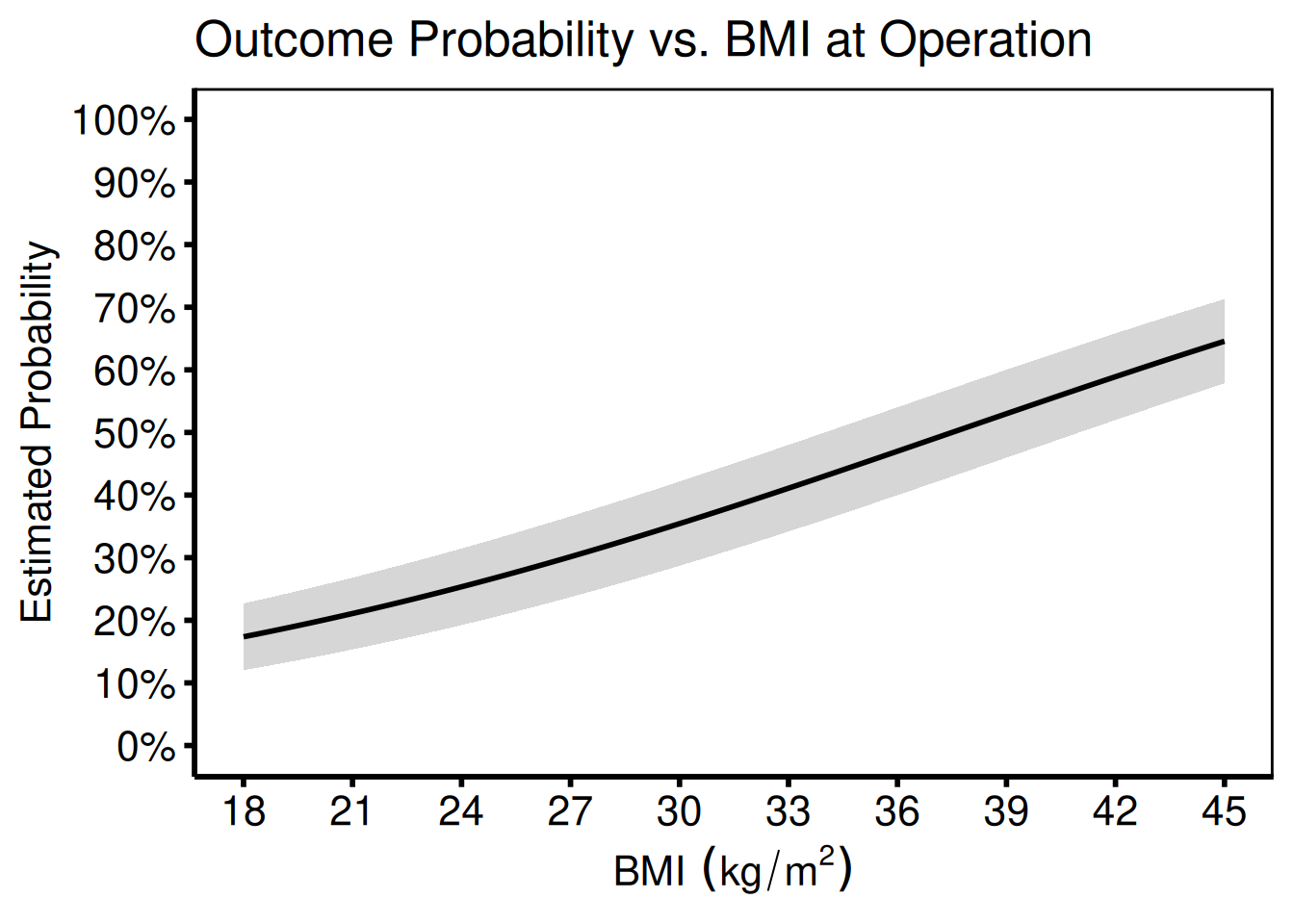
Covariate on the x-axis
Port: tp.np.z0axdpo.continuous.bmi_xaxis.sas
When BMI or another continuous covariate (rather than time) is on the x-axis, the function signature is identical — simply pass the covariate column name to x_col.
# Simulate covariate (BMI) x-axis data
set.seed(42)
n_pts  <- 300
bmi    <- seq(18, 45, length.out = n_pts)
est    <- plogis(-3 + 0.08 * bmi)
se     <- sqrt(est * (1 - est) / 50)
bmi_curve <- data.frame(
  bmi   = bmi,
  est   = est,
  lower = pmax(0, est - qnorm(0.84) * se),
  upper = pmin(1, est + qnorm(0.84) * se)
)

plot(hv_nonparametric(
  bmi_curve,
  x_col        = "bmi",
  estimate_col = "est",
  lower_col    = "lower",
  upper_col    = "upper"
)) +
  scale_x_continuous(
    breaks = seq(18, 45, 3),
    limits = c(18, 45)
  ) +
  scale_y_continuous(
    limits = c(0, 1),
    breaks = seq(0, 1, 0.1),
    labels = scales::percent
  ) +
  labs(
    x     = expression(BMI ~ (kg/m^2)),
    y     = "Estimated Probability",
    title = "Outcome Probability vs. BMI at Operation"
  ) +
  theme_hv_poster()
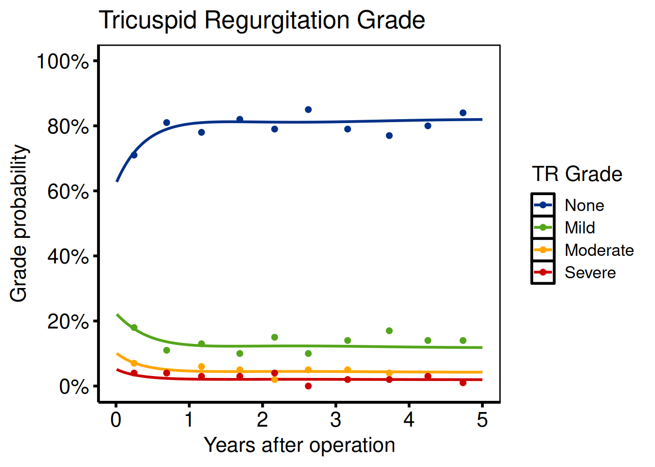
Ordinal outcomes
Port: tp.np.tr.ivecho.average_curv.ordinal.sas
Ordinal templates (TR grade, AR grade) use hv_ordinal(). The main migration step is reshaping the SAS wide-format predict dataset (one column per grade) to long format.
SAS reshape (do this before reading into R):
/* SAS wide format: p0, p1, p2, p3 */
data predict_wide;
  set predict;
run;
R reshape:
ord_labels <- c("None", "Mild", "Moderate", "Severe")
dat_ord     <- sample_nonparametric_ordinal_data(
  n            = 1000,
  time_max     = 5,
  grade_labels = ord_labels
)
dat_ord_pts <- sample_nonparametric_ordinal_points(
  n            = 1000,
  time_max     = 5,
  grade_labels = ord_labels
)

plot(hv_ordinal(
  dat_ord,
  grade_col   = "grade",
  data_points = dat_ord_pts
)) +
  scale_colour_manual(
    values = c(
      "None"     = "#003087",
      "Mild"     = "#55A51C",
      "Moderate" = "#FFA500",
      "Severe"   = "#CC0000"
    )
  ) +
  scale_x_continuous(breaks = 0:5) +
  scale_y_continuous(
    limits = c(0, 1),
    breaks = seq(0, 1, 0.2),
    labels = scales::percent
  ) +
  labs(
    x      = "Years after operation",
    y      = "Grade probability",
    colour = "TR Grade",
    title  = "Tricuspid Regurgitation Grade"
  ) +
  theme_hv_poster()
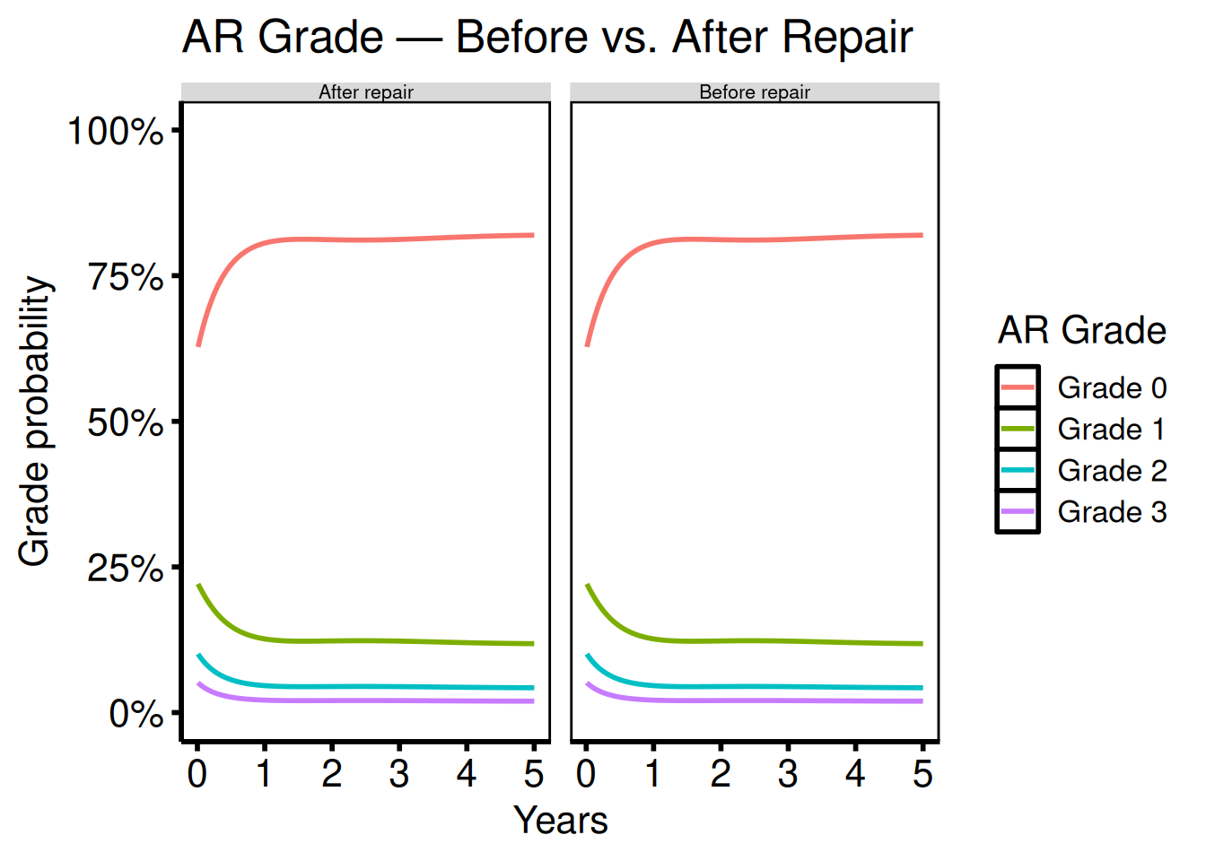
Ordinal multi-scenario comparison
Port: tp.np.po_ar.u_multi.ordinal.sas
The multi-scenario template (po_ar = post-op aortic regurgitation) places two or more ordinal grade curves side by side so you can read the grade distribution before repair in one panel and after repair in the next. In SAS this required separate %ordinal calls and manual page layout; here you bind the datasets, add a scenario column, and let facet_wrap() do the layout.
Ordinal phase independence
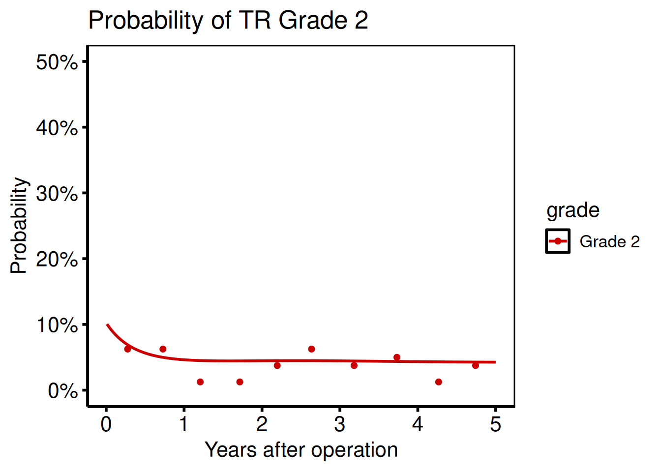
Port: tp.np.tr.ivecho.independence.sas
To examine a single grade in isolation, filter the long-format curve before passing it to the function:
dat_ind    <- sample_nonparametric_ordinal_data(n = 800)
pts_ind    <- sample_nonparametric_ordinal_points(n = 800)
grade_2    <- dat_ind[dat_ind$grade == "Grade 2", ]
dp_grade_2 <- pts_ind[pts_ind$grade == "Grade 2", ]

plot(hv_ordinal(
  grade_2,
  grade_col   = "grade",
  data_points = dp_grade_2
)) +
  scale_colour_manual(values = c("Grade 2" = "#CC0000")) +
  scale_x_continuous(breaks = seq(0, 5, 1)) +
  scale_y_continuous(
    limits = c(0, 0.5),
    labels = scales::percent
  ) +
  labs(
    x     = "Years after operation",
    y     = "Probability",
    title = "Probability of TR Grade 2"
  ) +
  theme_hv_poster()
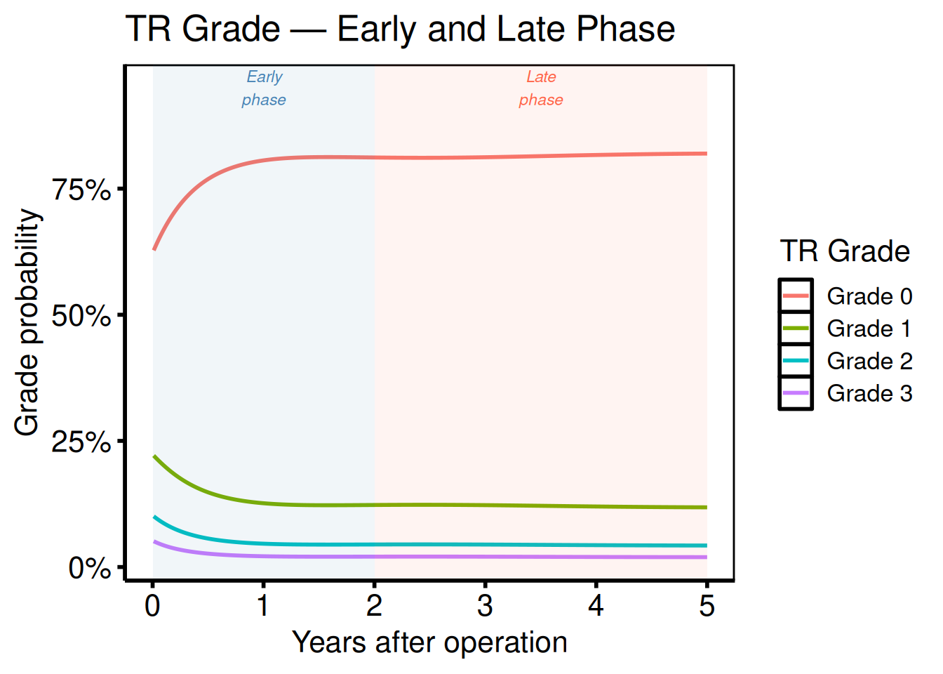
Ordinal phases
Port: tp.np.tr.ivecho.u.phases.sas
Phase-decomposed ordinal plots combine phase labels with grade colours. Create the figure by plotting grade-specific curves and annotating early vs. late phase regions:
dat_ph <- sample_nonparametric_ordinal_data(n = 800, seed = 7)

plot(hv_ordinal(dat_ph, grade_col = "grade")) +
  annotate("rect",
    xmin = 0, xmax = 2,  ymin = -Inf, ymax = Inf,
    fill = "steelblue", alpha = 0.07
  ) +
  annotate("text",
    x = 1, y = 0.95, label = "Early\nphase",
    size = 3, colour = "steelblue", fontface = "italic"
  ) +
  annotate("rect",
    xmin = 2, xmax = 5, ymin = -Inf, ymax = Inf,
    fill = "tomato", alpha = 0.07
  ) +
  annotate("text",
    x = 3.5, y = 0.95, label = "Late\nphase",
    size = 3, colour = "tomato", fontface = "italic"
  ) +
  scale_x_continuous(breaks = 0:5) +
  scale_y_continuous(labels = scales::percent) +
  labs(
    x      = "Years after operation",
    y      = "Grade probability",
    colour = "TR Grade",
    title  = "TR Grade — Early and Late Phase"
  ) +
  theme_hv_poster()
Survival analysis (tp.ac.dead.*, tp.cp.dead.*)
Ports: tp.ac.dead.sas, tp.cp.dead.sas
R equivalent: hv_survival()
hv_survival() wraps survfit() from the survival package and returns an S3 object. Call plot(km, type = ...) to render one of the five plot types matching the SAS %kaplan / %nelsont macro output flags (PLOTS, PLOTC, PLOTH, PLOTL). Tidy data frames live in km$tables.
dta <- sample_survival_data(n = 500, seed = 42)
km  <- hv_survival(dta)

# Kaplan–Meier survival (PLOTS)
plot(km) +
  scale_y_continuous(
    breaks = seq(0, 100, 20),
    labels = function(x) paste0(x, "%")
  ) +
  scale_x_continuous(breaks = seq(0, 20, 5)) +
  coord_cartesian(xlim = c(0, 20), ylim = c(0, 100)) +
  labs(
    x     = "Years after operation",
    y     = "Survival (%)",
    title = "Freedom from Death"
  ) +
  theme_hv_poster()

# Cumulative hazard (PLOTC)
plot(km, type = "cumhaz") +
  labs(x = "Years", y = "Cumulative Hazard") +
  theme_hv_poster()

# Hazard rate (PLOTH)
plot(km, type = "hazard") +
  labs(x = "Years", y = "Instantaneous Hazard") +
  theme_hv_poster()

# Log-log survival (PH check)
plot(km, type = "loglog") +
  labs(x = "log(Years)", y = "log(-log S(t))") +
  theme_hv_poster()

# Integrated survivorship (PLOTL)
plot(km, type = "life") +
  labs(x = "Years", y = "Restricted Mean Survival (years)") +
  theme_hv_poster()

# Access the KM data, risk table, and report table
km$data              # tidy KM data frame
km$tables$risk       # numbers-at-risk table
km$tables$report     # survival at report times
SAS → R argument mapping
data= |
data |
Patient-level data frame |
time= |
time_col |
Time-to-event column name |
event= |
event_col |
Event indicator column (1 = event) |
group= |
group_col |
Stratification variable |
method=kaplan |
method = "kaplan-meier" |
Default |
method=nelsont |
method = "nelson-aalen" |
Fleming–Harrington |
alpha=0.05 |
conf_level = 0.95 |
Default is 0.95 |
tp=0 1 2 3 5 7 10 |
report_times |
Table time points |
Goodness of follow-up (tp.dp.gfup.R)
Port: tp.dp.gfup.R
R equivalent: hv_followup()
tp.dp.gfup.R summarises how many patients remain under active follow-up at each time point – the kind of quality-check figure you run before committing to a temporal-prevalence analysis. The SAS version uses PROC FREQ output aggregated by year; hv_followup() accepts the same aggregated data frame (one row per time point, with counts for total patients and patients with a measurement). The output is a bar chart; any goodness-of-follow-up threshold you add in SAS (a dashed horizontal line) becomes a geom_hline(yintercept = ..., linetype = "dashed") call in R.
Covariate balance (tp.lp.propen.cov_balance.R)
Port: tp.lp.propen.cov_balance.R
R equivalent: hv_balance()
The SAS export arrives wide (one column per time-point). Reshape to long format before you call hv_balance(). Pass var_levels to control the bottom-to-top display order of covariates — this matches ylabel in the original script.
# Reshape wide → long (mirrors the original script)
ylabel <- c(
  "Cardiac Output", "BAV", "Cardiac Index", "NYHA -Functional Class",
  "COPD-Oxy", "Date of Surg", "Creatinine", "Age", "CAD",
  "Female", "LV PWT", "Mismatch", "HTN", "PVD", "Sinitibular Jcn: diam"
)

names(dta) <- c("variable", "Before match", "After match")

dta_long <- reshape(
  dta,
  direction = "long",
  varying   = c("Before match", "After match"),
  v.names   = "std_diff",
  timevar   = "group",
  times     = c("Before match", "After match"),
  idvar     = "variable"
)

n_vars    <- length(ylabel)
cb        <- hv_balance(
  data         = dta_long,
  variable_col = "variable",
  group_col    = "group",
  std_diff_col = "std_diff",
  var_levels   = ylabel
)

stdifPlot <- plot(cb) +
  scale_color_manual(
    values = c("Before match" = "red4", "After match" = "blue3"),
    name   = NULL
  ) +
  scale_shape_manual(
    values = c("Before match" = 17L, "After match" = 15L),
    name   = NULL
  ) +
  scale_x_continuous(limits = c(-40, 30), breaks = seq(-40, 30, 10)) +
  labs(x = "Standardized difference: SAVR - TF:TAVR (%)", y = "") +
  annotate("text", x = -30, y = 0,      label = "More likely TF-TAVR", size = 4.5) +
  annotate("text", x =  22, y = n_vars, label = "More likely SAVR",    size = 4.5) +
  theme(legend.position = c(0.20, 0.935)) +
  theme_hv_poster()

ggsave(here::here("graphs", "lp_cov-balance-SAVR_TF-TAVR.pdf"),
       plot = stdifPlot, height = 7, width = 8)
Alluvial flow (tp.dp.female_bicus_preAR_sankey.R)
Port: tp.dp.female_bicus_preAR_sankey.R
R equivalent: hv_alluvial()
tp.dp.female_bicus_preAR_sankey.R traces each patient through a sequence of categorical states (e.g. pre-op AR grade to procedure type to sex subgroup), producing the flowing band diagram that the original script builds with ggalluvial. The R port wraps this with hv_alluvial(), which handles the internal to_lodes_form() reshape and sets default fill aesthetics. You supply a data frame with one column per state and let scale_fill_brewer() or a manual fill scale control the colours. See the Alluvial section of the plot-functions vignette for a decorated worked example with labels.
Cluster stability Sankey (PAM analysis)
Source: PAM clustering analysis pipeline (R script using ggsankey)
R equivalent: hv_sankey()
hv_sankey() draws a Sankey diagram showing how patients flow between letter-labelled clusters as the number of clusters K increases from 2 to 9. Each column is one K; flow bands show assignment changes between consecutive K values; node labels show cluster letter + patient count.
The original code used ggsankey::make_long() with hard-coded column names and ordering vectors. The R port accepts any cluster columns and ordering via cluster_cols and node_levels arguments.
Requires ggsankey (install from GitHub):
remotes::install_github("davidsjoberg/ggsankey")
SAS/R workflow → R equivalent
sid_dta$C2 <- factor(...) with gr2_names ordering |
Factor levels set by node_levels argument |
make_long(C2, …, C9) |
.make_sankey_long() (internal) |
geom_sankey() + geom_sankey_label()
|
hv_sankey() + plot()
|
brewer.pal(9, "Set1")[c(2,6,8,4,3,5,7,1,9)] |
Default node_colours
|
To reproduce the original analysis with patient-level cluster assignments:
# Build a data frame with one row per patient, columns C2..C9 (factor)
grp_dta <- data.frame(
  C2 = factor(pm2clusters_labels, levels = gr2_names),
  C3 = factor(pm3clusters_labels, levels = gr3_names),
  # ... etc.
  C9 = factor(pm9clusters_labels, levels = gr9_names)
)

sk_grp <- hv_sankey(
  grp_dta,
  cluster_cols = paste0("C", 2:9),
  node_levels  = gr9_names
)

plot(sk_grp) +
  labs(x = NULL) +
  theme_hv_poster()
UpSet plot (tp.complexUpset.R)
Port: tp.complexUpset.R
R equivalent: hv_upset()
tp.complexUpset.R visualises how many patients fall into each combination of procedure categories (CABG, Valve, MAZE, Aorta, etc.) – the combinatorial overlap question that Venn diagrams can’t answer cleanly past three sets. The SAS version used a custom PROC TABULATE / SGPLOT workaround; the R port replaces it with the ComplexUpset package wrapped in hv_upset(). You pass a binary-indicator data frame (one column per set, 1 = member) and the intersect argument names the sets to include.
Spaghetti / individual trajectories (tp.dp.spaghetti.echo.R)
Port: tp.dp.spaghetti.echo.R
R equivalent: hv_spaghetti()
The template covers nine figures across three echo outcomes (AV mean gradient, AV area, DVI) in unstratified and sex-stratified variants, plus an ordinal MV regurgitation grade plot (plot_9).
Unstratified — AV mean gradient full range (plot_1)
The SAS template tp.dp.spaghetti.echo.R sets AXISY ORDER=(0 TO 80 BY 20) for the full gradient range. Reproduce that scale with coord_cartesian() so you keep the ggplot clipping behaviour rather than silently dropping out-of-range trajectories.
Unstratified — zoomed y-axis (plot_3)
Plot_3 in the SAS script tightens the y-axis to ORDER=(0 TO 30 BY 10) to reveal structure in the low-gradient patients that is invisible at the 0-80 range. Only coord_cartesian() changes; the constructor call and data are identical to plot_1. Look for: trajectories that were flat in plot_1 now showing meaningful within-patient variation – if none appear, the patient population may not have a low-gradient subgroup.
Stratified by sex (plot_2 / plot_4)
Template uses values=c("red", "blue"); modernised equivalents below. Pass colour_col = "group" to hv_spaghetti() when constructing sp_col so each patient trajectory inherits the group colour.
plot(sp_col) +
  scale_colour_manual(
    values = c(Female = "firebrick", Male = "steelblue"),
    name   = NULL
  ) +
  scale_x_continuous(breaks = seq(0, 5, 1)) +
  scale_y_continuous(breaks = seq(0, 80, 20)) +
  coord_cartesian(xlim = c(0, 5), ylim = c(0, 80)) +
  labs(x = "Years", y = "AV Mean Gradient (mmHg)") +
  theme_hv_poster()
AV area y-scale (plot_5 / plot_6)
Plot_5 (unstratified) and plot_6 (by sex) switch the outcome to effective orifice area (EOA, cm2) with AXISY ORDER=(0 TO 5 BY 1). The only change from the gradient plots is the y-axis range and the label; the constructor object and colour scale reuse sp / sp_col from above.
plot(sp_col) +
  scale_colour_manual(
    values = c(Female = "firebrick", Male = "steelblue"),
    name   = NULL
  ) +
  scale_x_continuous(breaks = seq(0, 5, 1)) +
  scale_y_continuous(breaks = seq(0, 5, 1)) +
  coord_cartesian(xlim = c(0, 5), ylim = c(0, 5)) +
  labs(x = "Years", y = "AV Area (EOA) (cm\u00b2)") +
  theme_hv_poster()
DVI y-scale (plot_7 / plot_8)
Plot_7 (unstratified) and plot_8 (by sex) track the dimensionless velocity index (DVI), a unitless ratio bounded roughly 0-1.25. The SAS option is AXISY ORDER=(0 TO 1.25 BY 0.25). This is the only spaghetti variant where a y-axis maximum above 1 is correct – do not treat values above 1 as outliers.
plot(sp_col) +
  scale_colour_manual(
    values = c(Female = "firebrick", Male = "steelblue"),
    name   = NULL
  ) +
  scale_x_continuous(breaks = seq(0, 5, 1)) +
  scale_y_continuous(breaks = seq(0, 1.25, 0.25)) +
  coord_cartesian(xlim = c(0, 5), ylim = c(0, 1.25)) +
  labs(x = "Years", y = "DVI") +
  theme_hv_poster()
Ordinal y-axis — MV regurgitation grade (plot_9)
Plot_9 is the outlier in this template family: MV regurgitation grade is ordinal (None / Mild / Moderate / Severe = 0-3), not continuous. In SAS the y-axis was labelled with AXISY ORDER=(0 TO 3 BY 1) and annotated manually; here you pass y_labels to plot() to replace the numeric tick marks with grade names. The pre-processing step rounds the raw echo value to an integer 0-3 before constructing the spaghetti object.
dta_ord       <- dta
dta_ord$value <- round(pmin(3, pmax(0, dta$value / 12)))
levels(dta_ord$group) <- c("Early", "Late")

sp_ord <- hv_spaghetti(dta_ord, colour_col = "group")

plot(sp_ord, y_labels = c(None = 0, Mild = 1, Moderate = 2, Severe = 3)) +
  scale_colour_manual(
    values = c(Early = "steelblue", Late = "red2"),
    name   = NULL
  ) +
  scale_x_continuous(breaks = seq(0, 6, 1)) +
  coord_cartesian(xlim = c(0, 6), ylim = c(0, 3)) +
  labs(x = "Years after Procedure", y = "MV Regurgitation Grade") +
  theme_hv_poster()
Trends over time (tp.*.trends.*)
Ports: tp.rp.trends.sas, tp.lp.trends.sas, tp.lp.trends.age.sas, tp.lp.trends.polytomous.sas, tp.dp.trends.R
R equivalent: hv_trends()
tp.rp.trends.sas — cases/year and age (1968–2000 by 4)
tp.rp.trends.sas is the right-panel trends template: a single smoothed curve for cases-per-year and a second figure for median operative age, both spanning 1968-2000. In SAS the two figures are separate SGPLOT calls sharing the same axisx order=(1968 to 2000 by 4) statement. In R you call the same hv_trends() object twice with different y-axis scales – one for counts, one for age – so you only need to build the constructor once.
one    <- sample_trends_data(n = 600, year_range = c(1968L, 2000L), groups = NULL)
tr_one <- hv_trends(one, group_col = NULL)

# Cases/year: axisy order=(0 to 10 by 2)
plot(tr_one) +
  scale_x_continuous(limits = c(1968, 2000), breaks = seq(1968, 2000, 4)) +
  scale_y_continuous(limits = c(0, 10),      breaks = seq(0, 10, 2)) +
  labs(x = "Year", y = "Cases/year") +
  theme_hv_poster()

# Age: axisy order=(30 to 70 by 10)
plot(tr_one) +
  scale_x_continuous(limits = c(1968, 2000), breaks = seq(1968, 2000, 4)) +
  scale_y_continuous(limits = c(30, 70),     breaks = seq(30, 70, 10)) +
  labs(x = "Year", y = "Age (years)") +
  theme_hv_poster()
tp.lp.trends.sas — binary % outcomes (1970–2000 by 10, y 0–100 by 10)
tp.lp.trends.sas is the left-panel trends template for binary percentage outcomes plotted together on a single figure – shock rate, pre-op IABP use, inotrope use, etc. The SAS SGPLOT overlays multiple SCATTER / REG statement pairs, one per outcome, with axisx order=(1970 to 2000 by 10) and axisy order=(0 to 100 by 20). In R you encode the outcome identity as a group variable and use scale_colour_manual() / scale_shape_manual() to assign the same per-outcome styling. CGM axis spec: axisx order=(1970 to 2000 by 10), axisy order=(0 to 100 by 20).
dta_lp <- sample_trends_data(
  n = 800, year_range = c(1970L, 2000L),
  groups = c("Shock %", "Pre-op IABP %", "Inotropes %"))
tr_lp <- hv_trends(dta_lp)

plot(tr_lp) +
  scale_colour_manual(
    values = c("Shock %" = "steelblue", "Pre-op IABP %" = "firebrick",
               "Inotropes %" = "forestgreen"), name = NULL) +
  scale_shape_manual(
    values = c("Shock %" = 16L, "Pre-op IABP %" = 15L, "Inotropes %" = 17L),
    name = NULL) +
  scale_x_continuous(limits = c(1970, 2000), breaks = seq(1970, 2000, 10)) +
  scale_y_continuous(limits = c(0, 100),     breaks = seq(0, 100, 10)) +
  coord_cartesian(xlim = c(1970, 2000), ylim = c(0, 100)) +
  labs(x = "Year", y = "Percent (%)") +
  theme_hv_poster()
tp.lp.trends.age.sas — age on x-axis (25–85 by 10, y 0–100 by 20)
tp.lp.trends.age.sas flips the x-axis from calendar year to patient age at operation, showing how the proportion receiving each procedure type shifts with age. The SAS axisx order=(25 to 85 by 10) statement is the tell; in R you use the same hv_trends() constructor but pass age as the x variable and set scale_x_continuous(limits = c(25, 85), breaks = seq(25, 85, 10)).
dta_age <- sample_trends_data(
  n = 600, year_range = c(25L, 85L),
  groups = c("Repair %", "Bioprosthesis %"), seed = 7L)
tr_age <- hv_trends(dta_age)

plot(tr_age) +
  scale_colour_manual(
    values = c("Repair %" = "steelblue", "Bioprosthesis %" = "firebrick"),
    name = NULL) +
  scale_x_continuous(limits = c(25, 85), breaks = seq(25, 85, 10)) +
  scale_y_continuous(limits = c(0, 100), breaks = seq(0, 100, 20)) +
  coord_cartesian(xlim = c(25, 85), ylim = c(0, 100)) +
  labs(x = "Age (years)", y = "Percent (%)") +
  theme_hv_poster()
tp.lp.trends.polytomous.sas — repair types (1990–1999 by 1, y 0–100 by 10)
tp.lp.trends.polytomous.sas extends the binary trends template to three or more mutually exclusive categorical outcomes (CE, Cosgrove, Periguard, DeVega repair types) that together sum to 100%. The SAS template uses a separate SCATTER / REG overlay per repair type; here each type is a group level. Because the percents are compositional (they sum to roughly 100), use coord_cartesian() rather than scale_y_continuous(limits = ...) to avoid silently dropping early time points where sample sizes are small.
dta_poly <- sample_trends_data(
  n = 800, year_range = c(1990L, 1999L),
  groups = c("CE", "Cosgrove", "Periguard", "DeVega"), seed = 5L)
tr_poly <- hv_trends(dta_poly)

plot(tr_poly) +
  scale_colour_manual(
    values = c(CE = "steelblue", Cosgrove = "firebrick",
               Periguard = "forestgreen", DeVega = "goldenrod3"),
    name = "Repair type") +
  scale_shape_manual(
    values = c(CE = 15L, Cosgrove = 19L, Periguard = 17L, DeVega = 18L),
    name = "Repair type") +
  scale_x_continuous(limits = c(1990, 1999), breaks = seq(1990, 1999, 1)) +
  scale_y_continuous(limits = c(0, 100),     breaks = seq(0, 100, 10)) +
  coord_cartesian(xlim = c(1990, 1999), ylim = c(0, 100)) +
  labs(x = "Year", y = "Percent (%)") +
  theme_hv_poster()
tp.dp.trends.R — LV mass index (1995–2015 by 5, y 0–200 by 50)
tp.dp.trends.R covers continuous-outcome trends, here LV mass index (g/m2) over a 20-year window. Unlike the SAS templates above this is an R script origin rather than a .sas file, so there is no axisx option to translate literally – the axis spec (1995 to 2015 by 5, y 0 to 200 by 50) comes from the scale_*_continuous() calls below.
dta_lv <- sample_trends_data(n = 800, year_range = c(1995L, 2015L),
                              groups = NULL, seed = 3L)
tr_lv  <- hv_trends(dta_lv, group_col = NULL)

plot(tr_lv) +
  scale_x_continuous(limits = c(1995, 2015), breaks = seq(1995, 2015, 5)) +
  scale_y_continuous(limits = c(0, 200),     breaks = seq(0, 200, 50)) +
  coord_cartesian(xlim = c(1995, 2015), ylim = c(0, 200)) +
  labs(x = "Years", y = "LV Mass Index") +
  theme_hv_poster()
tp.dp.trends.R — hospital LOS with annotation (1985–2015 by 5, y 0–20 by 5)
This variant of tp.dp.trends.R tracks hospital length of stay (days) and adds a text annotation inside the plot panel – the kind of label the SAS SGPLOT INSET statement would place. In R an annotate("text", ...) call places it at absolute data coordinates; adjust the x and y values to avoid overlapping the fitted curve.
dta_los <- sample_trends_data(n = 800, year_range = c(1985L, 2015L),
                               groups = NULL, seed = 11L)
tr_los  <- hv_trends(dta_los, group_col = NULL)

plot(tr_los) +
  scale_x_continuous(limits = c(1985, 2015), breaks = seq(1985, 2015, 5)) +
  scale_y_continuous(limits = c(0, 20),      breaks = seq(0, 20, 5)) +
  coord_cartesian(xlim = c(1985, 2015), ylim = c(0, 20)) +
  annotate("text", x = 1995, y = 18,
           label = "Trend: Hospital Length of Stay", size = 4.5) +
  labs(x = "Years", y = "Hospital LOS (Days)") +
  theme_hv_poster()
Longitudinal patient counts (tp.dp.longitudinal_patients_measures.R)
Port: tp.dp.longitudinal_patients_measures.R
R equivalent: hv_longitudinal()
tp.dp.longitudinal_patients_measures.R answers the question “how many patients have an echocardiogram measurement at each follow-up year?” – a companion to the goodness-of-follow-up chart above, but focused on measurement availability rather than vital-status follow-up. The original R script used PROC FREQ-style counting over a long-format echo dataset; hv_longitudinal() accepts the same patient-level long-format frame and produces a bar chart with count annotations. You need one row per patient per observation, with columns for patient ID, follow-up year, and (optionally) a measurement flag.
Mirror histogram (propensity score)
R equivalents: tp.lp.mirror-histogram_SAVR-TF-TAVR.R (binary-match), tp.lp.mirror_histo_before_after_wt.R (weighted IPTW)
hv_mirror_hist() replaces both scripts. Call plot(mh) to render. Diagnostics are in mh$tables$diagnostics, working data in mh$tables$working; layer scales, annotations, and a theme the usual way.
Binary-match mode (tp.lp.mirror-histogram_SAVR-TF-TAVR.R)
tp.lp.mirror-histogram_SAVR-TF-TAVR.R compares propensity score distributions for SAVR and TF-TAVR patients before and after 1:1 nearest-neighbour matching. Upper bars show pre-match counts; a darker overlaid bar shows the matched subset in each bin. Pass match_col to hv_mirror_hist() to activate this mode – the four internal fill levels (before_g0, matched_g0, before_g1, matched_g1) then map directly to the four scale_fill_manual() values.
dta <- sample_mirror_histogram_data(n = 400, separation = 1.5)
mh  <- hv_mirror_hist(dta)   # defaults: prob_t / tavr / match

plot(mh) +
  scale_fill_manual(
    values = c(
      before_g0  = "white",  matched_g0 = "green1",
      before_g1  = "white",  matched_g1 = "green4"
    ),
    guide = "none"
  ) +
  scale_x_continuous(limits = c(0, 100), breaks = seq(0, 100, 10)) +
  annotate("text", x = 20, y =  100, label = "SAVR",    size = 7) +
  annotate("text", x = 20, y = -100, label = "TF-TAVR", size = 7) +
  labs(x = "Propensity Score (%)", y = "Number of Patients") +
  theme_hv_poster()
Weighted IPTW mode (tp.lp.mirror_histo_before_after_wt.R)
tp.lp.mirror_histo_before_after_wt.R replaces the matched-subset bars with IPTW weight sums per bin – the right display when you are weighting rather than matching. Pass weight_col instead of match_col to switch modes. The fill levels change to before_g0, weighted_g0, before_g1, weighted_g1, so update your scale_fill_manual() values accordingly.
dta   <- sample_mirror_histogram_data(n = 400, add_weights = TRUE)
mh_wt <- hv_mirror_hist(
  dta,
  group_labels = c("Limited", "Extended"),
  weight_col   = "mt_wt"
)

plot(mh_wt) +
  scale_fill_manual(
    values = c(
      before_g0   = "white", weighted_g0 = "blue",
      before_g1   = "white", weighted_g1 = "red"
    ),
    guide = "none"
  ) +
  scale_x_continuous(limits = c(0, 100), breaks = seq(0, 100, 10)) +
  annotate("text", x = 30, y =  150, label = "Limited",  color = "blue", size = 5) +
  annotate("text", x = 30, y = -70,  label = "Extended", color = "red",  size = 5) +
  labs(x = "Propensity Score (%)", y = "#") +
  theme_hv_poster()
Stacked histogram
R equivalent: hv_stacked()
This plot has no direct SAS template predecessor – it is a new addition designed for the annual case-volume figures that were previously hand-built with PROC SGPLOT VBAR / VBARPARM calls. hv_stacked() accepts a data frame with one column for the x variable (typically operation year) and one column for the group/fill variable. It returns a bar chart with stacked fills; apply scale_fill_brewer() or scale_fill_manual() to set colours consistent with your other figures in the same presentation.
Using themes
All plot() calls return an unstyled ggplot object. Add a theme as the final layer:
You can pass base_size to any theme to scale all text simultaneously:
PowerPoint
save_ppt() inserts ggplot objects into a PowerPoint file as editable DrawingML vector graphics via the officer and rvg packages — shapes, lines, and text remain individually selectable in PowerPoint after export. The first argument is object (not plot); the output path is powerpoint (not file or filename).
# Locate the bundled Cleveland Clinic slide template
template <- system.file("extdata", "hv_ppt_template.pptx", package = "hvtiPlotR")

# Single slide — apply a PPT theme before saving
p_ppt <- p +
  scale_colour_manual(values = c("steelblue"), guide = "none") +
  scale_fill_manual(values   = c("steelblue"), guide = "none") +
  labs(x = "Years", y = "Prevalence (%)") +
  theme_hv_ppt_dark()

save_ppt(
  object       = p_ppt,
  template     = template,
  powerpoint   = "figures/afib_prevalence.pptx",
  slide_titles = "AF Prevalence over Time"
)

# Multiple plots — one slide per figure in a single call
save_ppt(
  object       = list(fig1 = p_binary, fig2 = p_multi),
  template     = template,
  powerpoint   = "figures/np_curves.pptx",
  slide_titles = c("Binary Outcome", "Multi-group Comparison")
)
PDF / TIFF for journals
ggsave() replaces the SAS device=eps / device=tiff options. For most journals, 3.5 x 3.5 inches (single column) at 600 dpi satisfies TIFF submission requirements; check the target journal’s figure guidelines for the exact width – double-column figures typically need 7 inches. Use theme_hv_manuscript() rather than theme_hv_poster() before saving, since manuscript figures need smaller base text sizes than poster figures.
ggsave("figures/afib_prevalence.pdf",  p, width = 3.5, height = 3.5, units = "in")
ggsave("figures/afib_prevalence.tiff", p, width = 3.5, height = 3.5,
       units = "in", dpi = 600)
Parametric hazard/survival (tp.hs.*)
Ports: tp.hs.dead.setup.sas, tp.hs.dead_uses_setup.sas, tp.hs.dead.procedure.tdepth.sas, tp.hs.dead.conditional.setup.sas, tp.hs.dead.conditional.uses_setup.sas, tp.hs.dead.compare_benefit.setup.sas, tp.hs.uslife_estimates_generate_stratify_.age.sas, tp.hs.uslife_generates_matched_estimates.sas
R equivalents: hazard_plot(), survival_difference_plot()
The tp.hs.* family extends tp.hp.dead.* by using the %hazpred macro to generate patient-specific parametric survival predictions from a fitted multivariable hazard model. The setup templates compute and store:
-
Cumulative hazard per patient at last follow-up (for observed vs. expected goodness-of-fit tests via
%chisqgf).
-
Individual survivorship curves on a fine time grid (for mean-curve aggregation with
PROC SUMMARY).
Subsequent use templates stratify the aggregated mean curves by a covariate and overlay Kaplan-Meier estimates from %kaplan. The resulting SAS datasets map directly to hazard_plot() in R:
Parametric survival with KM overlay
Reproduces the core figure from tp.hs.dead_uses_setup.sas and tp.hs.dead.procedure.tdepth.sas: a mean parametric survival curve (solid line with confidence band) overlaid with Kaplan-Meier empirical estimates (symbols with error bars).
dat_hp <- sample_hazard_data(n = 500, time_max = 10)
emp_hp <- sample_hazard_empirical(n = 500, time_max = 10, n_bins = 6)

hazard_plot(
  dat_hp,
  estimate_col  = "survival",
  lower_col     = "surv_lower",
  upper_col     = "surv_upper",
  empirical     = emp_hp,
  emp_lower_col = "lower",
  emp_upper_col = "upper"
) +
  scale_colour_manual(values = c("steelblue"), guide = "none") +
  scale_fill_manual(values = c("steelblue"), guide = "none") +
  scale_x_continuous(limits = c(0, 10), breaks = 0:10) +
  scale_y_continuous(limits = c(0, 100), breaks = seq(0, 100, 10),
                     labels = function(x) paste0(x, "%")) +
  labs(x = "Years after Operation", y = "Survival (%)") +
  theme_hv_poster()
Stratified by covariate
tp.hs.dead.procedure.tdepth.sas overlays curves for depth-of-invasion groups (tdepth = 1, 2, 3). Pass group_col to hazard_plot() and supply matched sample_hazard_data() / sample_hazard_empirical() calls with a groups vector whose names become the legend labels.
dat_strat <- sample_hazard_data(
  n = 500, time_max = 10,
  groups = c("pT1" = 0.4, "pT2" = 1.0, "pT3" = 1.8)
)
emp_strat <- sample_hazard_empirical(
  n = 500, time_max = 10, n_bins = 5,
  groups = c("pT1" = 0.4, "pT2" = 1.0, "pT3" = 1.8)
)

hazard_plot(
  dat_strat,
  estimate_col  = "survival",
  lower_col     = "surv_lower",
  upper_col     = "surv_upper",
  group_col     = "group",
  empirical     = emp_strat,
  emp_lower_col = "lower",
  emp_upper_col = "upper"
) +
  scale_colour_manual(
    values = c("pT1" = "steelblue", "pT2" = "forestgreen", "pT3" = "firebrick"),
    name   = NULL
  ) +
  scale_fill_manual(
    values = c("pT1" = "steelblue", "pT2" = "forestgreen", "pT3" = "firebrick"),
    guide  = "none"
  ) +
  scale_x_continuous(limits = c(0, 10), breaks = 0:10) +
  scale_y_continuous(limits = c(0, 100), breaks = seq(0, 100, 10),
                     labels = function(x) paste0(x, "%")) +
  labs(x = "Years after Operation", y = "Survival (%)") +
  theme_hv_poster()
Conditional survival after hospital discharge
tp.hs.dead.conditional.setup.sas computes individual survivorship curves starting from the time of hospital discharge rather than the operation date. The conditional survival S(t | discharge) is S(t) / S(t_discharge) for each patient. In R, you use the same hazard_plot() call — only the x-axis label and data preparation change.
dat_cond <- sample_hazard_data(n = 500, time_max = 10)
emp_cond <- sample_hazard_empirical(n = 500, time_max = 10, n_bins = 6)

hazard_plot(
  dat_cond,
  estimate_col  = "survival",
  lower_col     = "surv_lower",
  upper_col     = "surv_upper",
  empirical     = emp_cond,
  emp_lower_col = "lower",
  emp_upper_col = "upper"
) +
  scale_colour_manual(values = c("steelblue"), guide = "none") +
  scale_fill_manual(values = c("steelblue"), guide = "none") +
  scale_x_continuous(limits = c(0, 10), breaks = 0:10) +
  scale_y_continuous(limits = c(0, 100), breaks = seq(0, 100, 10),
                     labels = function(x) paste0(x, "%")) +
  labs(x = "Years after Discharge", y = "Survival after Discharge (%)") +
  theme_hv_poster()
US life-table overlay
tp.hs.uslife_* templates call %usmatchd to generate age-, sex-, and race-matched US population life-table survival curves for each patient. sample_life_table() provides representative matched curves stratified by age group for use in R examples.
dat_age <- sample_hazard_data(
  n = 600, time_max = 10,
  groups = c("<60" = 0.4, "60\u201385" = 1.0, "\u226585" = 2.0)
)
emp_age <- sample_hazard_empirical(
  n = 600, time_max = 10, n_bins = 6,
  groups = c("<60" = 0.4, "60\u201385" = 1.0, "\u226585" = 2.0)
)
lt <- sample_life_table(
  age_groups = c("<60", "60\u201385", "\u226585"),
  age_mids   = c(50, 72, 88),
  time_max   = 10
)

hazard_plot(
  dat_age,
  estimate_col     = "survival",
  lower_col        = "surv_lower",
  upper_col        = "surv_upper",
  group_col        = "group",
  empirical        = emp_age,
  emp_lower_col    = "lower",
  emp_upper_col    = "upper",
  reference        = lt,
  ref_estimate_col = "survival",
  ref_group_col    = "group"
) +
  scale_colour_manual(
    values = c("<60" = "steelblue", "60\u201385" = "forestgreen",
               "\u226585" = "firebrick"),
    name   = "Age group"
  ) +
  scale_fill_manual(
    values = c("<60" = "steelblue", "60\u201385" = "forestgreen",
               "\u226585" = "firebrick"),
    guide  = "none"
  ) +
  scale_x_continuous(limits = c(0, 10), breaks = 0:10) +
  scale_y_continuous(limits = c(0, 100), breaks = seq(0, 100, 20),
                     labels = function(x) paste0(x, "%")) +
  labs(x = "Years after Operation", y = "Survival (%)",
       caption = "Dashed lines: US population life table") +
  theme_hv_poster()
Treatment benefit distribution
tp.hs.dead.compare_benefit.setup.sas computes, for each patient, the difference in predicted survival at a fixed time point (5 years) under two treatment arms (e.g. ASA vs. no ASA). That per-patient distribution is the answer to “who benefits and by how much.” survival_difference_plot() plots the mean difference curve over time.
diff_dat <- sample_survival_difference_data(
  n      = 500,
  groups = c("No ASA" = 1.0, "ASA" = 0.75)
)

survival_difference_plot(
  diff_dat,
  lower_col = "diff_lower",
  upper_col = "diff_upper"
) +
  scale_colour_manual(values = c("steelblue"), guide = "none") +
  scale_fill_manual(values = c("steelblue"), guide = "none") +
  ggplot2::geom_hline(yintercept = 0, linetype = "dashed",
                      colour = "grey50") +
  scale_x_continuous(limits = c(0, 10), breaks = 0:10) +
  scale_y_continuous(limits = c(-5, 40),
                     labels = function(x) paste0(x, "%")) +
  labs(x = "Years", y = "Survival Difference (%)") +
  theme_hv_poster()
Adding new ports
As additional SAS templates are ported to R, update this guide:
Add a row to the lookup table at the top of this file with the SAS template name, family prefix, R function, and section anchor.
Add a section following the existing pattern: name the port, describe the SAS workflow, show the R equivalent with a runnable example, and document any column name mapping differences.
Export the new R function by adding @export to its roxygen block and running devtools::document() to regenerate NAMESPACE.
Update DESCRIPTION if a new package dependency is required.
Templates currently planned for porting:
-
tp.ce.states.* competing-events / state-occupancy → (pending)
-
tp.gp.* grouped longitudinal ordinal models → (pending)
Session info
R version 4.6.0 (2026-04-24)
Platform: x86_64-pc-linux-gnu
Running under: Ubuntu 24.04.4 LTS

Matrix products: default
BLAS:   /usr/lib/x86_64-linux-gnu/openblas-pthread/libblas.so.3
LAPACK: /usr/lib/x86_64-linux-gnu/openblas-pthread/libopenblasp-r0.3.26.so;  LAPACK version 3.12.0

locale:
 [1] LC_CTYPE=C.UTF-8       LC_NUMERIC=C           LC_TIME=C.UTF-8
 [4] LC_COLLATE=C.UTF-8     LC_MONETARY=C.UTF-8    LC_MESSAGES=C.UTF-8
 [7] LC_PAPER=C.UTF-8       LC_NAME=C              LC_ADDRESS=C
[10] LC_TELEPHONE=C         LC_MEASUREMENT=C.UTF-8 LC_IDENTIFICATION=C

time zone: UTC
tzcode source: system (glibc)

attached base packages:
[1] stats     graphics  grDevices utils     datasets  methods   base

other attached packages:
[1] ggplot2_4.0.3   hvtiPlotR_2.3.3

loaded via a namespace (and not attached):
 [1] generics_0.1.4          tidyr_1.3.2             fontLiberation_0.1.0
 [4] xml2_1.5.2              lattice_0.22-9          digest_0.6.39
 [7] magrittr_2.0.5          evaluate_1.0.5          grid_4.6.0
[10] RColorBrewer_1.1-3      fastmap_1.2.0           jsonlite_2.0.0
[13] Matrix_1.7-5            zip_2.3.3               consort_1.2.3
[16] survival_3.8-6          purrr_1.2.2             scales_1.4.0
[19] fontBitstreamVera_0.1.1 textshaping_1.0.5       cli_3.6.6
[22] rlang_1.2.0             fontquiver_0.2.1        ggupset_0.4.1
[25] splines_4.6.0           withr_3.0.2             yaml_2.3.12
[28] otel_0.2.0              gdtools_0.5.1           tools_4.6.0
[31] officer_0.7.5           uuid_1.2-2              dplyr_1.2.1
[34] vctrs_0.7.3             R6_2.6.1                lifecycle_1.0.5
[37] ragg_1.5.2              pkgconfig_2.0.3         pillar_1.11.1
[40] gtable_0.3.6            glue_1.8.1              Rcpp_1.1.1-1.1
[43] systemfonts_1.3.2       xfun_0.58               rvg_0.4.2
[46] tibble_3.3.1            tidyselect_1.2.1        knitr_1.51
[49] farver_2.1.2            htmltools_0.5.9         labeling_0.4.3
[52] rmarkdown_2.31          ggalluvial_0.12.6       compiler_4.6.0
[55] S7_0.2.2                askpass_1.2.1           openssl_2.4.1