The Composition Pattern
Every hvtiPlotR plot is built in two steps: a constructor (hv_*()) that shapes the data, followed by plot() that renders a bare ggplot object. No colour scales, axis labels, or theme are applied by either step — you add those by chaining layers with +:
plot(hv_*(...)) +
  scale_colour_*() +   # data colours
  scale_fill_*()   +   # fill colours
  labs()           +   # axis labels, title, caption
  annotate()       +   # text/arrows placed on the panel
  coord_cartesian() +  # viewport cropping
  theme_hv_manuscript()         # non-data formatting
This vignette demonstrates each decorator in turn, using hv_trends() and hv_survival() as representative base plots.
# Trends data — multi-group continuous outcome over time
dta_trends <- sample_trends_data(n = 600, seed = 42)
p_base <- plot(hv_trends(dta_trends))
# KM data — survival curve
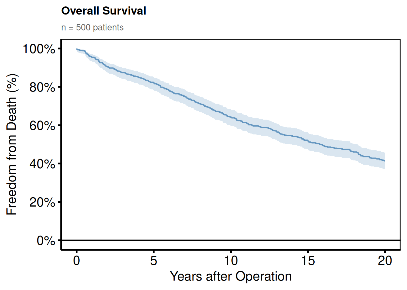
dta_km <- sample_survival_data(n = 500, seed = 42)
km <- hv_survival(dta_km)Themes
The hvtiPlotR package provides four themes via theme_hv_*(). The style argument selects the output target.
| Style | Target |
|---|---|
"manuscript" |
Journal PDF, black-on-white |
"poster" |
Conference poster, slightly larger text |
"light_ppt" |
PowerPoint on white/light background |
"dark_ppt" |
PowerPoint on dark/blue background |
Manuscript
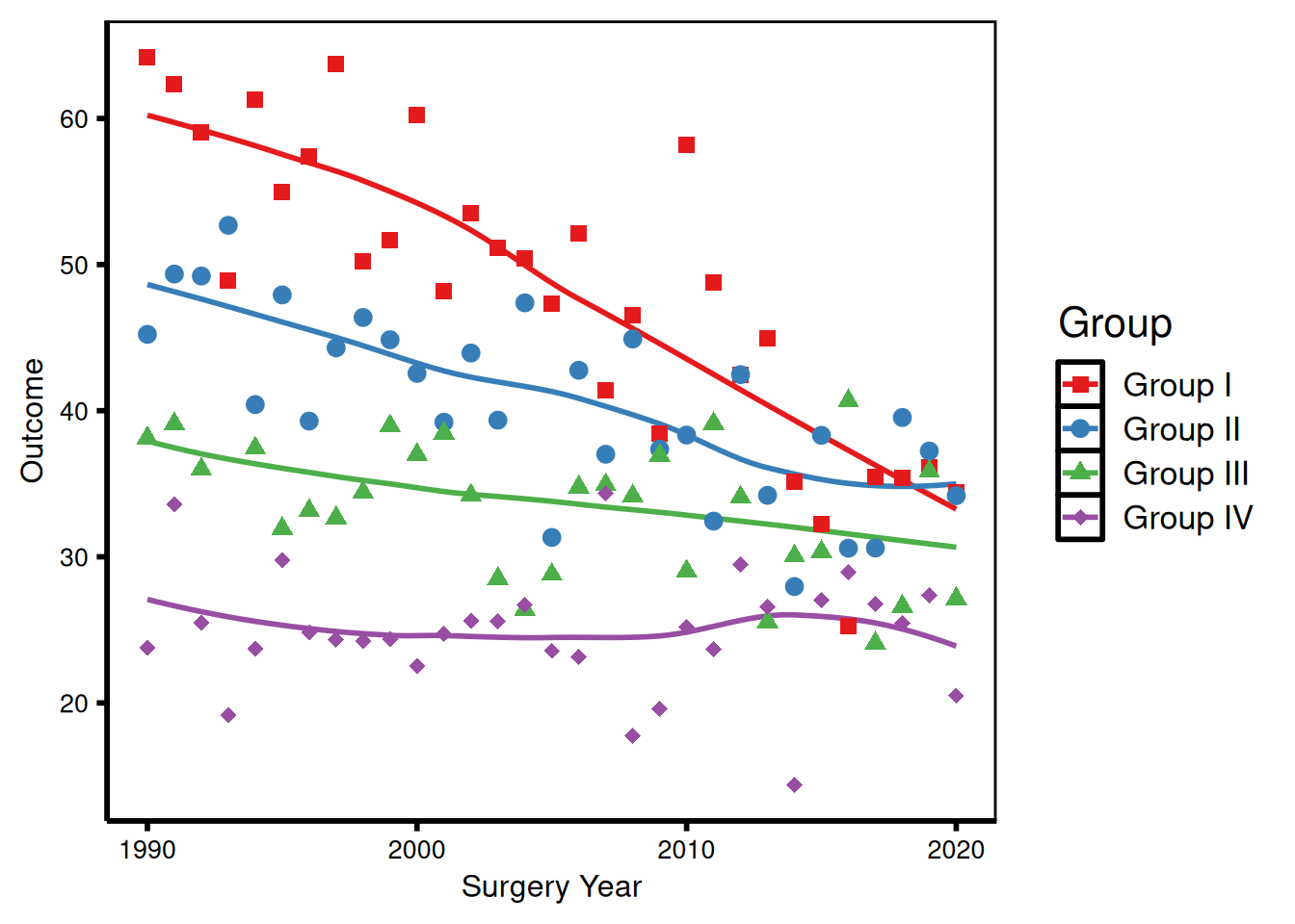
theme_hv_manuscript() is the default for journal submissions – white background, black text, minimal chrome. Font sizes are tuned for 8.5 x 11 inch letter-size PDFs where the figure may be reduced to a column width. Use this whenever the figure ends up in a Word or PDF document sent to a journal.
p_ms <- p_base +
  scale_colour_brewer(palette = "Set1", name = "Group") +
  scale_shape_manual(
    values = c("Group I" = 15, "Group II" = 19,
               "Group III" = 17, "Group IV" = 18),
    name = "Group"
  ) +
  labs(x = "Surgery Year", y = "Outcome") +
  theme_hv_manuscript()

p_ms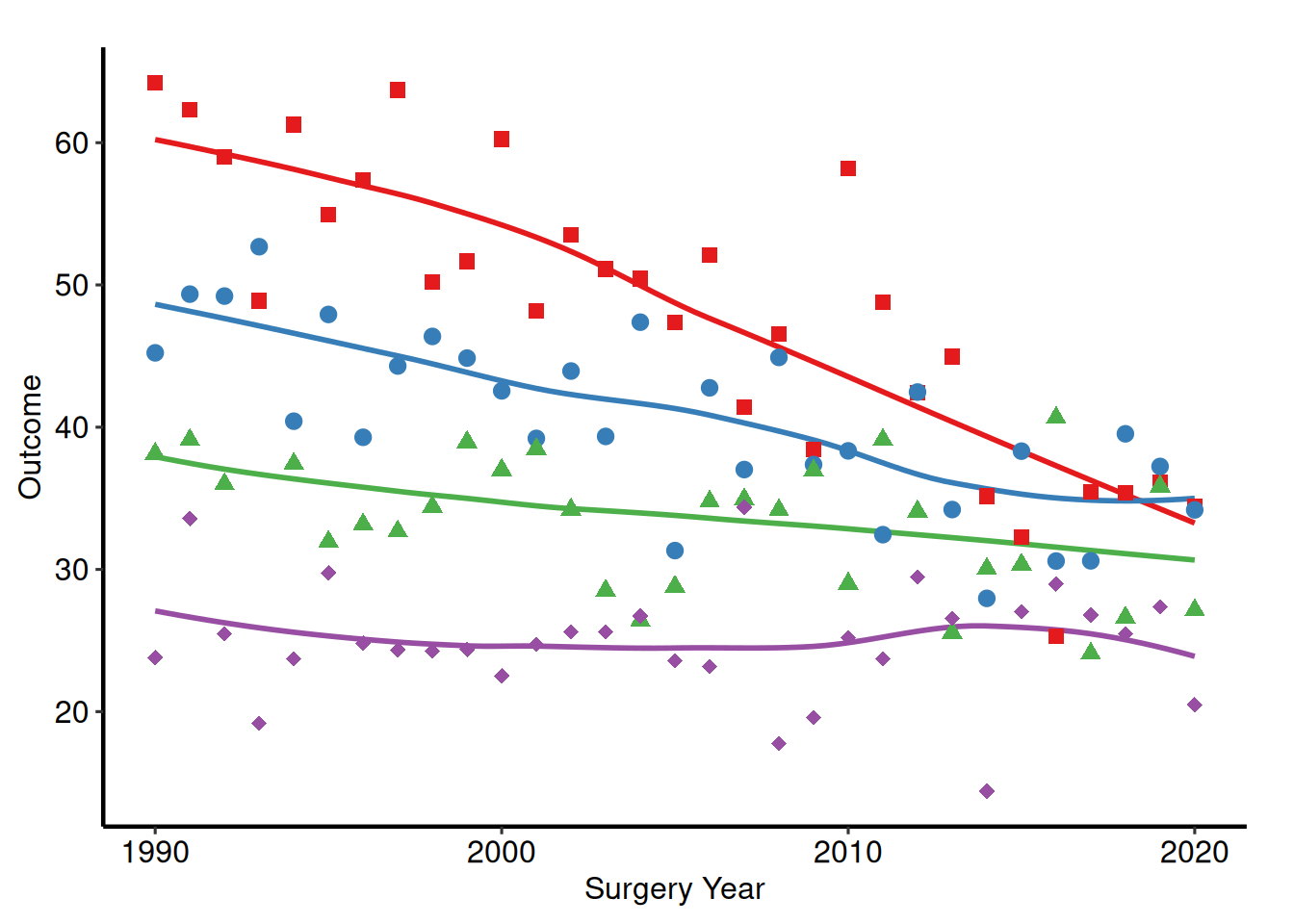
Poster
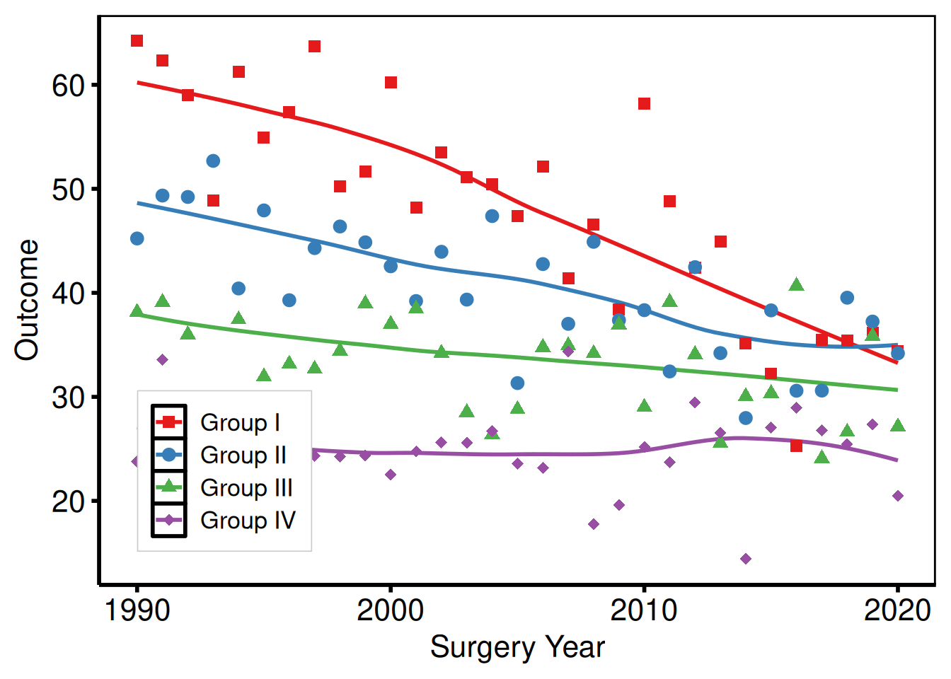
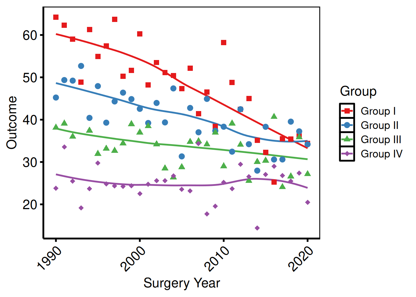
theme_hv_poster() bumps the axis text and tick weights up from the manuscript baseline and removes the panel grid, so the figure reads clearly at arm’s length on a 36 x 48 inch foam board. It is also the go-to theme for in-room slide presentations when you are not using the PowerPoint themes – the larger tick labels and the boxed panel hold up on a projector better than the manuscript variant. Pass base_family = "sans" (or another family) to switch the font face.
p_poster <- p_base +
  scale_colour_brewer(palette = "Set1", name = "Group") +
  scale_shape_manual(
    values = c("Group I" = 15, "Group II" = 19,
               "Group III" = 17, "Group IV" = 18),
    name = "Group"
  ) +
  labs(x = "Surgery Year", y = "Outcome") +
  theme_hv_poster()

p_poster
Light PowerPoint
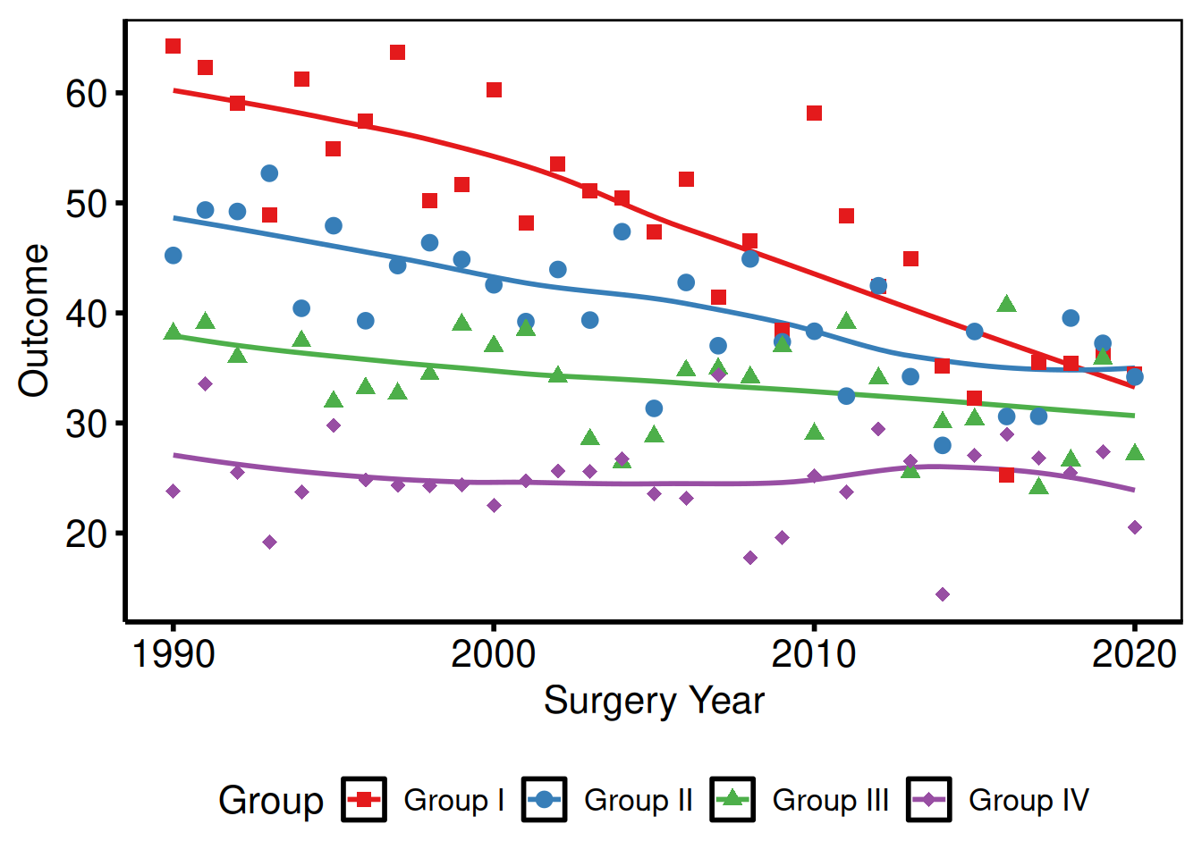
theme_hv_ppt_light() matches slides with a white or light-grey background – the Cleveland Clinic standard template, most default Office themes, and any deck where the content area is light. Text and lines are dark, so the figure reads without modification when placed on the light slide. Pair with save_ppt() to insert it as editable DrawingML.
p_base +
  scale_colour_brewer(palette = "Set1", name = "Group") +
  scale_shape_manual(
    values = c("Group I" = 15, "Group II" = 19,
               "Group III" = 17, "Group IV" = 18),
    name = "Group"
  ) +
  labs(x = "Surgery Year", y = "Outcome") +
  theme_hv_ppt_light()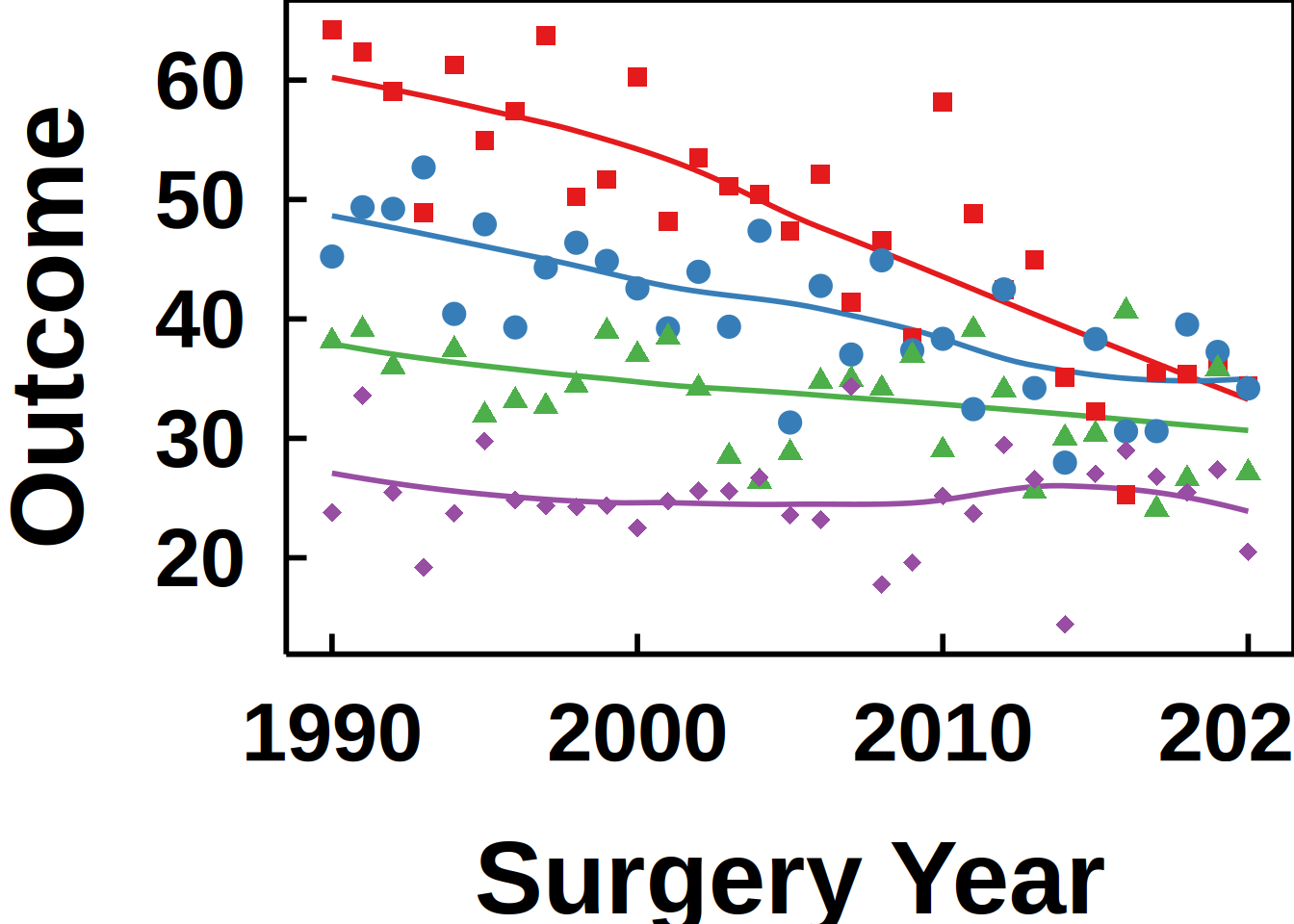
Dark PowerPoint
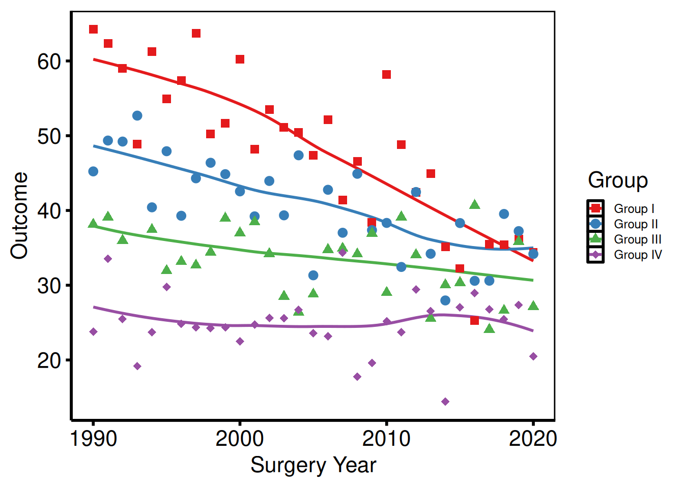
theme_hv_ppt_dark() flips the palette for dark-background slides – navy or dark-blue gradient decks where white-on-dark text is the convention. The theme sets a transparent plot background, so the slide’s background shows through behind the panel. The plot.background override in the chunk below simulates that navy background in the rendered vignette; you would omit it when saving to an actual .pptx file.
p_base +
  scale_colour_brewer(palette = "Set1", name = "Group") +
  scale_shape_manual(
    values = c("Group I" = 15, "Group II" = 19,
               "Group III" = 17, "Group IV" = 18),
    name = "Group"
  ) +
  labs(x = "Surgery Year", y = "Outcome") +
  theme_hv_ppt_dark() +
  theme(plot.background = element_rect(fill = "navy", colour = "navy"))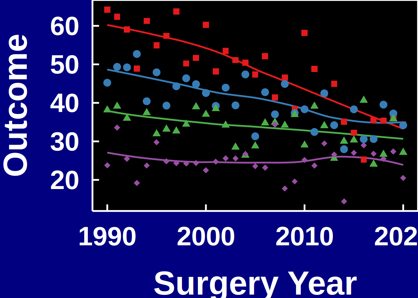
Colour Scales
scale_colour_* controls line and point colours; scale_fill_* controls filled areas (ribbons, bars). Both take the same name (legend title) and guide (legend display) arguments — set them once and both scales update.
Manual colours
Use scale_colour_manual() when assigning specific brand or convention colours to known levels.
plot(km) +
  scale_color_manual(values = c(All = "steelblue"), guide = "none") +
  scale_fill_manual(values  = c(All = "steelblue"), guide = "none") +
  scale_y_continuous(breaks = seq(0, 100, 20),
                     labels = function(x) paste0(x, "%")) +
  scale_x_continuous(breaks = seq(0, 20, 5)) +
  coord_cartesian(xlim = c(0, 20), ylim = c(0, 100)) +
  labs(x = "Years after Operation", y = "Freedom from Death (%)") +
  theme_hv_poster()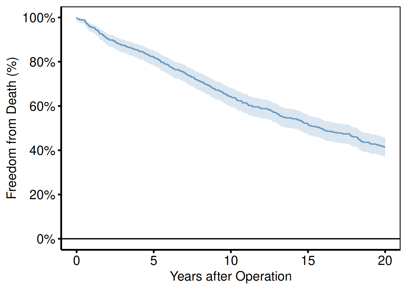
ColorBrewer palettes
scale_colour_brewer() applies a ColorBrewer palette — perceptually uniform and print-safe, which matters when figures go to black-and-white PDF. Use palette = "Set1" for categorical data, "RdYlGn" for diverging, "Blues" for sequential.
p_base +
  scale_colour_brewer(palette = "Set1", name = "Group") +
  scale_shape_manual(
    values = c("Group I" = 15, "Group II" = 19,
               "Group III" = 17, "Group IV" = 18),
    name = "Group"
  ) +
  labs(x = "Surgery Year", y = "Outcome") +
  theme_hv_poster()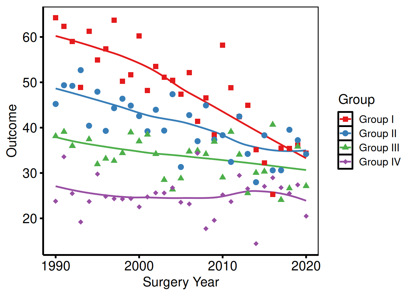
Suppressing legends
Pass guide = "none" to any scale and that aesthetic drops out of the legend. You’d do this when the axis labels or an annotation already name the group — a redundant legend only takes up panel space.
p_base +
  scale_colour_brewer(palette = "Dark2", guide = "none") +
  scale_shape_manual(
    values = c("Group I" = 15, "Group II" = 19,
               "Group III" = 17, "Group IV" = 18),
    guide = "none"
  ) +
  labs(x = "Surgery Year", y = "Outcome") +
  theme_hv_poster()
Labels and Annotations
labs()
labs() sets axis labels, the plot title, legend title, subtitle, and caption text. We set these outside the constructor so you can override them per project without touching the function itself.
plot(km) +
  scale_color_manual(values = c(All = "steelblue"), guide = "none") +
  scale_fill_manual(values  = c(All = "steelblue"), guide = "none") +
  scale_y_continuous(breaks = seq(0, 100, 20),
                     labels = function(x) paste0(x, "%")) +
  scale_x_continuous(breaks = seq(0, 20, 5)) +
  coord_cartesian(xlim = c(0, 20), ylim = c(0, 100)) +
  labs(
    title   = "Overall Survival",
    x       = "Years after Operation",
    y       = "Freedom from Death (%)",
    caption = "Logit CI, \u03b1 = 0.6827 (1 SD)"
  ) +
  theme_hv_poster()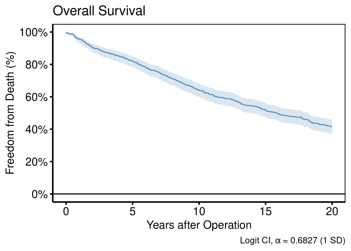
annotate()
annotate() places text, segments, rectangles, or arrows at fixed data coordinates — useful for a sample-size callout in the corner or a label pointing to an event of interest.
plot(km) +
  scale_color_manual(values = c(All = "steelblue"), guide = "none") +
  scale_fill_manual(values  = c(All = "steelblue"), guide = "none") +
  scale_y_continuous(breaks = seq(0, 100, 20),
                     labels = function(x) paste0(x, "%")) +
  scale_x_continuous(breaks = seq(0, 20, 5)) +
  coord_cartesian(xlim = c(0, 20), ylim = c(0, 100)) +
  labs(x = "Years after Operation", y = "Freedom from Death (%)") +
  annotate("text",    x = 1,  y = 5,
           label = paste0("n = ", nrow(dta_km)),
           hjust = 0, size = 3.5) +
  annotate("segment", x = 10, xend = 10, y = 30, yend = 50,
           arrow = arrow(length = unit(0.2, "cm")), colour = "grey40") +
  annotate("text",    x = 10.3, y = 40,
           label = "Median survival", hjust = 0, size = 3, colour = "grey40") +
  theme_hv_poster()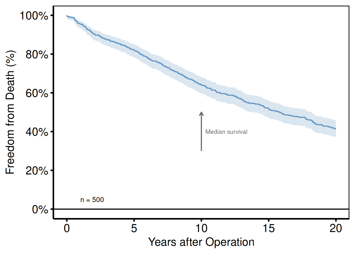
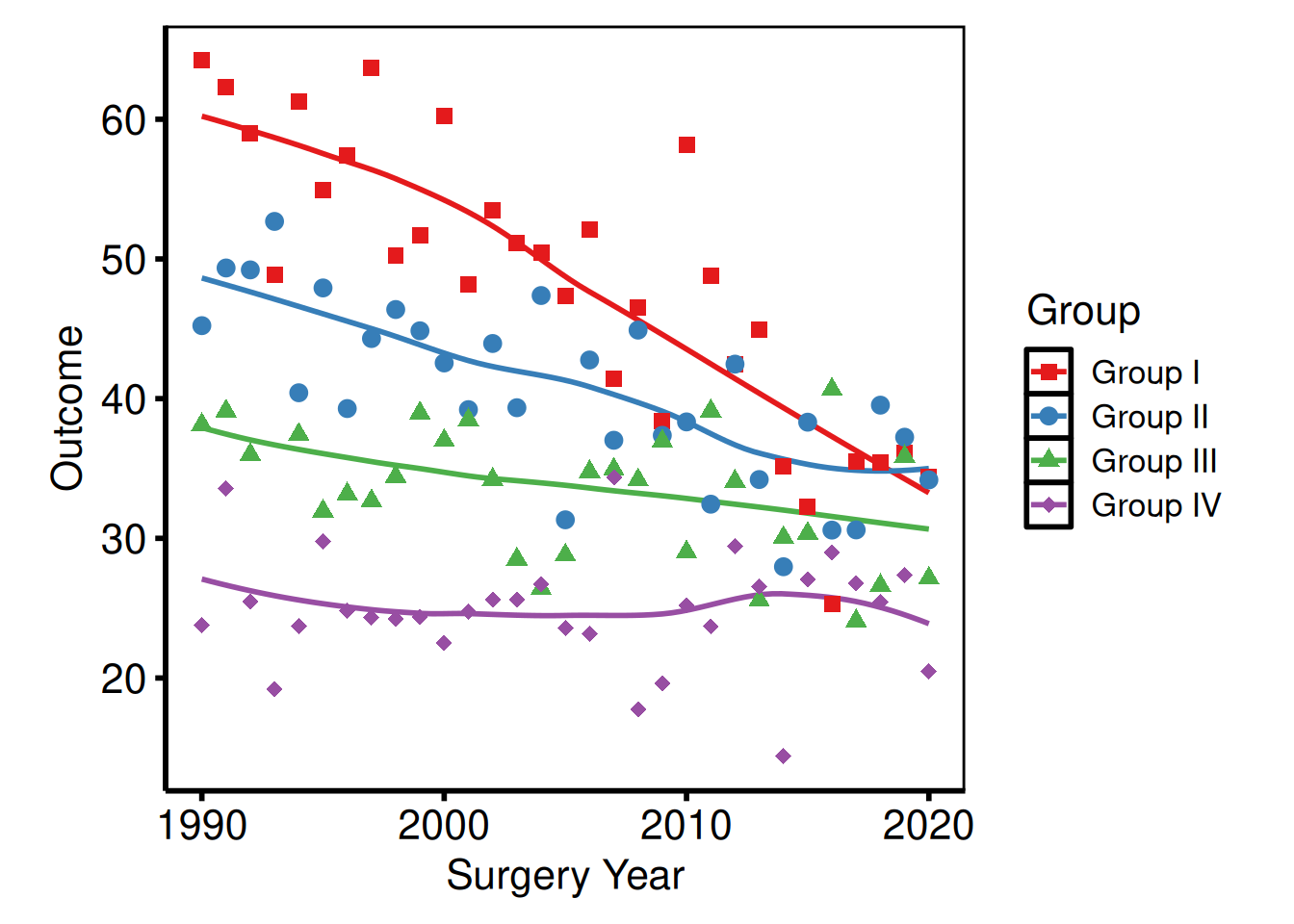
coord_cartesian()
coord_cartesian() crops the viewport without dropping data, preserving LOESS fits computed on the full range.
p_base +
  scale_colour_brewer(palette = "Set1", name = "Group") +
  scale_shape_manual(
    values = c("Group I" = 15, "Group II" = 19,
               "Group III" = 17, "Group IV" = 18),
    name = "Group"
  ) +
  labs(x = "Surgery Year", y = "Outcome") +
  coord_cartesian(xlim = c(1995, 2020), ylim = c(20, 70)) +
  theme_hv_poster()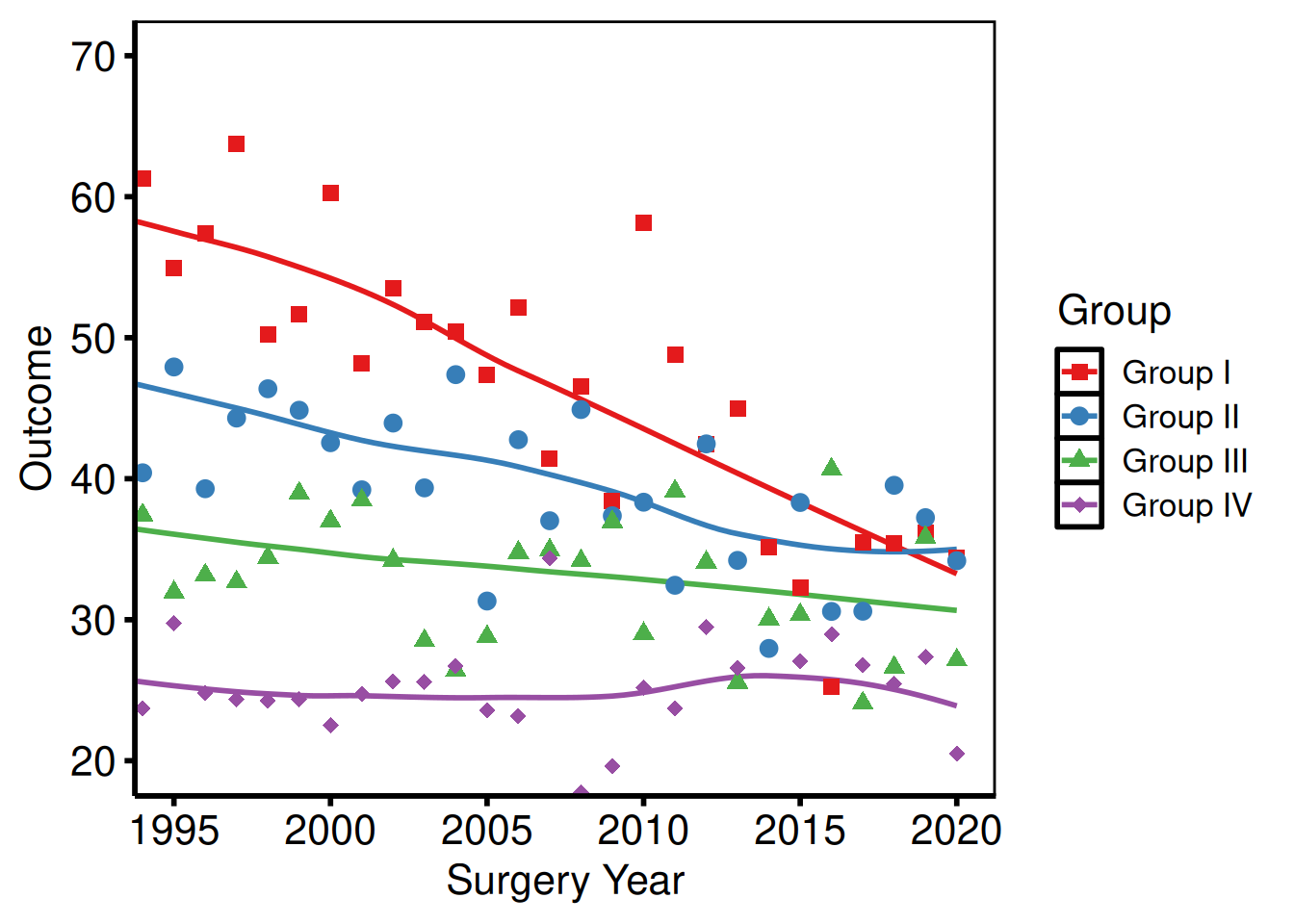
Saving Figures
Manuscript PDF
Use ggsave() with width = 11, height = 8.5 (US Letter landscape) for manuscript figures. Assign the fully composed plot to a variable first so the same object is both displayed in the session and written to disk.
ggsave(
  filename = "../graphs/trends_manuscript.pdf",
  plot     = p_ms,
  width    = 11,
  height   = 8.5
)
Poster PDF
Poster figures are typically larger and use theme_hv_poster(). Adjust dimensions to match the poster panel size.
ggsave(
  filename = "../graphs/trends_poster.pdf",
  plot     = p_poster,
  width    = 14,
  height   = 10
)
PowerPoint slides
save_ppt() inserts ggplot objects into a PowerPoint file as editable DrawingML vector graphics via the officer and rvg packages — shapes, lines, and text remain selectable in PowerPoint after export.
Key arguments:
| Argument | Default | Notes |
|---|---|---|
object |
— | A single ggplot or a named/unnamed list of ggplots |
template |
"../graphs/RD.pptx" |
Existing .pptx used as the slide template |
powerpoint |
"../graphs/pptExample.pptx" |
Output file path |
slide_titles |
"Plot" |
Character vector recycled to the number of plots |
layout |
"Title and Content" |
Slide layout from the template |
width / height
|
10.1 / 5.8
|
Plot area in inches |
left / top
|
0.0 / 1.2
|
Position from slide edges, in inches |
Apply theme_hv_ppt_dark() or theme_hv_ppt_light() before saving to match the slide background.
Single slide
Build a fully themed plot – theme_hv_ppt_dark() or theme_hv_ppt_light() – then pass it as object. The template argument points to an existing .pptx file whose slide master and layouts carry the brand fonts and background; save_ppt() appends a new slide rather than overwriting the template.
template <- system.file("extdata", "hv_ppt_template.pptx", package = "hvtiPlotR")

p_ppt <- p_base +
  scale_colour_brewer(palette = "Set1", name = "Group") +
  scale_shape_manual(
    values = c("Group I" = 15, "Group II" = 19,
               "Group III" = 17, "Group IV" = 18),
    name = "Group"
  ) +
  labs(x = "Surgery Year", y = "Outcome (%)") +
  theme_hv_ppt_dark()

save_ppt(
  object       = p_ppt,
  template     = template,
  powerpoint   = here::here("graphs", "trends_slides.pptx"),
  slide_titles = "Temporal Trends by Group"
)
Multiple slides from a list
Pass a named list of plots and a matching vector of titles to produce one slide per plot in a single call. This is the pattern we use for batch-report decks where each outcome gets its own slide – the list keeps plots in order and the names serve as a paper trail. Every plot in the list should carry the same theme so the deck looks consistent.
dta_km2 <- sample_survival_data(n = 400, seed = 99)
km2     <- hv_survival(dta_km2)

p_km_ppt <- plot(km2) +
  scale_color_manual(values = c(All = "white"), guide = "none") +
  scale_fill_manual(values  = c(All = "white"), guide = "none") +
  scale_y_continuous(breaks = seq(0, 100, 20),
                     labels = function(x) paste0(x, "%")) +
  scale_x_continuous(breaks = seq(0, 20, 5)) +
  coord_cartesian(xlim = c(0, 20), ylim = c(0, 100)) +
  labs(x = "Years after Operation", y = "Freedom from Death (%)") +
  theme_hv_ppt_dark()

save_ppt(
  object       = list(trends = p_ppt, survival = p_km_ppt),
  template     = template,
  powerpoint   = here::here("graphs", "multi_slide_deck.pptx"),
  slide_titles = c("Temporal Trends by Group", "Overall Survival")
)
Fixed panel placement across slides
When plots have different y-axis ranges (“0-1” vs “0-10000”), the axis-label widths differ, which shifts the plot panel inside a fixed ph_location(). On dark PPT themes with a visible panel background (black panel on a blue-gradient slide), that shift is visually jarring — the box appears to move between slides.
Pass panel_box = list(width, height, left, top) to anchor the panel content area at the same slide coordinates on every slide. save_ppt() calls hv_ph_location() for each plot, measures the axis/legend/title chrome around the panel, and adjusts per-slide placement so the panel lands at the target rectangle regardless of label width. Axis labels then extend outside the panel box as needed; device dimensions vary per plot.
Make panel_left / panel_top large enough to leave room for the widest axis labels in the deck — otherwise hv_ph_location() warns that the plot chrome spills off the slide edge.
Multi-panel PDF (EDA batch output)
When generating multiple plots in a loop, patchwork::wrap_plots() arranges them into a grid and ggsave() writes each page. This is typical for EDA batches where you have a dozen or more outcomes to inspect – you build the list with lapply(), chunk it into pages of 9, and let the loop handle pagination. The per_page constant is easy to adjust if you want a 2x2 or 4x4 grid instead.
# Build a list of plots (e.g. from an hv_eda() lapply loop)
plot_list <- lapply(
  c("ef", "lv_mass", "peak_grad"),
  function(yv) {
    dta_eda <- sample_eda_data()
    plot(hv_eda(dta_eda, x_col = "op_years", y_col = yv,
                 y_label = yv)) +
      scale_colour_manual(values = c("steelblue"), guide = "none") +
      labs(x = "Years") +
      theme_hv_poster()
  }
)

per_page <- 9L
for (pg in seq(1, length(plot_list), by = per_page)) {
  idx     <- seq(pg, min(pg + per_page - 1L, length(plot_list)))
  pg_plot <- patchwork::wrap_plots(plot_list[idx], nrow = 3, ncol = 3)
  ggsave(
    filename = sprintf(here::here("graphs", "eda_page%02d.pdf"),
                       ceiling(pg / per_page)),
    plot     = pg_plot,
    width    = 14,
    height   = 14
  )
}
Legend Positioning
ggplot2 places the legend outside the panel by default. For publication figures we usually move it inside or drop it — the axis labels often do the identification work already.
Inside the panel
Pass fractional coordinates c(x, y) to legend.position inside theme(). c(0, 0) is the bottom-left corner; c(1, 1) is the top-right.
p_base +
  scale_colour_brewer(palette = "Set1", name = NULL) +
  scale_shape_manual(
    values = c("Group I" = 15, "Group II" = 19,
               "Group III" = 17, "Group IV" = 18),
    name = NULL
  ) +
  labs(x = "Surgery Year", y = "Outcome") +
  theme_hv_poster() +
  theme(
    legend.position  = c(0.15, 0.2),        # bottom-left of panel
    legend.background = element_rect(fill = "white", colour = "grey80",
                                     linewidth = 0.3)
  )
Outside the panel (explicit sides)
Set legend.position to "right", "left", "top", or "bottom" to place the legend outside the panel area. "bottom" with legend.direction = "horizontal" is the most common choice for multi-group figures where a long label would crowd a corner inside the panel.
p_base +
  scale_colour_brewer(palette = "Set1", name = "Group") +
  scale_shape_manual(
    values = c("Group I" = 15, "Group II" = 19,
               "Group III" = 17, "Group IV" = 18),
    name = "Group"
  ) +
  labs(x = "Surgery Year", y = "Outcome") +
  theme_hv_poster() +
  theme(
    legend.position = "bottom",             # "right" | "left" | "top" | "bottom"
    legend.direction = "horizontal"
  )
Suppress all legends
Two ways to suppress legends, with slightly different scope. theme(legend.position = "none") hides every legend for the plot in one shot. guide = "none" on a scale_*() call drops only that aesthetic’s legend — handy when you want a colour legend but no shape legend (or vice versa). Both reclaim the panel width either way.
plot(km) +
  scale_color_manual(values = c(All = "steelblue"), guide = "none") +
  scale_fill_manual(values  = c(All = "steelblue"), guide = "none") +
  scale_y_continuous(breaks = seq(0, 100, 20),
                     labels = function(x) paste0(x, "%")) +
  scale_x_continuous(breaks = seq(0, 20, 5)) +
  coord_cartesian(xlim = c(0, 20), ylim = c(0, 100)) +
  labs(x = "Years after Operation", y = "Freedom from Death (%)") +
  theme_hv_poster()
guide = "none" on every scale_*() call removes all legend entries. This is preferred over theme(legend.position = "none") when only some aesthetics have legends and others do not.
Legend text and key size
The legend inherits font size from the active theme, which is often slightly larger than needed when the legend sits inside a crowded panel. legend.text controls the label font; legend.key.size shrinks the colour/shape swatch. Both accept any element_text() or unit() value.
p_base +
  scale_colour_brewer(palette = "Set1", name = "Group") +
  scale_shape_manual(
    values = c("Group I" = 15, "Group II" = 19,
               "Group III" = 17, "Group IV" = 18),
    name = "Group"
  ) +
  labs(x = "Surgery Year", y = "Outcome") +
  theme_hv_poster() +
  theme(
    legend.text  = element_text(size = 9),
    legend.key.size = unit(0.4, "cm")
  )
Theme Overrides
theme_hv_manuscript() sets a complete non-data formatting baseline. Layer additional theme() calls after it to adjust individual elements without touching the rest.
Axis text size
Override axis.text to resize tick labels and axis.title for the axis title, independent of the rest of the theme. This is useful when a figure is being resized for a different output target – for example, scaling down for a two-column journal layout where the default poster-sized text would be too large.
p_base +
  scale_colour_brewer(palette = "Set1", name = "Group") +
  scale_shape_manual(
    values = c("Group I" = 15, "Group II" = 19,
               "Group III" = 17, "Group IV" = 18),
    name = "Group"
  ) +
  labs(x = "Surgery Year", y = "Outcome") +
  theme_hv_poster() +
  theme(
    axis.text  = element_text(size = 10),   # tick labels
    axis.title = element_text(size = 12)    # axis titles
  )
Removing minor grid lines
Minor grid lines (panel.grid.minor) add density without adding precision – they can make a busy figure look cluttered, especially when there are many data series. Setting element_blank() removes them while keeping the major grid intact.
p_base +
  scale_colour_brewer(palette = "Set1", name = "Group") +
  scale_shape_manual(
    values = c("Group I" = 15, "Group II" = 19,
               "Group III" = 17, "Group IV" = 18),
    name = "Group"
  ) +
  labs(x = "Surgery Year", y = "Outcome") +
  theme_hv_poster() +
  theme(
    panel.grid.minor = element_blank()
  )
Rotating x-axis labels
Useful for time-point labels or long category names. The combination of angle = 45, hjust = 1, and vjust = 1 keeps the rotated label right-aligned to its tick mark; without the hjust/vjust corrections the labels will float off-center.
p_base +
  scale_colour_brewer(palette = "Set1", name = "Group") +
  scale_shape_manual(
    values = c("Group I" = 15, "Group II" = 19,
               "Group III" = 17, "Group IV" = 18),
    name = "Group"
  ) +
  labs(x = "Surgery Year", y = "Outcome") +
  theme_hv_poster() +
  theme(
    axis.text.x = element_text(angle = 45, hjust = 1, vjust = 1)
  )
Adding a plot title and subtitle
Titles are stripped from the base themes (they are rarely used in journal figures), but can be added back:
plot(km) +
  scale_color_manual(values = c(All = "steelblue"), guide = "none") +
  scale_fill_manual(values  = c(All = "steelblue"), guide = "none") +
  scale_y_continuous(breaks = seq(0, 100, 20),
                     labels = function(x) paste0(x, "%")) +
  scale_x_continuous(breaks = seq(0, 20, 5)) +
  coord_cartesian(xlim = c(0, 20), ylim = c(0, 100)) +
  labs(
    title    = "Overall Survival",
    subtitle = paste0("n = ", nrow(dta_km), " patients"),
    x        = "Years after Operation",
    y        = "Freedom from Death (%)"
  ) +
  theme_hv_poster() +
  theme(
    plot.title    = element_text(size = 14, face = "bold", hjust = 0),
    plot.subtitle = element_text(size = 11, colour = "grey40", hjust = 0)
  )
Expanding plot margins
Add breathing room around the panel – useful when a figure is placed directly on a poster without a surrounding text frame, or when axis labels clip against a tight device boundary. The margin() arguments follow top / right / bottom / left order, matching CSS convention.
p_base +
  scale_colour_brewer(palette = "Set1", name = "Group") +
  scale_shape_manual(
    values = c("Group I" = 15, "Group II" = 19,
               "Group III" = 17, "Group IV" = 18),
    name = "Group"
  ) +
  labs(x = "Surgery Year", y = "Outcome") +
  theme_hv_poster() +
  theme(
    plot.margin = margin(t = 10, r = 20, b = 10, l = 20, unit = "pt")
  )
Multi-panel Figures with patchwork
The patchwork package composes multiple ggplot objects into a single figure. The two patterns we reach for most are side-by-side comparisons and a main plot stacked above a companion table or risk panel.
Side-by-side plots
The | operator from patchwork places two plots next to each other in the same row, sharing the figure height. This is the typical layout for comparing two outcomes – trends and survival, for example – on a single manuscript figure. Both panels are built independently and composed at the last step, so you can adjust each one without touching the other.
library(patchwork)

p_ms <- p_base +
  scale_colour_brewer(palette = "Set1", name = "Group") +
  scale_shape_manual(
    values = c("Group I" = 15, "Group II" = 19,
               "Group III" = 17, "Group IV" = 18),
    name = "Group"
  ) +
  labs(x = "Surgery Year", y = "Outcome") +
  theme_hv_poster()

p_km_ms <- plot(km) +
  scale_color_manual(values = c(All = "steelblue"), guide = "none") +
  scale_fill_manual(values  = c(All = "steelblue"), guide = "none") +
  scale_y_continuous(breaks = seq(0, 100, 20),
                     labels = function(x) paste0(x, "%")) +
  scale_x_continuous(breaks = seq(0, 20, 5)) +
  coord_cartesian(xlim = c(0, 20), ylim = c(0, 100)) +
  labs(x = "Years after Operation", y = "Freedom from Death (%)") +
  theme_hv_poster()

p_ms | p_km_ms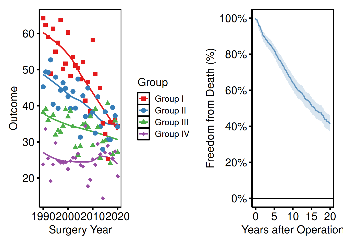
| places plots side by side; / stacks them vertically.
Controlling relative widths and heights
plot_layout(widths = ...) sets relative widths as a numeric vector – c(2, 1) makes the left panel twice as wide as the right. Use heights the same way for stacked layouts. This is the right tool when one panel has a wide y-axis label or a tall legend that throws off a 50/50 split.
(p_ms | p_km_ms) +
  plot_layout(widths = c(2, 1))   # left panel twice as wide as right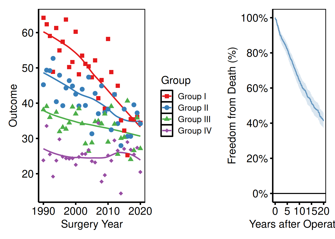
Stacking a plot above a risk table
A common pattern with survival curves is to pair the plot with a numbers-at-risk panel. hv_survival() stores the risk table as a data frame at km$tables$risk — columns strata, report_time, n.risk. Build a ggplot text panel from it, then stack with /.
risk_df <- km$tables$risk

rt_panel <- ggplot(risk_df,
                   aes(x = report_time, y = factor(strata),
                       label = n.risk)) +
  geom_text(size = 3) +
  scale_x_continuous(limits = c(0, 20), breaks = seq(0, 20, 5)) +
  labs(x = "Years after Operation", y = NULL) +
  theme_hv_poster() +
  theme(
    axis.line  = element_blank(),
    axis.ticks = element_blank()
  )

p_km_ms / rt_panel +
  plot_layout(heights = c(4, 1))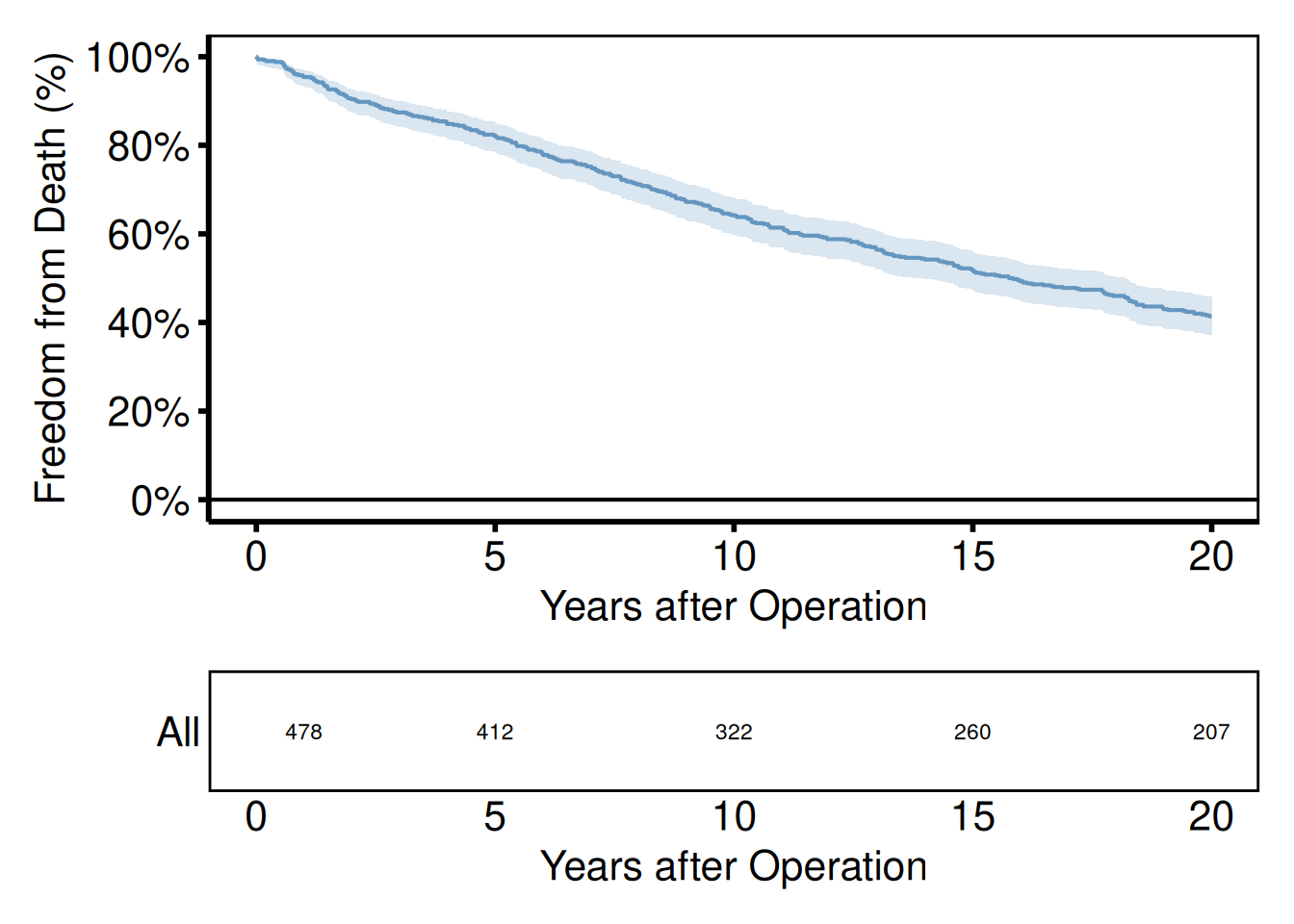
Shared axis labels and panel tags
plot_annotation() adds a shared title or panel tags (A, B, C…) across all panels. Tags are required by most journals for multi-panel figures and are referenced in the caption as “Panel A shows…” – setting tag_levels = "A" generates them automatically. The & operator applies a shared theme() call to every panel at once, so you only need to set plot.tag formatting in one place.
(p_ms | p_km_ms) +
  plot_annotation(
    title = "Figure 1. Outcomes after cardiac surgery",
    tag_levels = "A"
  ) &
  theme(plot.tag = element_text(size = 12, face = "bold"))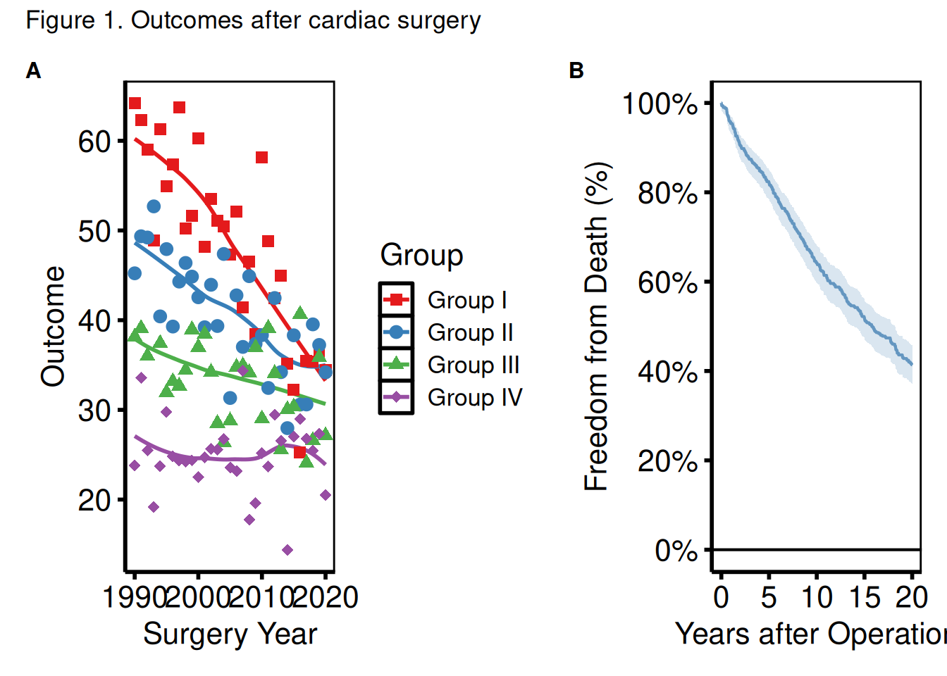
Saving a patchwork composite
Assign the composed object to a variable and pass it to ggsave(). For PowerPoint, save each panel individually with save_ppt() — patchwork flattens everything into a single raster, so the shapes and text are no longer editable in PowerPoint.
combined <- (p_ms | p_km_ms) +
  plot_annotation(tag_levels = "A") &
  theme(plot.tag = element_text(size = 12, face = "bold"))

ggsave(
  filename = here::here("graphs", "fig1_combined.pdf"),
  plot     = combined,
  width    = 14,
  height   = 7
)