All hvtiPlotR plot functions follow a two-step workflow. Call the constructor (hv_*()) to validate and prepare data — it returns an S3 object of class c("hv_<concept>", "hv_data") — then call plot() on the result to get a bare ggplot with no colour scales, axis labels, or theme applied yet. You add those with the usual + operator. See the companion vignette “Decorating and Saving hvtiPlotR Plots” for full coverage of scale_(), labs(), annotate(), themes, and ggsave() patterns.
Template Reference Map
The table below maps each hvtiPlotR constructor to the original SAS and R templates it ports. Functions marked with — have no direct predecessor and were designed specifically for this package. All functions have worked examples in the sections below.
| hvtiPlotR Constructor | SAS Template(s) | R Template(s) |
|---|---|---|
hv_mirror_hist() |
— |
tp.lp.mirror-histogram_SAVR-TF-TAVR.R, tp.lp.mirror_histo_before_after_wt.R
|
hv_stacked() |
— | — |
hv_balance() |
— | tp.lp.propen.cov_balance.R |
hv_followup() |
tp.dp.goodness_followup.*, tp.dp.goodness_event.*
|
— |
hv_survival() |
tp.hp.dead.sas (basic) |
tp.hp.dead.number_risk.R |
hazard_plot() |
tp.hp.dead.*, tp.hp.event.weighted.sas, tp.hp.repeated*.sas, tp.hp.numtreat.survdiff.matched.sas, tp.hs.dead.*, tp.hs.uslife_*
|
tp.hp.dead.number_risk.R |
survival_difference_plot() |
tp.hp.dead.life-gained.sas, tp.hp.numtreat.survdiff.matched.sas, tp.hs.dead.compare_benefit.setup.sas
|
— |
nnt_plot() |
tp.hp.numtreat.survdiff.matched.sas |
— |
hv_nonparametric() |
tp.np.*.avrg_curv.*, tp.np.*.u.trend.*, tp.np.*.double.*, tp.np.*.mult.*, tp.np.*.phases.*, tp.np.z0axdpo.*
|
— |
hv_ordinal() |
tp.np.*.ordinal.* |
— |
hv_eda() |
— | — |
hv_spaghetti() |
— | tp.dp.spaghetti.echo.R |
hv_trends() |
tp.lp.trends.sas, tp.lp.trends.age.sas, tp.lp.trends.polytomous.sas, tp.rp.trends.sas
|
tp.dp.trends.R |
hv_longitudinal() |
tp.dp.longitudinal_patients_measures.* |
— |
hv_alluvial() |
— | — |
hv_sankey() |
— | PAM cluster stability analysis |
hv_consort() |
— | — |
hv_upset() |
— | — |
Note: hazard_plot(), survival_difference_plot(), and nnt_plot() retain the legacy single-call API pending migration to the two-step constructor pattern.
: {tbl-colwidths=“[28,44,28]”}
Mirrored Propensity Score Histogram
In propensity-matched analyses, we routinely produce a mirrored histogram to show how well matching compressed the overlap between two treatment groups. hv_mirror_hist() prepares the data; plot() hands you a bare ggplot to dress with colour and labels.
The constructor accepts a data frame with columns for the propensity score, group indicator, and match indicator. The sample_mirror_histogram_data() function generates example data suitable for testing.
Two display modes are selected by the arguments supplied to the constructor. Binary-match mode (match_col) reproduces tp.lp.mirror-histogram_SAVR-TF-TAVR.R: upper bars show all observations before matching; overlaid bars show the matched subset. Weighted IPTW mode (weight_col) reproduces tp.lp.mirror_histo_before_after_wt.R: upper bars show raw counts; overlaid bars show per-bin IPTW weight sums.
Binary-match mode (SAVR vs. TF-TAVR)
sample_mirror_histogram_data() simulates 2,000 patients with a continuous propensity score (prob_t), a binary group indicator (tavr), and a match flag (match). Pass score_multiplier = 100 to put the score on a 0–100 percent scale, and binwidth = 5 to set 5-point bins.
mirror_dta <- sample_mirror_histogram_data(n = 2000, separation = 1.5)

mh <- hv_mirror_hist(
  data             = mirror_dta,
  score_col        = "prob_t",
  group_col        = "tavr",
  match_col        = "match",
  group_levels     = c(0, 1),
  group_labels     = c("SAVR", "TF-TAVR"),
  matched_value    = 1,
  score_multiplier = 100,
  binwidth         = 5
)
Bare plot
The bare panel shows two mirrored bar charts – upper bars for the first group, lower for the second – with white fill and no scale or labels yet. Look for: upper and lower bars that are roughly symmetric before matching, with the matched (darker) overlay narrowing the distribution; if both panels look identical, match_col may not be mapping correctly.
p <- plot(mh, alpha = 0.8)
p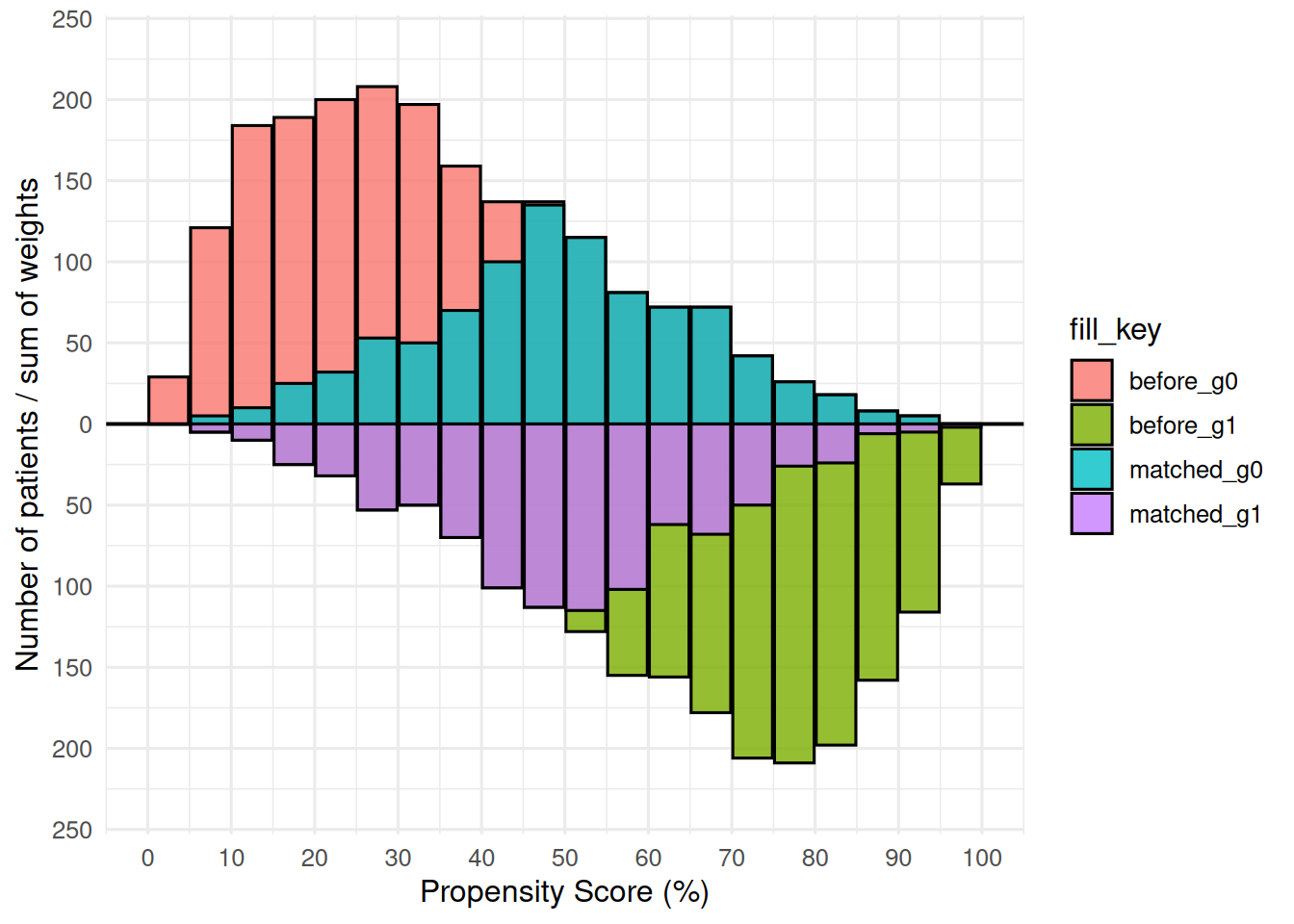
Adding scales, labels, and theme
scale_fill_manual() maps the four internal fill levels (before_g0, matched_g0, before_g1, matched_g1) to white (pre-match) and two greens (matched subsets). The annotation calls use y = Inf/-Inf with vjust to anchor labels at the panel edges; theme_hv_poster() sizes text for a conference poster.
p +
  ggplot2::scale_fill_manual(
    values = c(
      before_g0  = "white",  matched_g0 = "green1",
      before_g1  = "white",  matched_g1 = "green4"
    ),
    guide = "none"
  ) +
  ggplot2::scale_x_continuous(
    limits = c(0, 100),
    breaks = seq(0, 100, 10)
  ) +
  ggplot2::scale_y_continuous(labels = abs) +
  ggplot2::annotate("text", x = 20, y =  Inf, vjust =  2,
                    label = mh$meta$group_labels[1], size = 7) +
  ggplot2::annotate("text", x = 20, y = -Inf, vjust = -1,
                    label = mh$meta$group_labels[2], size = 7) +
  ggplot2::labs(x = "Propensity Score (%)", y = "Number of Patients") +
  theme_hv_poster()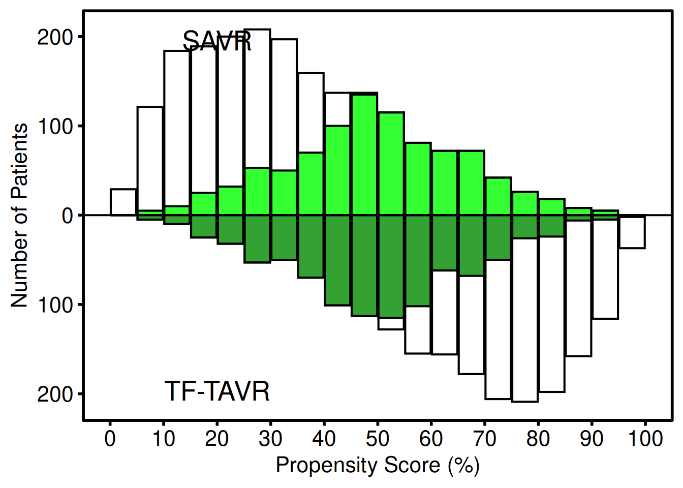
The lighter bars show the full (pre-match) distribution for each group; the darker overlaid bars show the matched subset. Upper panel = first group label; lower panel = second group label. scale_y_continuous(labels = abs) converts the internal negative counts to positive labels. y = Inf/-Inf with vjust anchors each annotation near the panel edge regardless of data scale, so the positions adapt automatically to different dataset sizes.
The constructor stores group counts and standardized mean differences (SMD) before and after matching in $tables$diagnostics. You can read those out directly:
mh$tables$diagnostics$smd_before[1] 1.563175
mh$tables$diagnostics$smd_matched[1] 0.02714868
mh$tables$diagnostics$group_counts_before
   0    1
2000 2000
mh$tables$diagnostics$group_counts_matched
  0   1
919 919
Weighted IPTW mode (Limited vs. Extended)
When the analysis uses inverse probability of treatment weighting rather than 1:1 matching, pass weight_col instead of match_col. Each bin’s overlay height is the sum of IPTW weights in that bin rather than a raw matched count. add_weights = TRUE in the sample-data generator attaches an mt_wt column.
wt_dta <- sample_mirror_histogram_data(
  n = 2000, separation = 1.5, add_weights = TRUE
)

mh_wt <- hv_mirror_hist(
  data             = wt_dta,
  score_col        = "prob_t",
  group_col        = "tavr",
  group_levels     = c(0, 1),
  group_labels     = c("Limited", "Extended"),
  weight_col       = "mt_wt",
  score_multiplier = 100,
  binwidth         = 5
)
Bare plot
The bare weighted panel looks the same as the binary-match bare plot – white bars with an overlay – but the overlay encodes IPTW weight sums, not counts. Look for: upper and lower overlay bars that are visually balanced, indicating good weighting; bars that remain heavily one-sided suggest extreme weights.
p_wt <- plot(mh_wt, alpha = 0.8)
p_wt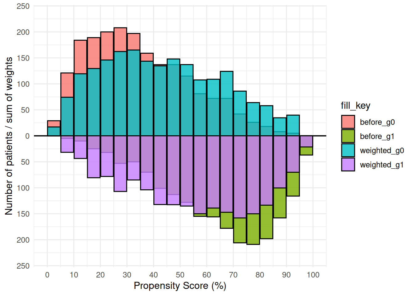
Adding scales, labels, and theme
The IPTW variant uses blue/red for the Limited/Extended groups, with the group labels coloured to match. The axis and annotation pattern is the same as the binary-match version; swap theme_hv_poster() for theme_hv_manuscript() when preparing the figure for a journal submission.
p_wt +
  ggplot2::scale_fill_manual(
    values = c(
      before_g0   = "white", weighted_g0 = "blue",
      before_g1   = "white", weighted_g1 = "red"
    ),
    guide = "none"
  ) +
  ggplot2::scale_x_continuous(
    limits = c(0, 100),
    breaks = seq(0, 100, 10)
  ) +
  ggplot2::scale_y_continuous(labels = abs) +
  ggplot2::annotate("text", x = 30, y =  Inf, vjust =  2,
                    label = mh_wt$meta$group_labels[1], color = "blue", size = 5) +
  ggplot2::annotate("text", x = 30, y = -Inf, vjust = -1,
                    label = mh_wt$meta$group_labels[2], color = "red",  size = 5) +
  ggplot2::labs(x = "Propensity Score (%)", y = "#") +
  theme_hv_poster()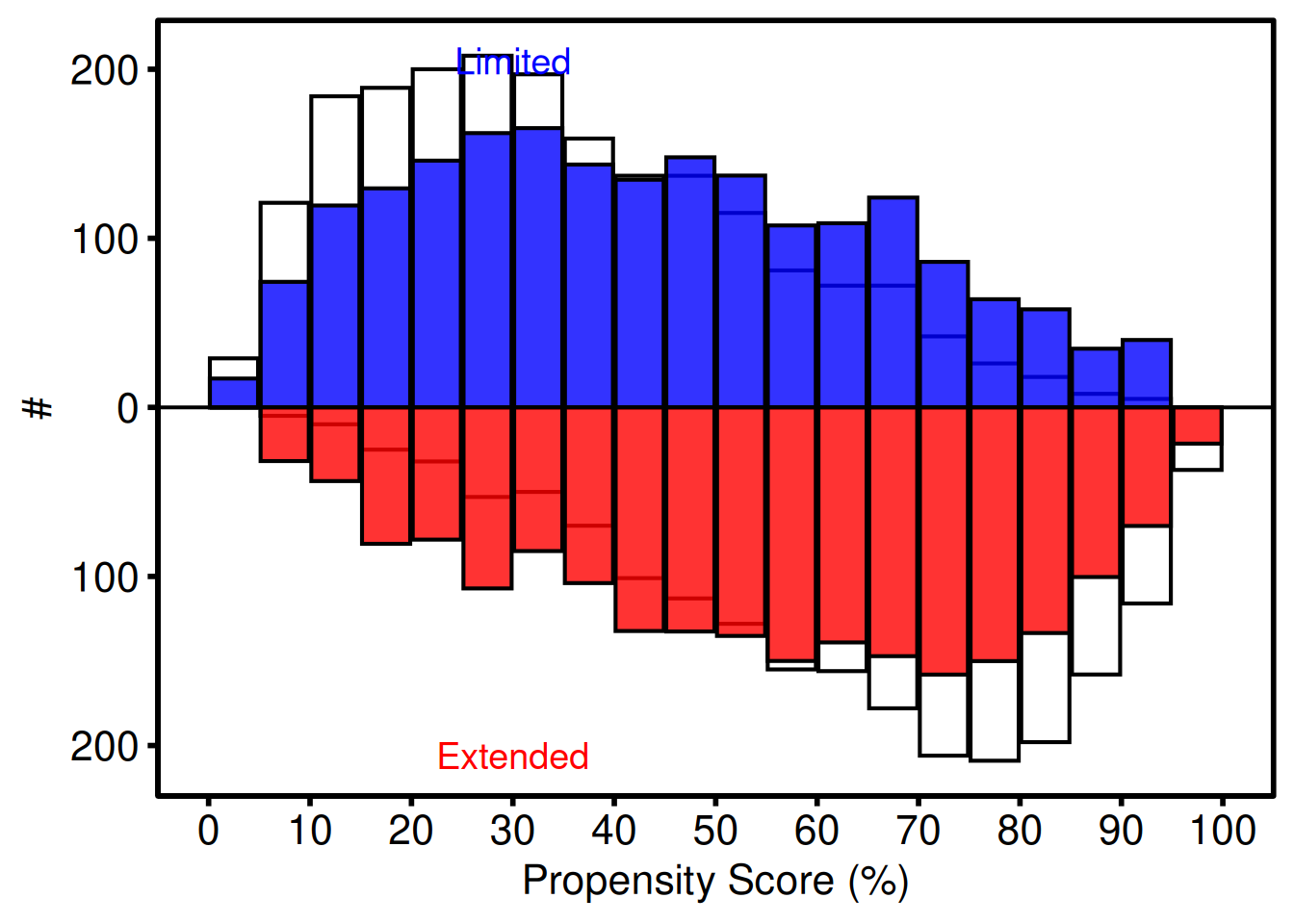
Weighted diagnostics include the effective N and weighted SMD:
mh_wt$tables$diagnostics$smd_weighted[1] 0.5434922
mh_wt$tables$diagnostics$effective_n_by_group 0 1
2000 2000 Stacked Histogram
The stacked histogram shows how the composition of a numeric variable shifts over time or across a grouping dimension. hv_stacked() prepares the data; plot() hands you a bare ggplot to dress with colour and labels.
The sample_stacked_histogram_data() function generates a reproducible example dataset with year and category columns.
# Generate sample data
hist_dta <- sample_stacked_histogram_data(n_years = 20, start_year = 2000,
                                           n_categories = 3)
head(hist_dta)
year category
1 2000 1
2 2000 1
3 2000 2
4 2000 2
5 2000 2
6 2000 1Count histogram
The default position = "stack" shows raw counts within each bin, equivalent to the plot.sas frequency histogram. Build the S3 object with hv_stacked(), then call plot() to get a bare ggplot you dress with colour scales and a theme in one pipeline.
# Build the S3 object, then render the bare plot
sh <- hv_stacked(hist_dta, x_col = "year", group_col = "category")
p_count <- plot(sh)

# Layer on colour scales, labels, and a theme
p_count +
  scale_fill_brewer(palette = "Set1", name = "Category") +
  scale_color_brewer(palette = "Set1", name = "Category") +
  labs(x = "Year", y = "Count") +
  theme_hv_poster()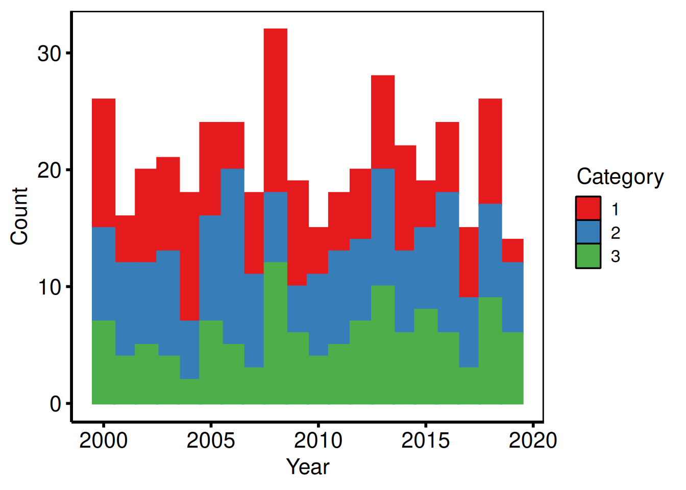
Proportion (fill) histogram
Setting position = "fill" rescales each bin so the bars sum to 1, making it easy to compare the relative composition across years without count differences obscuring the trend. Pass the composition variant to hv_stacked() at construction time, then layer in manual colour and axis labels.
# Build the proportional variant
sh2   <- hv_stacked(hist_dta, x_col = "year", group_col = "category",
                       position = "fill")
p_fill <- plot(sh2)

# Use manual colours and custom legend labels
p_final <- p_fill +
  scale_fill_manual(
    values = c("1" = "pink", "2" = "cyan", "3" = "orangered"),
    labels = c("1" = "Group A", "2" = "Group B", "3" = "Group C"),
    name   = "Category"
  ) +
  scale_color_manual(
    values = c("1" = "pink", "2" = "cyan", "3" = "orangered"),
    guide  = "none"
  ) +
  labs(x = "Year", y = "Proportion") +
  theme_hv_poster()

p_final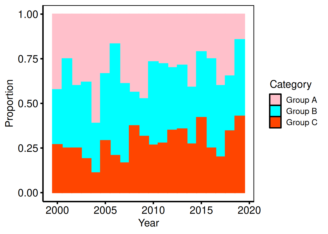
Saving
ggsave() writes the composed figure to a PDF at 11 x 8 inches, a standard landscape size for posters. For an editable PowerPoint slide, use save_ppt() instead; see the companion Decorating and Saving vignette.
ggsave(
  filename = "../graphs/stacked_histogram.pdf",
  plot     = p_final,
  width    = 11,
  height   = 8
)
Goodness-of-Follow-Up Plot
The goodness-of-follow-up plot is a standard quality-control figure in longitudinal outcome analyses. Each patient appears as a point at their operation date (x-axis) and follow-up duration (y-axis), with a short vertical tick below. A dashed diagonal line marks the maximum potential follow-up given the study start, study end, and follow-up closing date — points above the line have longer follow-up than that window alone explains, typically because passive surveillance supplemented active cross-sectional follow-up.
hv_followup() prepares the data; plot() hands you a bare ggplot with no colour, shape, axis, or label scales applied. Add those with the usual + operator. The type argument selects the panel: "followup" (default, the death/censoring scatter) or "event" (competing non-fatal event panel).
Sample data
sample_goodness_followup_data() generates 300 patients with operation dates, follow-up durations, vital status, and a simulated non-fatal event column. The constructor needs study_start, study_end, and close_date to draw the maximum-follow-up diagonal line correctly.
gfup_dta <- sample_goodness_followup_data(n = 300, seed = 42)
head(gfup_dta)
iv_opyrs iv_dead dead iv_event ev_event deads
1 29.5694 2.0261 FALSE 2.0261 FALSE FALSE
2 6.4834 6.9027 TRUE 4.0813 TRUE TRUE
3 14.4342 5.4468 TRUE 5.4468 FALSE TRUE
4 25.4324 6.1630 FALSE 0.6137 TRUE FALSE
5 3.4251 13.1369 TRUE 6.9232 TRUE TRUE
6 24.1620 7.4334 FALSE 7.4334 FALSE FALSEDeath follow-up plot
The bare plot(gf) panel shows each patient as a point and tick without scales, labels, or theme. Look for: a cloud of points below the diagonal, with some above it (patients with longer follow-up than the window explains); if all points fall exactly on the diagonal, the close date may be set incorrectly.
gf <- hv_followup(
  data        = gfup_dta,
  origin_year = 1990,
  study_start = as.Date("1990-01-01"),
  study_end   = as.Date("2019-12-31"),
  close_date  = as.Date("2021-08-06")
)

# Bare plot — no scales or labels yet
plot(gf)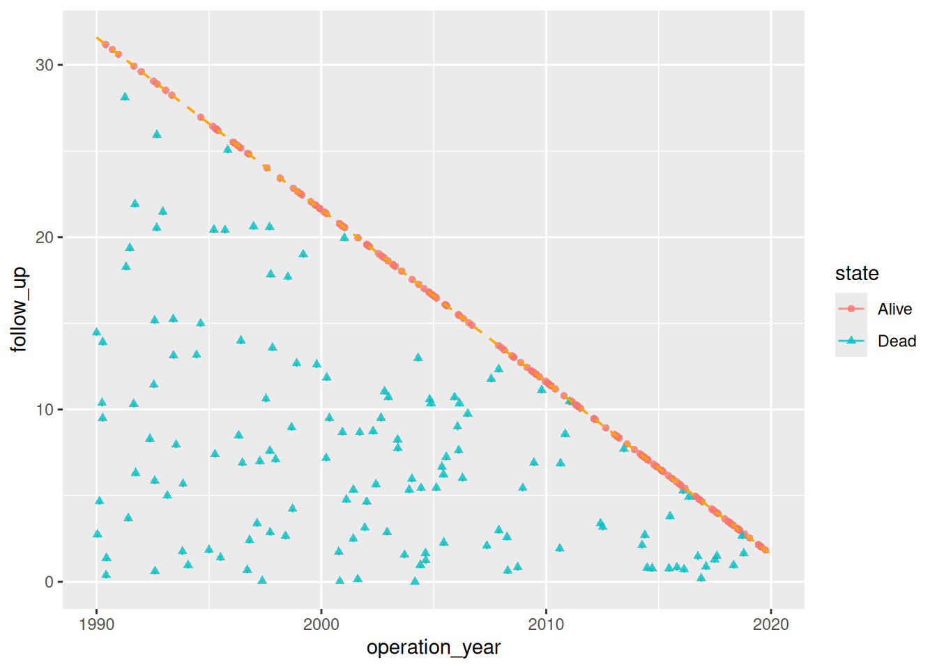
Adding scales, labels, and annotations
Scale, label, and annotation layers are composed with the usual + operator. scale_color_manual() and scale_shape_manual() map the binary alive/dead state to colours and point shapes. annotate() places group-identifying text directly on the panel.
gfup_final <- plot(gf, alpha = 0.8) +
  # Colour alive = blue, dead = red (Set1 palette positions 2 and 1)
  scale_color_manual(
    values   = c("#377EB8", "#E41A1C"),
    labels   = c("Alive", "Dead"),
    na.value = "black",
    drop     = FALSE
  ) +
  scale_shape_manual(
    values = c(1, 4),
    labels = c("Alive", "Dead")
  ) +
  # Axis tick placement
  scale_x_continuous(breaks = seq(1990, 2020, 3)) +
  scale_y_continuous(breaks = seq(0, 33,   3)) +
  # Clip the panel to the study window
  coord_cartesian(ylim = c(0, 33), xlim = c(1990, 2020)) +
  # Axis and legend labels
  labs(
    x     = "Operation Date",
    y     = "Follow-up (years)",
    color = "Status",
    shape = "Status"
  ) +
  # Annotate directly on the panel
  annotate("text", x = 1993, y = 31, label = "Alive at close",
           hjust = 0, size = 3.5) +
  annotate("text", x = 1993, y = 28, label = "Deceased",
           hjust = 0, size = 3.5, color = "#E41A1C") +
  theme(legend.position = "none") +
  theme_hv_poster()

gfup_final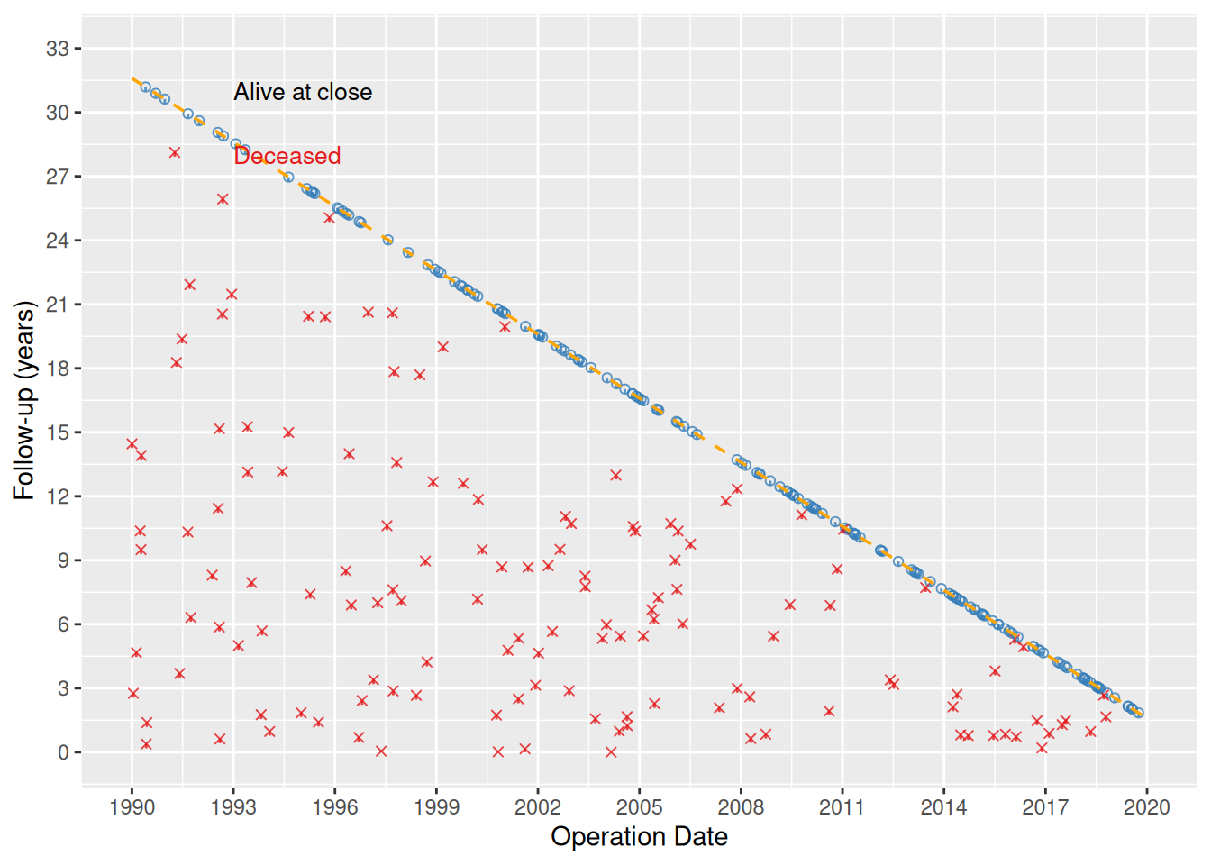
Saving
ggsave() writes the figure at 6 x 6 inches – square dimensions suit the scatter’s equal x–y scale. For a PowerPoint version, see Decorating and Saving.
ggsave(
  filename = "../graphs/dp_goodness-of-followup.pdf",
  plot     = gfup_final,
  height   = 6,
  width    = 6
)
Non-fatal event panel
When the dataset includes a non-fatal competing event (e.g. relapse, reoperation), pass event_col, event_time_col, and optionally death_for_event_col to the constructor and then call plot() with type = "event" to render the event panel.
gfup_event_dta <- sample_goodness_followup_data(n = 300, seed = 42)
gf2 <- hv_followup(
  gfup_event_dta,
  event_col           = "ev_event",
  event_time_col      = "iv_event",
  death_for_event_col = "deads",
  event_levels        = c("No event", "Relapse", "Death"),
  origin_year         = 1990,
  study_start         = as.Date("1990-01-01"),
  study_end           = as.Date("2019-12-31"),
  close_date          = as.Date("2021-08-06")
)

plot(gf2, type = "event", alpha = 0.8) +
  scale_color_manual(
    values = c("No event" = "blue", "Relapse" = "green3", "Death" = "red"),
    name   = NULL
  ) +
  scale_shape_manual(
    values = c("No event" = 1L, "Relapse" = 2L, "Death" = 4L),
    name   = NULL
  ) +
  scale_x_continuous(breaks = seq(1990, 2020, 3)) +
  scale_y_continuous(breaks = seq(0, 33, 3)) +
  coord_cartesian(ylim = c(0, 33), xlim = c(1990, 2020)) +
  labs(
    x = "Operation Date",
    y = "Follow-up (years)",
    color = "Event", shape = "Event"
  ) +
  annotate("text", x = 1993, y = 31,
           label = "Systematic follow-up", hjust = 0, size = 3.5) +
  theme(legend.position = c(0.85, 0.15)) +
  theme_hv_poster()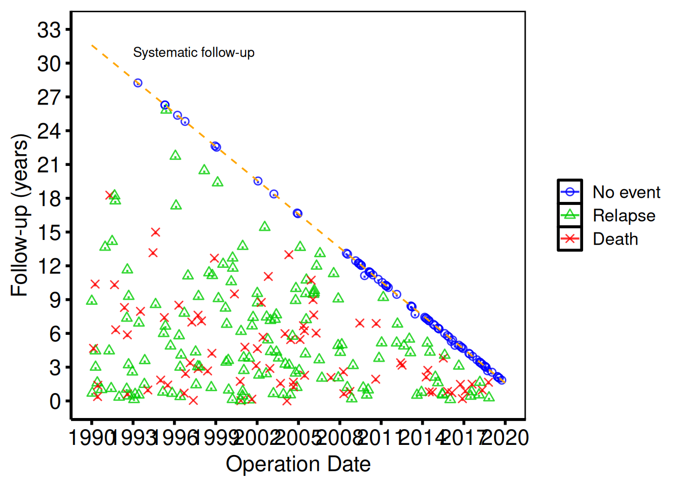
The default follow-up panel (plot(gf)) and the event panel (plot(gf2, type = "event")) share the same diagonal reference line and can be saved individually with ggsave().
Covariate Balance Plot
The covariate balance plot is the standard quality-control figure for propensity score matching and IPTW analyses. Each covariate occupies a labelled row; points show the standardized mean difference (SMD) for each comparison group (e.g. before and after matching). A solid vertical line marks zero balance; the dotted lines at ±10% give you a quick visual threshold for acceptable balance. hv_balance() prepares the data, superseding tp.lp.propen.cov_balance.R; plot() hands you a bare ggplot to style with the usual + operator.
Input data must be in long format: one row per covariate × group combination with columns for the covariate name, the group label, and the numeric SMD value. When the source dataset arrives in wide format (one column per time-point, as the SAS export does), reshape it first:
# Simulate a wide-format export (e.g. from SAS or a summary table)
dta_wide <- data.frame(
  variable      = c("Age", "Female sex", "Hypertension", "Diabetes", "COPD"),
  `Before match` = c(22.1, -15.3,  18.7, -9.4,  11.2),
  `After match`  = c( 3.5,   2.1,  -1.8,  4.0,  -2.3),
  check.names = FALSE
)

dta_long <- reshape(
  dta_wide,
  direction = "long",
  varying   = c("Before match", "After match"),
  v.names   = "std_diff",
  timevar   = "group",
  times     = c("Before match", "After match"),
  idvar     = "variable"
)
head(dta_long)
variable group std_diff
Age.Before match Age Before match 22.1
Female sex.Before match Female sex Before match -15.3
Hypertension.Before match Hypertension Before match 18.7
Diabetes.Before match Diabetes Before match -9.4
COPD.Before match COPD Before match 11.2
Age.After match Age After match 3.5Sample data
sample_covariate_balance_data() returns 12 covariates in the long format hv_balance() expects: one row per covariate × group combination with variable, group, and std_diff columns. Build the S3 object once and reuse it across the styled variants below.
dta_cb <- sample_covariate_balance_data(n_vars = 12)
head(dta_cb)
variable group std_diff
1 Age Before match 9.8
2 Female sex Before match 25.4
3 Hypertension Before match -14.7
4 Diabetes mellitus Before match -8.9
5 COPD Before match -3.9
6 Creatinine Before match 26.5
# Build the S3 object once; reuse for all plot variants below
cb <- hv_balance(dta_cb)
Bare plot
The bare panel lays out one covariate per row with points at their SMD values, but no colour, shape, axis limits, or theme yet. Look for: points clustered near zero for the matched/weighted group and scattered wider for the unmatched group; if both groups look identical, check that group levels are distinct.
plot(cb, alpha = 0.8)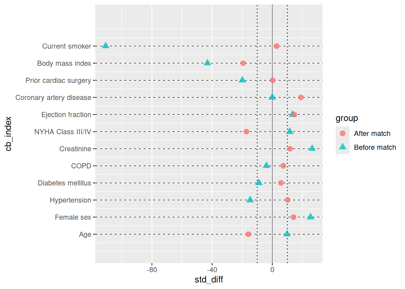
Adding colour, shape, and axis scales
We map "Before match" to red triangles and "After match" to blue squares – the same colour convention as tp.lp.propen.cov_balance.R. Set the x-axis limits wide enough to include your largest pre-match SMD; the symmetric breaks make the ±10 % threshold visually obvious.
plot(cb, alpha = 0.8) +
  scale_color_manual(
    values = c("Before match" = "red4", "After match" = "blue3"),
    name   = NULL
  ) +
  scale_shape_manual(
    values = c("Before match" = 17L, "After match" = 15L),
    name   = NULL
  ) +
  scale_x_continuous(
    limits = c(-45, 35),
    breaks = seq(-40, 30, 10)
  ) +
  labs(
    x = "Standardized difference (%)",
    y = ""
  ) +
  theme(legend.position = c(0.20, 0.95))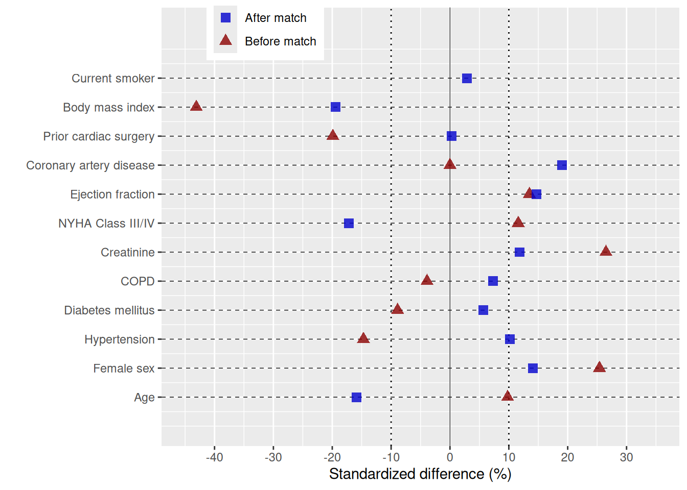
Adding directional annotations and theme
annotate() places explanatory text directly on the panel to indicate which direction of imbalance favours each group. The example below uses the exact labels, x-scale, annotation positions, and legend placement from tp.lp.propen.cov_balance.R (SAVR vs. TF-TAVR study).
n_vars <- length(unique(dta_cb$variable))

cb_final <- plot(cb, alpha = 0.8) +
  scale_color_manual(
    values = c("Before match" = "red4", "After match" = "blue3"),
    name   = NULL
  ) +
  scale_shape_manual(
    values = c("Before match" = 17L, "After match" = 15L),
    name   = NULL
  ) +
  scale_x_continuous(
    limits = c(-40, 30),
    breaks = seq(-40, 30, 10)
  ) +
  labs(x = "Standardized difference: SAVR - TF:TAVR (%)", y = "") +
  annotate("text", x = -30, y = 0,        label = "More likely TF-TAVR", size = 4.5) +
  annotate("text", x =  22, y = n_vars,   label = "More likely SAVR",    size = 4.5) +
  theme(legend.position = c(0.20, 0.935)) +
  theme_hv_poster()

cb_final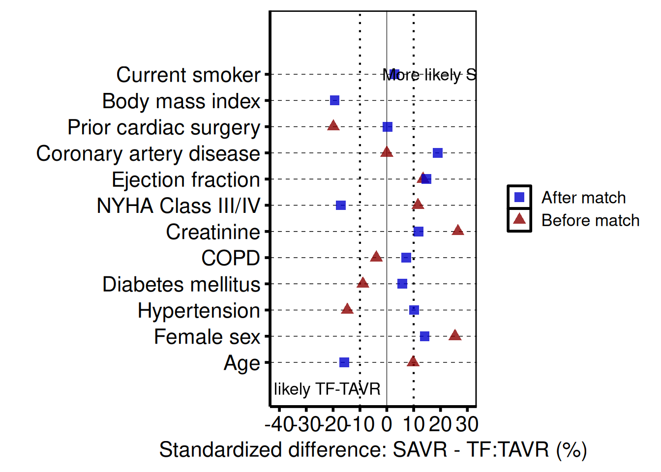
Controlling covariate order
Pass var_levels to the constructor to control the bottom-to-top display order of covariates. The example below reverses the default order; supply any character vector that contains all covariate names in the order you want them to appear.
cb_ord <- hv_balance(dta_cb, var_levels = rev(unique(dta_cb$variable)))

plot(cb_ord, alpha = 0.8) +
  scale_color_manual(
    values = c("Before match" = "red4", "After match" = "blue3"),
    name   = NULL
  ) +
  scale_shape_manual(
    values = c("Before match" = 17L, "After match" = 15L),
    name   = NULL
  ) +
  labs(x = "Standardized difference (%)", y = "") +
  theme_hv_poster()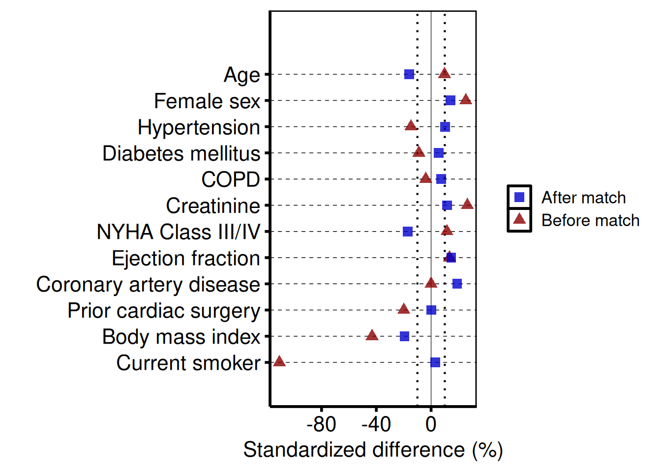
Saving
ggsave() writes the figure at 8 x 7 inches – the extra width accommodates long covariate labels on the y-axis. For a PowerPoint version, see Decorating and Saving.
Kaplan-Meier Survival Curve
hv_survival() estimates the Kaplan-Meier product-limit survival function and stores all five companion plots’ data (matching the SAS %kaplan macro output PLOTS, PLOTC, PLOTH, PLOTL) plus tidy summary tables in $tables. Call plot() with the type argument to render a bare ggplot for the selected panel (default "survival"). Confidence intervals use the logit transform at 0.95 by default.
Sample data
We work from a simulated cohort of 500 patients with a single follow-up window and right-censoring. sample_survival_data() builds the data frame in the long format hv_survival() expects — one row per patient with a time and an event column. Build the S3 object once and reuse it across the survival, hazard, log-log, and report panels below.
dta_km <- sample_survival_data(n = 500, seed = 42)
head(dta_km)
iv_dead dead iv_opyrs age_at_op
1 3.966736 TRUE 2003.503 58.08251
2 13.217905 TRUE 2008.716 65.37466
3 5.669821 TRUE 1990.072 58.80676
4 0.763838 TRUE 2005.739 66.45205
5 9.463533 TRUE 2006.139 75.84440
6 20.000000 FALSE 1991.461 60.21944
# Build the S3 object once; reuse across all plot variants below
km <- hv_survival(dta_km)
Survival curve (PLOTS=1)
The bare plot(km) panel is what PLOTS=1 produces from the SAS %kaplan macro — the survival curve with the logit-transform 95% CI ribbon. No colour scale, axis labels, or theme yet; you add those in the next subsection. Look for: a curve that starts at 100% and is monotonically non-increasing, with the ribbon widening as the at-risk population thins.
# Bare plot — no scales or labels yet
plot(km)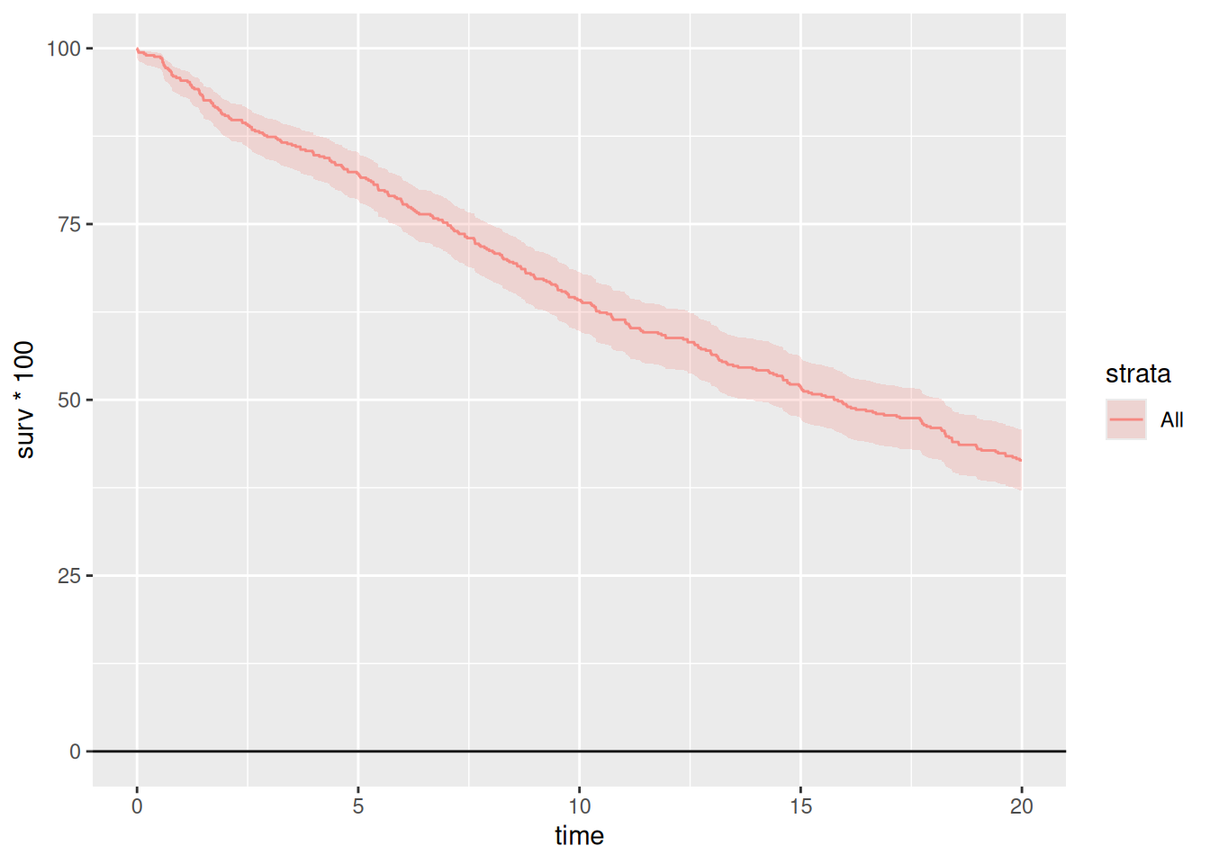
Adding scales, labels, and annotations
To get a manuscript-ready figure, we layer scales, labels, and a theme onto the bare plot with +. The pattern below is what we use most often in CORR: a steelblue palette for single-cohort figures, percent labels on the y-axis, the n = callout in the lower-left, and the poster-sized theme. Swap theme_hv_poster() for theme_hv_manuscript() when you want the journal version.
km_final <- plot(km, alpha = 0.8) +
  scale_color_manual(values = c(All = "steelblue"), guide = "none") +
  scale_fill_manual(values  = c(All = "steelblue"), guide = "none") +
  scale_y_continuous(
    breaks = seq(0, 100, 20),
    labels = function(x) paste0(x, "%")
  ) +
  scale_x_continuous(breaks = seq(0, 20, 5)) +
  coord_cartesian(xlim = c(0, 20), ylim = c(0, 100)) +
  labs(
    x     = "Years after Operation",
    y     = "Freedom from Death (%)",
    title = "Overall Survival"
  ) +
  annotate("text", x = 1, y = 5,
           label = paste0("n = ", nrow(dta_km)),
           hjust = 0, size = 3.5) +
  theme_hv_poster()

km_final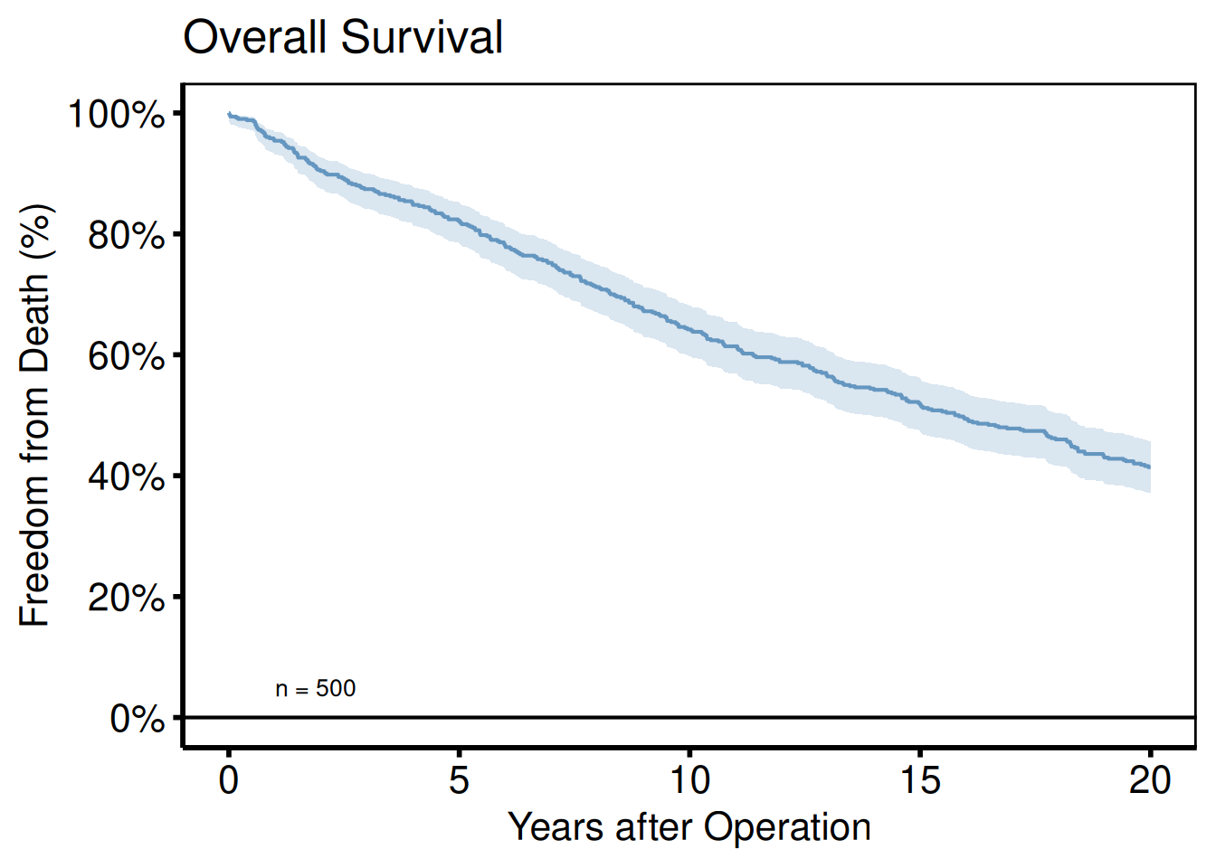
Numbers at risk and report table
hv_survival() stores the at-risk table and the per-time-point summary in $tables. The risk table is the strip that goes under the plot in the SAS %kaplan output; the report table is the per-year summary with point estimates and CIs. Read either one out directly:
km$tables$risk strata report_time n.risk
1 All 1 478
2 All 5 412
3 All 10 322
4 All 15 260
5 All 20 207
6 All 25 207
km$tables$report strata report_time surv lower upper n.risk n.event
1 All 1 0.954 0.9317320 0.9692443 478 1
2 All 5 0.822 0.7859710 0.8530976 412 1
3 All 10 0.642 0.5989814 0.6828473 322 1
4 All 15 0.518 0.4741762 0.5615486 260 1
5 All 20 0.414 0.3715880 0.4577269 207 0
6 All 25 0.414 0.3715880 0.4577269 207 0Saving
ggsave() writes the composed figure to disk — the width/height here are tuned for manuscript aspect ratios. For an editable PowerPoint slide use save_ppt() instead; see the companion Decorating and Saving vignette.
ggsave("../graphs/km_survival.pdf", km_final, width = 8, height = 6)Stratified analysis
To compare survival across groups, pass group_col to hv_survival() and the constructor fits a separate KM curve per stratum. Below we simulate a two-arm valve-type cohort with a 1.4× hazard ratio, then style the curves with scale_color_manual() so the two groups are visually distinct. Look for: clearly separated curves with non-overlapping CI ribbons in the windows where treatment effects matter most.
dta_km_s <- sample_survival_data(
  n             = 500,
  strata_levels = c("Type A", "Type B"),
  hazard_ratios = c(1, 1.4),
  seed          = 42
)

km_s <- hv_survival(dta_km_s, group_col = "valve_type")

plot(km_s, alpha = 0.8) +
  scale_color_manual(
    values = c("Type A" = "steelblue", "Type B" = "firebrick"),
    name   = "Valve Type"
  ) +
  scale_fill_manual(
    values = c("Type A" = "steelblue", "Type B" = "firebrick"),
    name   = "Valve Type"
  ) +
  scale_y_continuous(breaks = seq(0, 100, 20),
                     labels = function(x) paste0(x, "%")) +
  scale_x_continuous(breaks = seq(0, 20, 5)) +
  coord_cartesian(xlim = c(0, 20), ylim = c(0, 100)) +
  labs(x = "Years after Operation", y = "Freedom from Death (%)",
       title = "Survival by Valve Type") +
  theme(legend.position = c(0.15, 0.20)) +
  theme_hv_poster()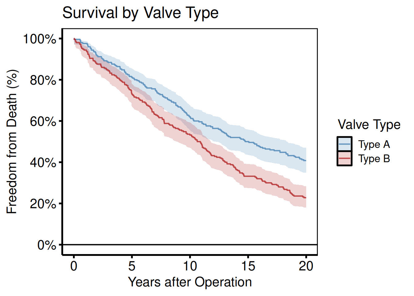
Cumulative hazard (PLOTC=1)
PLOTC=1 from the SAS %kaplan macro is the Nelson-Aalen cumulative hazard estimate H(t) = -log S(t). Same KM object, different type argument. Look for: a monotonically non-decreasing curve starting at zero; the slope at any time point is the instantaneous hazard rate.
plot(km, type = "cumhaz") +
  scale_x_continuous(breaks = seq(0, 20, 5)) +
  labs(x = "Years after Operation", y = "Cumulative Hazard H(t)",
       title = "Nelson-Aalen Cumulative Hazard") +
  scale_color_manual(values = c(All = "steelblue"), guide = "none") +
  theme_hv_poster()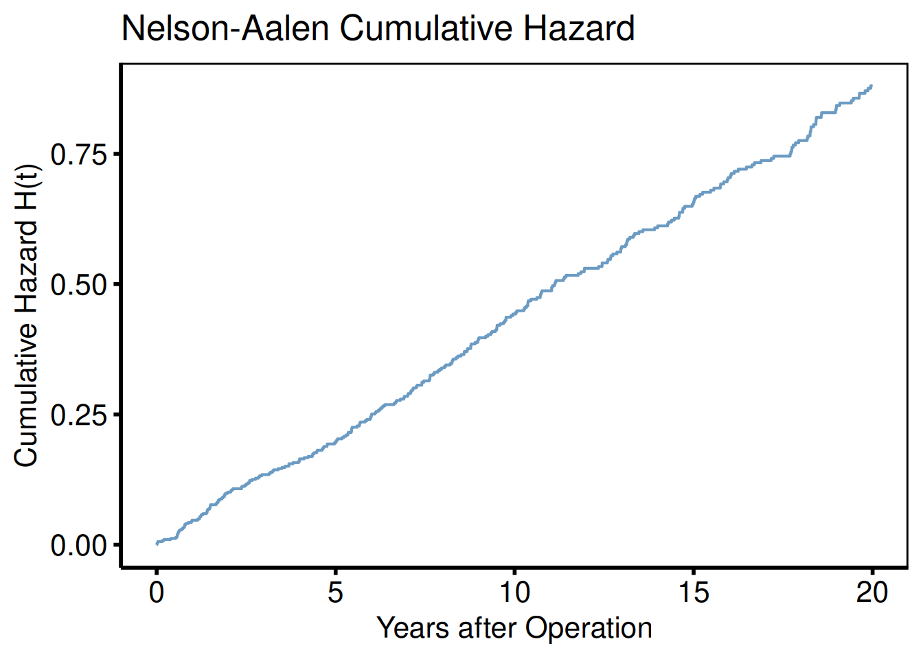
Log-log survival plot (Weibull/PH check)
Parallel lines across strata indicate proportional hazards.
plot(km_s, type = "loglog") +
  scale_color_manual(
    values = c("Type A" = "steelblue", "Type B" = "firebrick"),
    name   = "Valve Type"
  ) +
  labs(x = "log(Years after Operation)", y = "log(-log S(t))",
       title = "Log-Log Survival — Proportional-Hazards Check") +
  theme_hv_poster()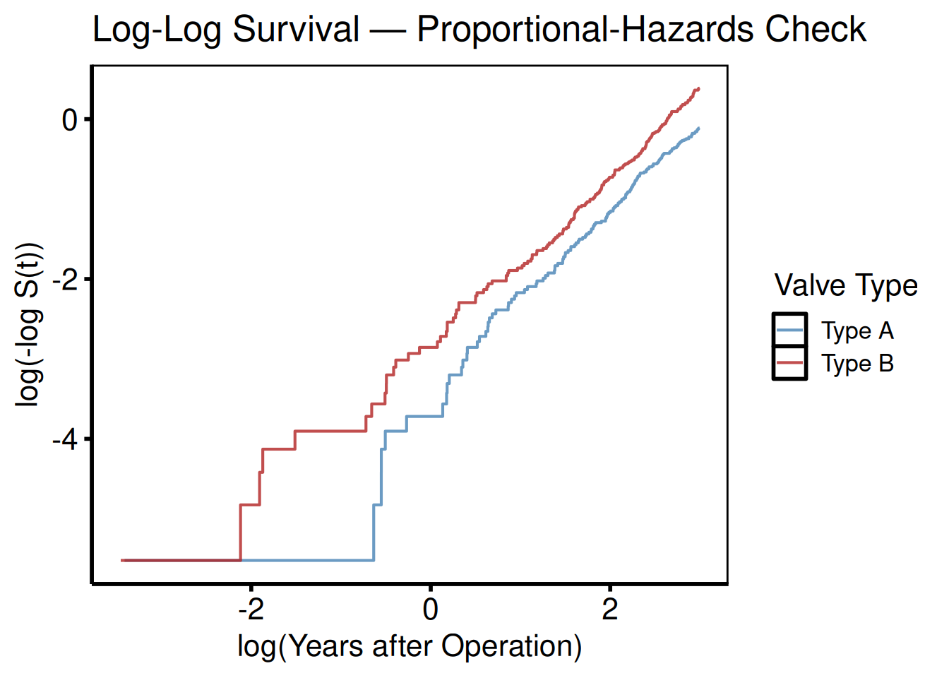
Hazard rate (PLOTH=1)
The raw point estimates are noisy; add geom_smooth() for a smoothed curve suitable for figures.
plot(km, type = "hazard") +
  geom_smooth(
    aes(x = mid_time, y = hazard, color = strata),
    method = "loess", se = FALSE, span = 0.6
  ) +
  scale_color_manual(values = c(All = "steelblue"), guide = "none") +
  scale_x_continuous(breaks = seq(0, 20, 5)) +
  labs(x = "Years after Operation", y = "Instantaneous Hazard",
       title = "Hazard Rate") +
  theme_hv_poster()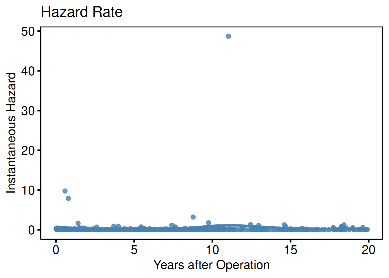
Integrated survivorship / restricted mean survival (PLOTL=1)
PLOTL=1 is the integrated survivorship — the area under the survival curve up to time t, equivalent to restricted mean survival time (RMST) at that horizon. Useful when the proportional-hazards assumption fails and a single hazard ratio summary would mislead. Look for: a curve that rises linearly while S(t) ≈ 1 and bends as event accumulation pulls the mean down.
plot(km, type = "life") +
  scale_color_manual(values = c(All = "steelblue"), guide = "none") +
  scale_x_continuous(breaks = seq(0, 20, 5)) +
  labs(x = "Years after Operation",
       y = "Restricted Mean Survival (years)",
       title = "Integral of Survivorship") +
  theme_hv_poster()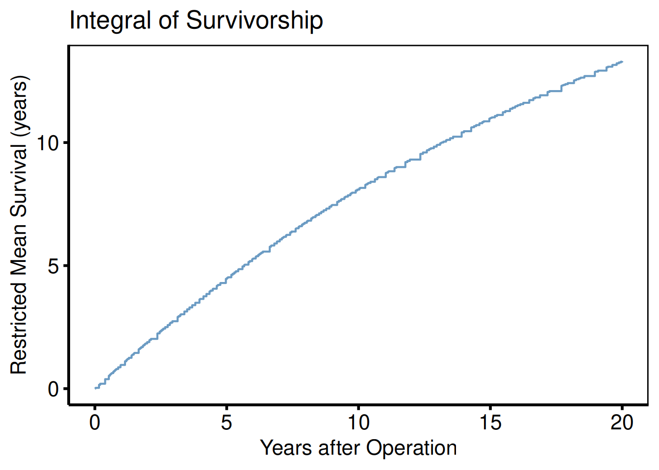
EDA Barplots and Scatterplots
The hvtiPlotR package provides hv_eda() for exploratory data analysis of all variables in a dataset against a reference time axis. It replicates the Function_DataPlotting() workflow from tp.dp.EDA_barplots_scatterplots.R and tp.dp.EDA_barplots_scatterplots_varnames.R, replacing base-R graphics with composable ggplot2 objects.
Three helpers support the workflow: eda_classify_var() detects whether a column is continuous ("Cont"), numeric-categorical ("Cat_Num"), or character-categorical ("Cat_Char") (matching the UniqueLimit logic from the template); eda_select_vars() subsets and reorders columns by name or space-separated string, replacing the Order_Variables() / Mod_Data <- dta[, Order_Var] pattern from the varnames template; and sample_eda_data() generates a reproducible mixed-type dataset for demonstration.
plot() on an hv_eda object returns a bare ggplot. Add colour scales, axis labels, annotations, and theme_hv_manuscript().
Sample data
sample_eda_data() returns a mixed-type dataset of 300 patients with continuous, binary, ordinal, and character columns spanning surgery years 2005–2020. eda_classify_var() detects each column’s type before you build the plots, so you can confirm the classification matches your expectations.
dta_eda <- sample_eda_data(n = 300, seed = 42)
head(dta_eda)
year op_years male cabg nyha valve_morph ef lv_mass peak_grad
1 2005 0.48 1 0 2 Tricuspid 66.3 97.6 31.0
2 2009 4.44 1 0 2 Unicuspid 52.0 121.1 38.0
3 2005 0.06 0 0 2 Tricuspid NA 129.7 25.2
4 2013 8.32 1 0 3 Bicuspid 49.8 131.4 52.5
5 2014 9.87 1 0 4 Tricuspid NA 146.3 NA
6 2008 3.92 1 1 1 Bicuspid 20.0 148.0 45.1
# Inspect auto-detected types for each column
sapply(dta_eda, eda_classify_var)
year op_years male cabg nyha valve_morph
"Cont" "Cont" "Cat_Num" "Cat_Num" "Cat_Num" "Cat_Char"
ef lv_mass peak_grad
"Cont" "Cont" "Cont" Binary categorical: count barplot
Numeric 0/1 columns are classified as "Cat_Num". NA values appear as an explicit "(Missing)" fill level so they can be coloured with scale_fill_manual(). The y_label argument sets the plot title and fill-legend name in place of the raw column name.
plot(hv_eda(dta_eda, x_col = "year", y_col = "male",
              y_label = "Sex")) +
  scale_fill_manual(
    values = c("0" = "steelblue", "1" = "firebrick", "(Missing)" = "grey80"),
    labels = c("0" = "Female", "1" = "Male", "(Missing)" = "Missing"),
    name   = NULL
  ) +
  scale_x_discrete(breaks = seq(2005, 2020, 5)) +
  labs(x = "Surgery Year", y = "Count") +
  theme_hv_poster()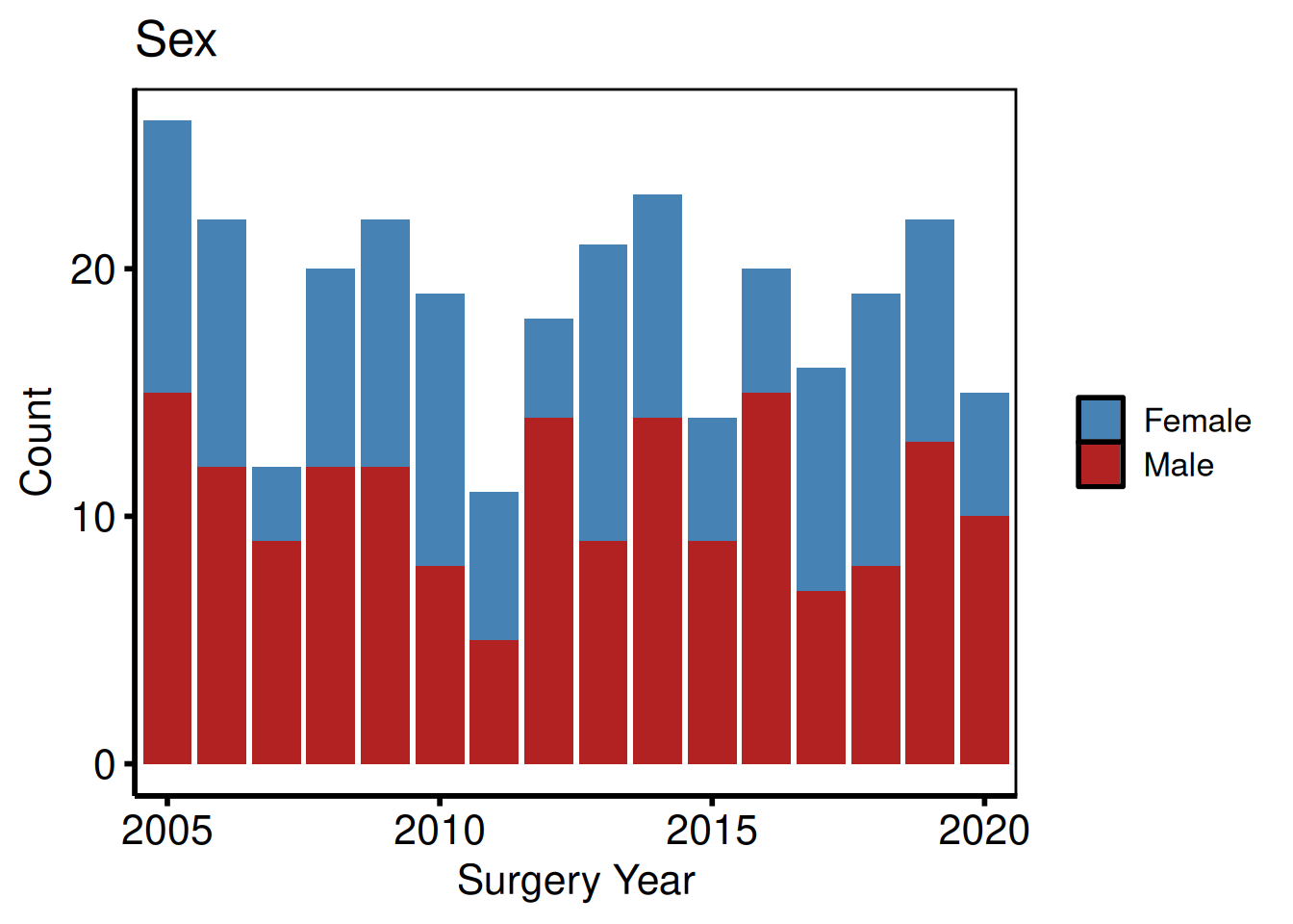
Binary categorical: percentage barplot
Setting show_percent = TRUE switches geom_bar() to position = "fill".
plot(hv_eda(dta_eda, x_col = "year", y_col = "cabg",
              y_label = "Concomitant CABG", show_percent = TRUE)) +
  scale_fill_manual(
    values = c("0" = "grey70", "1" = "steelblue", "(Missing)" = "grey90"),
    labels = c("0" = "No CABG", "1" = "CABG", "(Missing)" = "Missing"),
    name   = NULL
  ) +
  scale_x_discrete(breaks = seq(2005, 2020, 5)) +
  scale_y_continuous(labels = scales::percent) +
  labs(x = "Surgery Year", y = "Proportion") +
  theme_hv_poster()
Ordinal and multi-level categorical
Columns with more than two numeric levels are classified as "Cat_Num" and rendered as stacked count bars, one level per fill colour. Use scale_fill_brewer() with a diverging palette (here "RdYlGn", reversed) to signal grade severity from green (low) through yellow to red (high).
plot(hv_eda(dta_eda, x_col = "year", y_col = "nyha",
              y_label = "Preoperative NYHA Class")) +
  scale_fill_brewer(
    palette = "RdYlGn", direction = -1,
    labels  = c("1" = "I", "2" = "II", "3" = "III", "4" = "IV",
                "(Missing)" = "Missing"),
    name    = "NYHA"
  ) +
  scale_x_discrete(breaks = seq(2005, 2020, 5)) +
  labs(x = "Surgery Year", y = "Count") +
  theme_hv_poster()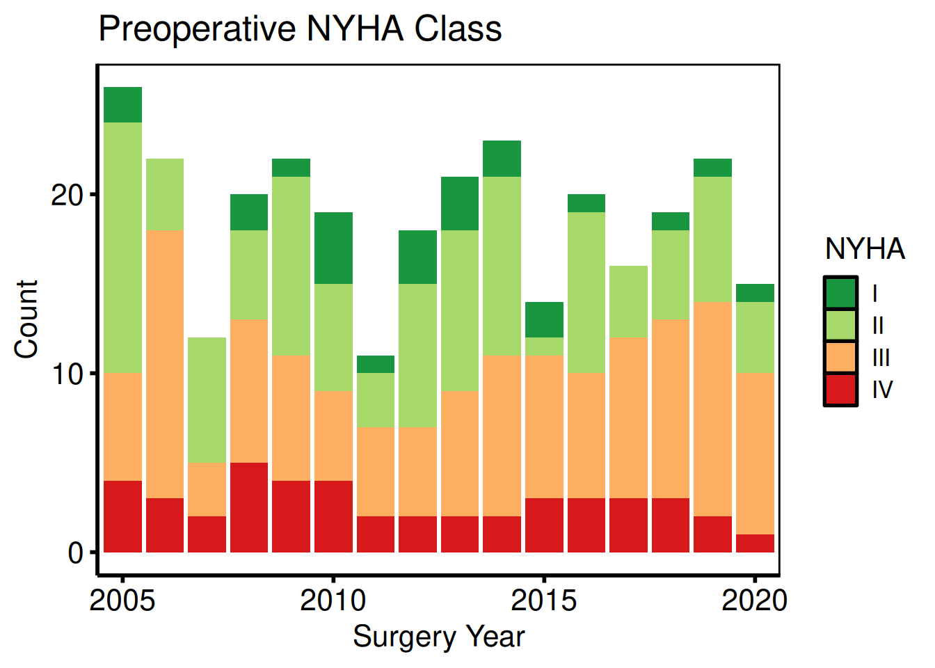
Character categorical
String columns are classified as "Cat_Char" and produce stacked count bars with one level per fill colour. Unlike "Cat_Num" columns, the levels are ordered alphabetically by default – use scale_fill_manual() to assign colours that carry clinical meaning (here, morphology type).
plot(hv_eda(dta_eda, x_col = "year", y_col = "valve_morph",
              y_label = "Valve Morphology")) +
  scale_fill_manual(
    values = c(Bicuspid   = "steelblue",
               Tricuspid  = "firebrick",
               Unicuspid  = "goldenrod3",
               "(Missing)" = "grey80"),
    name = "Morphology"
  ) +
  scale_x_discrete(breaks = seq(2005, 2020, 5)) +
  labs(x = "Surgery Year", y = "Count") +
  theme_hv_poster()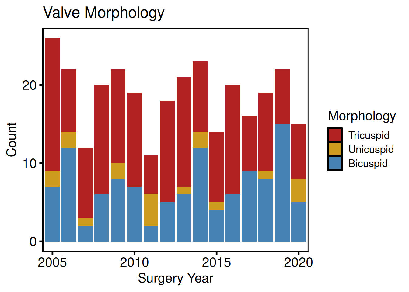
Continuous: scatter + LOESS
Continuous columns produce a scatter plot with a LOESS smoother overlay. Where y_col is NA, a rug mark is drawn on the x-axis.
plot(hv_eda(dta_eda, x_col = "op_years", y_col = "ef",
              y_label = "Ejection Fraction (%)")) +
  scale_colour_manual(values = c("firebrick"), guide = "none") +
  scale_x_continuous(breaks = seq(0, 15, 5)) +
  scale_y_continuous(limits = c(20, 80), breaks = seq(20, 80, 20)) +
  labs(x = "Years from First Surgery Year",
       caption = "Tick marks on x-axis: observations with missing EF") +
  theme_hv_poster()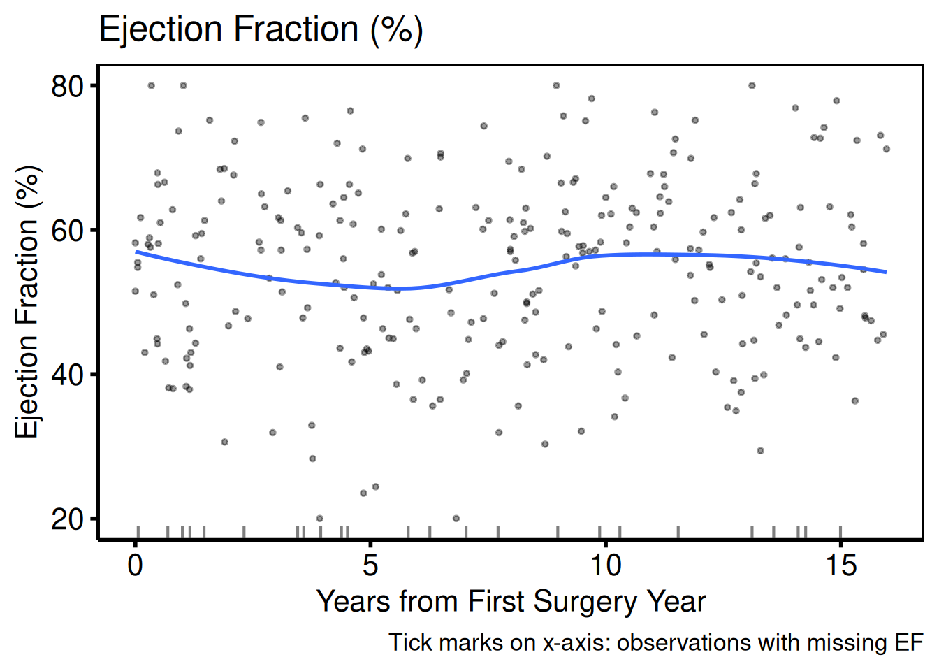
Variable selection and labels (varnames template pattern)
eda_select_vars() subsets columns by name, matching the Var_CatList / Var_ContList + Order_Variables() workflow. A named vector whose names are column names and whose values are human-readable labels drives a single lapply() loop.
bin_vars <- c(male = "Sex (Male)", cabg = "Concomitant CABG")
sub_bin  <- eda_select_vars(dta_eda, c("year", names(bin_vars)))

p_bin <- lapply(names(bin_vars), function(cn) {
  plot(hv_eda(sub_bin, x_col = "year", y_col = cn,
                y_label = bin_vars[[cn]])) +
    scale_fill_brewer(palette = "Set1", direction = -1, name = NULL) +
    scale_x_discrete(breaks = seq(2005, 2020, 5)) +
    labs(x = "Surgery Year", y = "Count") +
    theme_hv_poster()
})
p_bin[[1]]
p_bin[[2]]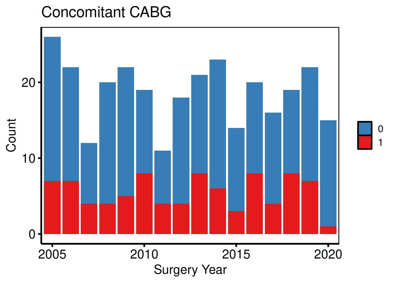
cat_vars <- c(nyha        = "NYHA Class",
              valve_morph = "Valve Morphology")
sub_cat <- eda_select_vars(dta_eda, c("year", names(cat_vars)))

p_cat <- lapply(names(cat_vars), function(cn) {
  plot(hv_eda(sub_cat, x_col = "year", y_col = cn,
                y_label = cat_vars[[cn]])) +
    scale_fill_brewer(palette = "Set2", name = NULL) +
    scale_x_discrete(breaks = seq(2005, 2020, 5)) +
    labs(x = "Surgery Year", y = "Count") +
    theme_hv_poster()
})
p_cat[[1]]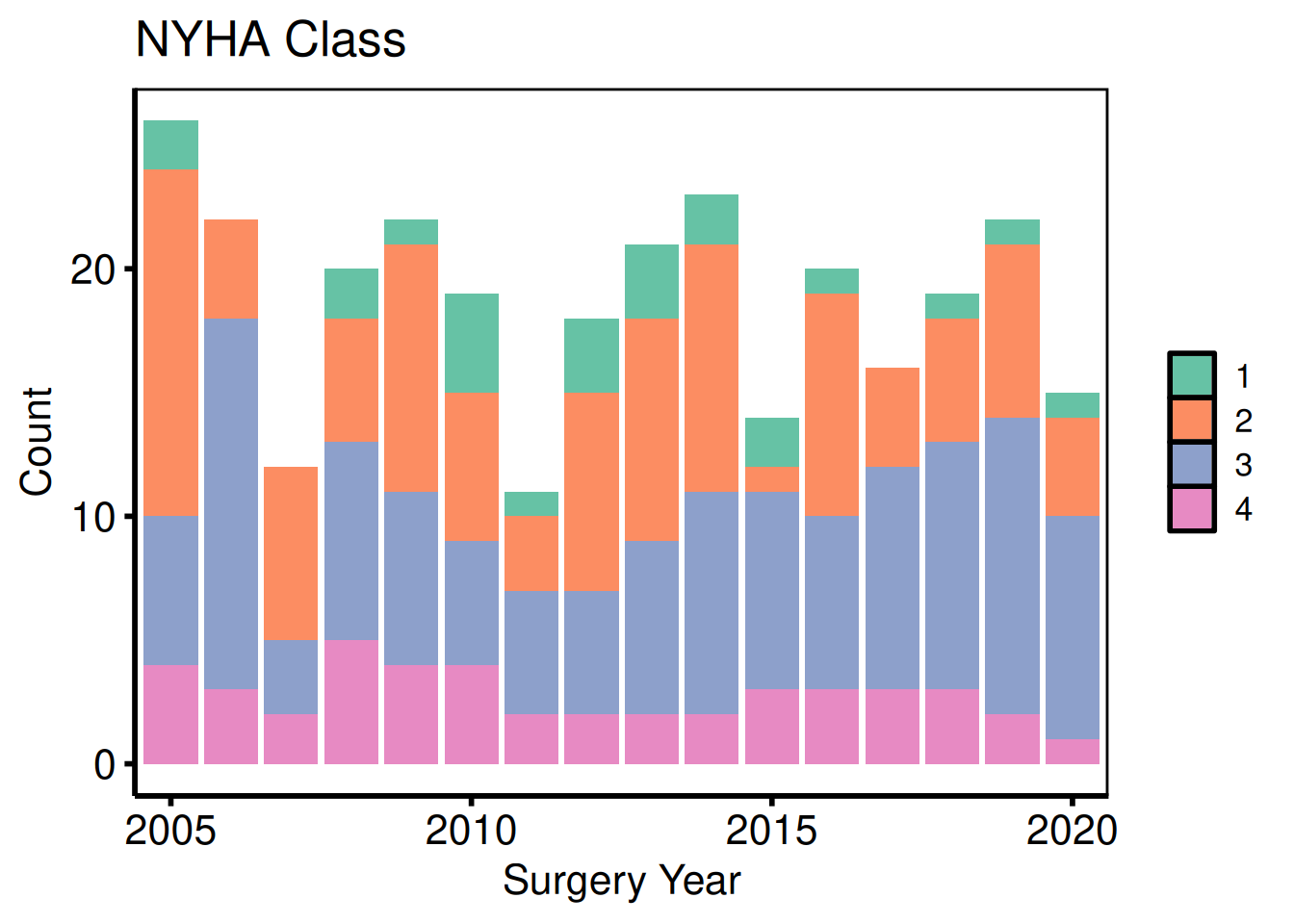
p_cat[[2]]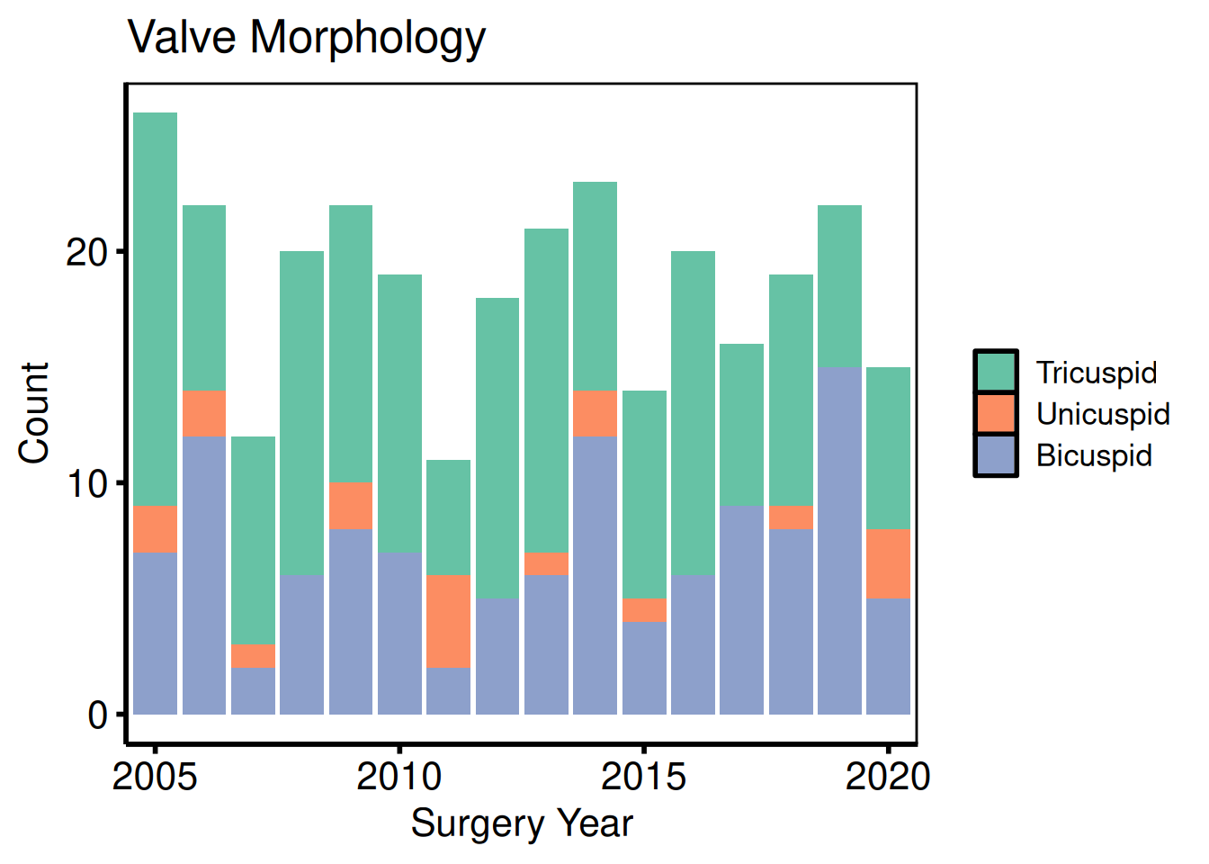
cont_vars <- c(ef        = "Ejection Fraction (%)",
               lv_mass   = "LV Mass Index (g/m\u00b2)",
               peak_grad = "Peak Gradient (mmHg)")
sub_cont <- eda_select_vars(dta_eda, c("op_years", names(cont_vars)))

p_cont <- lapply(names(cont_vars), function(cn) {
  plot(hv_eda(sub_cont, x_col = "op_years", y_col = cn,
                y_label = cont_vars[[cn]])) +
    scale_colour_manual(values = c("steelblue"), guide = "none") +
    scale_x_continuous(breaks = seq(0, 15, 5)) +
    labs(x = "Years from First Surgery Year") +
    theme_hv_poster()
})
p_cont[[1]]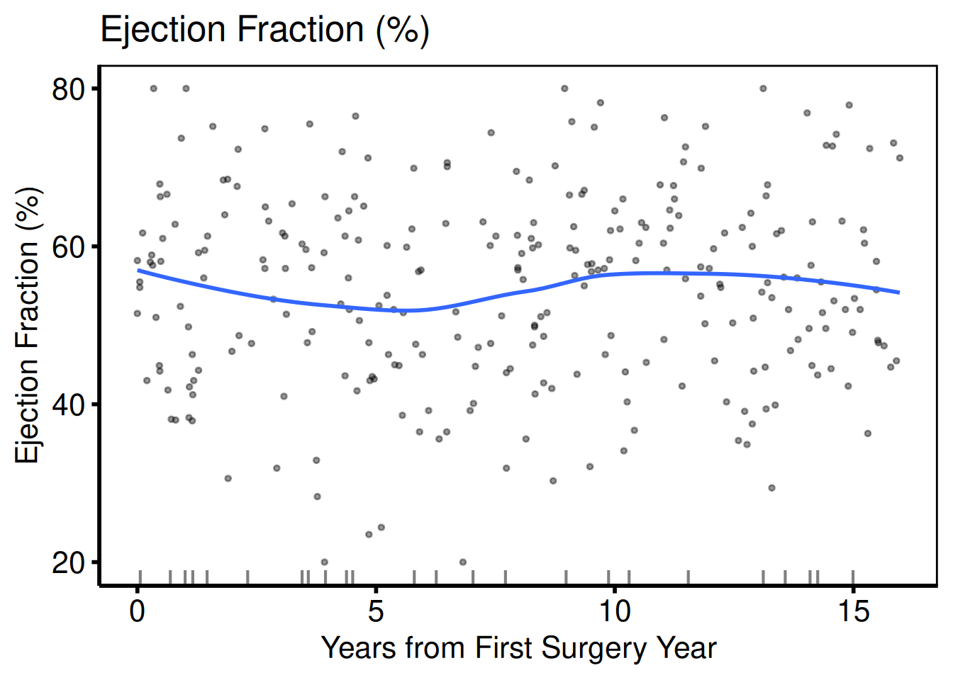
p_cont[[2]]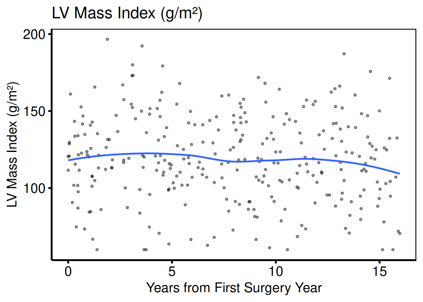
p_cont[[3]]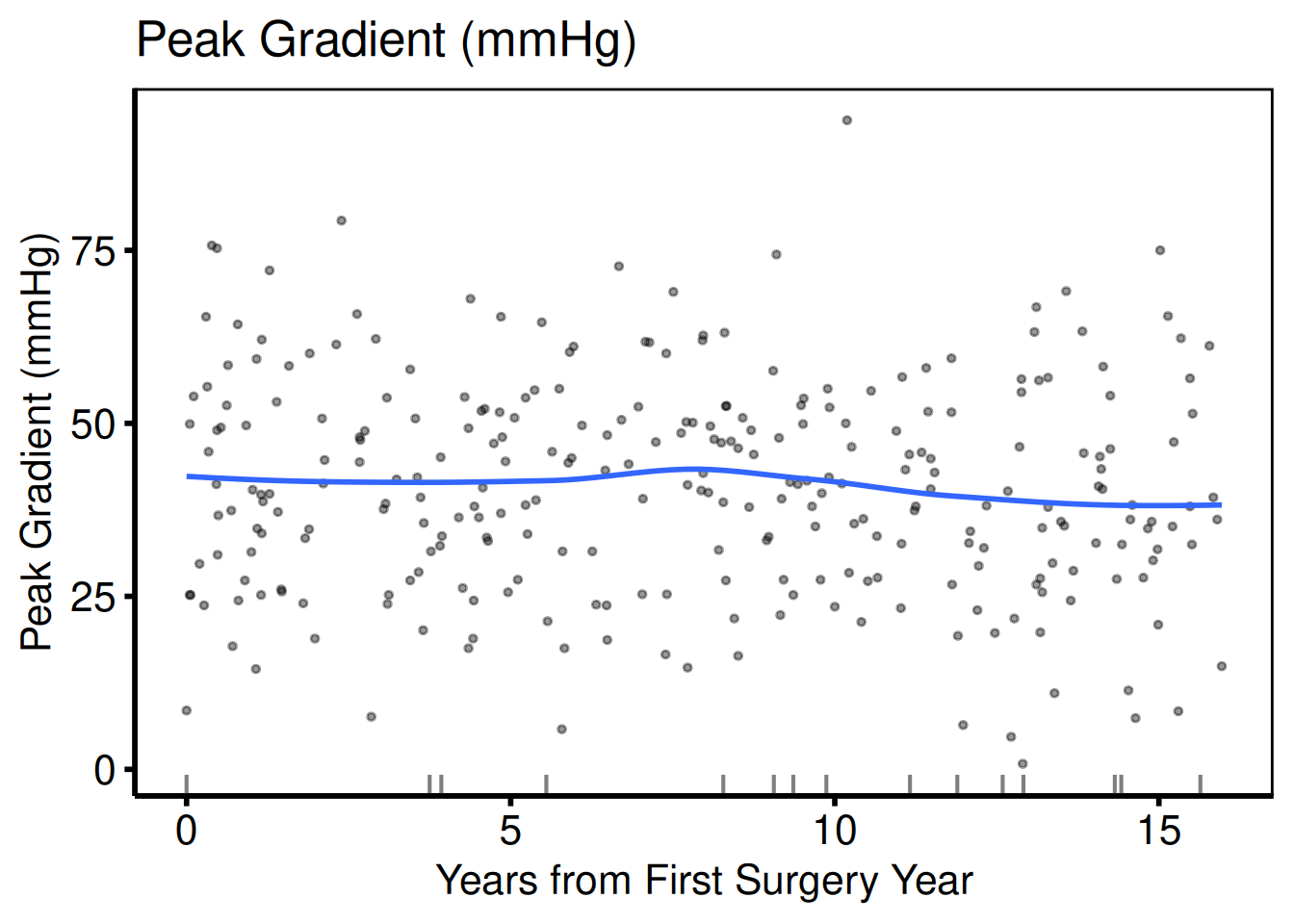
Saving EDA plots
patchwork::wrap_plots() arranges multiple plots into a grid and ggsave() writes each page to a separate PDF file.
all_plots <- c(p_bin, p_cat, p_cont)
per_page  <- 9L  # 3 x 3 grid

for (pg in seq(1, length(all_plots), by = per_page)) {
  idx     <- seq(pg, min(pg + per_page - 1L, length(all_plots)))
  pg_plot <- patchwork::wrap_plots(all_plots[idx], nrow = 3, ncol = 3)
  ggsave(
    filename = sprintf("../graphs/eda_page%02d.pdf", ceiling(pg / per_page)),
    plot     = pg_plot,
    width    = 14,
    height   = 14
  )
}
Alluvial (Sankey) Plot
hv_alluvial() prepares an alluvial (Sankey-style) diagram using ggalluvial, so you can see how patients flow between states across time points or treatment stages. Each row of the input is a unique combination of axis values with an associated patient count; plot() draws flows proportional to that count. Ports tp.dp.female_bicus_preAR_sankey.R.
Sample data
sample_alluvial_data() simulates 300 patients with pre-operative AR grade, procedure type, and post-operative AR grade columns. The axes vector defines the left-to-right display order; each unique combination of axis values becomes one band, sized by its freq count.
dta_al  <- sample_alluvial_data(n = 300, seed = 42)
axes    <- c("pre_ar", "procedure", "post_ar")
head(dta_al)
pre_ar procedure post_ar freq
1 Mild Repair Mild 3
2 Moderate Repair Mild 7
4 Severe Repair Mild 5
5 Mild Replacement Mild 3
6 Moderate Replacement Mild 25
8 Severe Replacement Mild 17Bare plot
The bare panel shows flows between the three axis stages with uniform fill and no colour, labels, or theme. Look for: bands that connect every level of pre_ar through procedure to every level of post_ar, with band widths proportional to the freq column; missing bands indicate a combination that does not occur in the data.
al <- hv_alluvial(dta_al, axes = axes, y_col = "freq")
plot(al)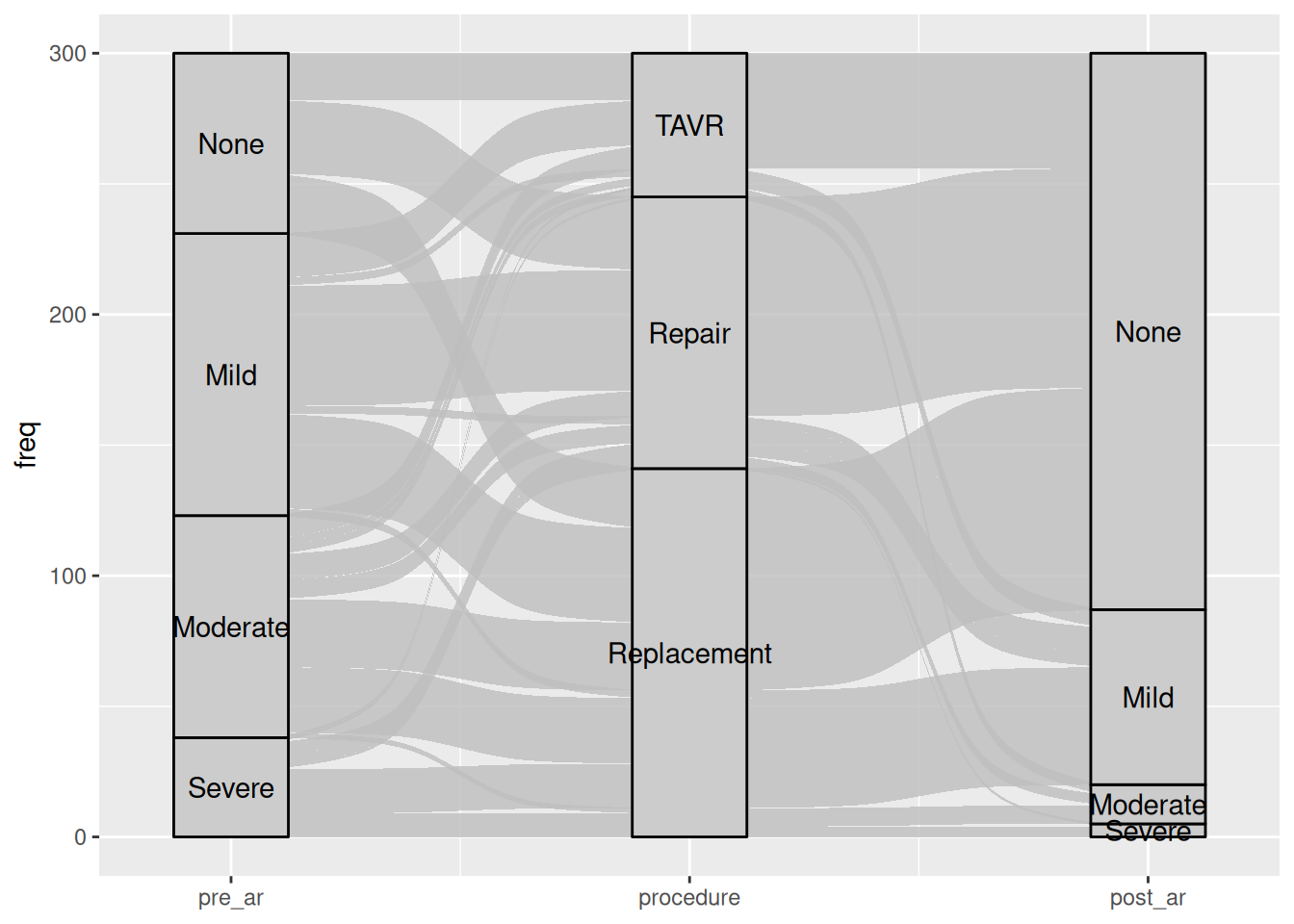
Fill flows by pre-operative grade
Pass fill_col to the constructor to colour each flow band by the value of a categorical column. Here pre-operative AR grade colours the bands so you can trace how each grade distributes across procedure types and post-operative outcomes. Swap scale_fill_manual() for scale_fill_brewer() when your levels map naturally to a diverging palette.
al_filled <- hv_alluvial(dta_al, axes = axes, y_col = "freq",
                            fill_col = "pre_ar")

plot(al_filled) +
  scale_fill_manual(
    values = c(None     = "steelblue",
               Mild     = "goldenrod",
               Moderate = "darkorange",
               Severe   = "firebrick"),
    name = "Pre-op AR"
  ) +
  scale_colour_manual(
    values = c(None     = "steelblue",
               Mild     = "goldenrod",
               Moderate = "darkorange",
               Severe   = "firebrick"),
    guide = "none"
  ) +
  scale_x_continuous(
    breaks = 1:3,
    labels = c("Pre-op AR", "Procedure", "Post-op AR"),
    expand = c(0.05, 0.05)
  ) +
  labs(y = "Patients (n)",
       title = "AV Regurgitation: Pre- to Post-operative") +
  theme_hv_poster()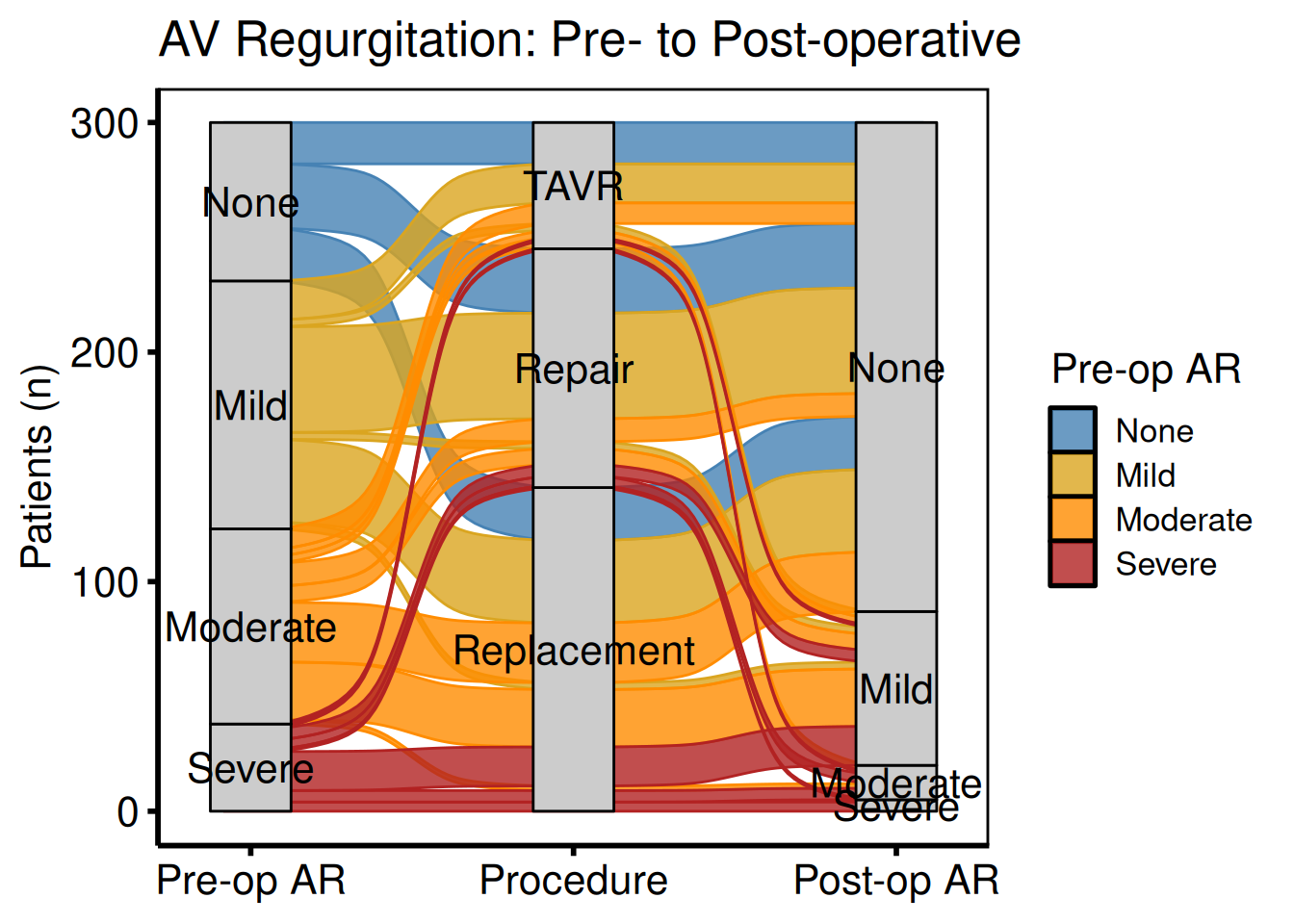
Two-axis before / after comparison
When you only need to compare two time points (pre- and post-operative), drop the middle axis and pass just two columns to axes. Use custom axis_labels to replace the raw column names with readable stage labels, and annotate() to call out the direction of change directly on the panel.
al2 <- hv_alluvial(
  dta_al,
  axes        = c("pre_ar", "post_ar"),
  y_col       = "freq",
  fill_col    = "pre_ar",
  axis_labels = c("Pre-operative", "Post-operative")
)

plot(al2) +
  scale_fill_brewer(palette = "RdYlGn", direction = -1,
                    name = "AR Grade") +
  scale_colour_brewer(palette = "RdYlGn", direction = -1,
                      guide = "none") +
  annotate("text", x = 1.5, y = 250,
           label = "Improvement after surgery",
           size = 3.5, fontface = "italic") +
  labs(y = "Patients (n)",
       title = "AV Regurgitation Before and After Surgery") +
  theme_hv_poster()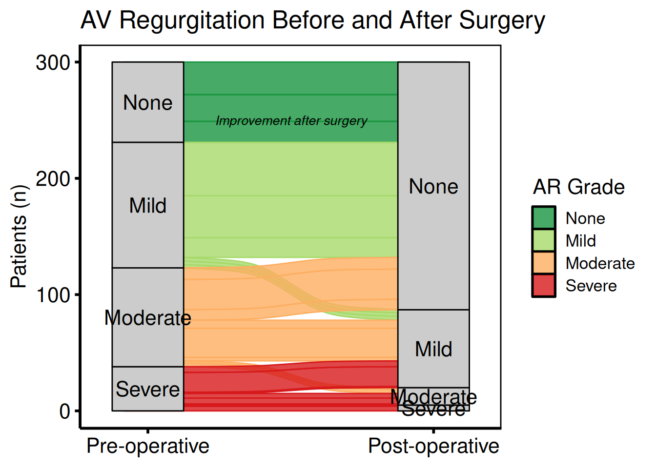
Saving
ggsave() writes the alluvial figure at 8 x 6 inches – wider than tall to give the horizontal flow diagram room. For a PowerPoint version, see Decorating and Saving.
p_al <- plot(al_filled) +
  scale_fill_brewer(palette = "RdYlGn", direction = -1) +
  scale_colour_brewer(palette = "RdYlGn", direction = -1, guide = "none") +
  labs(y = "Patients (n)") +
  theme_hv_poster()

ggsave("../graphs/alluvial.pdf", p_al, width = 8, height = 6)
Cluster Stability Sankey Plot
hv_sankey() prepares a Sankey diagram that lets you watch how patient cluster assignments shift as you increase K — a visual test of cluster stability. Where the bands stay wide and orderly, the solution holds; where they cross and fragment, you can see at a glance that K has grown past what the data supports. It ports the PAM cluster stability figure from the HVTI clustering analysis pipeline. Each column represents one value of K (default K = 2 to 9); each band shows the fraction of patients whose assignment changes between consecutive K values. Node labels show the cluster letter and count.
Requires ggsankey (not on CRAN):
remotes::install_github("davidsjoberg/ggsankey")Sample data
sample_cluster_sankey_data() returns 300 patients with nine cluster-assignment columns (C2 through C9), where each column gives the PAM cluster label at that K. table(dta_san$C9) confirms the marginal counts at K = 9 before you pass the data to the constructor.
dta_san <- sample_cluster_sankey_data(n = 300, seed = 42)
head(dta_san)
C2 C3 C4 C5 C6 C7 C8 C9
1 B B B B F F H H
2 B B B B F F H H
3 A A A A A A A A
4 A A A A A G G G
5 B B D D D D D D
6 B B B B F F F F
table(dta_san$C9)
 B  F  H  D  I  C  E  G  A
59 39 22 26 11 42 38 22 41
Default plot (K = 2 to 9)
hv_sankey() reads the nine cluster-assignment columns (C2 through C9) and builds the Sankey data automatically. Call plot() and add a title and theme; the default Set1 palette assigns one colour per cluster letter. Look for: wide bands that stay intact across K values, indicating a stable partition; heavy crossing and fragmentation signal that K has grown past what the data supports.
sk <- hv_sankey(dta_san)
plot(sk) +
  labs(title = "Cluster Stability: K = 2 to 9") +
  theme_hv_poster()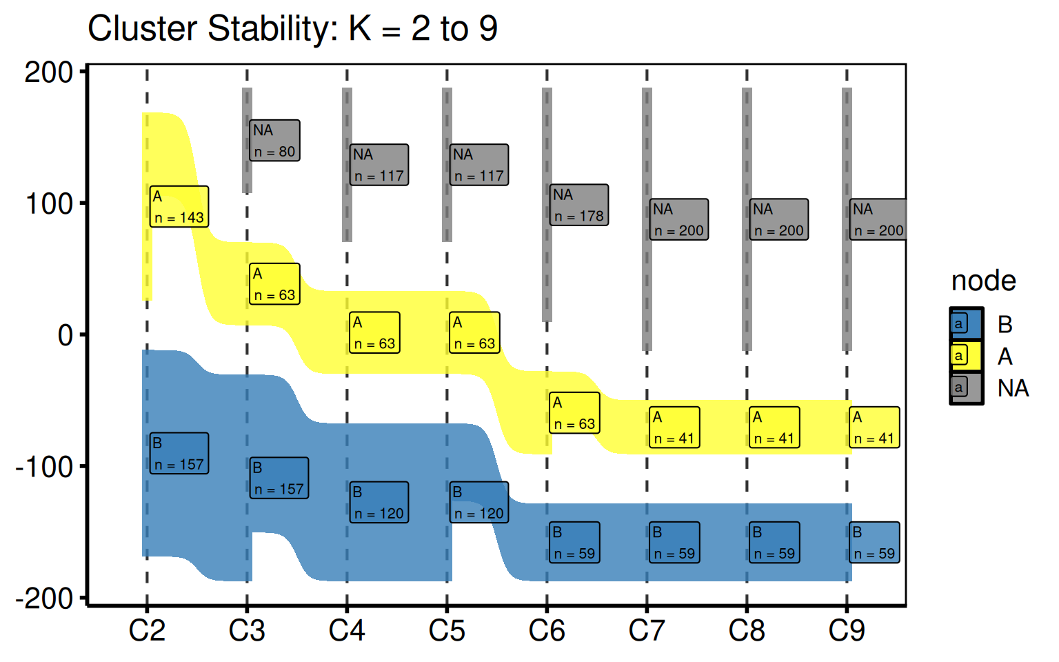
Custom colour palette
Replace the default Set1 colours with a fully custom named vector. Names must match the node labels in the data.
my_cols <- c(
  A = "#1f77b4", B = "#ff7f0e", C = "#2ca02c", D = "#d62728",
  E = "#9467bd", F = "#8c564b", G = "#e377c2", H = "#7f7f7f",
  I = "#bcbd22"
)
sk_custom <- hv_sankey(dta_san, node_colours = my_cols)
plot(sk_custom) +
  labs(title = "Cluster Stability: K = 2 to 9") +
  theme_hv_poster()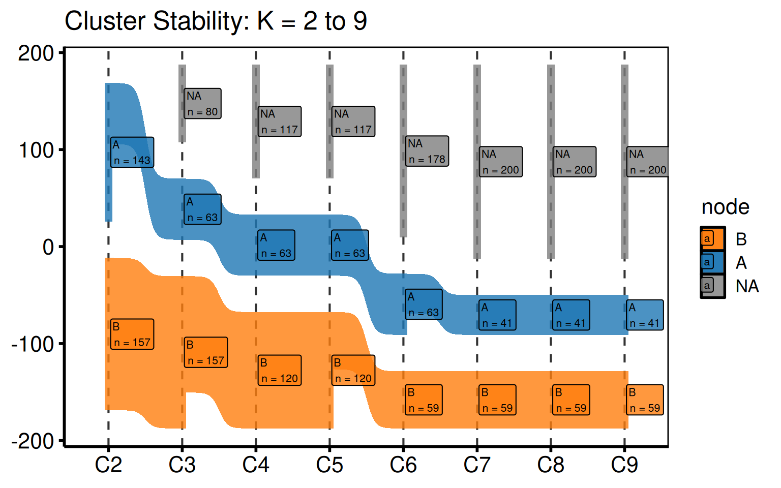
Subset of K values
Pass a shorter cluster_cols vector to the constructor to show only a range of K. This is useful when a stability plateau is already evident and you want to focus the figure on, say, K = 2 to 6 for a manuscript panel.
sk_sub <- hv_sankey(dta_san, cluster_cols = paste0("C", 2:6))
plot(sk_sub) +
  labs(title = "Cluster Stability: K = 2 to 6") +
  theme_hv_poster()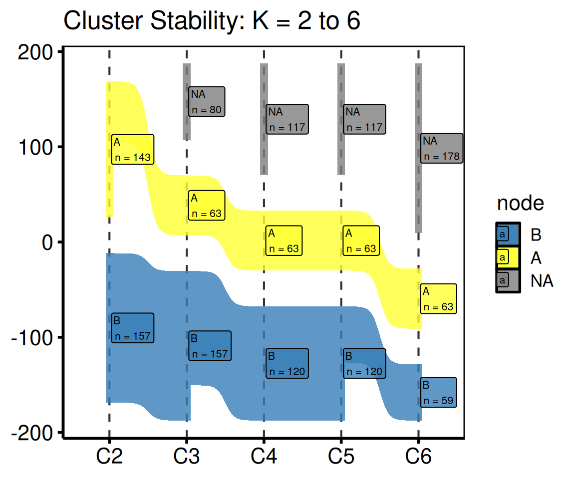
Saving
ggsave() writes the figure at 8 x 5 inches – wide enough to spread K = 2 through K = 9 across the panel. For a PowerPoint version, see Decorating and Saving.
p_san <- plot(sk) +
  labs(title = "PAM Cluster Stability") +
  theme_hv_poster()

ggsave("../graphs/sankey_clusters.pdf", p_san, width = 8, height = 5)
CONSORT Patient Flow Diagram
hv_consort() builds a CONSORT-style patient-flow diagram via a three-step API: hv_consort_start() initializes a patient-level tracker, hv_consort_exclude() adds exclusion stages, and hv_consort() renders the result. Because the diagram is drawn by the consort package (grid graphics), it is not a ggplot and you don’t decorate it with +.
Sample data
The quickest way to see a finished tracker is sample_consort_data(), which simulates a cardiac-surgery cohort and returns a three-stage hv_consort_tracker.
tracker <- sample_consort_data(n = 300, seed = 42)
tracker
<hv_consort_tracker>
Patients : 300
ID column : patient_id
Stages : 3
[screened] Screened -- N = 300
-> excl [excl_screen]: 73
[eligible] Eligible -- N = 227
-> excl [excl_eligible]: 41
[analyzed] Analyzed -- N = 186Building a tracker from your own data
Start from a data frame with one row per patient. hv_consort_start() records the patient identifier and marks every patient as screened; each hv_consort_exclude() call adds an exclusion stage. Exclusion rules are two-sided formulas — <condition> ~ "<reason>" — evaluated against the data. The first matching rule wins, and patients dropped in an earlier stage are automatically skipped in later ones, so each stage operates only on the survivors of the last.
set.seed(42)
cohort <- data.frame(
  mrn         = paste0("P", 1:300),
  age         = sample(12:85, 300, replace = TRUE),
  had_surgery = sample(c(TRUE, FALSE), 300, replace = TRUE, prob = c(0.9, 0.1)),
  echo        = sample(c(TRUE, FALSE), 300, replace = TRUE, prob = c(0.85, 0.15))
)

tracker2 <- hv_consort_start(cohort, patient_id = mrn, label = "Screened") |>
  hv_consort_exclude(
    label        = "Eligible",
    col          = "excl_screen",
    age < 18     ~ "Age < 18",
    !had_surgery ~ "No qualifying surgery"
  ) |>
  hv_consort_exclude(
    label = "Analyzed",
    col   = "excl_eligible",
    !echo ~ "Missing echocardiogram"
  )
tracker2
<hv_consort_tracker>
Patients : 300
ID column : mrn
Stages : 3
[screened] Screened -- N = 300
-> excl [excl_screen]: 59
[eligible] Eligible -- N = 241
-> excl [excl_eligible]: 32
[analyzed] Analyzed -- N = 209The diagram
hv_consort() derives the box layout from the tracker’s stage metadata and renders the diagram; plot() draws it. By default every exclusion column is shown as a side box — pass a character vector to side_box to select specific ones.
fig <- hv_consort(tracker)
plot(fig)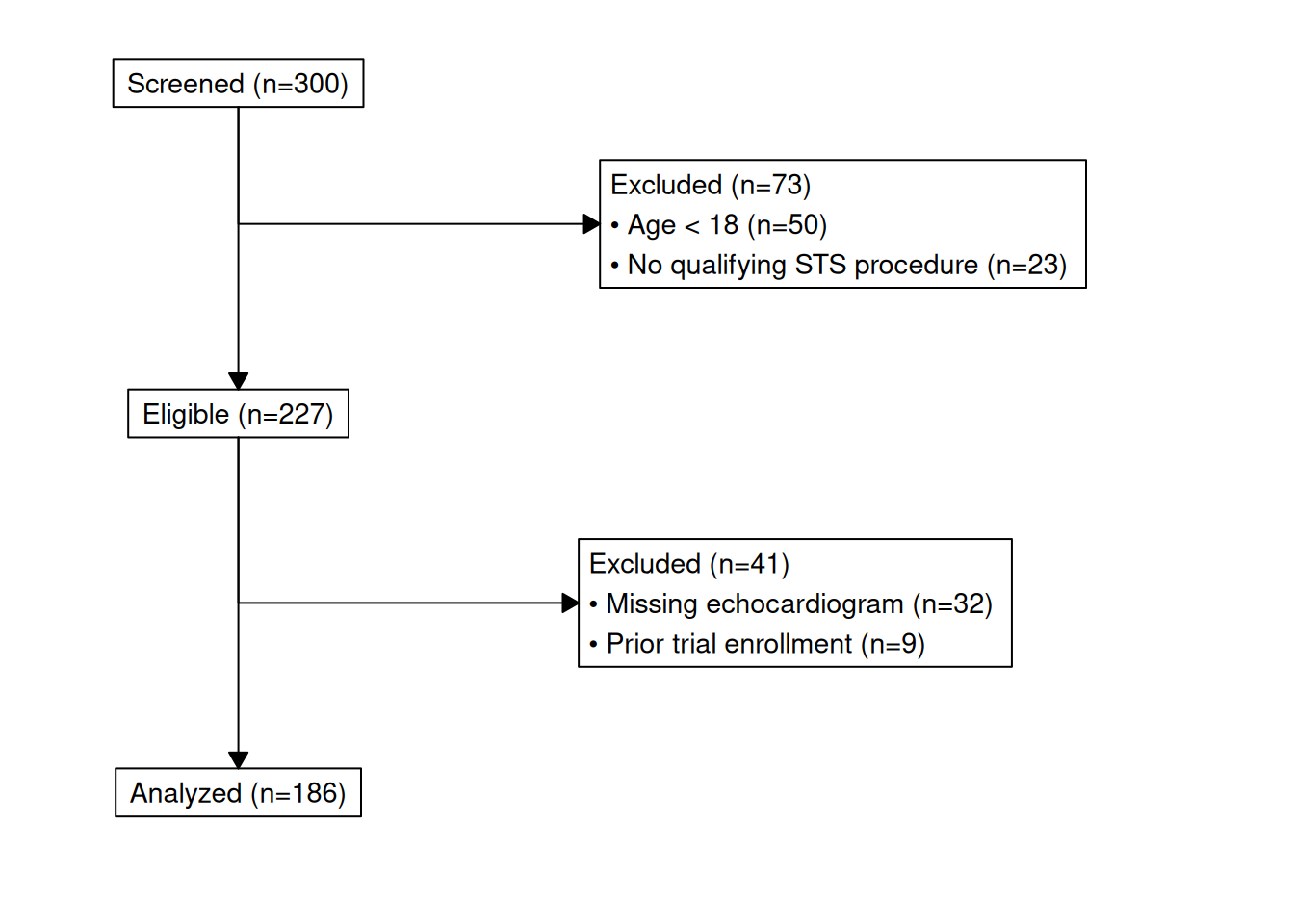
Auditing the cohort
Two helpers keep the tracker auditable. hv_consort_summary() returns a per-stage count table suitable for a methods section:
hv_consort_summary(tracker) label include_col n_included excl_col n_excluded
1 Screened screened 300 excl_screen 73
2 Eligible eligible 227 excl_eligible 41
3 Analyzed analyzed 186 <NA> NAhv_consort_patients() returns the patient IDs active at a stage, or the subset excluded for a specific reason:
# IDs still in the analysed cohort
head(hv_consort_patients(tracker, "Analyzed"))
[1] "PT0001" "PT0002" "PT0003" "PT0004" "PT0005" "PT0007"
# IDs dropped at screening for being under 18
head(hv_consort_patients(tracker, "Screened", reason = "Age < 18"))
[1] "PT0008" "PT0018" "PT0022" "PT0025" "PT0035" "PT0037"Saving
save_ppt() accepts an hv_consort object and writes the diagram to a slide as an editable vector graphic. The slide dimensions come from the object itself (set at hv_consort() time), so width/height are not needed here.
save_ppt(
  object       = hv_consort(tracker),
  template     = "../graphs/RD.pptx",
  powerpoint   = "../graphs/consort.pptx",
  slide_titles = "CONSORT Patient Flow"
)
Hazard Plot
hazard_plot() plots pre-computed parametric curves — survival, hazard, or cumulative hazard — from a fitted Weibull or other parametric model, with optional Kaplan-Meier empirical overlay and population life-table reference. It ports the entire tp.hp.dead.* SAS template family.
The input data comes from two sources that map directly to the SAS output:
| Column set | SAS dataset | R function |
|---|---|---|
| Parametric prediction grid |
predict (SSURVIV, SCLLSURV, SCLUSURV) |
sample_hazard_data() |
| KM empirical overlay |
plout (CUM_SURV, CL_LOWER, CL_UPPER) |
sample_hazard_empirical() |
| Population life table | smatched |
sample_life_table() |
Sample data
sample_hazard_data() generates the parametric prediction grid (one row per time point) with survival, hazard, and cumhaz columns plus their CI bounds – the same shape as the SAS predict dataset. sample_hazard_empirical() generates the KM empirical overlay with 6 binned time intervals, matching the plout dataset. Both use the same cohort size so the overlay aligns.
dat_hp  <- sample_hazard_data(n = 500, time_max = 10)
emp_hp  <- sample_hazard_empirical(n = 500, time_max = 10, n_bins = 6)
head(dat_hp)
time survival surv_lower surv_upper hazard haz_lower haz_upper
1 0.01000000 99.99558 99.93731 100 0.6629126 0.3996474 1.099602
2 0.03002004 99.97702 99.84413 100 1.1485818 0.6924408 1.905203
3 0.05004008 99.95054 99.75561 100 1.4829116 0.8939968 2.459770
4 0.07006012 99.91808 99.66720 100 1.7546549 1.0578216 2.910523
5 0.09008016 99.88059 99.57770 100 1.9896233 1.1994760 3.300275
6 0.11010020 99.83868 99.48662 100 2.1996335 1.3260840 3.648628
cumhaz cumhaz_lower cumhaz_upper
1 0.004419417 0 0.5871202
2 0.022986980 0 1.3519229
3 0.049470012 0 1.9990187
4 0.081954223 0 2.5912321
5 0.119483723 0 3.1493081
6 0.161453396 0 3.6834317Survival curve with KM overlay
The most common tp.hp.dead.sas output: smooth parametric survival with confidence band plus discrete KM empirical circles and error bars.
hazard_plot(
  dat_hp,
  estimate_col  = "survival",
  lower_col     = "surv_lower",
  upper_col     = "surv_upper",
  empirical     = emp_hp,
  emp_lower_col = "lower",
  emp_upper_col = "upper"
) +
  scale_colour_manual(values = c("steelblue"), guide = "none") +
  scale_fill_manual(values = c("steelblue"), guide = "none") +
  scale_x_continuous(limits = c(0, 10), breaks = 0:10) +
  scale_y_continuous(limits = c(0, 100), breaks = seq(0, 100, 20),
                     labels = function(x) paste0(x, "%")) +
  labs(x = "Years", y = "Survival (%)") +
  theme_hv_poster()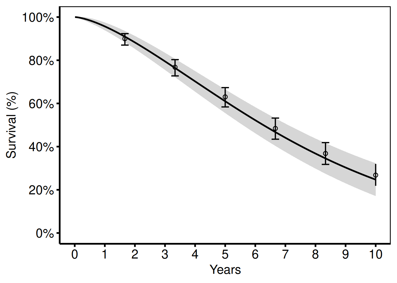
Hazard rate curve
Switching estimate_col to "hazard" (and the matching CI columns) shows the instantaneous hazard rate (%/year) instead of survival.
hazard_plot(
  dat_hp,
  estimate_col = "hazard",
  lower_col    = "haz_lower",
  upper_col    = "haz_upper"
) +
  scale_colour_manual(values = c("firebrick"), guide = "none") +
  scale_fill_manual(values = c("firebrick"), guide = "none") +
  scale_x_continuous(limits = c(0, 10), breaks = 0:10) +
  scale_y_continuous(limits = c(0, 30),
                     labels = function(x) paste0(x, "%/yr")) +
  labs(x = "Years", y = "Hazard (%/year)") +
  theme_hv_poster()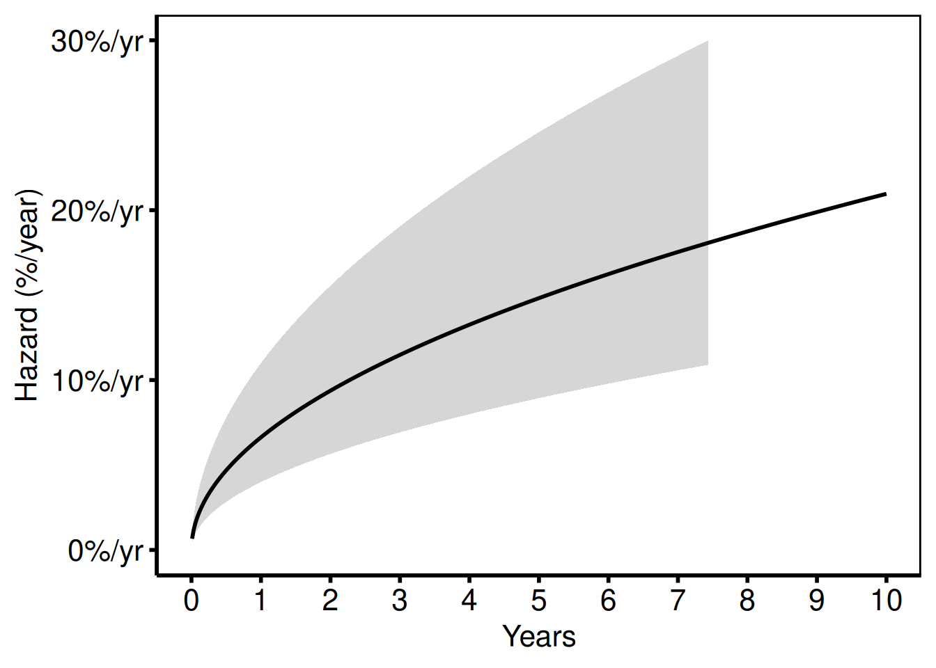
Cumulative hazard
Used for readmission and repeated-event analyses (tp.hp.event.weighted.sas, tp.hp.repeated_events.sas). The "cumhaz" column equals -log(S) * 100.
hazard_plot(
  dat_hp,
  estimate_col  = "cumhaz",
  lower_col     = "cumhaz_lower",
  upper_col     = "cumhaz_upper"
) +
  scale_colour_manual(values = c("darkorange"), guide = "none") +
  scale_fill_manual(values = c("darkorange"), guide = "none") +
  scale_x_continuous(limits = c(0, 10), breaks = 0:10) +
  labs(x = "Years", y = "Cumulative Hazard (%)") +
  theme_hv_poster()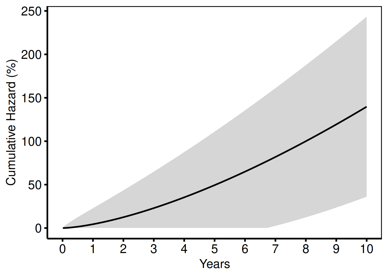
Stratified by group
Pass group_col to compare two or more groups (tp.hp.dead.tkdn.stratified.sas).
dat_strat <- sample_hazard_data(
  n = 400, time_max = 10,
  groups = c("No Takedown" = 1.0, "Takedown" = 0.65)
)
emp_strat <- sample_hazard_empirical(
  n = 400, time_max = 10, n_bins = 6,
  groups = c("No Takedown" = 1.0, "Takedown" = 0.65)
)

hazard_plot(
  dat_strat,
  estimate_col  = "survival",
  lower_col     = "surv_lower",
  upper_col     = "surv_upper",
  group_col     = "group",
  empirical     = emp_strat,
  emp_lower_col = "lower",
  emp_upper_col = "upper"
) +
  scale_colour_manual(
    values = c("No Takedown" = "steelblue", "Takedown" = "firebrick"),
    name   = NULL
  ) +
  scale_fill_manual(
    values = c("No Takedown" = "steelblue", "Takedown" = "firebrick"),
    guide  = "none"
  ) +
  scale_x_continuous(limits = c(0, 10), breaks = 0:10) +
  scale_y_continuous(limits = c(0, 100), breaks = seq(0, 100, 20),
                     labels = function(x) paste0(x, "%")) +
  labs(x = "Years after Esophagostomy", y = "Survival (%)") +
  theme_hv_poster()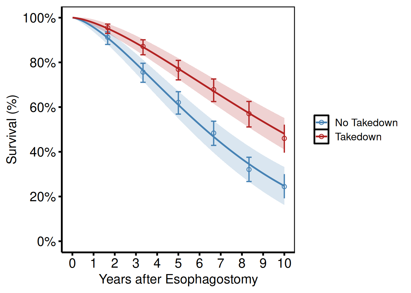
Life-table overlay
tp.hp.dead.age_with_population_life_table.sas and tp.hp.dead.uslife.stratifed.sas overlay US population life-table survival (dashed lines) on age-stratified study curves. Pass the life-table data frame to reference and set ref_group_col to vary the linetype by age group.
dat_age <- sample_hazard_data(
  n = 600, time_max = 12,
  groups = c("<65" = 0.5, "65\u201380" = 1.0, "\u226580" = 1.8)
)
emp_age <- sample_hazard_empirical(
  n = 600, time_max = 12, n_bins = 6,
  groups = c("<65" = 0.5, "65\u201380" = 1.0, "\u226580" = 1.8)
)
lt <- sample_life_table(
  age_groups = c("<65", "65\u201380", "\u226580"),
  age_mids   = c(55, 72, 85),
  time_max   = 12
)

hazard_plot(
  dat_age,
  estimate_col     = "survival",
  lower_col        = "surv_lower",
  upper_col        = "surv_upper",
  group_col        = "group",
  empirical        = emp_age,
  emp_lower_col    = "lower",
  emp_upper_col    = "upper",
  reference        = lt,
  ref_estimate_col = "survival",
  ref_group_col    = "group"
) +
  scale_colour_manual(
    values = c("<65" = "steelblue", "65\u201380" = "forestgreen",
               "\u226580" = "firebrick"),
    name   = "Age group"
  ) +
  scale_fill_manual(
    values = c("<65" = "steelblue", "65\u201380" = "forestgreen",
               "\u226580" = "firebrick"),
    guide  = "none"
  ) +
  scale_x_continuous(limits = c(0, 12), breaks = seq(0, 12, 2)) +
  scale_y_continuous(limits = c(0, 100), breaks = seq(0, 100, 20),
                     labels = function(x) paste0(x, "%")) +
  labs(x = "Years", y = "Survival (%)",
       caption = "Dashed lines: US population life table") +
  theme_hv_poster()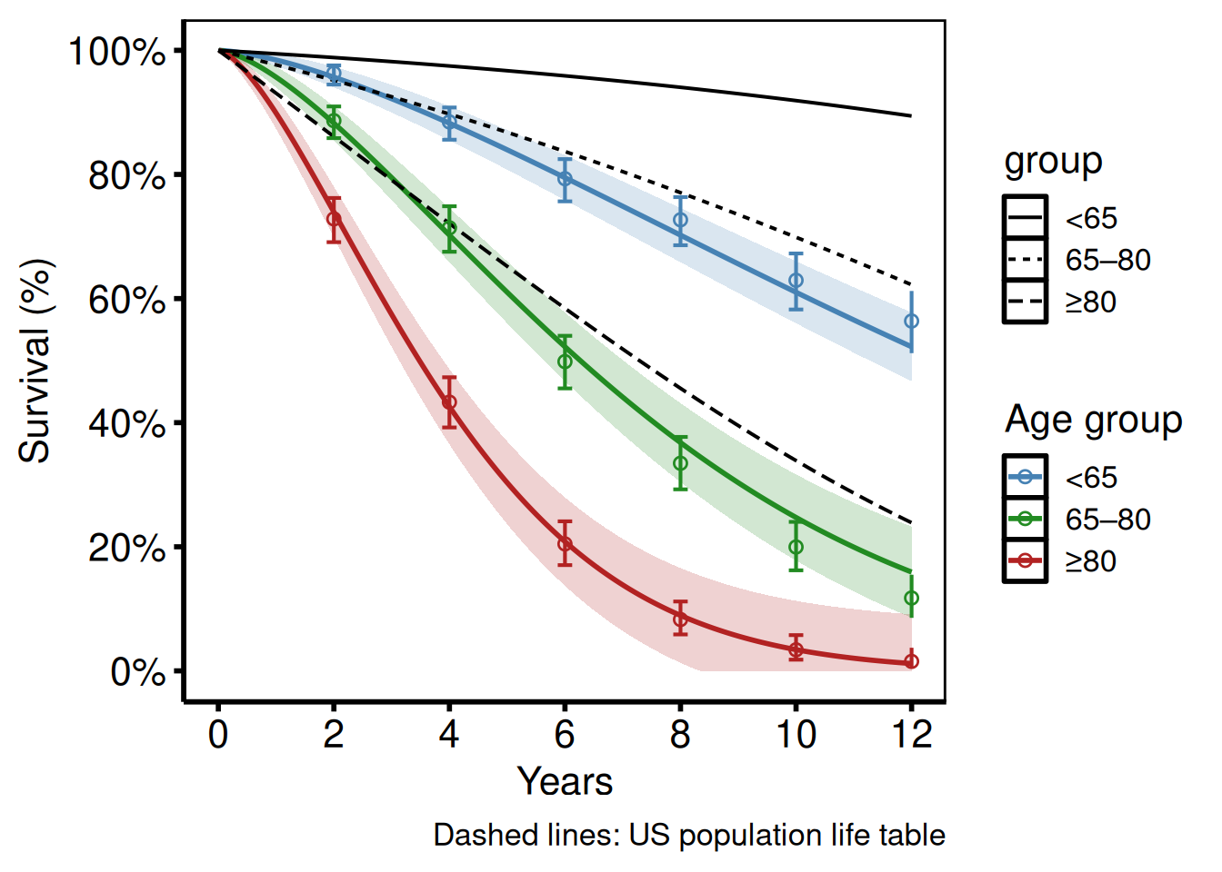
Survival Difference (Life-Gained) Plot
survival_difference_plot() plots the difference S_2(t) - S_1(t) between two groups over time, with an optional confidence band. This ports tp.hp.dead.life-gained.sas (HAZDIFL macro output).
Sample data
sample_survival_difference_data() generates two groups with a specified hazard-ratio contrast and returns the point-wise difference S_2(t) - S_1(t) with bootstrap CI bounds, matching the HAZDIFL macro output columns. Both control and treatment groups are simulated at the same n to keep the CI width realistic.
diff_dat <- sample_survival_difference_data(
  n      = 500,
  groups = c("Control" = 1.0, "Treatment" = 0.70)
)
head(diff_dat)
time difference diff_lower diff_upper group1_surv group2_surv
1 0.01000000 0.001831068 -0.03739885 0.04106099 99.99558 99.99741
2 0.03002004 0.009522643 -0.08737593 0.10642122 99.97702 99.98654
3 0.05004008 0.020489267 -0.13072627 0.17170481 99.95054 99.97103
4 0.07006012 0.033934691 -0.17121839 0.23908777 99.91808 99.95201
5 0.09008016 0.049459769 -0.21006489 0.30898443 99.88059 99.93005
6 0.11010020 0.066810699 -0.24784775 0.38146915 99.83868 99.90549Survival difference curve
survival_difference_plot() takes the pre-computed difference and CI columns directly – no grouping argument needed for the two-group case. The dashed horizontal line at zero makes the no-benefit baseline immediately visible; a positive difference means the treatment group has higher survival.
survival_difference_plot(
  diff_dat,
  lower_col = "diff_lower",
  upper_col = "diff_upper"
) +
  scale_colour_manual(values = c("steelblue"), guide = "none") +
  scale_fill_manual(values = c("steelblue"), guide = "none") +
  ggplot2::geom_hline(yintercept = 0, linetype = "dashed",
                      colour = "grey50") +
  scale_x_continuous(limits = c(0, 10), breaks = 0:10) +
  scale_y_continuous(limits = c(-5, 40),
                     labels = function(x) paste0(x, "%")) +
  labs(x = "Years", y = "Survival Difference (%)") +
  theme_hv_poster()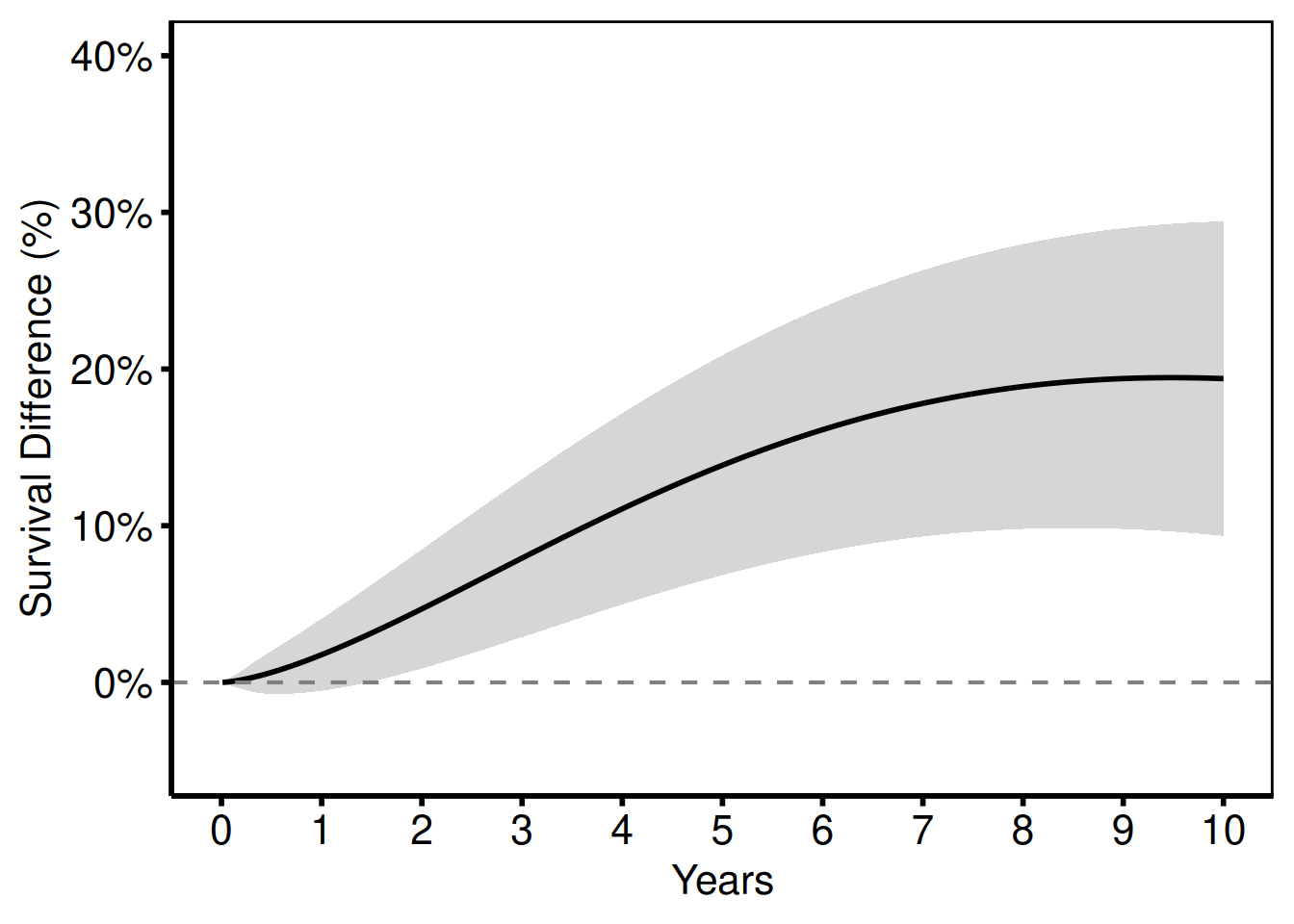
Multiple comparisons
Combine several two-group differences into one long data frame and use group_col to overlay them.
d1 <- sample_survival_difference_data(
  groups = c("Medical Mgmt" = 1.0, "TF-TAVR" = 0.70), seed = 1L
)
d1$comparison <- "TF-TAVR vs Medical Mgmt"

d2 <- sample_survival_difference_data(
  groups = c("TA-TAVR" = 0.90, "TF-TAVR" = 0.70), seed = 2L
)
d2$comparison <- "TF-TAVR vs TA-TAVR"

d3 <- sample_survival_difference_data(
  groups = c("AVR" = 0.80, "TF-TAVR" = 0.70), seed = 3L
)
d3$comparison <- "TF-TAVR vs AVR"

survival_difference_plot(rbind(d1, d2, d3),
                         group_col = "comparison") +
  scale_colour_brewer(palette = "Set1", name = NULL) +
  scale_fill_brewer(palette = "Set1", guide = "none") +
  ggplot2::geom_hline(yintercept = 0, linetype = "dashed",
                      colour = "grey50") +
  scale_x_continuous(limits = c(0, 10), breaks = 0:10) +
  labs(x = "Years", y = "Survival Difference (%)") +
  theme_hv_poster()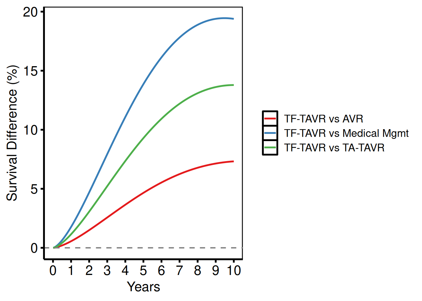
Number Needed to Treat (NNT) Plot
nnt_plot() plots the number needed to treat and absolute risk reduction over time, porting the NNT component of tp.hp.numtreat.survdiff.matched.sas.
Sample data
sample_nnt_data() generates two survival curves with a specified hazard-ratio contrast and computes NNT and ARR at each time point with CI bounds, matching the structure of the tp.hp.numtreat.survdiff.matched.sas output. The groups argument sets the group names and their hazard multipliers.
nnt_dat <- sample_nnt_data(
  n      = 500,
  time_max = 20,
  groups = c("SVG" = 1.0, "ITA" = 0.75)
)
head(nnt_dat)
time arr arr_lower arr_upper nnt nnt_lower nnt_upper
1 0.01000000 0.001548865 -0.03849194 0.04158967 NA NA NA
2 0.05006012 0.017341632 -0.13725732 0.17194059 NA 581.5963 NA
3 0.09012024 0.041863418 -0.22369142 0.30741825 NA 325.2897 NA
4 0.13018036 0.072628007 -0.30691800 0.45217401 NA 221.1538 NA
5 0.17024048 0.108520503 -0.38909707 0.60613807 921.4849 164.9789 NA
6 0.21030060 0.148855060 -0.47112585 0.76883597 671.7944 130.0668 NANNT curve
NNT decreases over time as the treatment benefit accumulates — early in follow-up you need to treat many patients to prevent one event; by later years the survival gap has widened enough that fewer do.
nnt_plot(
  nnt_dat,
  lower_col = "nnt_lower",
  upper_col = "nnt_upper"
) +
  scale_colour_manual(values = c("steelblue"), guide = "none") +
  scale_fill_manual(values = c("steelblue"), guide = "none") +
  scale_x_continuous(limits = c(0, 20), breaks = seq(0, 20, 5)) +
  scale_y_continuous(limits = c(0, 50), breaks = seq(0, 50, 10)) +
  labs(x = "Years", y = "Number Needed to Treat") +
  theme_hv_poster()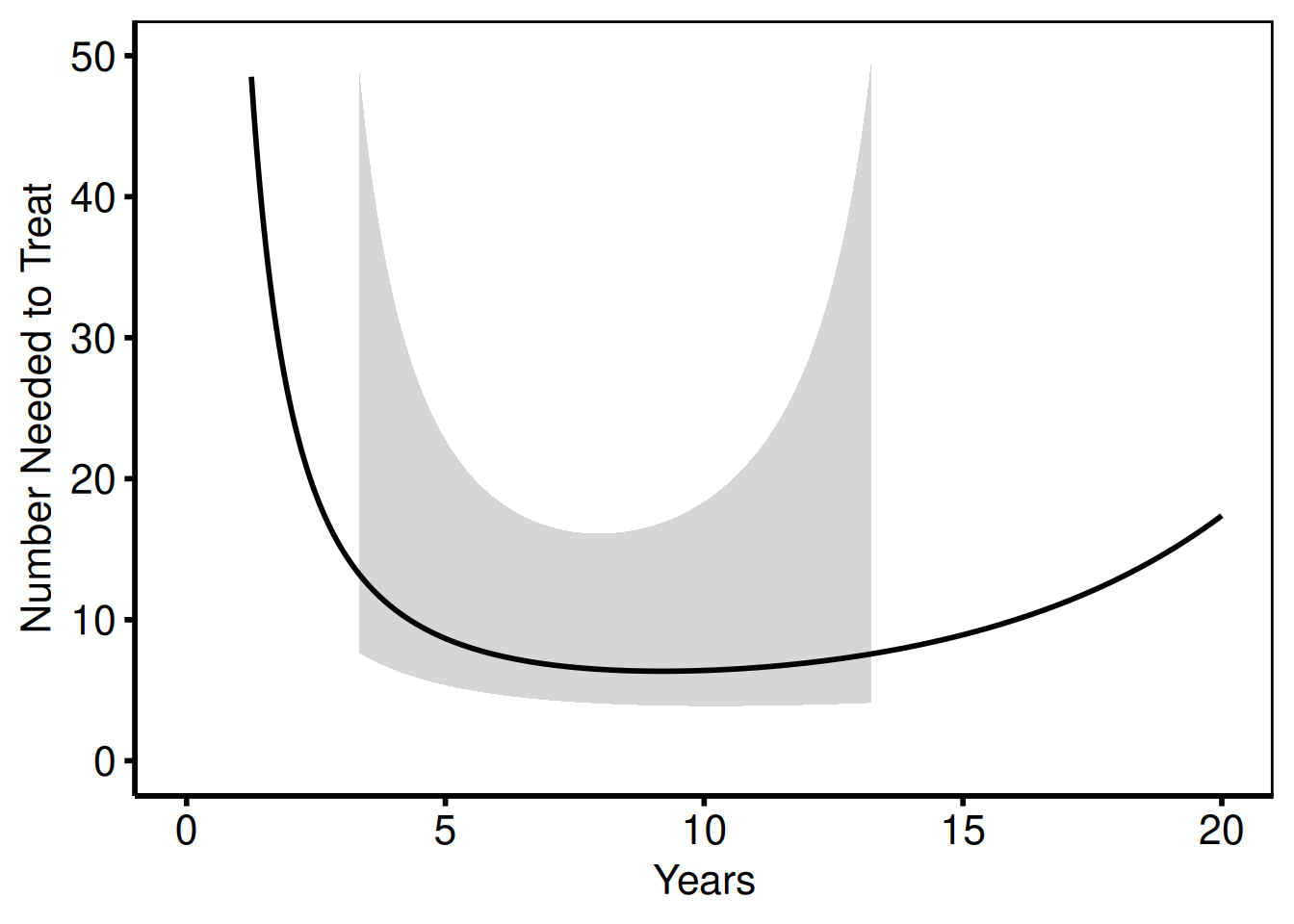
Absolute risk reduction
The same data, plotted as ARR (%) instead of NNT.
nnt_plot(
  nnt_dat,
  estimate_col = "arr",
  lower_col    = "arr_lower",
  upper_col    = "arr_upper"
) +
  scale_colour_manual(values = c("firebrick"), guide = "none") +
  scale_fill_manual(values = c("firebrick"), guide = "none") +
  scale_x_continuous(limits = c(0, 20), breaks = seq(0, 20, 5)) +
  scale_y_continuous(limits = c(0, 50),
                     labels = function(x) paste0(x, "%")) +
  labs(x = "Years", y = "Absolute Risk Reduction (%)") +
  theme_hv_poster()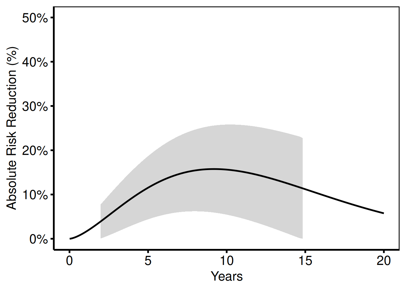
Saving
ggsave() writes the parametric survival figure at 11.5 x 8 inches, the standard landscape size for the SAS template output. For a PowerPoint version, see Decorating and Saving.
p_hp <- hazard_plot(
  dat_hp,
  estimate_col  = "survival",
  lower_col     = "surv_lower",
  upper_col     = "surv_upper",
  empirical     = emp_hp,
  emp_lower_col = "lower",
  emp_upper_col = "upper"
) +
  scale_colour_manual(values = c("steelblue"), guide = "none") +
  scale_fill_manual(values = c("steelblue"), guide = "none") +
  labs(x = "Years", y = "Survival (%)") +
  theme_hv_poster()

ggsave("../graphs/hazard_survival.pdf", p_hp, width = 11.5, height = 8)
Temporal Trend Plot
hv_trends() ports the pattern from five SAS/R templates:
| Template | Study | Key pattern |
|---|---|---|
tp.rp.trends.sas |
Tricuspid valve replacement, 1968–2000 | Single continuous outcome vs operation year |
tp.lp.trends.sas |
Post-infarct VSD, 1969–2000 | Binary % outcomes, x 1970–2000 by 10, y 0–100 |
tp.lp.trends.age.sas |
Mitral valve surgery, 1990–1999 | Binary % vs age (not year), x 25–85 by 10 |
tp.lp.trends.polytomous.sas |
Tricuspid valve repair, 1990–1999 | Polytomous (≥3) groups, x 1990–1999 by 1 |
tp.dp.trends.R |
Mitral degeneration, 1985–2015 | NYHA %, LV mass, %CHF, case volume, LOS |
The constructor accepts patient-level data and computes annual summaries (mean or median) internally. plot() returns a bare ggplot; add scales, labels, annotations, and theme_hv_manuscript().
Sample data
sample_trends_data() generates patient-level data that hv_trends() then aggregates by year. The year_range and groups arguments mirror the study period and group structure from the SAS template you’re porting; the 1968–2000 window below matches tp.rp.trends.sas.
# year_range matches the 1968-2000 Tricuspid Valve Replacement study in the
# SAS template (tp.rp.trends.sas)
dta_tr <- sample_trends_data(
  n          = 600,
  year_range = c(1968L, 2000L),
  groups     = c("Group I", "Group II", "Group III", "Group IV")
)
head(dta_tr)
year value group
1 1975 68.94 Group I
2 1973 58.54 Group I
3 1977 42.45 Group I
4 1994 42.06 Group I
5 1987 35.46 Group II
6 1992 27.59 Group IVSingle variable: cases/year
The SAS template plots annual case volume against operation year with axisx order=(1968 to 2000 by 4) and axisy order=(0 to 10 by 2).
one_grp <- dta_tr[dta_tr$group == "Group I", ]
tr1 <- hv_trends(one_grp, group_col = NULL)
Bare plot
The bare plot(tr1) panel shows the annual mean with connecting segments and no colour, axis limits, or theme. Look for: a line that traces the operation year on the x-axis against the summary statistic on the y-axis; if the line is flat, the group_col = NULL single-group path may be grouping incorrectly.
p_tr1 <- plot(tr1)
p_tr1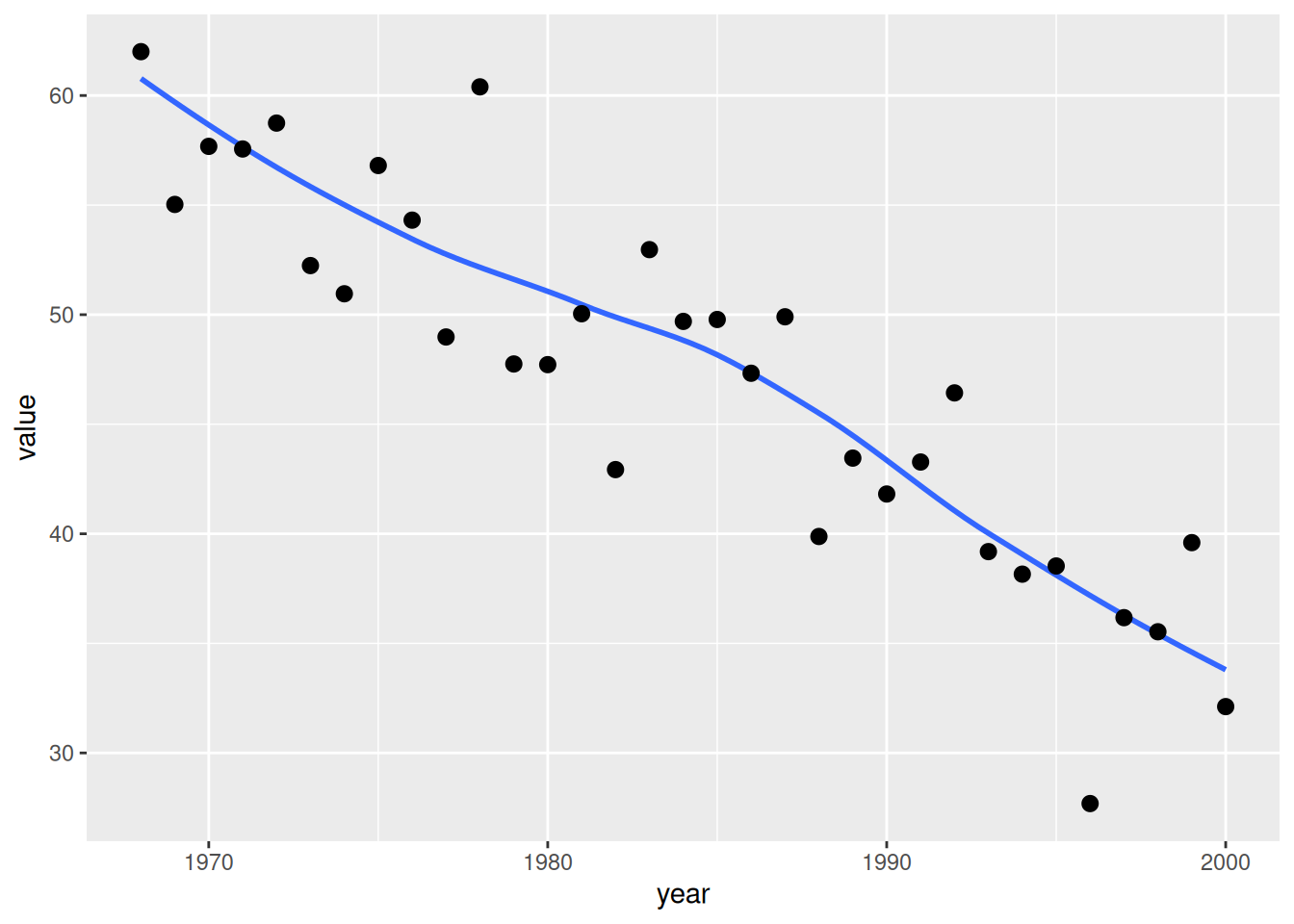
Adding scales, labels, and theme
Lay on axis limits and breaks that match the SAS template (x: 1968–2000 by 4; y: 0–10 by 2), then add axis labels and the poster theme. Swap theme_hv_poster() for theme_hv_manuscript() for a journal-ready version.
p_tr1 +
  scale_x_continuous(limits = c(1968, 2000), breaks = seq(1968, 2000, 4)) +
  scale_y_continuous(limits = c(0, 10),      breaks = seq(0, 10, 2)) +
  labs(x = "Year", y = "Cases/year") +
  theme_hv_poster()
Single variable: age
The age figure uses the same x-axis and axisy order=(30 to 70 by 10).
plot(tr1) +
  scale_x_continuous(limits = c(1968, 2000), breaks = seq(1968, 2000, 4)) +
  scale_y_continuous(limits = c(30, 70),     breaks = seq(30, 70, 10)) +
  labs(x = "Year", y = "Age (years)") +
  theme_hv_poster()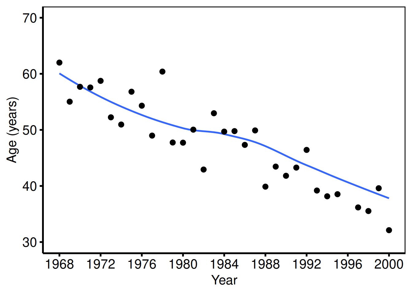
Multiple groups with scale_colour_brewer
When group_col is set, the constructor computes per-group annual means and plot() draws one line per group. scale_colour_brewer() and scale_shape_manual() together give each group a distinct colour and marker shape, which keeps the figure readable in greyscale print.
tr <- hv_trends(dta_tr)
plot(tr) +
  scale_colour_brewer(palette = "Set1", name = "Group") +
  scale_shape_manual(
    values = c("Group I" = 15L, "Group II" = 19L,
               "Group III" = 17L, "Group IV" = 18L),
    name = "Group"
  ) +
  scale_x_continuous(limits = c(1968, 2000), breaks = seq(1968, 2000, 4)) +
  labs(x = "Year", y = "Outcome (%)") +
  theme_hv_poster()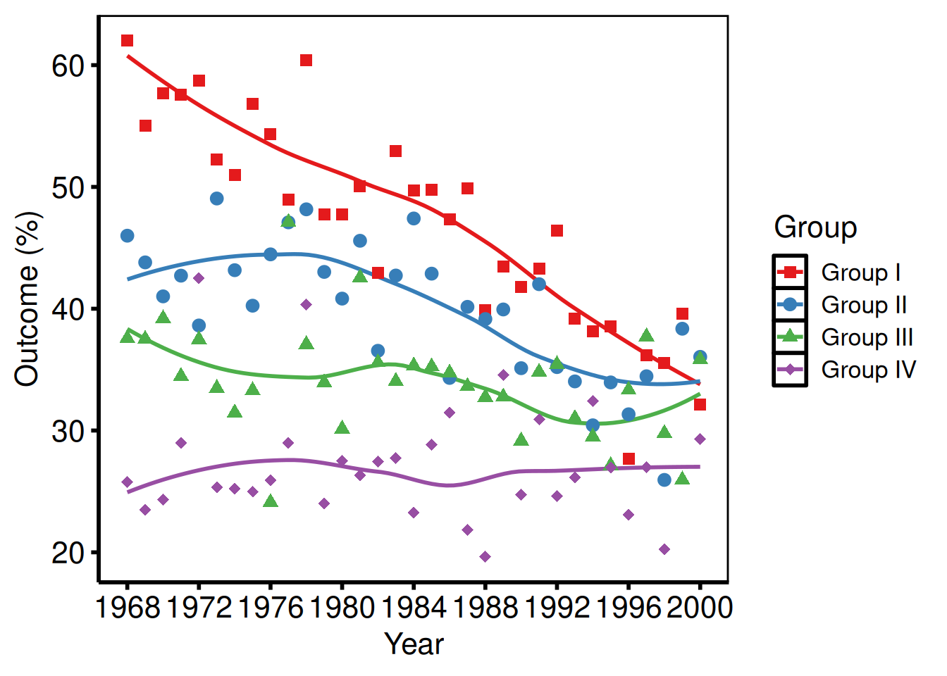
Median summary + manual colours (NYHA style)
Pass summary_fn = "median" when the outcome distribution is skewed and the median is more interpretable than the mean – typical for NYHA class percentage trends. Manual colours let you assign clinically meaningful hues (here, one colour per NYHA class).
tr_med <- hv_trends(dta_tr, summary_fn = "median")
plot(tr_med) +
  scale_colour_manual(
    values = c(
      "Group I"   = "steelblue",
      "Group II"  = "firebrick",
      "Group III" = "forestgreen",
      "Group IV"  = "goldenrod3"
    ),
    name = "NYHA Class"
  ) +
  scale_shape_manual(
    values = c("Group I" = 15L, "Group II" = 19L,
               "Group III" = 17L, "Group IV" = 18L),
    name = "NYHA Class"
  ) +
  scale_x_continuous(limits = c(1968, 2000), breaks = seq(1968, 2000, 4)) +
  scale_y_continuous(limits = c(0, 80),      breaks = seq(0, 80, 20)) +
  labs(x = "Year", y = "%", title = "Preoperative NYHA Class Over Time") +
  annotate("text", x = 1980, y = 75,
           label = "Trend: Preoperative NYHA", size = 4) +
  theme_hv_poster()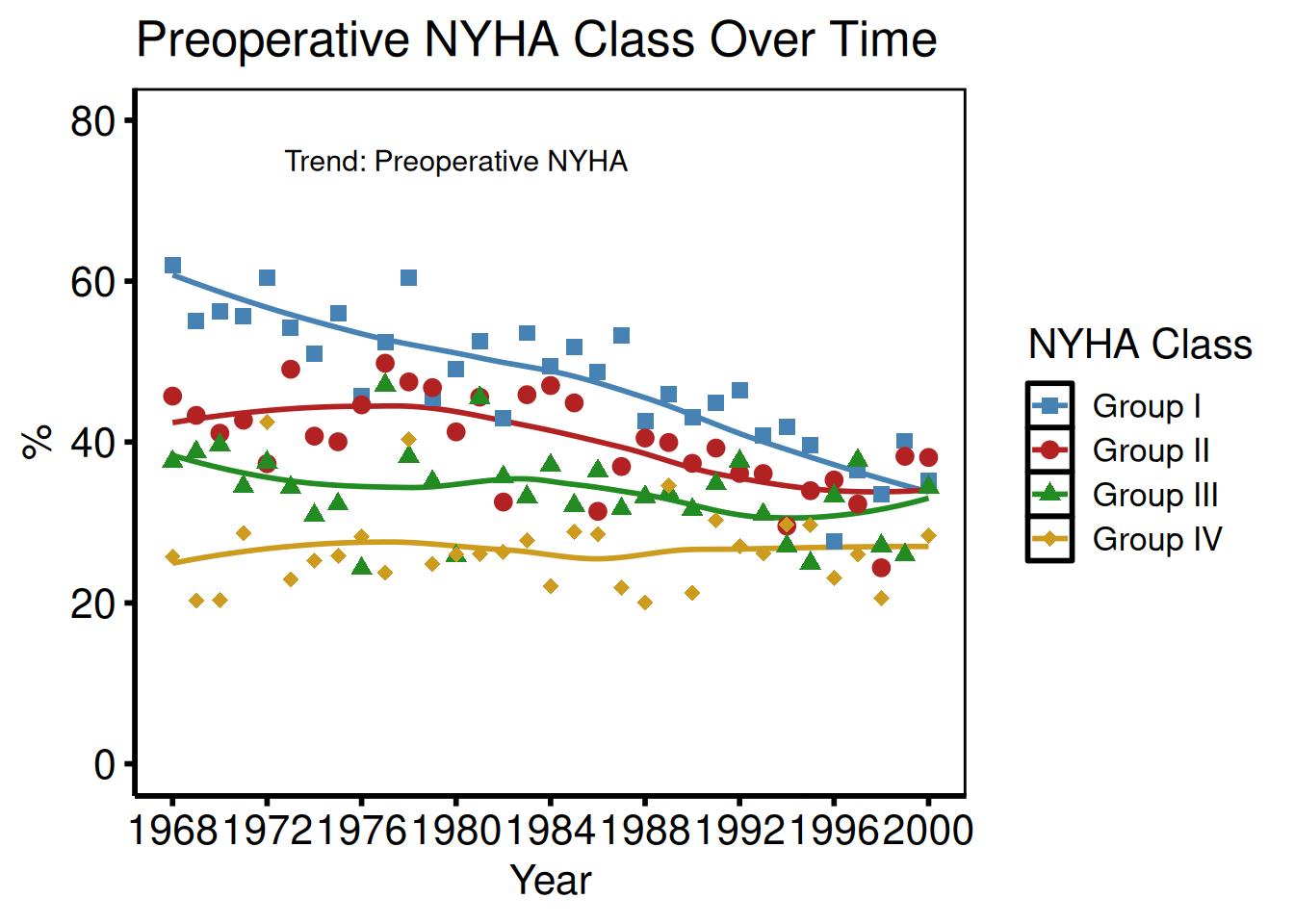
With confidence ribbon
Pass se = TRUE to plot() to add a geom_ribbon() around the mean line. The alpha argument controls the ribbon opacity – 0.2 keeps the band visible without obscuring the line itself.
plot(tr1, se = TRUE, alpha = 0.2) +
  scale_x_continuous(limits = c(1968, 2000), breaks = seq(1968, 2000, 4)) +
  labs(x = "Year", y = "Cases/year") +
  theme_hv_poster()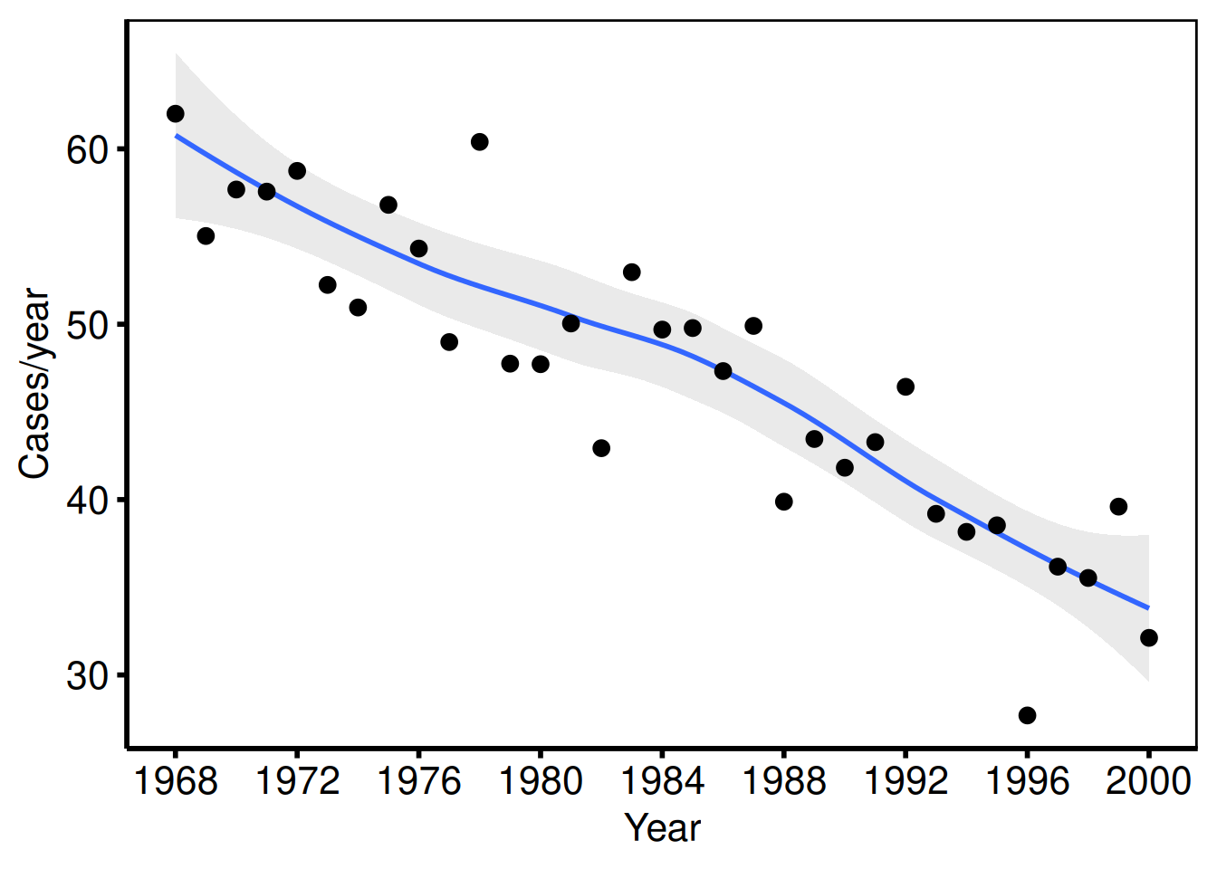
Binary % outcomes (tp.lp.trends.sas)
The VSD template plots multiple binary outcomes (cardiogenic shock %, pre-op IABP %, inotropes %) on the same axes: axisx order=(1970 to 2000 by 10), axisy order=(0 to 100 by 10). Each outcome becomes a group.
dta_lp <- sample_trends_data(
  n          = 800,
  year_range = c(1970L, 2000L),
  groups     = c("Shock %", "Pre-op IABP %", "Inotropes %")
)

plot(hv_trends(dta_lp)) +
  scale_colour_manual(
    values = c("Shock %"       = "steelblue",
               "Pre-op IABP %" = "firebrick",
               "Inotropes %"   = "forestgreen"),
    name = NULL
  ) +
  scale_shape_manual(
    values = c("Shock %" = 16L, "Pre-op IABP %" = 15L, "Inotropes %" = 17L),
    name = NULL
  ) +
  scale_x_continuous(limits = c(1970, 2000), breaks = seq(1970, 2000, 10)) +
  scale_y_continuous(limits = c(0, 100),     breaks = seq(0, 100, 10)) +
  coord_cartesian(xlim = c(1970, 2000), ylim = c(0, 100)) +
  labs(x = "Year", y = "Percent (%)") +
  theme_hv_poster()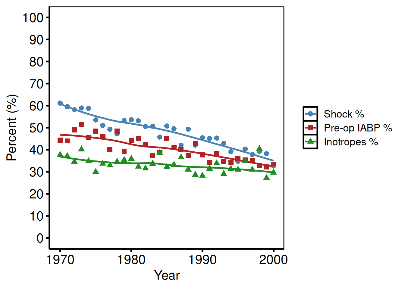
Age as x-axis (tp.lp.trends.age.sas)
The mitral valve template uses patient age (not year) on the x-axis: axisx order=(25 to 85 by 10), axisy order=(0 to 100 by 20). Pass real data with an age column and set x_col = "age". The example below uses the sample data’s year column relabelled for illustration.
# With real data: x_col = "age", x_col_data has values ~25 to 85
# Illustration using sample_trends_data() with year_range spanning age range:
dta_age <- sample_trends_data(
  n          = 600,
  year_range = c(25L, 85L),
  groups     = c("Repair %", "Bioprosthesis %"),
  seed       = 7L
)

plot(hv_trends(dta_age)) +
  scale_colour_manual(
    values = c("Repair %" = "steelblue", "Bioprosthesis %" = "firebrick"),
    name   = NULL
  ) +
  scale_shape_manual(
    values = c("Repair %" = 16L, "Bioprosthesis %" = 15L),
    name   = NULL
  ) +
  scale_x_continuous(limits = c(25, 85), breaks = seq(25, 85, 10)) +
  scale_y_continuous(limits = c(0, 100), breaks = seq(0, 100, 20)) +
  coord_cartesian(xlim = c(25, 85), ylim = c(0, 100)) +
  labs(x = "Age (years)", y = "Percent (%)") +
  theme_hv_poster()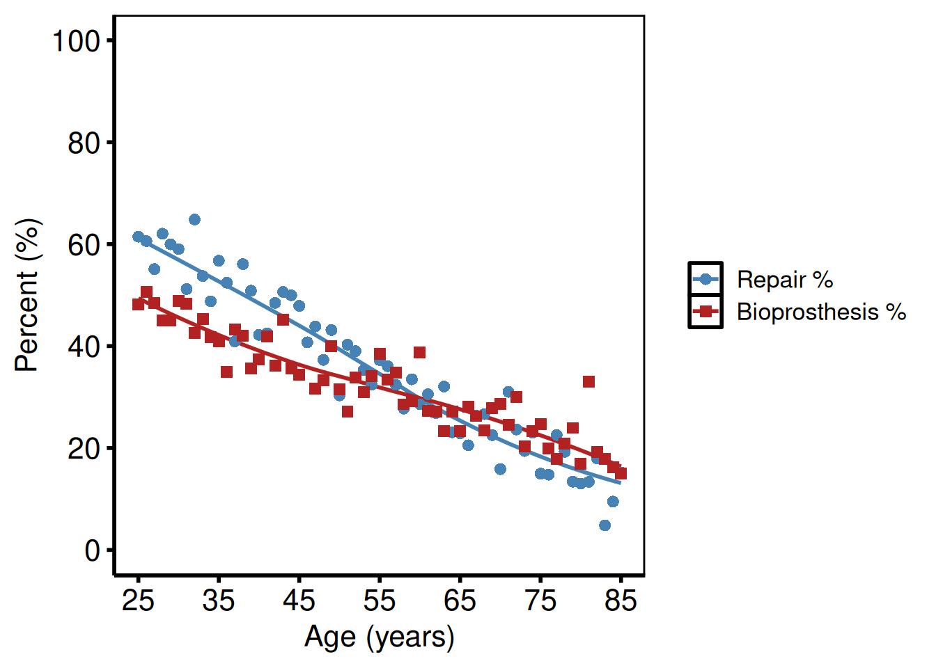
Polytomous groups — repair types (tp.lp.trends.polytomous.sas)
Four repair categories over a short study period (1990–1999): the SAS template uses axisx order=(1990 to 1999 by 1) for fine year breaks.
dta_poly <- sample_trends_data(
  n          = 800,
  year_range = c(1990L, 1999L),
  groups     = c("CE", "Cosgrove", "Periguard", "DeVega"),
  seed       = 5L
)

plot(hv_trends(dta_poly)) +
  scale_colour_manual(
    values = c(CE        = "steelblue",
               Cosgrove  = "firebrick",
               Periguard = "forestgreen",
               DeVega    = "goldenrod3"),
    name = "Repair type"
  ) +
  scale_shape_manual(
    values = c(CE = 15L, Cosgrove = 19L, Periguard = 17L, DeVega = 18L),
    name = "Repair type"
  ) +
  scale_x_continuous(limits = c(1990, 1999), breaks = seq(1990, 1999, 1)) +
  scale_y_continuous(limits = c(0, 100),     breaks = seq(0, 100, 10)) +
  coord_cartesian(xlim = c(1990, 1999), ylim = c(0, 100)) +
  labs(x = "Year", y = "Percent (%)") +
  theme_hv_poster()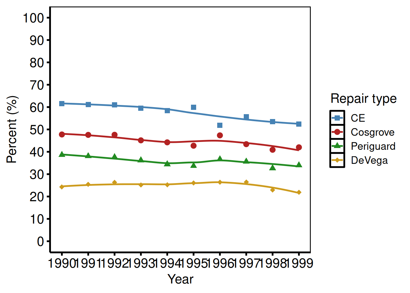
LV mass index (tp.dp.trends.R — plot2)
Continuous outcome with a larger y range: scale_y_continuous(breaks=seq(0, 200, 50)), coord_cartesian(xlim = c(1995, 2016), ylim = c(0, 200)).
dta_lv <- sample_trends_data(
  n          = 800,
  year_range = c(1995L, 2015L),
  groups     = NULL,
  seed       = 3L
)

plot(hv_trends(dta_lv, group_col = NULL)) +
  scale_x_continuous(limits = c(1995, 2015), breaks = seq(1995, 2015, 5)) +
  scale_y_continuous(limits = c(0, 200),     breaks = seq(0, 200, 50)) +
  coord_cartesian(xlim = c(1995, 2015), ylim = c(0, 200)) +
  labs(x = "Years", y = "LV Mass Index") +
  theme_hv_poster()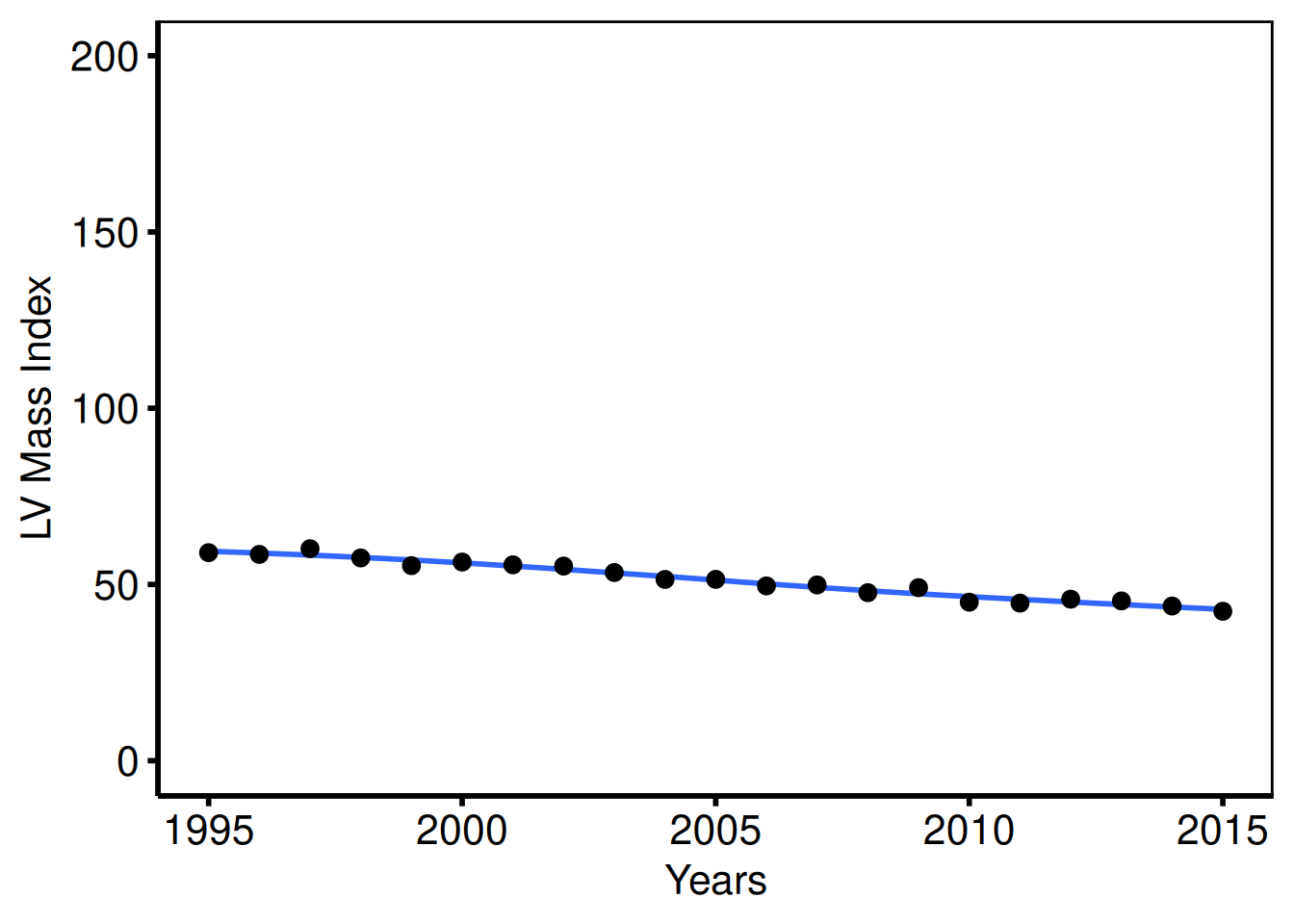
Case volume / total surgeries per year (tp.dp.trends.R — plot4)
The annual case-volume figure uses a y-axis that runs 0–400 by 50, matching the mitral degeneration study’s scale from tp.dp.trends.R. A single group_col = NULL call collapses all patients into one series.
dta_vol <- sample_trends_data(
  n          = 1000,
  year_range = c(1985L, 2015L),
  groups     = NULL,
  seed       = 9L
)

plot(hv_trends(dta_vol, group_col = NULL)) +
  scale_x_continuous(limits = c(1985, 2015), breaks = seq(1985, 2015, 5)) +
  scale_y_continuous(limits = c(0, 400),     breaks = seq(0, 400, 50)) +
  coord_cartesian(xlim = c(1985, 2015), ylim = c(0, 400)) +
  labs(x = "Years", y = "Surgeries (#)") +
  theme_hv_poster()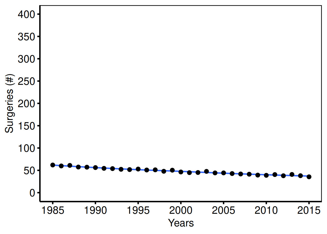
Annotated trend — hospital LOS (tp.dp.trends.R — plot5)
Template: coord_cartesian(ylim = c(0, 20)), annotate("text", 1995, 18, label="Trend: Hospital Length of Stay", size=4.5).
dta_los <- sample_trends_data(
  n          = 800,
  year_range = c(1985L, 2015L),
  groups     = NULL,
  seed       = 11L
)

plot(hv_trends(dta_los, group_col = NULL)) +
  scale_x_continuous(limits = c(1985, 2015), breaks = seq(1985, 2015, 5)) +
  scale_y_continuous(limits = c(0, 20),      breaks = seq(0, 20, 5)) +
  coord_cartesian(xlim = c(1985, 2015), ylim = c(0, 20)) +
  annotate("text", x = 1995, y = 18,
           label = "Trend: Hospital Length of Stay", size = 4.5) +
  labs(x = "Years", y = "Hospital LOS (Days)") +
  theme_hv_poster()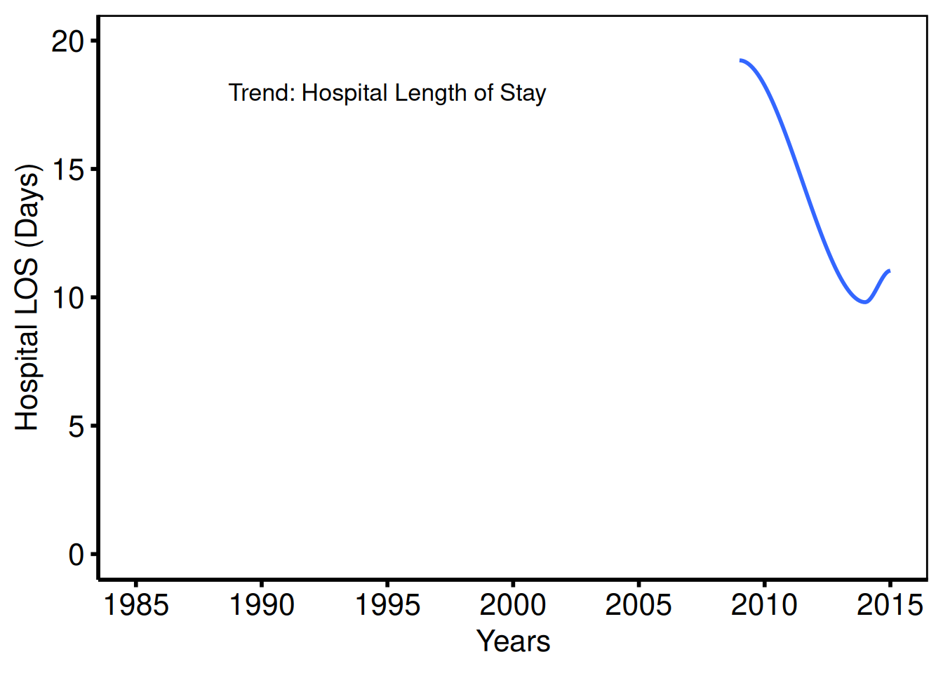
Saving
ggsave() writes the trends figure at 11.5 x 8 inches. For a PowerPoint version, see Decorating and Saving.
p_tr <- plot(tr) +
  scale_colour_brewer(palette = "Set1", name = "Group") +
  scale_shape_manual(
    values = c("Group I" = 15L, "Group II" = 19L,
               "Group III" = 17L, "Group IV" = 18L),
    name = "Group"
  ) +
  scale_x_continuous(limits = c(1968, 2000), breaks = seq(1968, 2000, 4)) +
  labs(x = "Year", y = "Outcome (%)") +
  theme_hv_poster()

ggsave(here::here("graphs", "rp.trends.pdf"), p_tr, width = 11.5, height = 8)
Spaghetti / Profile Plot
hv_spaghetti() ports the pattern from tp.dp.spaghetti.echo.R: one trajectory line per subject over time, with optional stratification by a grouping variable. plot() accepts add_smooth = TRUE for an optional LOESS overlay and returns a bare ggplot you can dress with theme_hv_manuscript(). The original template covers nine figures — unstratified and sex-stratified variants of three echo outcomes (AV mean gradient, AV area, DVI) plus an ordinal MV regurgitation grade plot.
Sample data
sample_spaghetti_data() generates 150 patients with up to 6 observations each, stratified by a named proportion vector that mirrors the Female/Male MALE column in the original template. Build both the unstratified and colour-stratified S3 objects here for reuse across the variants below.
# groups mirrors the Female/Male sex stratification in the template (MALE column)
dta_sp <- sample_spaghetti_data(
  n_patients = 150,
  max_obs    = 6,
  groups     = c(Female = 0.45, Male = 0.55),
  seed       = 42L
)
head(dta_sp)
id time value group
1 1 0.44 22.12 Female
2 1 0.67 27.20 Female
3 1 0.91 29.24 Female
4 1 1.29 18.95 Female
5 1 1.96 24.00 Female
6 2 2.04 25.16 Female
# Build S3 objects for reuse below
sp     <- hv_spaghetti(dta_sp)
sp_col <- hv_spaghetti(dta_sp, colour_col = "group")
Bare plot
The bare plot(sp) panel draws one thin trajectory per patient over time with no colour, axis limits, or theme. Look for: a dense bundle of lines that gives a visual impression of the distribution’s shape; if lines are missing or the x-axis is wrong, check that the time_col and id_col arguments match the data structure.
p_sp <- plot(sp)
p_sp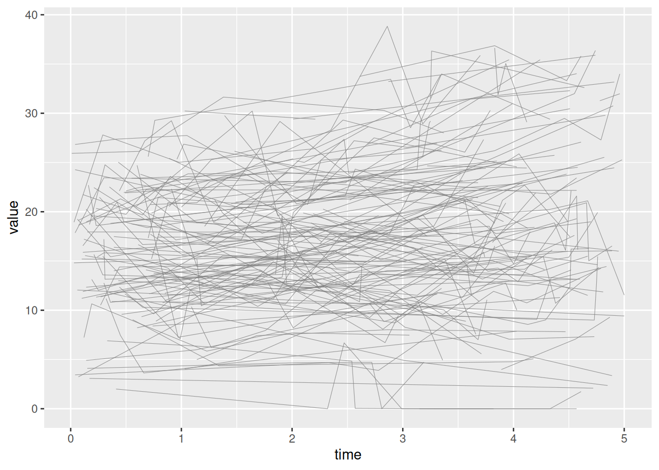
Unstratified — AV mean gradient, full range (plot_1)
Template: scale_y_continuous(breaks=seq(0, 80, 20)), coord_cartesian(xlim = c(0, 5), ylim = c(0, 80)).
plot(sp) +
  scale_x_continuous(breaks = seq(0, 5, 1)) +
  scale_y_continuous(breaks = seq(0, 80, 20)) +
  coord_cartesian(xlim = c(0, 5), ylim = c(0, 80)) +
  labs(x = "Years", y = "AV Mean Gradient (mmHg)") +
  theme_hv_poster()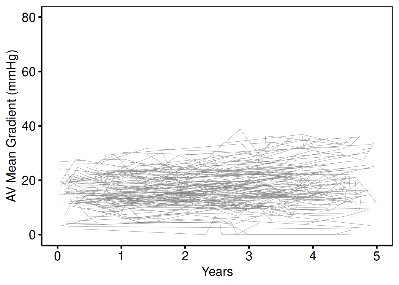
Unstratified — zoomed y-axis (plot_3)
Template: scale_y_continuous(breaks=seq(0, 30, 10)), coord_cartesian(ylim = c(0, 30)).
plot(sp) +
  scale_x_continuous(breaks = seq(0, 5, 1)) +
  scale_y_continuous(breaks = seq(0, 30, 10)) +
  coord_cartesian(xlim = c(0, 5), ylim = c(0, 30)) +
  labs(x = "Years", y = "AV Mean Gradient (mmHg)") +
  theme_hv_poster()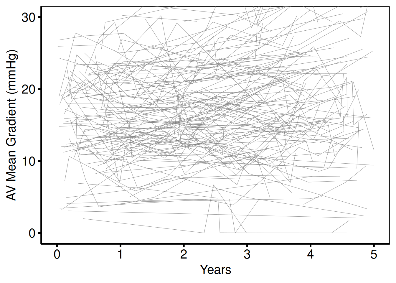
Stratified by sex — AV mean gradient (plot_2 / plot_4)
Template: scale_color_manual(breaks = c("0", "1"), values=c("red", "blue")). The quick-start in the template header uses the modernised "firebrick" / "steelblue" equivalents.
p_sp <- plot(sp_col) +
  scale_colour_manual(
    values = c(Female = "firebrick", Male = "steelblue"),
    name   = NULL
  ) +
  scale_x_continuous(breaks = seq(0, 5, 1)) +
  scale_y_continuous(breaks = seq(0, 80, 20)) +
  coord_cartesian(xlim = c(0, 5), ylim = c(0, 80)) +
  labs(x = "Years", y = "AV Mean Gradient (mmHg)") +
  theme_hv_poster()

p_sp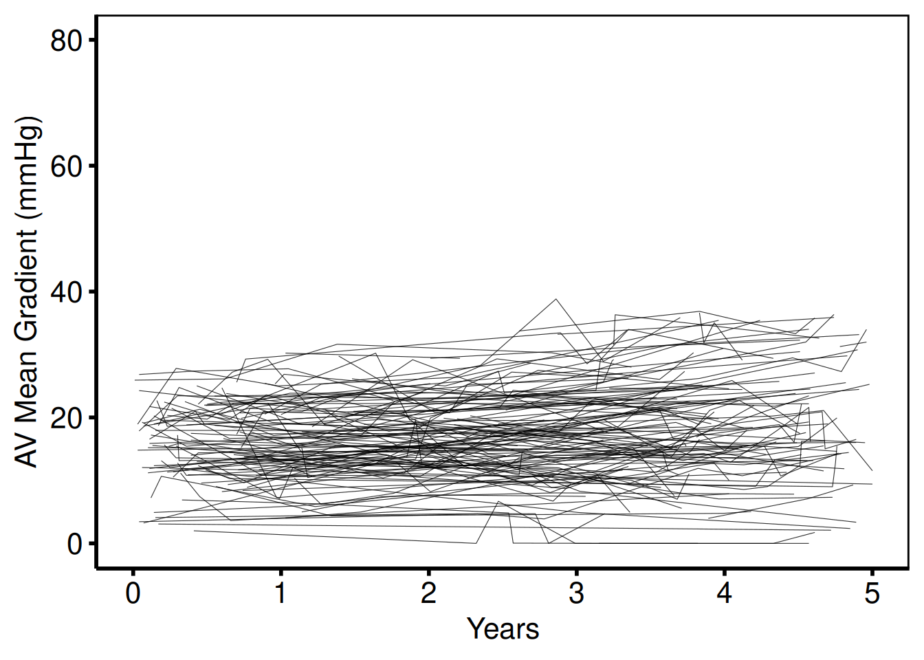
AV area y-scale (plot_5 / plot_6)
Template: scale_y_continuous(breaks=seq(0, 5, 1)), coord_cartesian(ylim = c(0, 5)), ylab('AV Area (EOA) (cm^2)').
plot(sp_col) +
  scale_colour_manual(
    values = c(Female = "firebrick", Male = "steelblue"),
    name   = NULL
  ) +
  scale_x_continuous(breaks = seq(0, 5, 1)) +
  scale_y_continuous(breaks = seq(0, 5, 1)) +
  coord_cartesian(xlim = c(0, 5), ylim = c(0, 5)) +
  labs(x = "Years", y = "AV Area (EOA) (cm\u00b2)") +
  theme_hv_poster()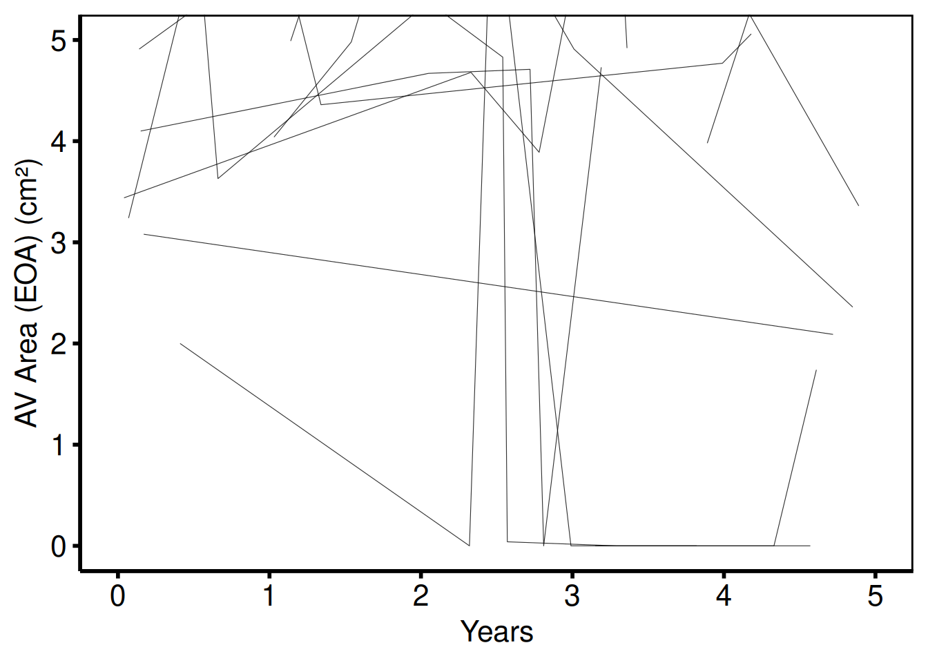
DVI y-scale (plot_7 / plot_8)
Template: scale_y_continuous(breaks=seq(0, 1.25, 0.25)), coord_cartesian(ylim = c(0, 1.25)), ylab('DVI').
plot(sp_col) +
  scale_colour_manual(
    values = c(Female = "firebrick", Male = "steelblue"),
    name   = NULL
  ) +
  scale_x_continuous(breaks = seq(0, 5, 1)) +
  scale_y_continuous(breaks = seq(0, 1.25, 0.25)) +
  coord_cartesian(xlim = c(0, 5), ylim = c(0, 1.25)) +
  labs(x = "Years", y = "DVI") +
  theme_hv_poster()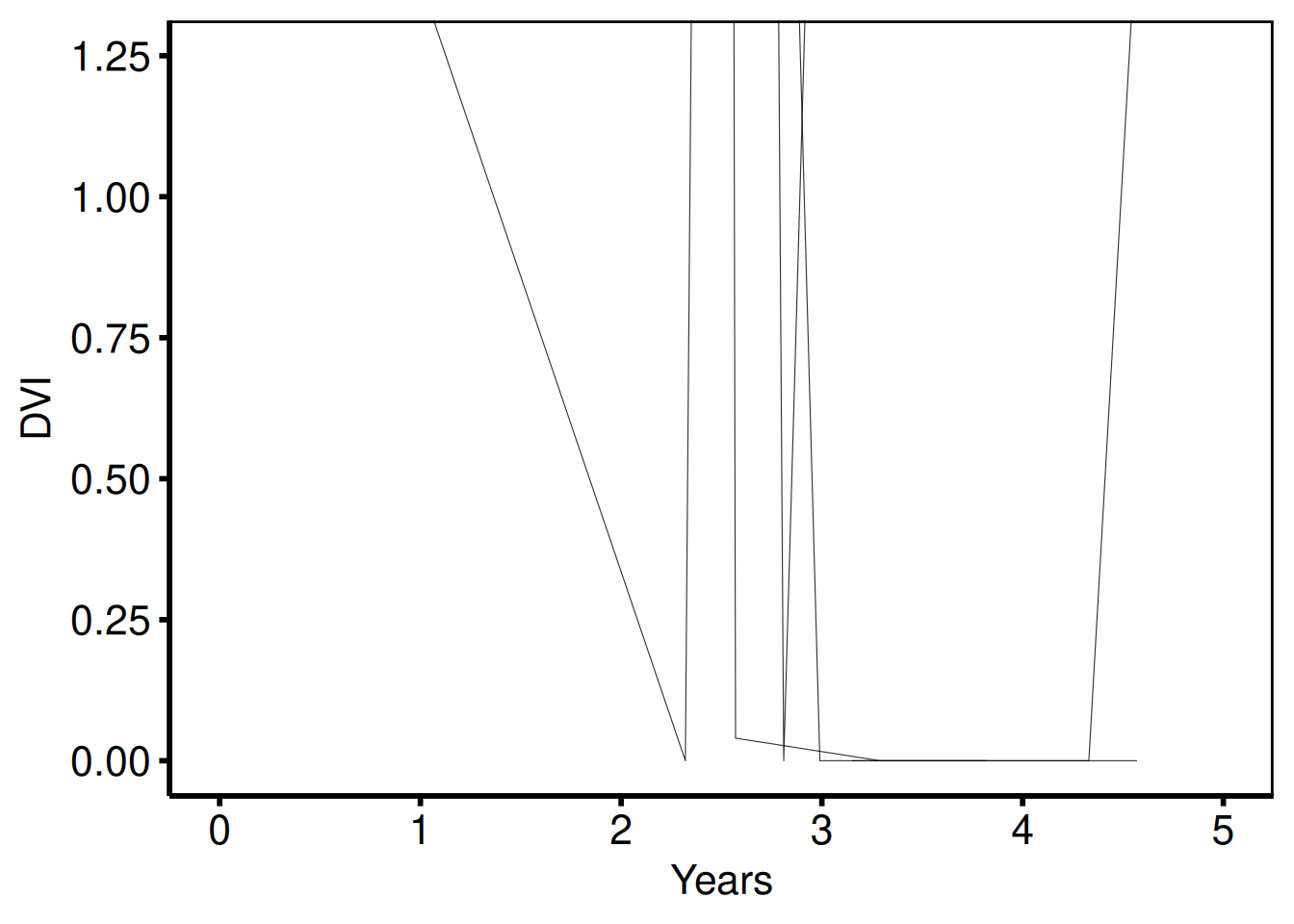
Ordinal y-axis — MV regurgitation grade (plot_9)
Template: scale_y_continuous(labels=c("None", "Mild", "Moderate", "Severe")), coord_cartesian(xlim = c(0, 6), ylim = c(0, 3)), two colour groups for early (blue) and late (red2) cohorts.
dta_ord        <- dta_sp
dta_ord$value  <- round(pmin(3, pmax(0, dta_sp$value / 12)))
levels(dta_ord$group) <- c("Early", "Late")

sp_ord <- hv_spaghetti(dta_ord, colour_col = "group")

plot(sp_ord, y_labels = c(None = 0, Mild = 1, Moderate = 2, Severe = 3)) +
  scale_colour_manual(
    values = c(Early = "steelblue", Late = "red2"),
    name   = NULL
  ) +
  scale_x_continuous(breaks = seq(0, 6, 1)) +
  coord_cartesian(xlim = c(0, 6), ylim = c(0, 3)) +
  labs(x = "Years after Procedure", y = "MV Regurgitation Grade") +
  theme_hv_poster()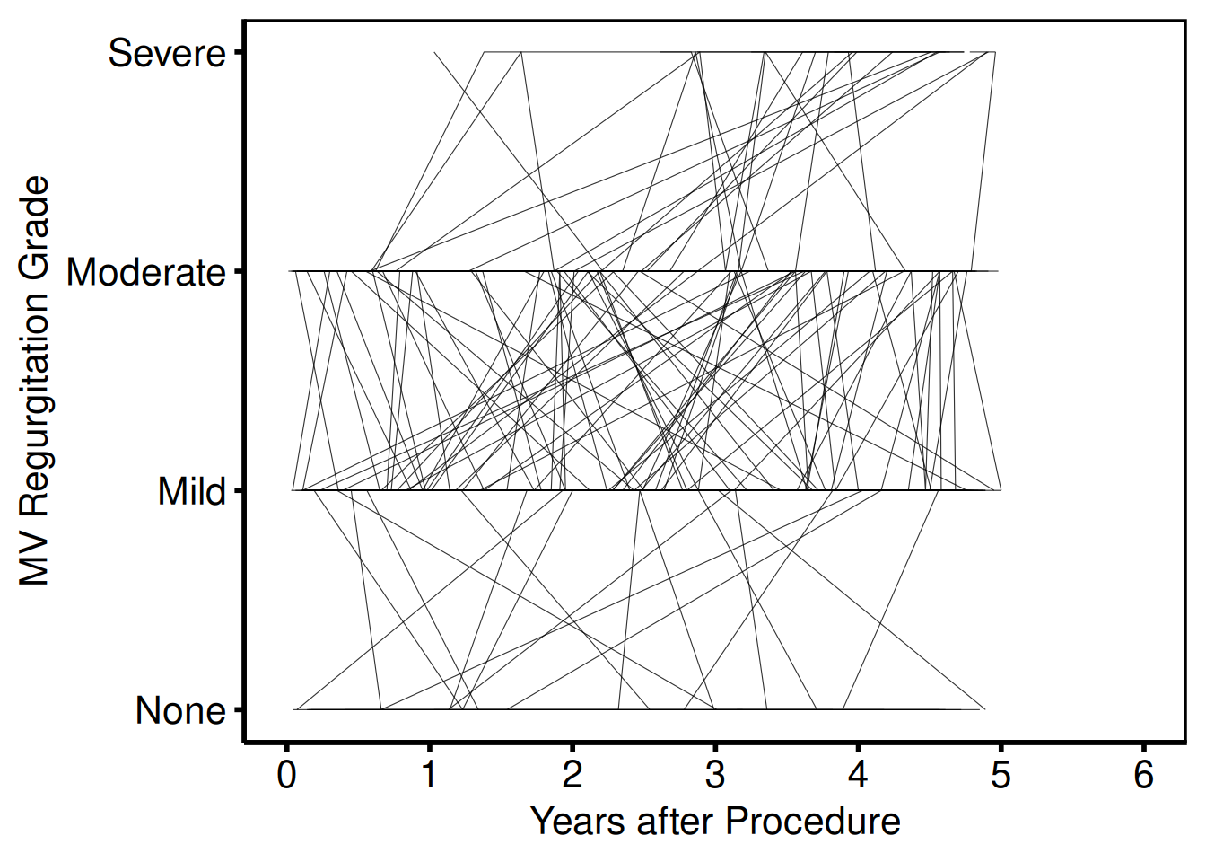
With LOESS smooth overlay
Pass add_smooth = TRUE to plot() to add a LOESS trend line per group over the individual trajectories. The smoother uses geom_smooth() defaults; the alpha argument on the line layer controls individual trajectory opacity so the trend line stands out.
plot(sp_col, add_smooth = TRUE) +
  scale_colour_manual(
    values = c(Female = "firebrick", Male = "steelblue"),
    name   = NULL
  ) +
  scale_x_continuous(breaks = seq(0, 5, 1)) +
  scale_y_continuous(breaks = seq(0, 80, 20)) +
  coord_cartesian(xlim = c(0, 5), ylim = c(0, 80)) +
  labs(x = "Years", y = "AV Mean Gradient (mmHg)") +
  theme_hv_poster()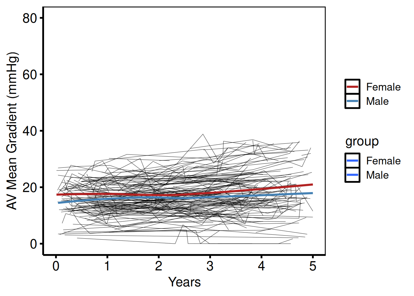
Saving
Template uses wid = 11, hei = 8.5 in pdf().
Nonparametric Temporal Trend Curve
hv_nonparametric() prepares pre-computed average curves from a two-phase nonparametric temporal trend model — the R equivalent of the SAS tp.np.*.avrg_curv.* and tp.np.*.u.trend.* template family.
Pass the SAS mean_curv and boots_ci datasets (read in with read.csv()) and call plot() for a bare ggplot you can dress with colour, labels, and theme_hv_manuscript().
Sample data
sample_nonparametric_curve_data() generates the average-curve and bootstrap CI dataset; sample_nonparametric_curve_points() generates the binned summary points that overlay the curve. Both mirror the structure of the SAS mean_curv and boots_ci output from the nonparametric temporal trend model.
curve_dat <- sample_nonparametric_curve_data(
  n            = 500,
  time_max     = 12,
  outcome_type = "probability",
  ci_level     = 0.68       # 68 % CI — one SE, matching SAS cll_p68/clu_p68
)
pts_dat <- sample_nonparametric_curve_points(n = 500, time_max = 12)
head(curve_dat)
time estimate lower upper
1 0.05000000 0.2395042 0.2148392 0.2660414
2 0.05055219 0.2395916 0.2149201 0.2661351
3 0.05111048 0.2396798 0.2150019 0.2662297
4 0.05167493 0.2397690 0.2150845 0.2663253
5 0.05224562 0.2398592 0.2151680 0.2664220
6 0.05282261 0.2399503 0.2152524 0.2665196Single average curve with 68 % CI ribbon
Build the S3 object once – pass lower_col/upper_col that match the CI columns in your data, and optionally data_points for the summary overlay. The bare plot and the decorated plot share the same object.
np <- hv_nonparametric(
  curve_data  = curve_dat,
  lower_col   = "lower",
  upper_col   = "upper",
  data_points = pts_dat
)
Bare plot
The bare panel shows the average curve with its CI ribbon and the binned summary points in default colours and no axis formatting. Look for: a smooth curve passing through the binned points, with the ribbon widening at the extremes where the bootstrap sample thins; a flat curve suggests the outcome_type or CI columns may be misspecified.
p_np_bare <- plot(np)
p_np_bare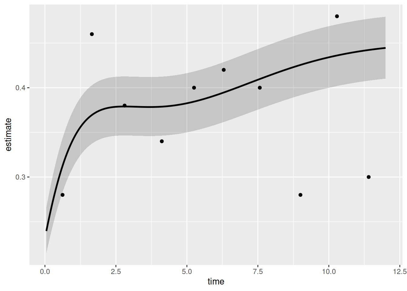
Adding scales, labels, and theme
Layer on colour scales that match your analysis context, then set axis limits and labels to match the SAS template breaks. The example uses percent labels on the y-axis via scales::percent; swap to raw units for a continuous outcome.
p_np <- p_np_bare +
  ggplot2::scale_colour_manual(values = c("steelblue"), guide = "none") +
  ggplot2::scale_fill_manual(values   = c("steelblue"), guide = "none") +
  ggplot2::scale_x_continuous(
    limits = c(0, 12),
    breaks = seq(0, 12, 2),
    labels = function(x) paste(x, "yr")
  ) +
  ggplot2::scale_y_continuous(
    limits = c(0, 1),
    breaks = seq(0, 1, 0.2),
    labels = scales::percent
  ) +
  ggplot2::labs(x = "Follow-up (years)", y = "Prevalence (%)") +
  theme_hv_poster()

p_np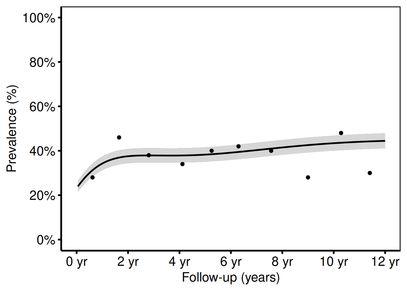
The shaded ribbon shows the 68 % bootstrap CI (one standard error), matching cll_p68/clu_p68 in the SAS template. Switch to ci_level = 0.95 in sample_nonparametric_curve_data() for 95 % CI bands.
Two-group comparison (analogous to tp.np.avpkgrad_ozak_ind_mtwt.sas)
Pass group_col to the constructor to compare two average curves in a single panel, one per valve type (Ozaki vs. CE-Pericardial). Each group gets its own CI ribbon; scale_colour_manual() and scale_fill_manual() assign the colours consistently between the line and the ribbon.
curve_grp <- sample_nonparametric_curve_data(
  n      = 400,
  time_max = 7,
  groups   = c("Ozaki" = 0.7, "CE-Pericardial" = 1.3),
  outcome_type = "continuous",
  ci_level = 0.68
)
pts_grp <- sample_nonparametric_curve_points(
  n = 400, time_max = 7,
  groups = c("Ozaki" = 0.7, "CE-Pericardial" = 1.3),
  outcome_type = "continuous"
)

np_grp <- hv_nonparametric(
  curve_data  = curve_grp,
  group_col   = "group",
  lower_col   = "lower",
  upper_col   = "upper",
  data_points = pts_grp
)

plot(np_grp) +
  ggplot2::scale_colour_manual(
    values = c("Ozaki" = "steelblue", "CE-Pericardial" = "firebrick"),
    name   = NULL
  ) +
  ggplot2::scale_fill_manual(
    values = c("Ozaki" = "steelblue", "CE-Pericardial" = "firebrick"),
    guide  = "none"
  ) +
  ggplot2::scale_x_continuous(limits = c(0, 7), breaks = 0:7) +
  ggplot2::labs(
    x = "Follow-up (years)",
    y = "AV Peak Gradient (mmHg)"
  ) +
  theme_hv_poster() +
  ggplot2::theme(legend.position = c(0.15, 0.85))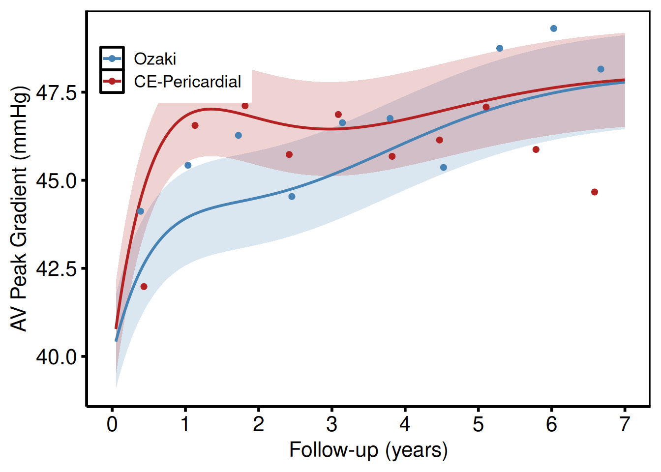
Saving
ggsave() writes the manuscript PDF at 11 x 8.5 inches; save_ppt() writes the same figure to an editable PowerPoint slide using the Cleveland Clinic template. See Decorating and Saving for save_ppt() options.
# Manuscript PDF
ggsave(here::here("graphs", "np_afib_prevalence.pdf"),
       p_np, width = 11, height = 8.5)

# Editable PowerPoint
save_ppt(p_np,
         template   = system.file("extdata", "hv_ppt_template.pptx", package = "hvtiPlotR"),
         powerpoint = here::here("graphs", "np_afib_prevalence.pptx"))
Nonparametric Ordinal Outcome Curve
hv_ordinal() prepares pre-computed grade-specific probability curves from a cumulative proportional-odds model — the R equivalent of tp.np.*.ordinal.* SAS templates (e.g. TR grade prevalence, AR severity).
The SAS predict dataset stores one column per grade (p0, p1, p2, p3). You’ll need to reshape it to long format before passing it to the constructor:
library(tidyr)
long <- pivot_longer(
  predict_wide,
  cols      = c(p0, p1, p2, p3),
  names_to  = "grade",
  values_to = "estimate"
)
Sample data
sample_nonparametric_ordinal_data() generates grade-specific probability curves in long format (one row per time × grade combination) and sample_nonparametric_ordinal_points() generates the binned summary points. Both mirror the predict and means SAS datasets from tp.np.*.ordinal.*.
ord_dat <- sample_nonparametric_ordinal_data(
  n            = 800,
  time_max     = 5,
  grade_labels = c("None", "Mild", "Moderate", "Severe")
)
ord_pts <- sample_nonparametric_ordinal_points(
  n            = 800,
  time_max     = 5,
  grade_labels = c("None", "Mild", "Moderate", "Severe")
)
head(ord_dat)
time estimate grade
1 0.01000000 0.6276258 None
2 0.01012532 0.6276898 None
3 0.01025221 0.6277545 None
4 0.01038069 0.6278200 None
5 0.01051078 0.6278864 None
6 0.01064250 0.6279535 NoneGrade probability curves with data summary points
Build the S3 object once with hv_ordinal(), passing both the curve data and the summary points. The same object drives the bare and decorated plots below.
np_ord <- hv_ordinal(curve_data = ord_dat, data_points = ord_pts)Bare plot
The bare panel draws one line per grade with overlaid summary points and no colour, axis formatting, or theme. Look for: four lines that sum to approximately 1.0 at every time point, with the "None" line starting high and declining; if lines cross or drift above 1.0, check that the grade probability columns were correctly reshaped to long format.
p_ord_bare <- plot(np_ord)
p_ord_bare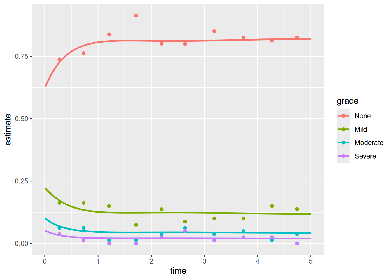
Adding scales, labels, and theme
Assign clinically meaningful colours (grey for None, graduated colours for increasing severity) and format the y-axis as a percentage. Use theme(legend.position = c(...)) to anchor the legend inside the panel where white space permits.
p_ord <- p_ord_bare +
  ggplot2::scale_colour_manual(
    values = c(
      "None"     = "grey40",
      "Mild"     = "steelblue",
      "Moderate" = "darkorange",
      "Severe"   = "firebrick"
    ),
    name = "AR Grade"
  ) +
  ggplot2::scale_x_continuous(limits = c(0, 5), breaks = 0:5) +
  ggplot2::scale_y_continuous(
    limits = c(0, 1),
    breaks = seq(0, 1, 0.2),
    labels = scales::percent
  ) +
  ggplot2::labs(
    x = "Follow-up (years)",
    y = "Grade prevalence (%)"
  ) +
  theme_hv_poster() +
  ggplot2::theme(legend.position = c(0.75, 0.6))

p_ord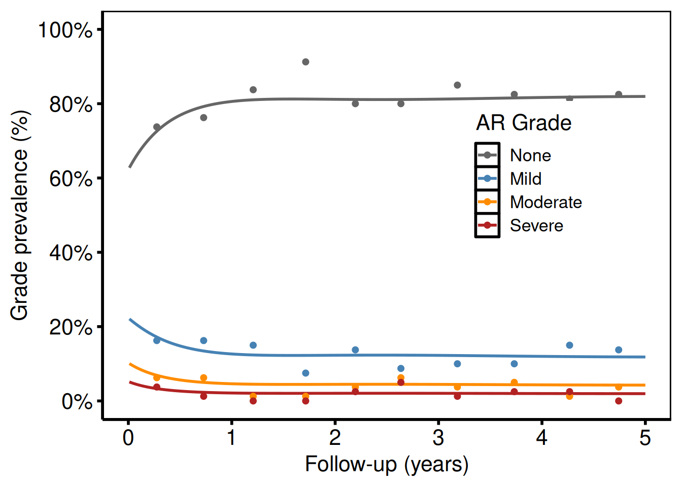
Each line is one grade level. Points show binned data summary values (analogous to the SAS means dataset with smntr0–smntr3 columns).
Combined mild + moderate (p34 = p3 + p4 pattern)
For analyses that collapse higher grades (e.g. Moderate + Severe combined), subset and re-label before passing to the constructor:
ord_collapsed <- ord_dat
# Merge Moderate and Severe into one level
ord_collapsed <- subset(ord_collapsed, grade %in% c("None", "Mild", "Moderate/Severe"))

# If your data has Moderate and Severe as separate rows, combine with:
# library(dplyr)
# ord_collapsed <- ord_dat |>
#   dplyr::filter(grade %in% c("Moderate", "Severe")) |>
#   dplyr::summarise(estimate = sum(estimate), .by = time) |>
#   dplyr::mutate(grade = "Moderate/Severe") |>
#   dplyr::bind_rows(dplyr::filter(ord_dat, grade %in% c("None", "Mild")))

# Show three-level version using only two grades from sample data
ord_two <- subset(ord_dat, grade %in% c("None", "Severe"))

plot(hv_ordinal(curve_data = ord_two)) +
  ggplot2::scale_colour_manual(
    values = c("None" = "steelblue", "Severe" = "firebrick"),
    name   = NULL
  ) +
  ggplot2::scale_x_continuous(limits = c(0, 5), breaks = 0:5) +
  ggplot2::scale_y_continuous(limits = c(0, 1), breaks = seq(0, 1, 0.2),
                               labels = scales::percent) +
  ggplot2::labs(x = "Follow-up (years)", y = "Grade prevalence (%)") +
  theme_hv_poster()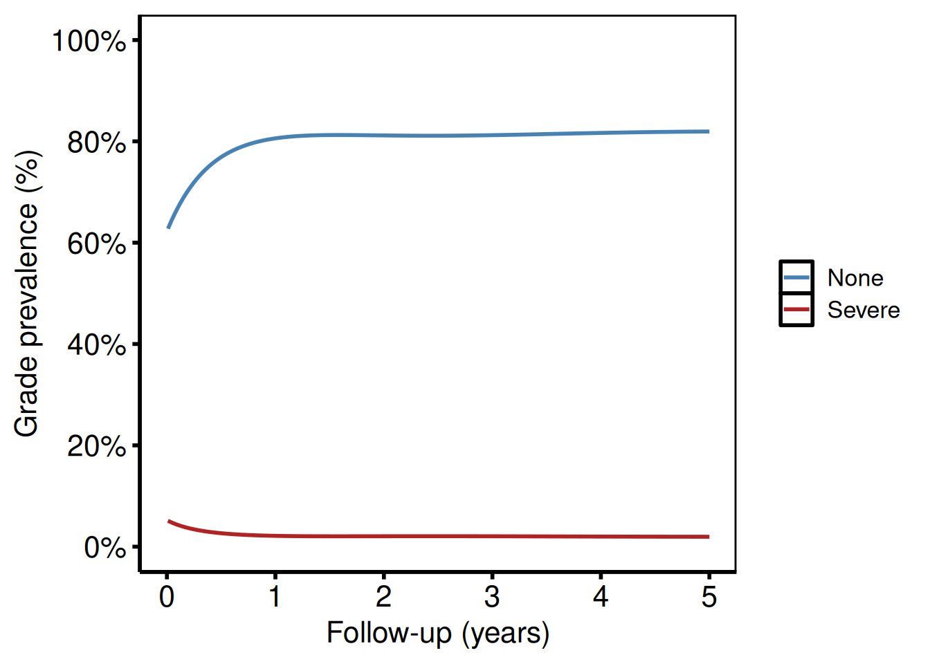
Saving
ggsave() writes the ordinal curve figure at 11 x 8.5 inches to match the SAS template output dimensions.
Longitudinal Participation Counts
hv_longitudinal() reproduces the two-panel layout from tp.dp.longitudinal_patients_measures.*: a grouped bar chart of patients and measurements at each follow-up window, paired with a numeric summary table below. Call plot(lc) for the bar chart and plot(lc, type = "table") for the table panel. Compose the two panels with patchwork.
Input must be pre-aggregated long-format data (one row per time-window × series combination). Use sample_longitudinal_counts_data() to derive this from patient-level data, or build it yourself from your registry data.
Sample data
sample_longitudinal_counts_data() derives pre-aggregated long-format data from a simulated patient-level registry of 300 patients: one row per time-window × series (Patients, Measurements) combination with a count column. Build the S3 object once and use it for both the bar-chart and table panels.
lc_dat <- sample_longitudinal_counts_data(n_patients = 300, seed = 42L)
lc_dat
time_label series count
1 ≥0 Days Patients 19
2 ≥1 Month Patients 47
3 ≥3 Months Patients 49
4 ≥6 Months Patients 100
5 ≥1 Year Patients 159
6 ≥2 Years Patients 101
7 ≥2.5 Years Patients 276
8 ≥0 Days Measurements 19
9 ≥1 Month Measurements 50
10 ≥3 Months Measurements 56
11 ≥6 Months Measurements 118
12 ≥1 Year Measurements 217
13 ≥2 Years Measurements 113
14 ≥2.5 Years Measurements 620
# Build the S3 object once; use for both panels
lc <- hv_longitudinal(lc_dat)
Bare plot
The bare plot(lc) panel shows grouped bars at each follow-up window with no fill colour, axis scale, or theme. Look for: paired bars at each time window with Patients always >= Measurements; if the two series are equal, check that the series_col argument maps to the right column.
p_lc_bare <- plot(lc)
p_lc_bare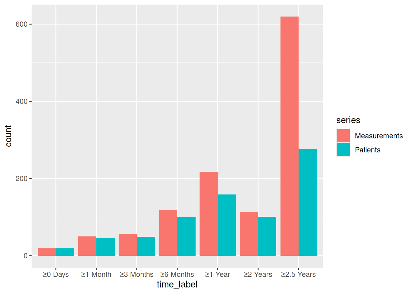
Bar chart
Layer fill colours onto the bare plot to distinguish Patients from Measurements, then expand the y-axis with ggplot2::coord_cartesian() to leave room for labels above the tallest bar.
p_lc_bar <- plot(lc) +
  ggplot2::scale_fill_manual(
    values = c(Patients = "steelblue", Measurements = "firebrick"),
    name   = NULL
  ) +
  ggplot2::scale_y_continuous(
    breaks = seq(0, 2000, 500),
    expand = c(0, 0)
  ) +
  ggplot2::coord_cartesian(ylim = c(0, 2200)) +
  ggplot2::labs(x = NULL, y = "Count (n)") +
  theme_hv_poster() +
  ggplot2::theme(legend.position = c(0.85, 0.85))

p_lc_bar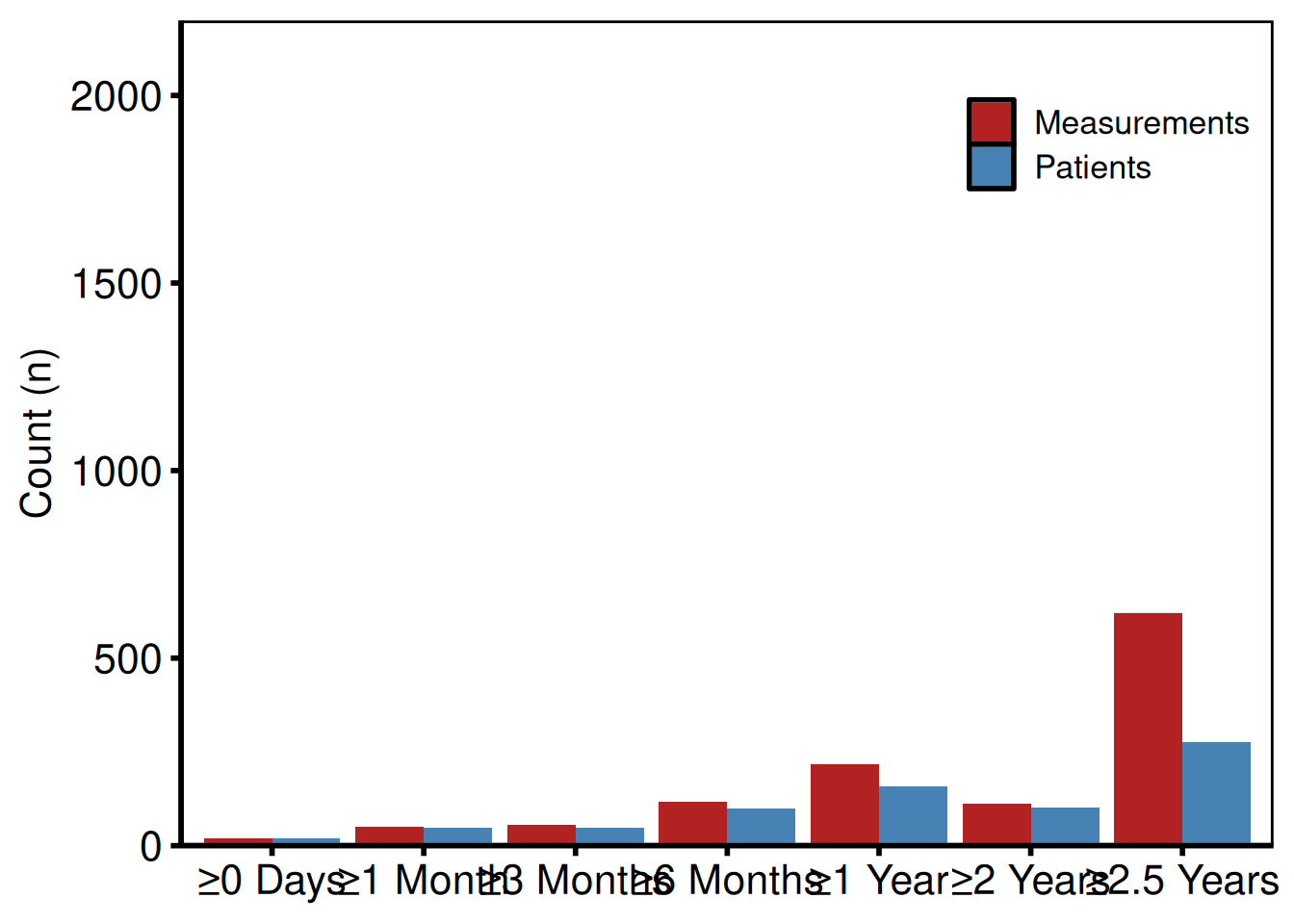
Numeric table panel
Call plot(lc, type = "table") to get the numeric summary panel – the same counts the bar chart shows, rendered as coloured text below the x-axis labels. This panel is intended to be composed with patchwork below the bar chart, so keep the theme consistent.
p_lc_tbl <- plot(lc, type = "table") +
  ggplot2::scale_colour_manual(
    values = c(Patients = "steelblue", Measurements = "firebrick"),
    guide  = "none"
  ) +
  theme_hv_poster()

p_lc_tbl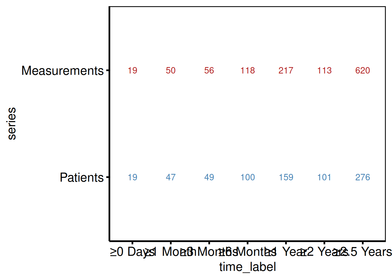
Two-panel layout with patchwork
Stack the bar chart above the table panel with / and use patchwork::plot_layout(heights = c(3, 1)) to give the bar chart three times the vertical space. This ratio matches the original SAS template layout.
library(patchwork)

p_lc_bar / p_lc_tbl +
  patchwork::plot_layout(heights = c(3, 1))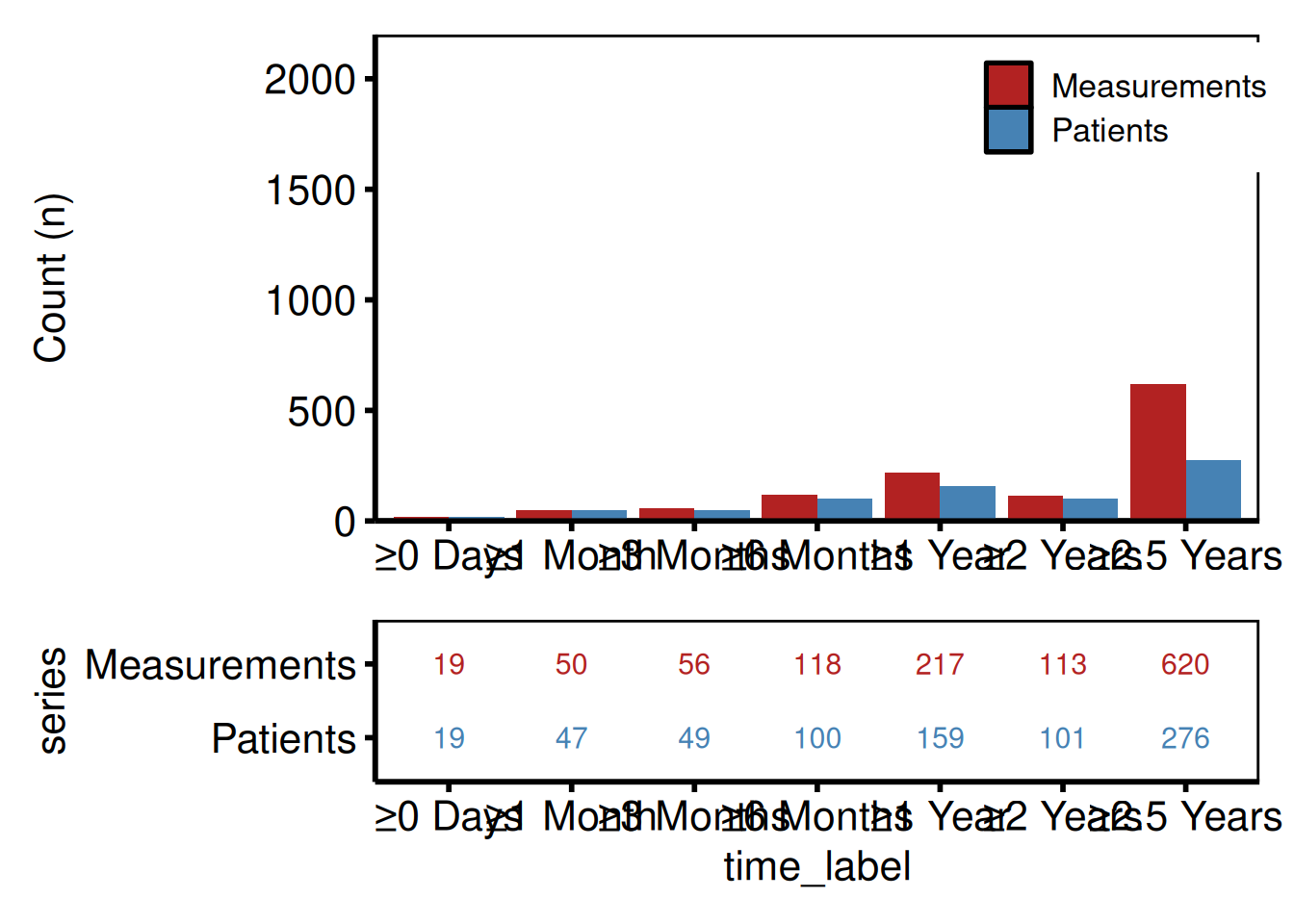
Saving the combined figure
ggsave() writes the patchwork composite at 11 x 6 inches. save_ppt() takes the bar chart alone – patchwork composites may need ggsave() first – and writes it to a PowerPoint slide. See Decorating and Saving for details.
combined <- p_lc_bar / p_lc_tbl +
  patchwork::plot_layout(heights = c(3, 1))

ggsave(here::here("graphs", "longitudinal_participation.pdf"),
       combined, width = 11, height = 6)

# PowerPoint (bar chart only — patchwork composites may need ggsave first)
save_ppt(p_lc_bar,
         template   = system.file("extdata", "hv_ppt_template.pptx", package = "hvtiPlotR"),
         powerpoint = here::here("graphs", "longitudinal_participation.pptx"))
UpSet Plot
hv_upset() builds an UpSet diagram via ggupset::scale_x_upset() to visualise surgical procedure co-occurrences or any set membership data. Where a Venn diagram breaks down past three or four sets, UpSet scales cleanly to seven or more.
plot.hv_upset() returns a ggplot when set_size = FALSE, or a patchwork composite of an intersection-bar plot + a set-size sidebar when set_size = TRUE (the default). For the bare ggplot path, themes apply via + like every other hvtiPlotR plot; for the patchwork path, use patchwork’s & operator to theme every sub-panel:
plot(hu) & theme_hv_poster()                  # default (patchwork)
plot(hu, set_size = FALSE) + theme_hv_poster() # single ggplot
Sample data
sample_upset_data() returns a binary indicator matrix: one column per procedure, one row per patient, with 1 indicating the procedure was performed. Pass the column names to intersect in the constructor to define the set membership axes. colSums() confirms the marginal counts before you build.
sets <- c("AV_Replacement", "AV_Repair", "MV_Replacement", "MV_Repair",
          "TV_Repair", "Aorta", "CABG")

upset_dta <- sample_upset_data(n = 400, seed = 42)
head(upset_dta)
AV_Replacement AV_Repair MV_Replacement MV_Repair TV_Repair Aorta CABG
1 FALSE FALSE FALSE TRUE FALSE FALSE FALSE
2 FALSE FALSE FALSE TRUE FALSE FALSE FALSE
3 FALSE FALSE FALSE FALSE FALSE FALSE TRUE
4 FALSE TRUE FALSE FALSE FALSE FALSE FALSE
5 FALSE FALSE TRUE FALSE TRUE FALSE FALSE
6 TRUE FALSE FALSE FALSE FALSE FALSE TRUE
colSums(upset_dta)AV_Replacement AV_Repair MV_Replacement MV_Repair TV_Repair
127 50 56 49 42
Aorta CABG
56 147
hu <- hv_upset(upset_dta, intersect = sets)Default plot
Intersection bars (top 10 by frequency) with a set-size sidebar on the right. set_size = TRUE returns a patchwork composite, so theme it with & to cover both sub-panels:
plot(hu) &
  theme_hv_poster()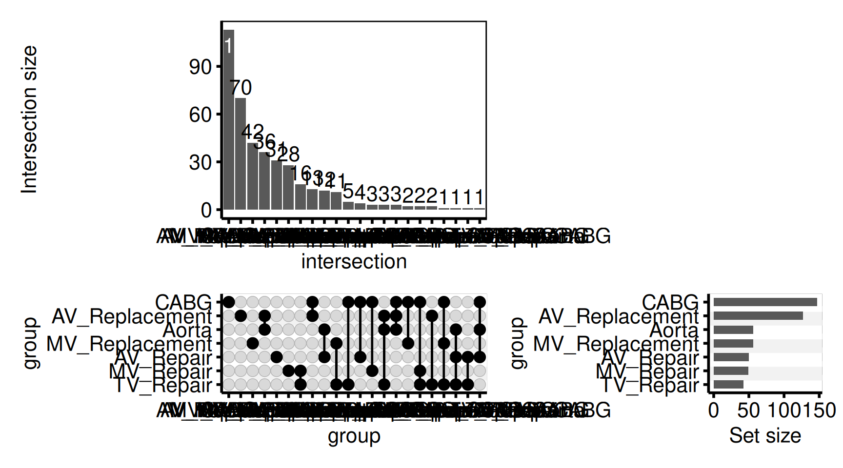
Custom intersection bar colour
The intersection bars are a standard geom_bar() — change the colour via the bar_fill argument (or set set_size = FALSE to return just the intersection-bar ggplot for full customisation).
plot(hu, bar_fill = "steelblue", set_size = FALSE) +
  ggplot2::labs(y = "Patients (n)") +
  theme_hv_poster()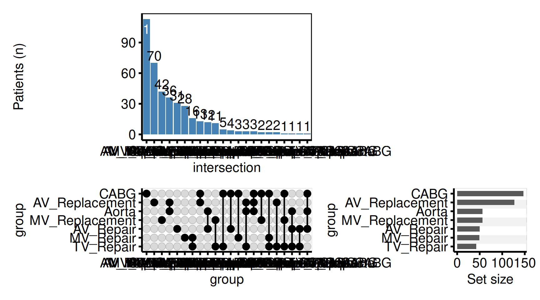
Colour bars by era
Pass fill_col to fill the intersection bars by a grouping column on the input data. Combine with scale_fill_manual() for explicit colour assignment.
upset_dta$era <- ifelse(seq_len(nrow(upset_dta)) <= 200, "Early", "Recent")
hu_era <- hv_upset(upset_dta, intersect = sets)

plot(hu_era, fill_col = "era", set_size = FALSE) +
  ggplot2::scale_fill_manual(
    values = c("Early" = "grey60", "Recent" = "steelblue"),
    name   = "Era"
  ) +
  ggplot2::labs(y = "Patients (n)") +
  theme_hv_poster()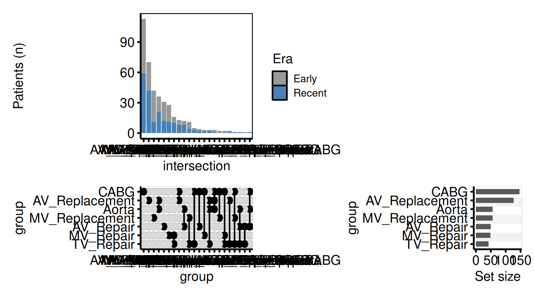
Saving
ggsave() handles a patchwork composite the same as a bare ggplot – write it at 11 x 6 inches, wide enough for the intersection bars plus the set-size sidebar. For a PowerPoint version, see Decorating and Saving.
p_upset <- plot(hu) & theme_hv_poster()

# UpSet plot is a patchwork composite when set_size = TRUE (the default);
# ggsave() handles it the same as any ggplot.
ggplot2::ggsave(here::here("graphs", "procedure_cooccurrence.pdf"),
                p_upset, width = 11, height = 6)
Draft Footnotes
make_footnote() writes a small annotation to the bottom-right corner of the current graphics device using grid. Call it after printing a plot to mark the figure as a work-in-progress during analysis. When you’re ready for final output, omit the call — the plot object itself is untouched.
# During analysis                   # For publication
print(p)                             ggsave("fig1.pdf", p, ...)
make_footnote("R/analysis.R")        # <- no footnote call
Draft annotation pattern
Build any hvtiPlotR figure as usual, then call print() followed by make_footnote() to stamp the bottom-right corner with the source file path and a timestamp. The ggplot object itself is unchanged – only the rendered device gets the annotation.
dta_fn <- sample_hazard_data(n = 300, time_max = 10)
emp_fn <- sample_hazard_empirical(n = 300, time_max = 10, n_bins = 5)

p_draft <- hazard_plot(
  dta_fn,
  estimate_col  = "survival",
  lower_col     = "surv_lower",
  upper_col     = "surv_upper",
  empirical     = emp_fn,
  emp_lower_col = "lower",
  emp_upper_col = "upper"
) +
  scale_colour_manual(values = c("steelblue"), guide = "none") +
  scale_fill_manual(values = c("steelblue"), guide = "none") +
  scale_x_continuous(limits = c(0, 10), breaks = 0:10) +
  scale_y_continuous(limits = c(0, 100), breaks = seq(0, 100, 20),
                     labels = function(x) paste0(x, "%")) +
  labs(x = "Years", y = "Survival (%)") +
  theme_hv_poster()

print(p_draft)
make_footnote("vignettes/plot-functions.qmd")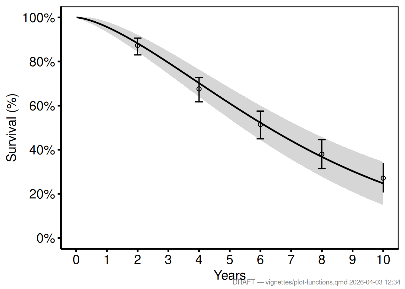
Custom analyst tag
Pass any string as text and set timestamp = FALSE for a stable label.
print(p_draft)
make_footnote(
  text      = paste("J. Ehrlinger |", Sys.Date()),
  timestamp = FALSE,
  prefix    = ""
)
Saving without the footnote
The ggsave() call writes the ggplot object directly — make_footnote() is never called, so the saved file is clean.
ggsave("../graphs/fig1_survival.pdf", p_draft, width = 11, height = 8.5)