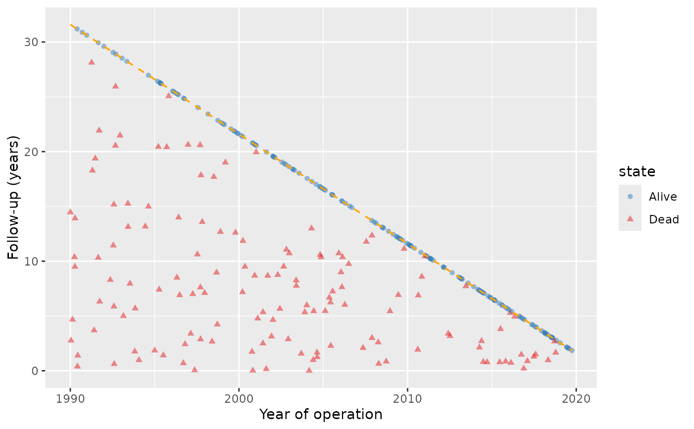
Draws one bare goodness-of-follow-up figure per panel, through
plot.hv_followup(). Colors, shapes, labels and themes are left to the
caller, as everywhere in this package; the state levels are "Alive" and
"Dead" for a death panel, and "No event", the event's label and
"Death" for an event panel.
Usage
# S3 method for class 'hv_followup_panels'
plot(x, alpha = 0.5, ...)
Arguments
- x
An
hv_followup_panelsobject.- alpha
Point transparency. Default
0.5, which keeps a dense cohort readable as a distribution.- ...
Passed to
plot.hv_followup(), for examplediagonal_color.
Examples
dta <- sample_goodness_followup_data()
fp <- hv_followup_panels(dta, origin_year = 1990,
                         panels = list(all = list(status = "dead", time = "iv_dead")))
plots <- plot(fp)
plots$all +
  ggplot2::scale_color_manual(values = c(Alive = "#377EB8", Dead = "#E41A1C")) +
  ggplot2::labs(x = "Year of operation", y = "Follow-up (years)")