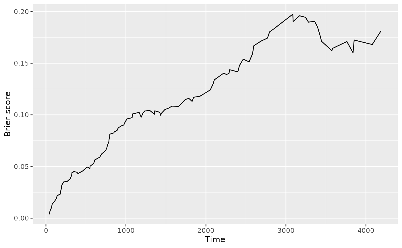
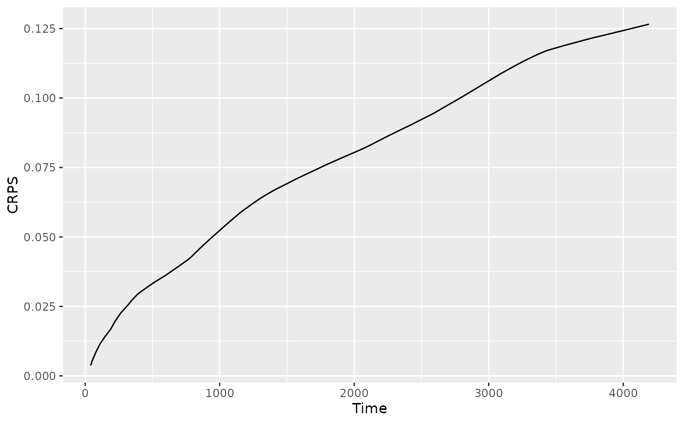
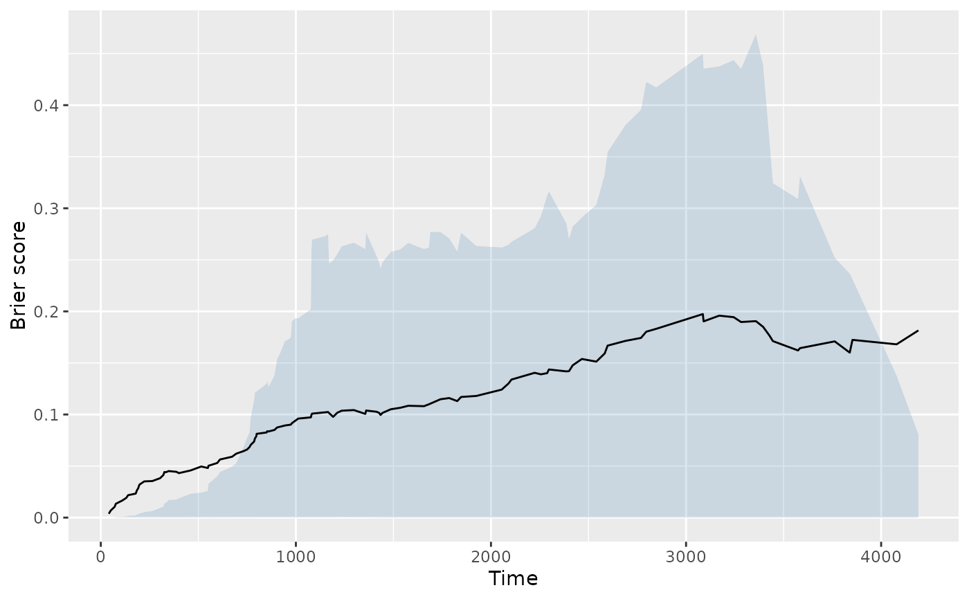
Draws the time-resolved Brier score or the running CRPS from a
gg_brier object. The curve moves across the event-time
grid on the x-axis; lower values mean the forest's predicted survival
probabilities are closer to what actually happened. Think of
0 as "perfect" and roughly 0.25 as "uninformative" – a
forest that predicts 0.5 for every subject regardless of
prognosis would sit near that ceiling.
Arguments
- x
A
gg_brierobject.- type
Which series to plot:
"brier"(default) or"crps".- envelope
Logical. When
TRUE, overlays a ribbon spanning the 15th-85th percentile of per-subject Brier (or running CRPS) contributions at each time, around the overall line. WhenFALSE(default), draws the overall series only.- ...
Extra arguments forwarded to
geom_line().
Details
Set envelope = TRUE to add a ribbon around the overall curve
spanning the 15th to 85th percentile of the per-subject Brier
contributions at each time. The ribbon shows how heterogeneous the
scoring is across subjects: a narrow ribbon means most subjects are
predicted equally well (or equally poorly); a wide ribbon means a
minority of subjects are driving the average.
Examples
# \donttest{
library(survival)   # Surv() must be on the search path for rfsrc()
data(pbc, package = "randomForestSRC")
rf <- randomForestSRC::rfsrc(Surv(days, status) ~ ., data = pbc,
                             nsplit = 10)
gg_dta <- gg_brier(rf)
plot(gg_dta)

plot(gg_dta, type = "crps")

plot(gg_dta, envelope = TRUE)   # adds 15-85% envelope

# }
# }