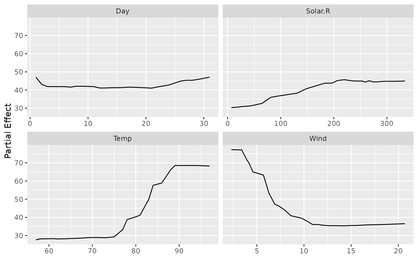
Turns a gg_partial object into a ggplot2 figure. Each curve
is a partial dependence trace – the forest's average prediction as one
predictor is swept across its range while the rest are marginalized over the
training data. Continuous predictors appear as line plots; categorical
predictors appear as bar charts. Both panels are faceted by variable name
so you can compare the shape and scale of each variable's effect at a
glance.
Usage
# S3 method for class 'gg_partial'
plot(x, ...)
Arguments
- x
A
gg_partialobject (output ofgg_partial).- ...
Not currently used; reserved for future arguments.
Value
A ggplot (or patchwork) object. When only one
variable type is present a single ggplot is returned. When both
continuous and categorical variables are present the two panels are
combined vertically via patchwork::wrap_plots(), which also
satisfies inherits(p, "ggplot").
Details
When a model label was attached in gg_partial(), lines are
coloured by model – handy for overlaying results from two forests (e.g.,
one tuned, one default) in the same figure.
Examples
set.seed(42)
airq <- na.omit(airquality)
rf <- randomForestSRC::rfsrc(Ozone ~ ., data = airq, ntree = 50)
pv <- randomForestSRC::plot.variable(rf, partial = TRUE, show.plots = FALSE)
pd <- gg_partial(pv)
plot(pd)