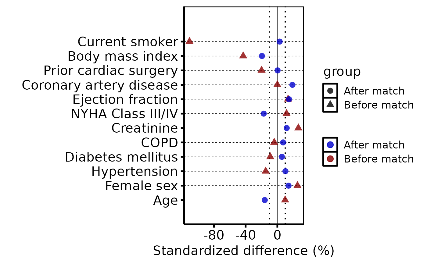
Builds a bare covariate balance ggplot2 object from an
hv_balance data object. Each covariate appears as a
labelled row; points show the standardized mean difference per group.
A solid line marks zero; dotted lines mark \(\pm\)threshold.
Add colour, shape, axis scales, and a theme with +.
Usage
# S3 method for class 'hv_balance'
plot(
  x,
  point_size = 3,
  alpha = 0.8,
  hline_linetype = "dashed",
  hline_linewidth = 0.25,
  vline_linewidth = 0.2,
  threshold_linetype = "dotted",
  ...
)
Arguments
- x
An
hv_balanceobject.- point_size
Passed to
geom_point(). Default3.- alpha
Point transparency in \([0,1]\). Default
0.8.- hline_linetype
Linetype for horizontal covariate guides. Default
"dashed".- hline_linewidth
Linewidth for horizontal guides. Default
0.25.- vline_linewidth
Linewidth for the zero reference line. Default
0.2.- threshold_linetype
Linetype for the \(\pm\)threshold lines. Default
"dotted".- ...
Ignored; present for S3 consistency.
Value
A bare ggplot object.
Examples
dta <- sample_covariate_balance_data()
cb  <- hv_balance(dta)

plot(cb) +
  ggplot2::scale_color_manual(
    values = c("Before match" = "red4", "After match" = "blue3"),
    name   = NULL
  ) +
  ggplot2::labs(x = "Standardized difference (%)", y = "") +
  theme_hv_poster()