Builds a bare mirrored-histogram ggplot2 object from an
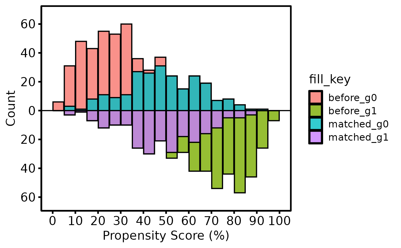
hv_mirror_hist data object. Bars for the treated group
appear above the x-axis; bars for the control group appear below. Matched
or weighted patients are shown in a contrasting shade. Compose with
+ to add colour scales, axis labels, and theme_hv_manuscript.
Usage
# S3 method for class 'hv_mirror_hist'
plot(x, alpha = 0.8, ...)
Arguments
- x
An
hv_mirror_histobject fromhv_mirror_hist.- alpha
Bar transparency in \([0,1]\). Default
0.8.- ...
Ignored; present for S3 consistency.
Value
A bare ggplot object; compose with +
to add colour scales, axis limits, labels, and
theme_hv_manuscript.
See also
hv_mirror_hist to build the data object,
theme_hv_manuscript for the publication theme,
sample_mirror_histogram_data for example data.
Other Propensity Score & Matching:
hv_mirror_hist()
Examples
dta <- sample_mirror_histogram_data(n = 500)
mh  <- hv_mirror_hist(dta)
#> mirror_histogram diagnostics: n=1000  dropped=0  [see $tables$diagnostics]

plot(mh) +
  ggplot2::labs(x = "Propensity Score (%)", y = "Count") +
  theme_hv_poster()