This chapter covers the two figures we reach for to vouch for a study before we report a single outcome from it. The covariate balance plot says the groups we are comparing were actually comparable. The goodness-of-follow-up plot says we kept track of the patients long enough to believe the outcome. Neither is the headline figure of a paper, but a reviewer who does not see them will ask, and both belong in the same quality-control habit.
They answer separate decisions. Use the balance plot to decide whether measured baseline covariates are acceptably similar across comparison groups. Use the follow-up plot to decide whether outcome ascertainment covers the study window. Good balance cannot make up for poor follow-up, and good follow-up cannot repair confounding at baseline.
18.1 Covariate balance plots
18.1.1 When to use it
Whenever you compare two groups that were not randomized (a propensity-matched SAVR-versus-TAVR cohort, say, or an inverse-probability-weighted analysis) the first question is whether the comparison is fair. If the treated patients were sicker to begin with, any difference in outcome could just be that. The covariate balance plot is how we show, covariate by covariate, that matching or weighting pulled the two groups together.
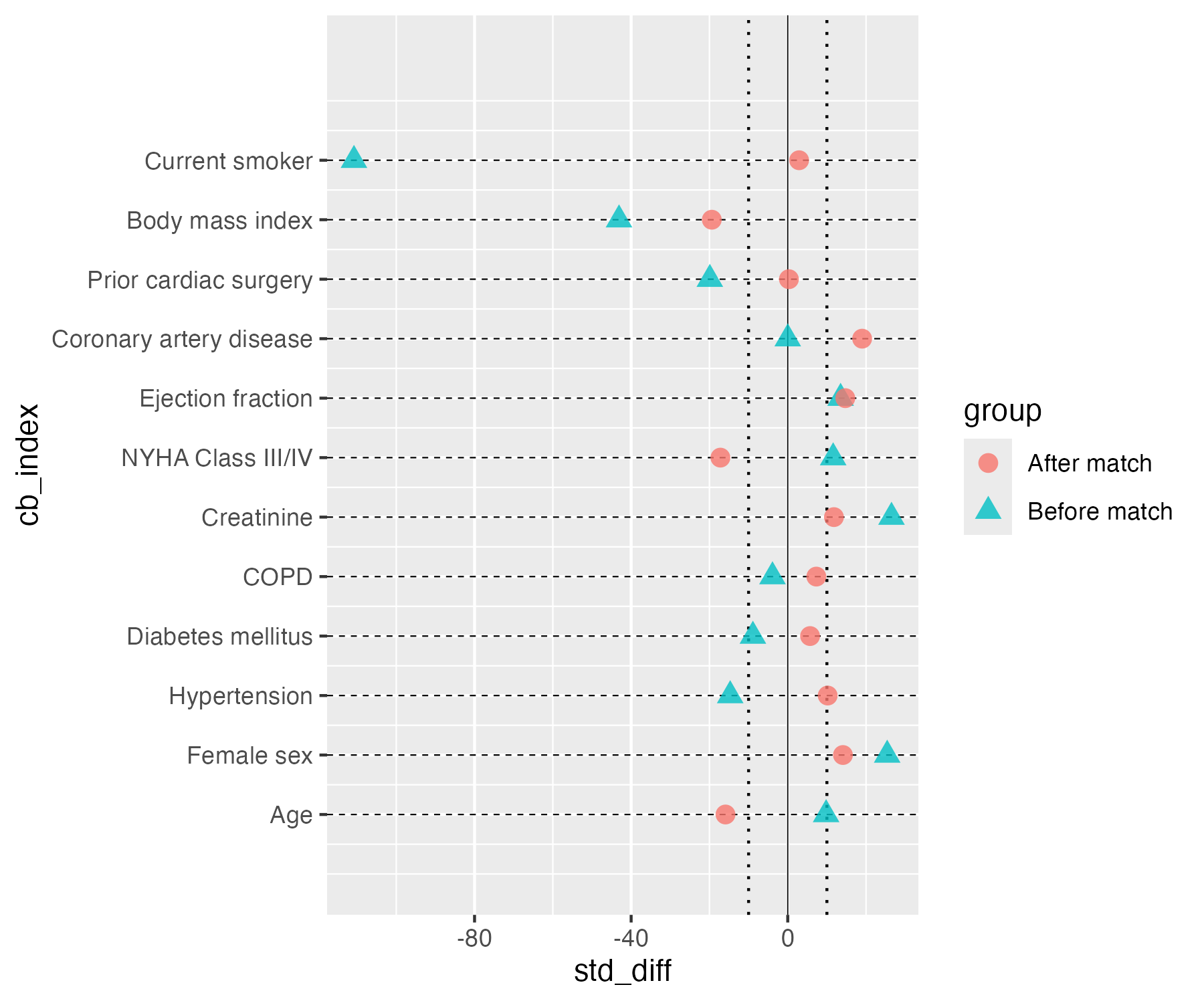
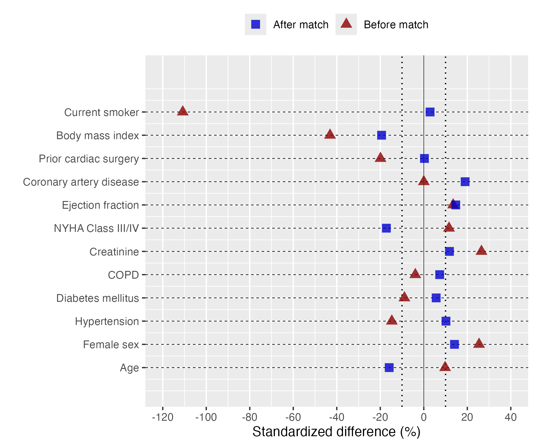
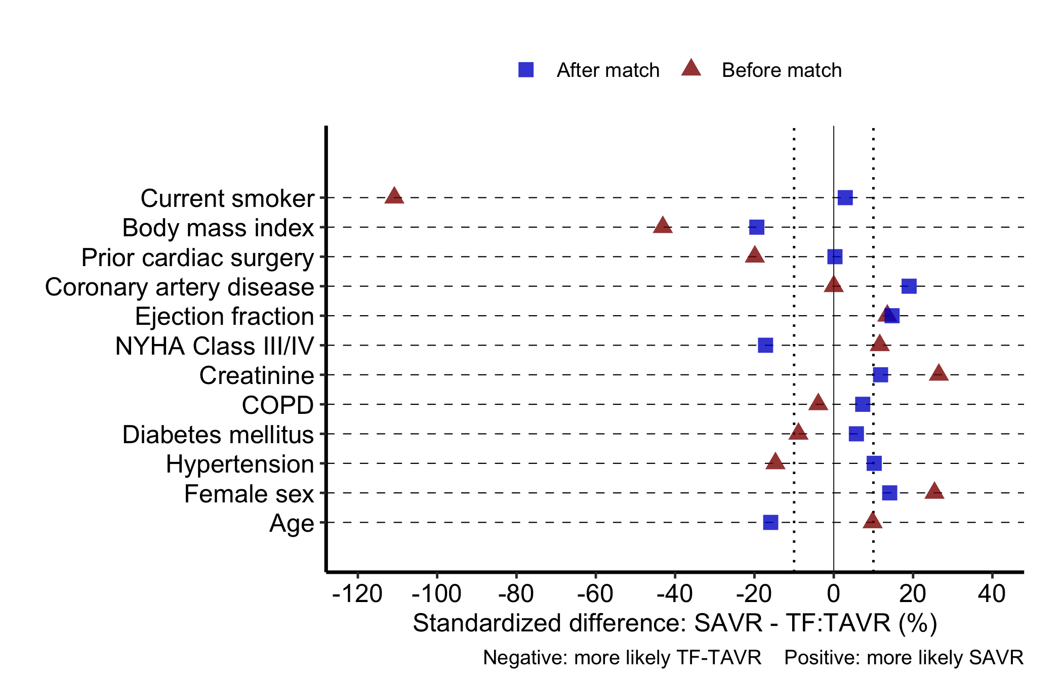
Each covariate is a row. A point shows the standardized mean difference (SMD, the gap between groups in standard-deviation units, scaled to a percent) for each comparison stage, usually before and after matching. A solid line at zero marks perfect balance; dotted guides at plus and minus ten percent give the eye a threshold for “close enough.” hv_balance()(Ehrlinger 2026) prepares the data and plot() hands back a bare ggplot to style with +.
18.1.2 The data it needs
hv_balance() wants long format: one row per covariate-by-group combination, with a column for the covariate name, one for the group label ("Before match", "After match"), and one for the numeric SMD. sample_covariate_balance_data() returns 12 covariates already in that shape, with columns variable, group, and std_diff.
           variable        group std_diff
1               Age Before match      9.8
2        Female sex Before match     25.4
3      Hypertension Before match    -14.7
4 Diabetes mellitus Before match     -8.9
5              COPD Before match     -3.9
6        Creatinine Before match     26.5
# Build the S3 object once; reuse for all plot variants belowcb <-hv_balance(dta_cb, threshold =10)
If your numbers arrive in wide format (one column per stage, as a summary table or spreadsheet export usually does), reshape to long first. reshape() from base R does it in one call: name the two stage columns in varying, give the stacked value column a name with v.names, and tell it which column identifies the covariate.
                              variable        group std_diff
Age.Before match                   Age Before match     22.1
Female sex.Before match     Female sex Before match    -15.3
Hypertension.Before match Hypertension Before match     18.7
Diabetes.Before match         Diabetes Before match     -9.4
COPD.Before match                 COPD Before match     11.2
Age.After match                    Age  After match      3.5
18.1.3 Inspect it
Inspect the prepared balance object before plotting. Its metadata records the row order and the 10-percent threshold. The cross-tabulation then audits how many covariates fall inside that threshold for each stage. In this synthetic example, only 4 of 12 covariates are inside the guides both before and after matching, so the figure is a diagnosis of inadequate balance, not evidence that matching succeeded.
cb
<hv_balance>
  Variables   : 12
  Groups      : 2 (Before match, After match)
  Value col   : std_diff
  Threshold   : ±10
  Stats       : smd
  Height      : 3.5 in at 12 pt (see hv_balance_height())
              within_threshold
group          FALSE TRUE
  After match      8    4
  Before match     8    4
18.1.4 Build it
Start from the bare panel to see what the constructor produced. One covariate per row, points at their SMD values, and no colour, shape, axis limits, or theme yet.
# Free size: one row per covariate, so the height grows with the list.plot(cb, alpha =0.8)
Figure 18.1: Bare covariate balance panel before any scales, labels or theme. Salmon-red circles mark covariates after matching and teal triangles before matching, the solid vertical line marks zero, the dotted vertical lines plus and minus 10 percent, and thin dashed horizontal lines guide the eye along each row.
Now layer on the house style. We map "Before match" to red triangles and "After match" to blue squares, the colour convention this team has used for years, and widen the x-axis enough to hold the largest pre-match SMD. Symmetric breaks around zero make the plus-or-minus-ten-percent threshold easy to eyeball.
# Free size: one row per covariate, so the height grows with the list.plot(cb, alpha =0.8) +scale_color_manual(values =c("Before match"="red4", "After match"="blue3"),name =NULL ) +scale_shape_manual(values =c("Before match"=17L, "After match"=15L),name =NULL ) +scale_x_continuous(limits =c(-120, 40),breaks =seq(-120, 40, 20) ) +labs(x ="Standardized difference (%)", y ="") +theme(legend.position ="top")
Figure 18.2: Covariate balance panel with the team colors and shapes applied. Dark-red filled triangles mark covariates before matching and blue filled squares after matching, the solid vertical line marks zero, the dotted vertical lines plus and minus 10 percent, and thin dashed horizontal lines guide the eye along each row.
For a finished figure, put the legend above the panel and state the direction of imbalance in the caption. Keeping both outside the data region avoids covering the most imbalanced covariates and keeps the interpretation attached when the figure is exported.
# Free size: one row per covariate, so the height grows with the list.cb_final <-plot(cb, alpha =0.8) +scale_color_manual(values =c("Before match"="red4", "After match"="blue3"),name =NULL ) +scale_shape_manual(values =c("Before match"=17L, "After match"=15L),name =NULL ) +scale_x_continuous(limits =c(-120, 40),breaks =seq(-120, 40, 20) ) +labs(x ="Standardized difference: SAVR - TF:TAVR (%)",y ="",caption ="Negative: more likely TF-TAVR Positive: more likely SAVR" ) +theme_hv_manuscript(base_size =12) +theme(legend.position ="top")cb_final
Figure 18.3: Covariate balance plot showing standardized mean differences before and after matching; negative values favor TF-TAVR and positive values favor SAVR. Dark-red filled triangles mark each covariate before matching and blue filled squares after matching, the solid vertical line marks zero difference, the dotted vertical lines mark plus and minus 10 percent, and thin dashed horizontal lines guide the eye along each row.
18.1.5 Read it
Read down the rows, comparing the two points in each:
The after-match points should collapse toward zero. That is the target, but it is not what this synthetic example shows overall. Only 4 of 12 blue squares sit inside the dotted plus-or-minus-ten guides, the same count as before matching. Do not describe this cohort as balanced.
Watch any covariate that stays imbalanced. A blue point still well past ten percent is a variable matching did not fix. You either adjust for it in the outcome model or say so in the limitations.
The caption names the direction. A positive SMD means one group has more of that covariate; the caption tells the reader which. Without it a reviewer cannot tell whether “more likely SAVR” sits left or right.
18.1.6 Variations
18.1.6.1 Controlling covariate order
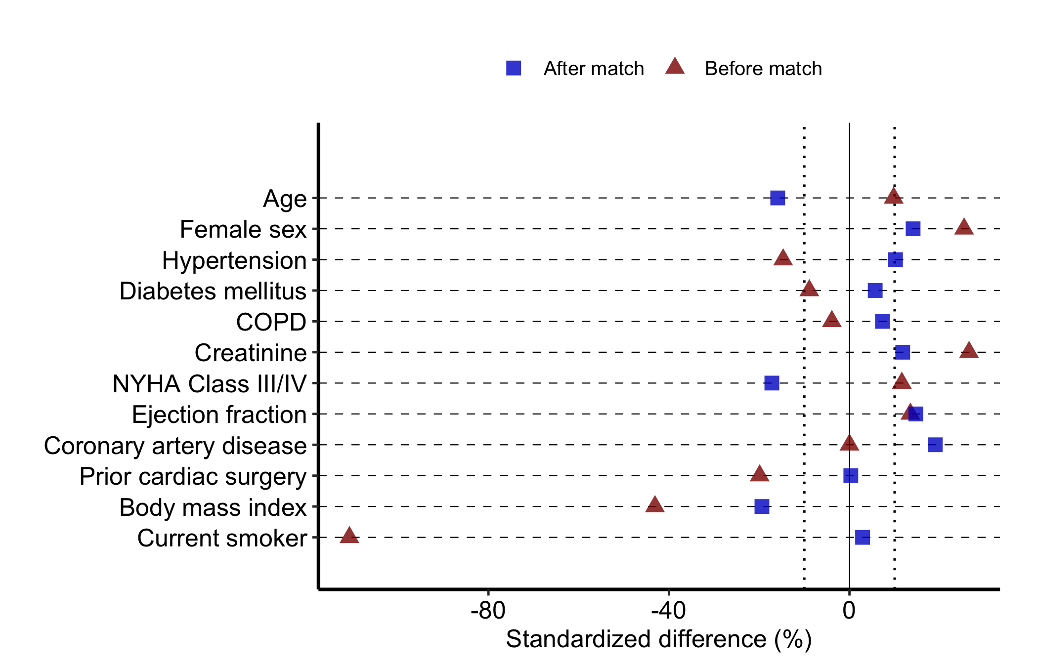
Pass var_levels to the constructor to set the bottom-to-top order of rows. Supply any vector containing all the covariate names; the example reverses the default. Order covariates the way a reader scans them, often most-imbalanced at top, rather than by data-frame order.
# Free size: one row per covariate, so the height grows with the list.cb_ord <-hv_balance(dta_cb, var_levels =rev(unique(dta_cb$variable)))plot(cb_ord, alpha =0.8) +scale_color_manual(values =c("Before match"="red4", "After match"="blue3"),name =NULL ) +scale_shape_manual(values =c("Before match"=17L, "After match"=15L),name =NULL ) +labs(x ="Standardized difference (%)", y ="") +theme_hv_manuscript(base_size =12) +theme(legend.position ="top")
Figure 18.4: Covariate balance plot with the row order reversed to control how a reader scans the covariates. Dark-red filled triangles mark each covariate before matching and blue filled squares after matching, the solid vertical line marks zero difference, the dotted vertical lines mark plus and minus 10 percent, and thin dashed horizontal lines guide the eye along each row.
18.2 Goodness-of-follow-up plots
18.2.1 When to use it
A survival or time-to-event analysis is only as trustworthy as its follow-up. If patients vanished from the records early, an apparent absence of events may just be an absence of looking. The goodness-of-follow-up plot is how we show a reviewer that the cohort was tracked across the whole study window, not just at the start.
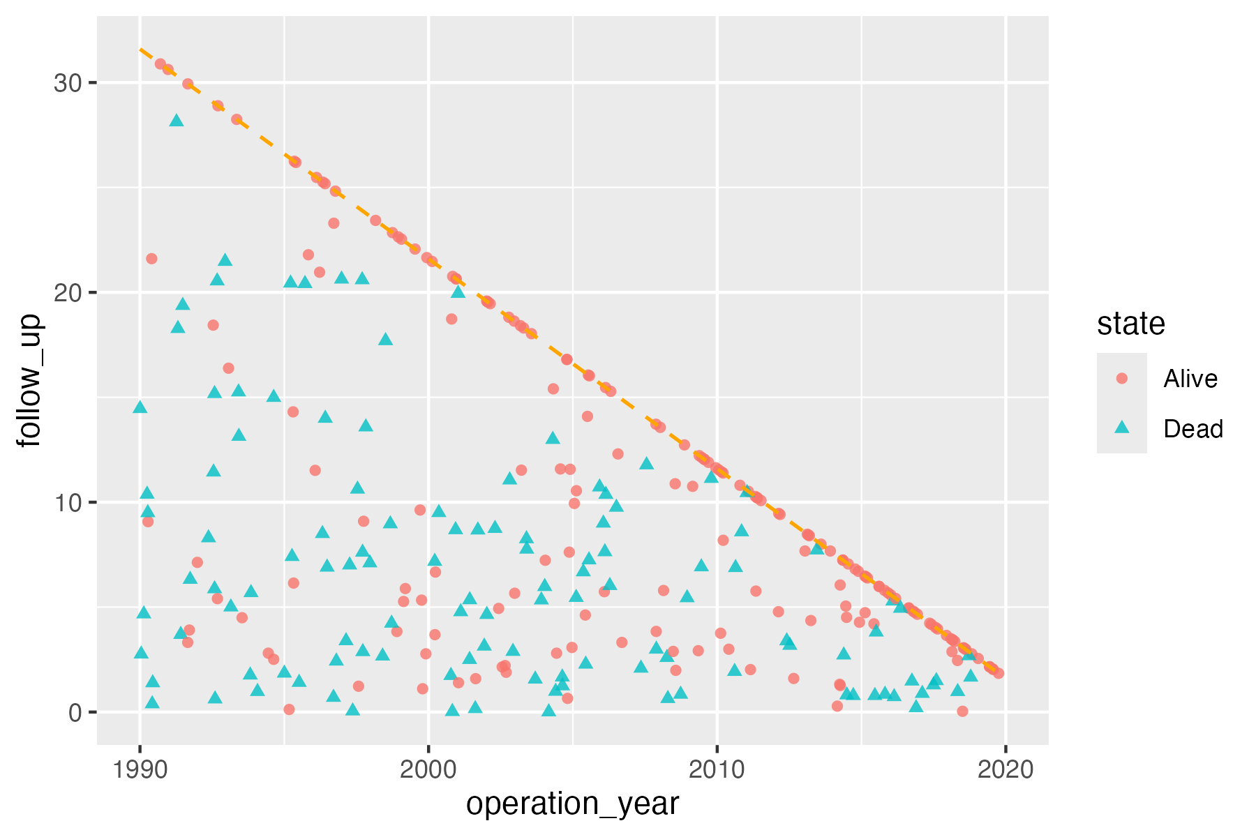
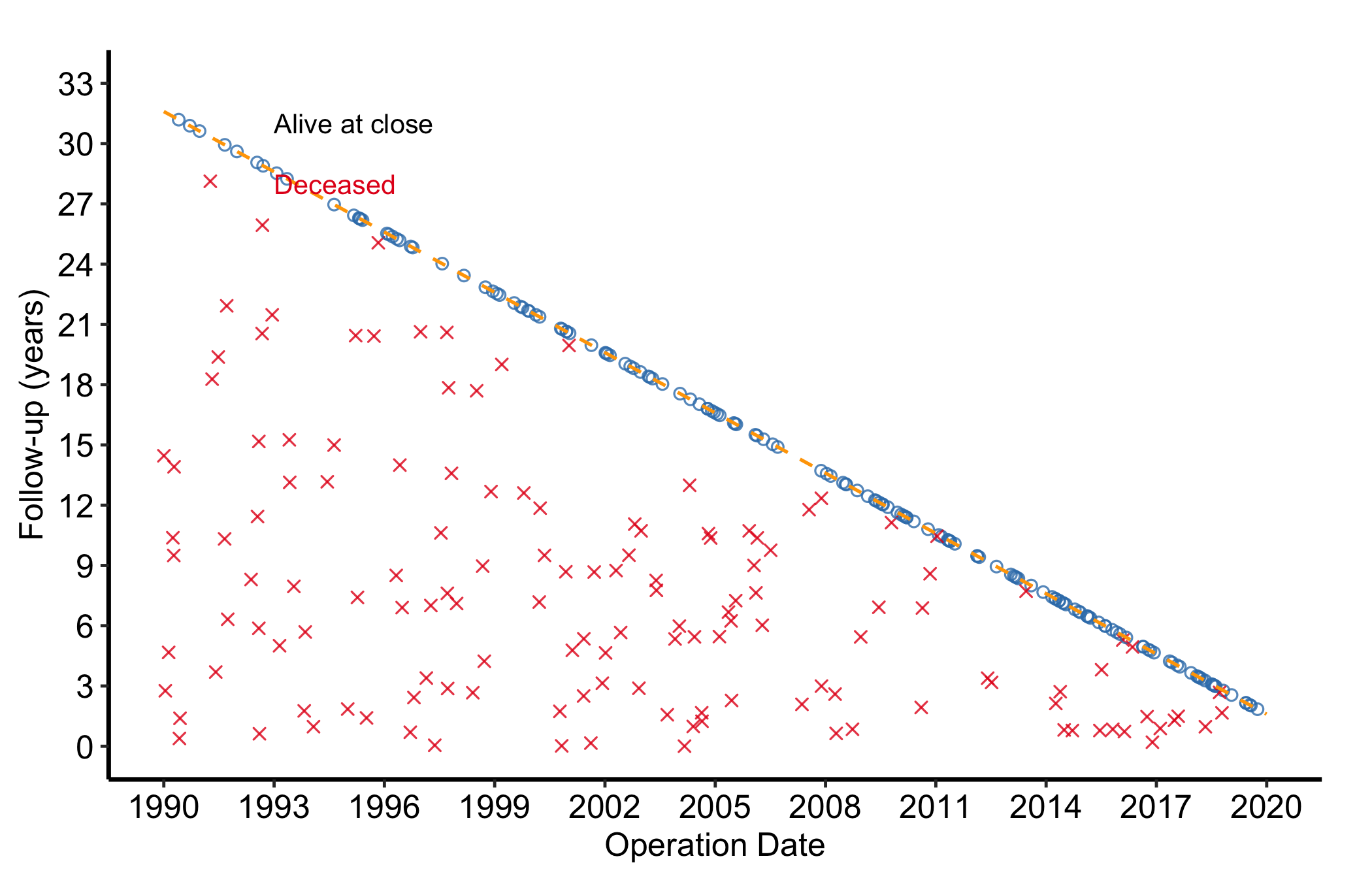
Each patient is a point at their operation date (x-axis) and follow-up duration (y-axis), with a short tick below. A dashed diagonal marks the maximum follow-up the study window alone could explain: a patient operated on early could be followed for many years, one operated on late for only a few. A survivor followed right up to the close date sits on the diagonal, and one lost to follow-up sits below it. Nothing can sit above it, because close_date is the day the dataset was frozen. hv_followup()(Ehrlinger 2026) prepares the data; the type argument picks the panel: "followup" (the default death-or-censoring scatter) or "event" (a competing non-fatal event).
18.2.2 The data it needs
hv_followup() wants one row per patient with an operation date, a follow-up duration, and a vital-status indicator. The constructor also needs three study dates, study_start, study_end, and close_date, to place the maximum-follow-up diagonal correctly. sample_goodness_followup_data() generates 300 patients in that shape, including a simulated non-fatal event column we use later.
The returned object carries the prepared plotting rows and the dates that set the diagonal. Inspect both before drawing the panel. The state table is also a legend audit: its Alive and Dead levels must match the two manual colour and shape entries used below.
gf
<hv_followup>
  N patients  : 300
  Study period: 1990-01-01 – 2019-12-31 (close: 2021-08-06)
  Death col   : dead / iv_dead
  Panels      : followup
Start with the bare panel: each patient is a point and tick, with no scales or labels yet.
# Bare plot, no scales or labels yetplot(gf)
Figure 18.5: Bare goodness-of-follow-up panel before any scales or labels. Salmon-red circles mark patients last known alive, teal triangles deaths, and the dashed orange diagonal the longest follow-up the study window allows.
Now finish it. scale_color_manual() and scale_shape_manual() map the binary alive-or-dead state to colour and point shape; coord_cartesian() clips the view to the study window; annotate() labels the two states on the panel; and theme_hv_manuscript() gives the journal-sized version.
Figure 18.6: Goodness-of-follow-up plot showing each patient’s operation date against follow-up duration, colored by vital status, with the maximum-follow-up diagonal. Blue open circles mark patients last known alive, red crosses mark deaths, and the dashed orange diagonal marks the longest follow-up the study window allows.
18.2.5 Read it
Read the shape of the cloud:
Survivors on the diagonal were followed to the close date. A blue point on the line is a patient whose follow-up is complete. Deaths fall below the line wherever they happened, and that is expected.
Survivors below the diagonal were lost to follow-up. Each one was last contacted before the close date. A scatter of them is normal. A cluster in one era of operation dates flags a stretch where follow-up lapsed, and their share of the survivors is the number a reviewer will ask for.
Nothing should sit above the diagonal. Follow-up past the day the dataset was frozen is impossible, so a point up there is a wrong date. The opposite pattern is a warning too: if every survivor sits exactly on the line, follow-up was probably computed to the close date rather than to last contact.
The colour split shows the events. Red points are deaths. Where they cluster (early after surgery, or late at long follow-up) is a hint at the hazard pattern you will quantify in the survival analysis.
18.2.6 Variations
18.2.6.1 Non-fatal event panel
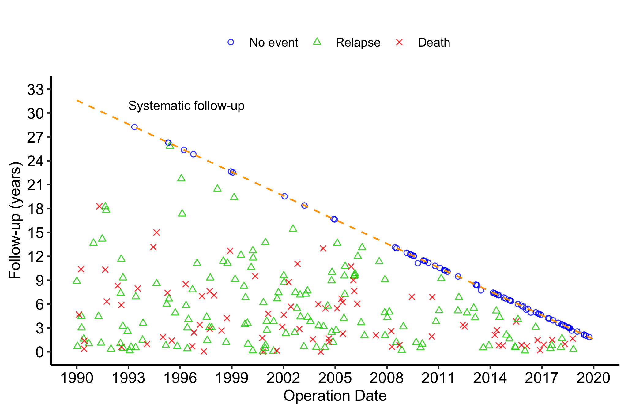
When the dataset carries a non-fatal competing event (relapse, reoperation), pass event_col, event_time_col, and optionally death_for_event_col to the constructor, then call plot() with type = "event". The panel then shows the three-way event status (no event, the non-fatal event, death) instead of the binary alive-or-dead split.
<hv_followup>
  N patients  : 300
  Study period: 1990-01-01 – 2019-12-31 (close: 2021-08-06)
  Death col   : dead / iv_dead
  Event col   : ev_event / iv_event
  Panels      : followup, event
  operation_year follow_up segment_end    state
1       2019.569    2.0261      2.0261 No event
2       1996.483    4.0813      4.0813  Relapse
3       2004.434    2.8045      2.8045 No event
4       2015.432    0.6137      0.6137  Relapse
5       1993.425    6.9232      6.9232  Relapse
6       2014.162    0.2802      0.2802 No event
The event table makes the classification explicit before the legend appears. A recorded relapse is labelled Relapse only when it occurs before death. If death occurs first, the row is labelled Death; a patient with neither is labelled No event. Check these three counts against the event analysis set before interpreting the panel.
Figure 18.7: Goodness-of-follow-up plot showing three-way event status (no event, non-fatal event, death) for each patient. Blue open circles mark patients with no event, green open triangles a relapse, red crosses death, and the dashed orange diagonal marks the longest follow-up the study window allows.
18.3 Pitfalls
Balance plots need long format. One row per covariate-by-group combination. Hand hv_balance() a wide table and you get one point per covariate instead of the before-and-after pair; reshape first.
Distinguish the groups. If the before and after points sit on top of each other for every covariate, check that the group column has two distinct levels. Identical points usually mean a labelling slip, not perfect matching.
A single threshold is a guide, not a verdict. The ten-percent lines are a convention. A covariate just past them may matter clinically or may not; judge it against what the variable is, not the line alone.
The follow-up diagonal depends on the dates.study_start, study_end, and close_date set where the line falls. Get one wrong and every point looks mis-placed relative to it. Confirm the three dates against the protocol before reading the figure.
Above the line is a data error.close_date is when the dataset was frozen, so a point above the diagonal has follow-up that cannot exist. Trace it to the patient’s dates and fix the record. Widening the axis to make room for it hides the error.
Ehrlinger, John. 2026. hvtiPlotR: HVTI Ggplot2 Themes and Clinical Plot Functions for the Cleveland Clinic Heart & Vascular Institute. https://github.com/ehrlinger/hvtiPlotR.