Does the relationship between two measurements look the same across clinical groups or eras? A postage stamp plot gives each subgroup the same small panel so the layout carries the comparison.
14.1 When to use it
Sometimes overlaying every group on one panel turns into spaghetti: too many colours, too many overlapping clouds, and the comparison you wanted is lost. The fix is to give each group its own small panel and line them up on a shared grid. The result is a “postage stamp” plot, the same plot repeated across the levels of a categorical variable, each panel reading like a stamp on a sheet. Because every panel shares the same axes and geometry, your eye compares them the way it compares photographs in a contact sheet: the layout does the alignment for you. Reach for it when one figure has to carry a per-subgroup comparison and an overlay would be too busy.
hvtiPlotR 2.7.17 has no postage-stamp or faceting constructor, so we build this layout directly with ggplot2’s (Wickham et al. 2026)facet_wrap() and apply the house theme theme_hv_manuscript() for visual consistency. The faceting is the whole trick. You write one ggplot() call describing a single panel, add facet_wrap(), and ggplot2 repeats the panel once per group.
14.2 The data it needs
A faceted scatter needs an x and a y for the relationship inside each panel, plus a categorical column to split the panels on. We use hvtiPlotR::sample_eda_data() with op_years (years since first surgery) for x and ef (ejection fraction) for y, and we facet on operative year. A postage stamp only earns its keep when there are many small panels, so we restrict to a nine-year window, which lays out as a clean three-by-three sheet.
dat <-sample_eda_data()# A nine-year window facets into a 3 x 3 sheet of small multiples.dat <- dat[dat$year %in%2012:2020, ]dat$year <-factor(dat$year)xvar <-"op_years"yvar <-"ef"grp <-"year"c(x = xvar, y = yvar, facet = grp, panels =nlevels(dat[[grp]]))
         x          y      facet     panels
"op_years"       "ef"     "year"        "9"
The .data[[xvar]] idiom is how ggplot2 reads a column name held in a variable, so the recipe runs against whatever columns you name. Faceting on a window of years turns one busy overlay into a contact sheet you read year by year; substitute your own grouping (centre, severity class, era) and the mechanics are identical.
14.3 Inspect it
There is no S3 constructor object in this direct faceting recipe. Check the factor order and panel counts before smoothing, because a sparse or misordered panel looks just as finished as a well-supported one.
    op_years           ef
 Min.   : 7.03   Min.   :29.40
 1st Qu.: 9.13   1st Qu.:47.40
 Median :11.29   Median :56.30
 Mean   :11.37   Mean   :55.61
 3rd Qu.:13.55   3rd Qu.:63.00
 Max.   :15.97   Max.   :80.00
                 NAs    :11
14.4 Build it
Each panel shows the relationship between the two numeric variables for one level of the faceting variable, with a straight fitted line to summarize the direction within each subgroup. A linear fit is stable in these small, narrow panels; facet_wrap() lays them out left to right and wraps to a new row when it runs out of width.
p_sheet <-ggplot(dat, aes(x = .data[[xvar]], y = .data[[yvar]])) +geom_point(alpha =0.4, size =0.8) +geom_smooth(method ="lm", se =FALSE) +facet_wrap(vars(.data[[grp]]), ncol =3) +scale_x_continuous(breaks =c(8, 12, 16)) +labs(title ="Small-multiple panels by operative year",x ="Years from first surgery",y ="Ejection fraction (%)" ) +theme_hv_manuscript(base_size =12)# Facets of one plot: hv_panel_size() gives each a 3 by 2 inch panel, shrunk to fit the page.dims_p_sheet <-hv_panel_size(p_sheet)
p_sheet
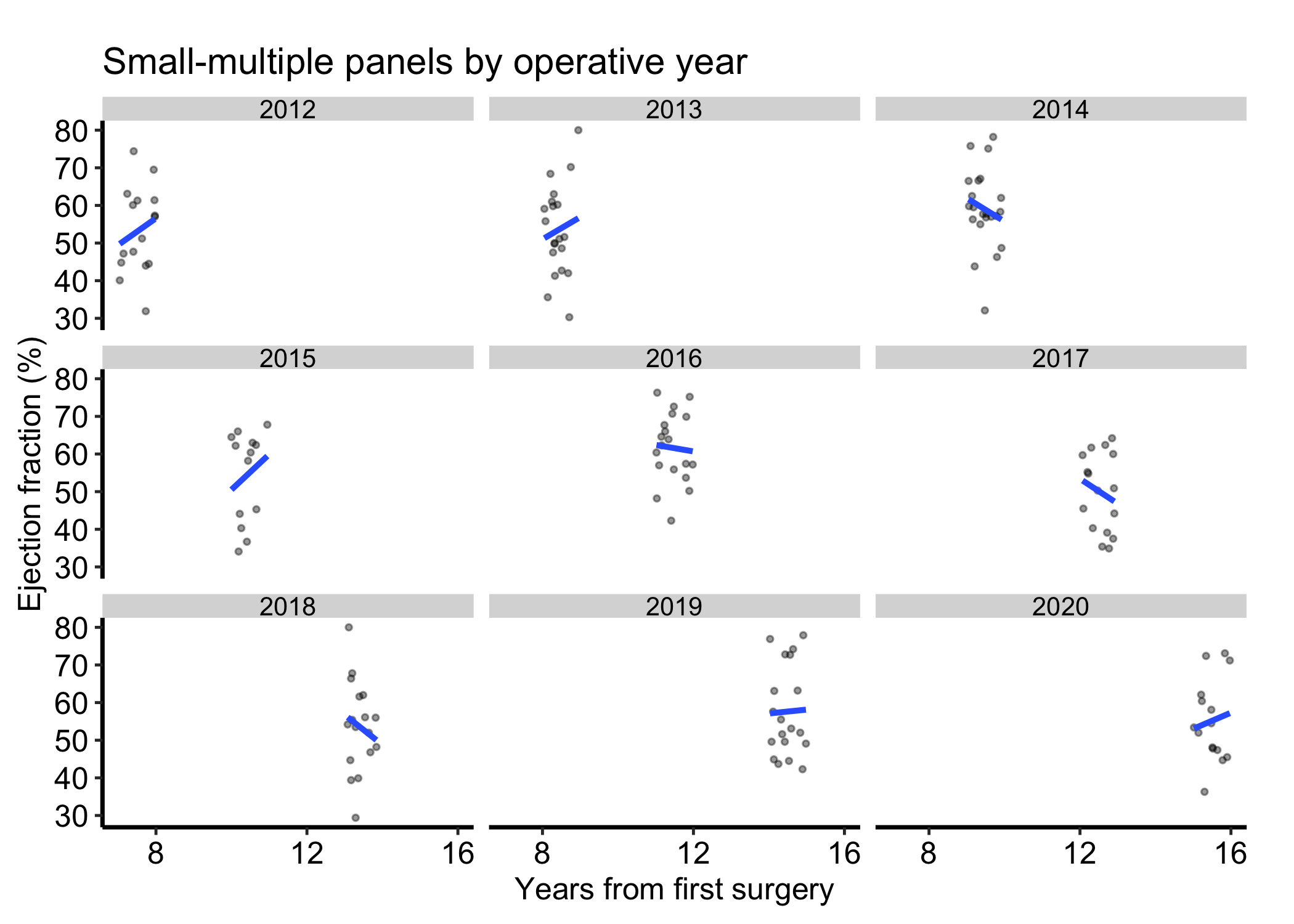
Figure 14.1: Ejection fraction against years from surgery, faceted into a three-by-three sheet of small multiples by operative year on shared axes. Black filled circles mark patients and the blue line is the linear fit within each panel.
All nine panels share one x-axis and one y-axis. The smooth in each panel is computed from that panel’s data alone, so the curves are directly comparable: a higher curve in one panel really does mean a higher y there, not a trick of a rescaled axis.
14.5 Read it
Read a postage stamp plot by comparing panels, not by studying any one in isolation. Years from first surgery are on the x-axis, ejection fraction is on the y-axis, and operative year defines the panels. Each fitted line uses only the observations in its panel. Differences among lines are descriptive era comparisons; they do not show that operative year caused EF to differ or that a cross-sectional pattern is a within-patient change.
Compare on the shared scale. The point of the layout is that the axes are fixed across panels, so a difference in height or slope between two panels is a real difference in the data. Trust the comparison only as long as the scales are shared; the moment you free the scales (see below) the panels no longer line up and cross-panel reading breaks.
Look at the trend per panel. Each panel’s smooth summarises that subgroup. Do the curves rise in some panels and fall in others? A pattern that differs by panel is exactly the interaction a single overlaid plot would have buried.
Watch the density of points. A panel with few points (a year with fewer operations) gives a smooth you should not over-read; the curve is drawn with the same confidence as a panel backed by ten times the data.
14.6 Adapt it
14.6.1 Fixing the panel layout
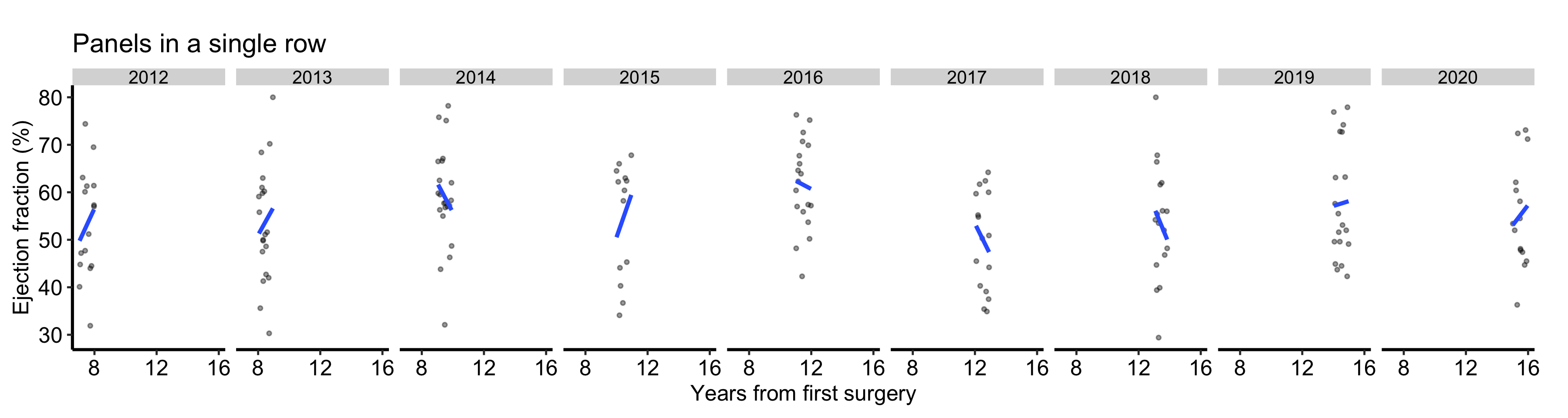
facet_wrap() chooses a roughly square grid by default. When you want the panels in a single row to emphasise a left-to-right comparison, or in a single column to stack them, set nrow or ncol directly.
# Free size: nine facet panels in one row. hv_panel_size() refuses this one: nine# across a 6.5 inch page leaves each panel under the 1.6 inches it needs.ggplot(dat, aes(x = .data[[xvar]], y = .data[[yvar]])) +geom_point(alpha =0.4, size =0.8) +geom_smooth(method ="lm", se =FALSE) +facet_wrap(vars(.data[[grp]]), nrow =1) +scale_x_continuous(breaks =c(8, 12, 16)) +labs(title ="Panels in a single row",x ="Years from first surgery",y ="Ejection fraction (%)" ) +theme_hv_manuscript(base_size =12)
Figure 14.2: The same panels forced into a single row to emphasize a left-to-right comparison. Black filled circles mark patients and the blue line is the linear fit within each panel.
14.6.2 Free scales, used deliberately
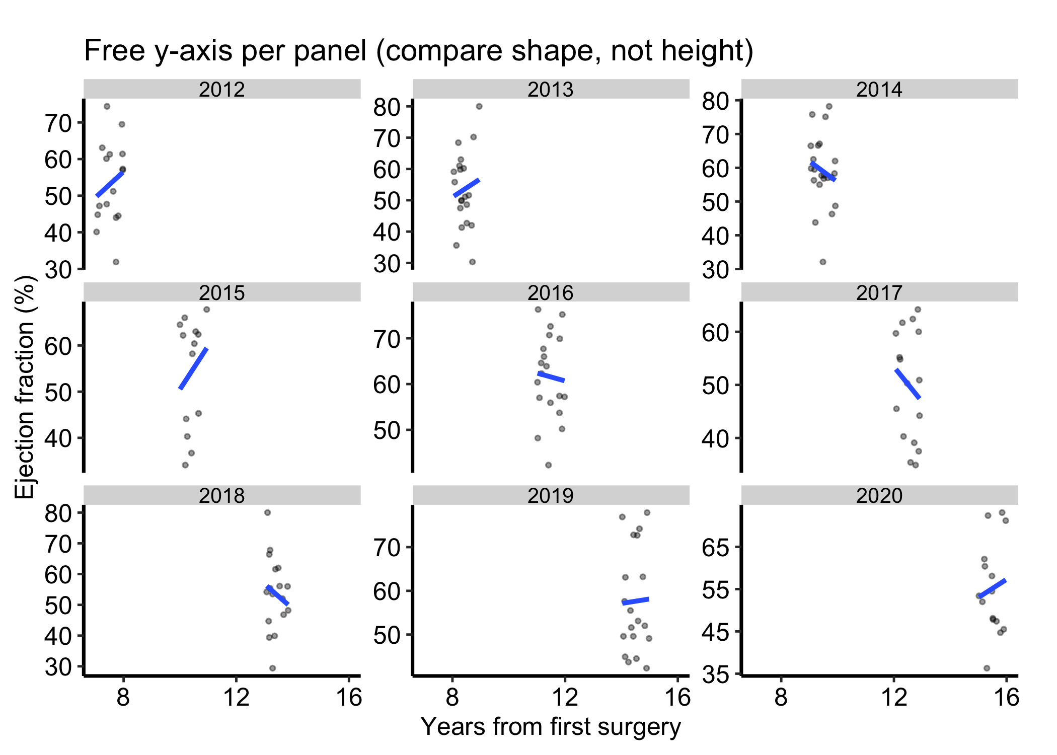
By default every panel shares both axes, which is what makes cross-panel reading honest. Sometimes one group lives on a different range and the shared scale squashes it flat. scales = "free_y" lets each panel set its own y-axis. Use it only when you care about the shape inside each panel rather than comparing heights across them, and say so in the caption, because the panels no longer line up.
p_free <-ggplot(dat, aes(x = .data[[xvar]], y = .data[[yvar]])) +geom_point(alpha =0.4, size =0.8) +geom_smooth(method ="lm", se =FALSE) +facet_wrap(vars(.data[[grp]]), scales ="free_y") +scale_x_continuous(breaks =c(8, 12, 16)) +labs(title ="Free y-axis per panel (compare shape, not height)",x ="Years from first surgery",y ="Ejection fraction (%)" ) +theme_hv_manuscript(base_size =12)# Facets of one plot: hv_panel_size() gives each a 3 by 2 inch panel, shrunk to fit the page.dims_p_free <-hv_panel_size(p_free)
p_free
Figure 14.3: Panels with a free y-axis per group, for comparing the shape within each panel rather than heights across them. Black filled circles mark patients and the blue line is the linear fit within each panel.
14.7 Deliver it
Once the facet order and shared scales are fixed, use Finish and deliver the result for the manuscript, poster, or slide export path. Keep the panel variable, per-panel smoother, and any free scale choice in the caption so the exported sheet remains interpretable.
14.8 Pitfalls
Free scales by accident. The default shared scale is what makes the panels comparable. Switching to scales = "free" or "free_y" without flagging it lets a reader compare panel heights that are no longer on the same axis, which is a common way for a small-multiples figure to mislead. Free the scales only on purpose, and label it.
Too many panels. A facet over a high-cardinality variable produces a wall of tiny panels nobody can read. If a categorical has more than eight or so levels, collapse the rare ones into an “Other” group, or pick the levels worth showing, before you facet.
Unhelpful panel order.facet_wrap() orders panels by the factor levels, which default to alphabetical. When the variable has a natural order (severity, era, anatomical class), reorder the factor first so the panels read in that order; otherwise the trend across panels is scrambled.
Over-reading a thin panel. A subgroup with few observations gets a panel and a smooth that look just as authoritative as a well-populated one. Note the per-panel counts, or let the sparse panel speak for itself, rather than reading a confident-looking curve off a dozen points.
Wickham, Hadley, Winston Chang, Lionel Henry, et al. 2026. Ggplot2: Create Elegant Data Visualisations Using the Grammar of Graphics. https://ggplot2.tidyverse.org.