The Kaplan-Meier curve is the workhorse of every CORR outcomes paper. Reach for it whenever the question is how long until an event and some patients have not had the event yet by the end of follow-up: death, reoperation, readmission. That last part is what makes survival analysis its own method: a patient who is alive at last contact is right-censored, not a non-event, and the product-limit estimator is what lets those partial observations still count.
Before you choose a panel, name the question. These displays share a time axis, but they do not answer the same thing:
Survival probability, \(S(t)\): What proportion remains alive and event-free beyond time \(t\)?
Cumulative hazard, \(H(t)\): How much event intensity has accumulated through time \(t\)? This is dimensionless and is not a probability.
Hazard rate, \(h(t)\): Among patients still at risk at time \(t\), how quickly are events occurring? Its units are events per unit of person-time.
Absolute survival difference, \(S_2(t)-S_1(t)\): How many percentage points separate two groups at a named time? We build that contrast in the NNT and survival-difference chapter.
Number needed to treat, \(NNT(t)\): How many patients must receive group 2 rather than group 1 to prevent one event by time \(t\)? The direction and time horizon belong beside the number.
At-risk denominator, \(n(t)\): How many observed, event-free patients support the estimate immediately before time \(t\)? It tells you how much information remains; it is not another outcome curve.
hv_survival()(Ehrlinger 2026), built on the survival package (Therneau 2026), estimates the product-limit survival function once and stores everything five related panels need (the survival curve, cumulative hazard, hazard rate, log-log check, and integrated survivorship), plus tidy summary tables in $tables. If the old program used %kaplan, hv_survival() is the maintained R workflow. Build the S3 object once, inspect its data and tables, then call plot() with a type argument to pull out the panel you want. Each panel comes back as a bare ggplot you finish with the usual +.
19.2 The data it needs
hv_survival() expects long-format data: one row per patient with a follow-up time and an event indicator (1 = event, 0 = censored). Nothing else is required for an unstratified curve; add a grouping column when you want curves per arm. sample_survival_data() builds a simulated right-censored cohort in exactly this shape, so the recipe runs end to end before you point it at your own data.
  strata report_time n.risk
1    All           0    500
2    All           5    411
3    All          10    321
4    All          15    259
5    All          20    207
19.3 Build it
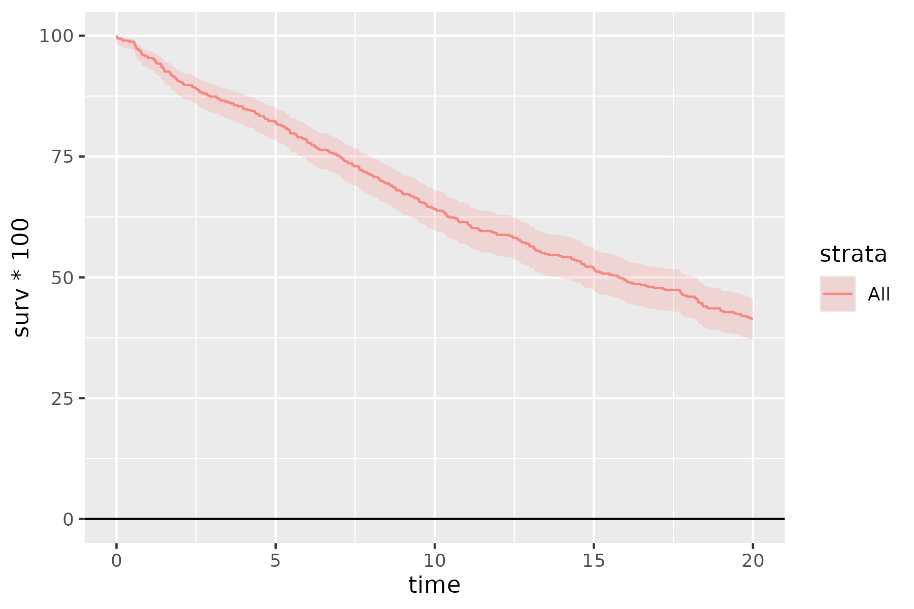
Start from the bare panel so you can see what the constructor produced before any styling. The default type = "survival" is the curve with a logit-transform 95% confidence ribbon.
plot(km)
Figure 19.1: The bare Kaplan-Meier panel as the constructor returns it. The solid salmon step line is the survival curve and the light salmon ribbon its logit-transform 95% confidence band, both in the ggplot2 default color.
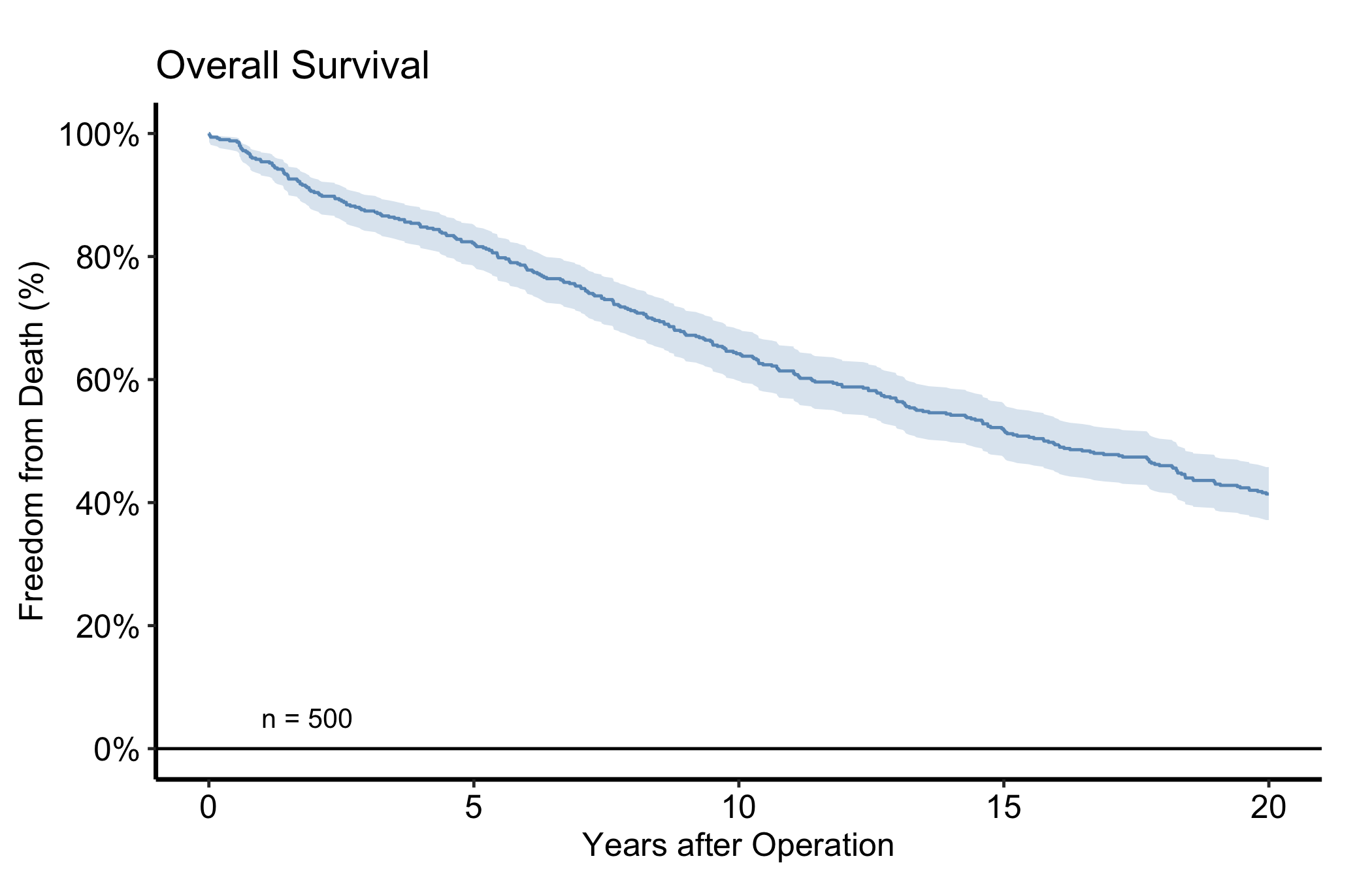
Then layer on the house style. The pattern below is the one we use most often in CORR: a single steelblue for a one-cohort figure, percent labels on the y-axis, an n = callout in the lower-left, and the manuscript theme. Swap in theme_hv_poster() when you want the larger, poster-sized text.
plot(km, alpha =0.8) +scale_color_manual(values =c(All ="steelblue"), guide ="none") +scale_fill_manual(values =c(All ="steelblue"), guide ="none") +scale_y_continuous(breaks =seq(0, 100, 20),labels =function(x) paste0(x, "%")) +scale_x_continuous(breaks =seq(0, 20, 5)) +coord_cartesian(xlim =c(0, 20), ylim =c(0, 100)) +labs(x ="Years after Operation", y ="Freedom from Death (%)",title ="Overall Survival") +annotate("text", x =1, y =5, label =paste0("n = ", nrow(dta_km)),hjust =0, size =3.5) +theme_hv_manuscript(base_size =12)
Figure 19.2: Kaplan-Meier overall survival for the simulated cohort, styled in the CORR house style. The solid steel-blue step line is the survival curve and the light steel-blue ribbon its logit-transform 95% confidence band.
19.4 Read it
A Kaplan-Meier curve starts at 100% and steps downward at each event time; it never rises. A few things to look at:
Censoring changes the denominator, not the curve height. A censor time removes that patient from later risk sets without creating a downward step. This simulated cohort has administrative censoring at 20 years, so the final at-risk count is the group still event-free when observation ends.
The ribbon widens to the right. As the at-risk population thins, each remaining event moves the estimate more, so the confidence band fans out. Be cautious reading the far-right tail, which may rest on a handful of patients.
Median survival is where the curve crosses 50%. If it never crosses, the median is not reached within follow-up and you report a different landmark (e.g. 5-year survival) instead.
The numbers at risk below the figure tell the reader how much data backs each region of the curve. Always show them.
The at-risk strip and the per-time-point report (point estimates with CIs) are stored on the object, so you never recompute them:
km$tables$risk
  strata report_time n.risk
1    All           0    500
2    All           5    411
3    All          10    321
4    All          15    259
5    All          20    207
km$tables$report
  strata report_time  surv     lower     upper n.risk n.event
1    All           0 1.000 1.0000000 1.0000000    500       0
2    All           5 0.822 0.7859710 0.8530976    412       1
3    All          10 0.642 0.5989814 0.6828473    322       1
4    All          15 0.518 0.4741762 0.5615486    260       1
5    All          20 0.414 0.3715880 0.4577269    207       0
19.5 Numbers at risk
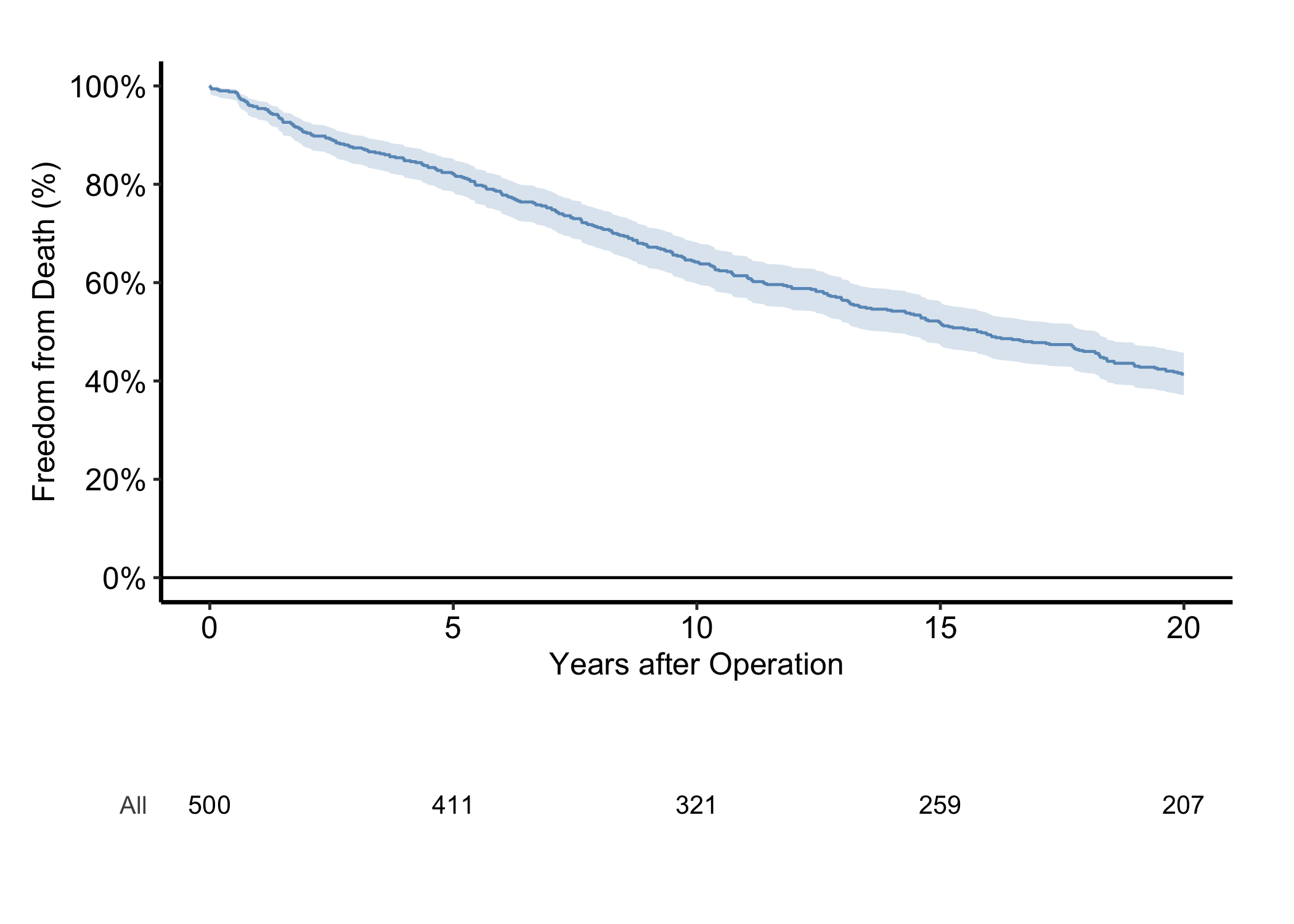
The “always show them” advice has a one-call answer. hv_atrisk() turns the object’s risk table into an aligned panel, and hv_atrisk_compose() stacks it under the curve, matching the table’s x-range to the plot’s so the counts sit beneath the time points they describe. Style the curve as usual, build the table from the same object, and compose the two.
# Free size: curve stacked over a numbers-at-risk table.curve <-plot(km, alpha =0.8) +scale_color_manual(values =c(All ="steelblue"), guide ="none") +scale_fill_manual(values =c(All ="steelblue"), guide ="none") +scale_y_continuous(breaks =seq(0, 100, 20),labels =function(x) paste0(x, "%")) +scale_x_continuous(breaks =seq(0, 20, 5)) +coord_cartesian(xlim =c(0, 20), ylim =c(0, 100)) +labs(x ="Years after Operation", y ="Freedom from Death (%)") +theme_hv_manuscript(base_size =12)risk_panel <-hv_atrisk(km)hv_atrisk_compose(curve, risk_panel)
Figure 19.3: Survival curve with an aligned numbers-at-risk table composed beneath the time axis. The solid steel-blue step line is the survival curve, the light steel-blue ribbon its 95% confidence band, and the black numbers below the axis the patients still at risk at each tick.
The counts under the axis are the same km$tables$risk numbers from above, now positioned at the curve’s 0-, 5-, 10-, 15-, and 20-year ticks. A stratified figure gives the table one row per group, labelled to match the curves.
19.6 Variations
19.6.1 Stratified by group
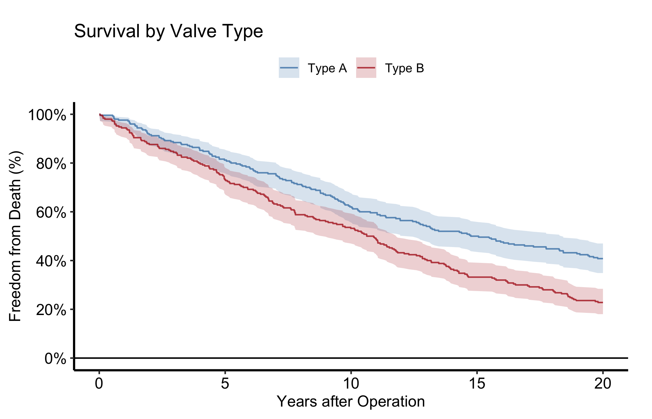
To compare arms, pass group_col and the constructor fits a separate curve per stratum. Here we simulate a two-arm valve-type cohort with a 1.4x hazard ratio. Look for clearly separated curves whose CI ribbons stop overlapping in the windows where the treatment difference matters.
Figure 19.4: Stratified survival curves for a two-arm valve-type cohort simulated with a 1.4x hazard ratio. Solid step lines are the survival curves and light ribbons their 95% confidence bands; steel blue marks Type A and firebrick marks Type B.
19.6.2 Cumulative hazard
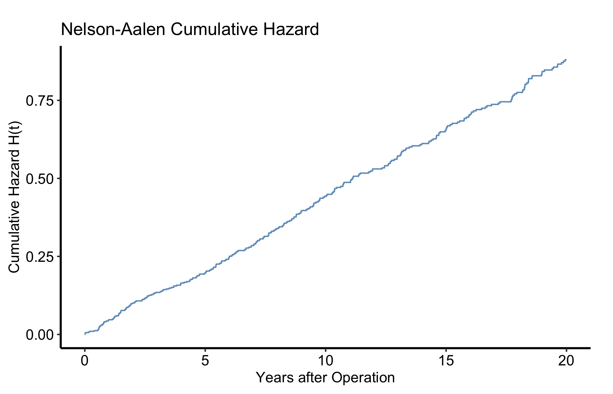
type = "cumhaz" gives the Nelson-Aalen cumulative hazard, a monotonically non-decreasing estimate of accumulated event intensity. Under the usual survival relationship, \(H(t) = -\log S(t)\); it is not \(1-S(t)\) and it is not a percentage. The local slope is the instantaneous hazard rate. Same object, different type.
plot(km, type ="cumhaz") +scale_x_continuous(breaks =seq(0, 20, 5)) +labs(x ="Years after Operation", y ="Cumulative Hazard H(t)",title ="Nelson-Aalen Cumulative Hazard") +scale_color_manual(values =c(All ="steelblue"), guide ="none") +theme_hv_manuscript(base_size =12)
Figure 19.5: Nelson-Aalen cumulative hazard, a dimensionless measure of event intensity accumulated through each follow-up time. The solid steel-blue step line is the cumulative hazard.
19.6.3 Hazard rate
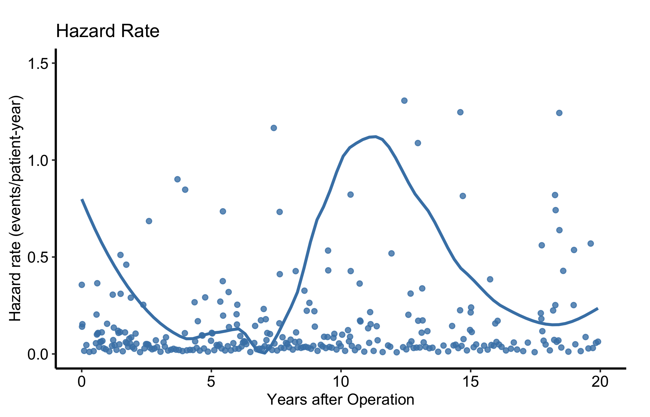
type = "hazard" is the instantaneous event rate among patients still at risk. Because follow-up is measured in years, its units are events per patient-year. The raw point estimates are noisy, so for a figure overlay a LOESS smooth. The smoothed curve answers when events occur fastest; it does not report the probability of an event at that time. Very short event intervals can produce a few large point estimates, so the displayed y-range stops at 1.5 events per patient-year to keep the smooth and most points readable.
plot(km, type ="hazard") +geom_smooth(aes(x = mid_time, y = hazard, color = strata),method ="loess", se =FALSE, span =0.6) +scale_color_manual(values =c(All ="steelblue"), guide ="none") +scale_x_continuous(breaks =seq(0, 20, 5)) +scale_y_continuous(breaks =seq(0, 1.5, 0.5)) +coord_cartesian(xlim =c(0, 20), ylim =c(0, 1.5)) +labs(x ="Years after Operation", y ="Hazard rate (events/patient-year)",title ="Hazard Rate") +theme_hv_manuscript(base_size =12)
Figure 19.6: Instantaneous event rate per patient-year with a LOESS smooth; the y-axis stops at 1.5 so a few unstable interval spikes fall outside the displayed range. Steel-blue filled circles are the interval hazard estimates and the solid steel-blue line is the LOESS smooth.
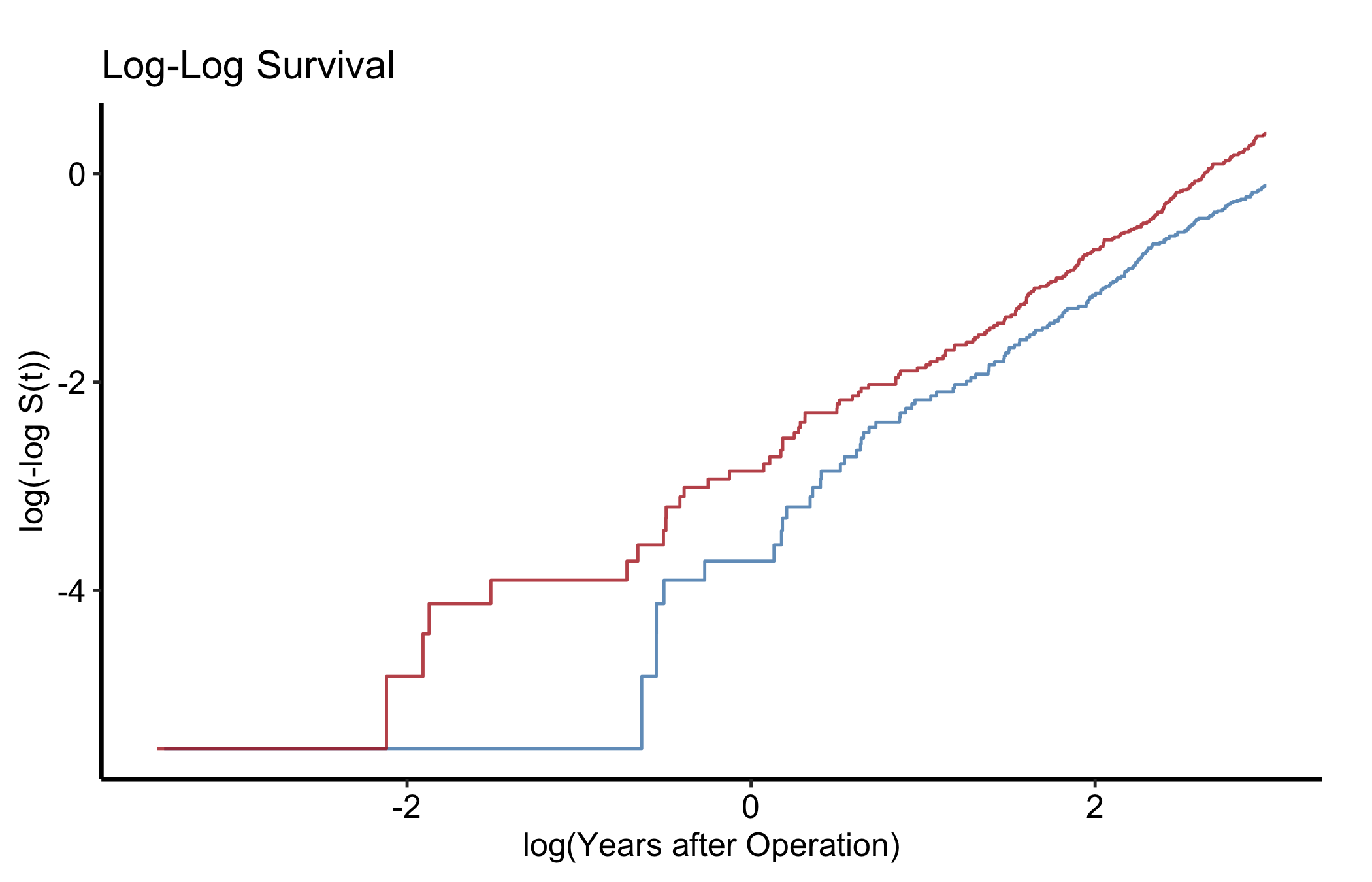
type = "loglog" plots log(-log S(t)) against log(time). Parallel lines across strata mean the proportional-hazards assumption is reasonable. Run this check before you quote a single hazard ratio. Fit with group_col so there are strata to compare.
plot(km_s, type ="loglog") +scale_color_manual(values =c("Type A"="steelblue", "Type B"="firebrick"),name ="Valve Type" ) +labs(x ="log(Years after Operation)", y ="log(-log S(t))",title ="Log-Log Survival") +theme_hv_manuscript(base_size =12)
Figure 19.7: Log-log survival plot for checking the proportional-hazards assumption across strata. Solid step lines show log(-log S(t)) against log time, steel blue for Type A and firebrick for Type B; roughly parallel lines support proportional hazards.
19.6.5 Integrated life table (restricted mean survival)
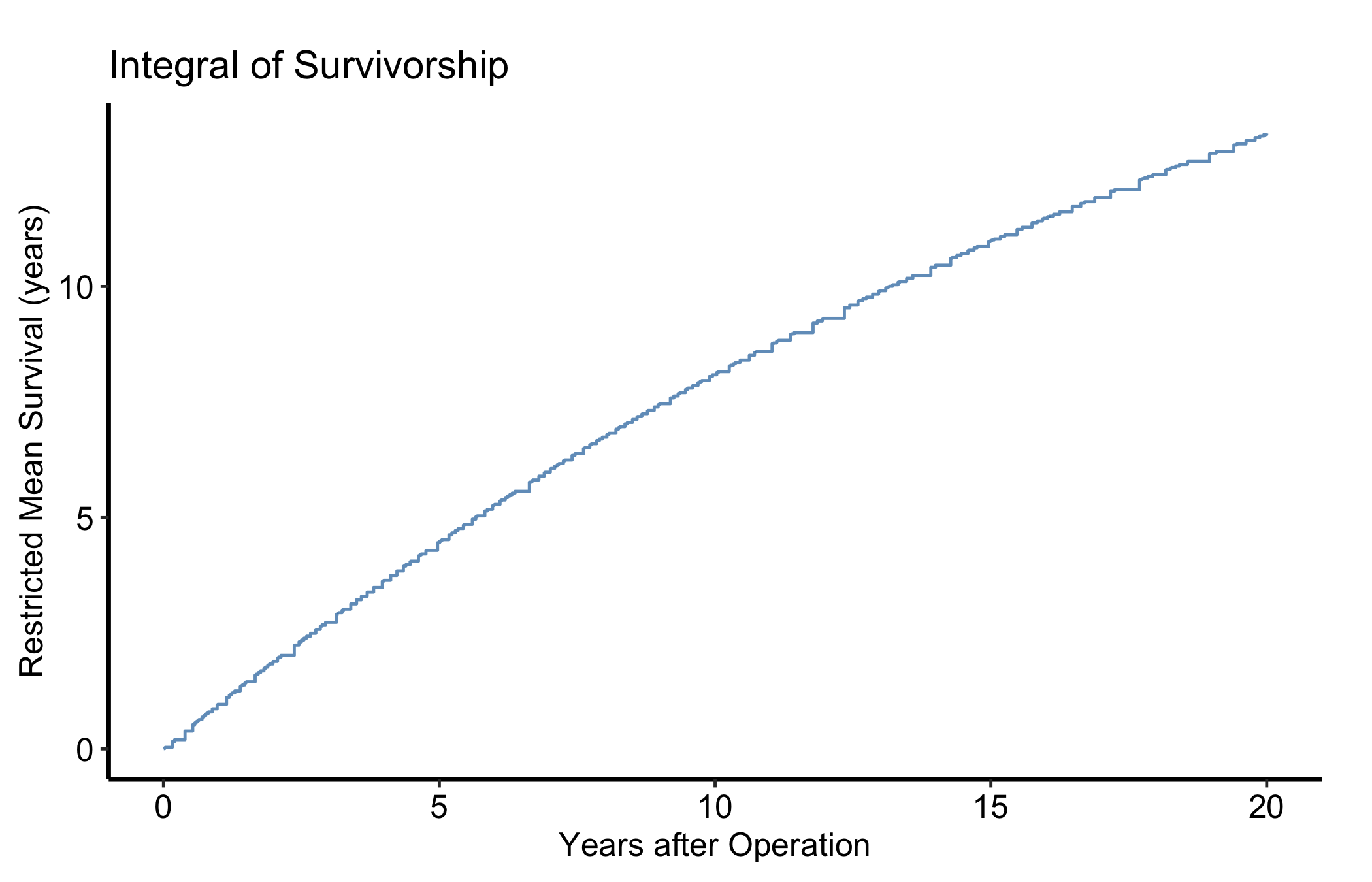
type = "life" is the integrated survivorship: the area under the survival curve up to time t, equal to the restricted mean survival time (RMST) at that horizon. It rises linearly while S(t) is near 1 and bends as events accumulate. RMST is the summary to reach for when the log-log check above shows hazards are not proportional and a single hazard ratio would mislead.
plot(km, type ="life") +scale_color_manual(values =c(All ="steelblue"), guide ="none") +scale_x_continuous(breaks =seq(0, 20, 5)) +labs(x ="Years after Operation",y ="Restricted Mean Survival (years)",title ="Integral of Survivorship") +theme_hv_manuscript(base_size =12)
Figure 19.8: Integrated survivorship, the restricted mean survival time accumulated up to each horizon. The solid steel-blue step line is the area under the survival curve to each time.
19.7 Pitfalls
Event coding.event must be 1 for the event and 0 for censored. Flip them and you estimate freedom from being censored, which is meaningless. Check the coding before you trust the curve.
Reading the tail. The right end of the curve often rests on very few patients; the widening ribbon is the warning. Quote a landmark estimate (with its at-risk count) rather than the visual endpoint.
Non-proportional hazards. If the log-log curves cross, a single hazard ratio is the wrong summary. Report RMST from the integrated panel instead.
Ehrlinger, John. 2026. hvtiPlotR: HVTI Ggplot2 Themes and Clinical Plot Functions for the Cleveland Clinic Heart & Vascular Institute. https://github.com/ehrlinger/hvtiPlotR.