set.seed(20260828)
data(pbc, package = "randomForestSRC")
rf <- rfsrc(Surv(days, status) ~ ., data = pbc, ntree = 100,
importance = TRUE)30 Variable and partial dependence
30.1 When to use it
Variable importance ranks predictors but says nothing about how a predictor moves the prediction. Once VIMP tells you bilirubin matters, the next question is the shape of that effect: does predicted survival fall steadily as bilirubin climbs, drop off a cliff past some threshold, or level out at the high end? Dependence plots answer that. Reach for them whenever you have a forest that predicts well and you need to describe what a specific variable is doing, for a results figure, a clinical discussion, or your own understanding of the model.
Two plots fill the gap, and the difference between them is the whole point of this chapter:
- Variable dependence shows the forest’s predicted value for every observation against that observation’s actual predictor value. It is the raw, marginal picture, one point per patient, scatter and all.
- Partial dependence sets every patient to the same value of one variable, keeps their other predictors as observed, and averages the forest’s predictions, one grid value at a time. It is a smoother, model-level summary of how the prediction moves with that one variable. It describes the model, so it does not remove confounding or estimate a causal dose-response.
Both come from ggRandomForests (Ehrlinger 2026): gg_variable() for the first, gg_partial_rfsrc() for the second. Each hands back a bare ggplot you finish with a house theme.
30.2 The data it needs
Like VIMP, dependence plots read from a fitted rfsrc object, not a raw data frame. We fit a survival forest to pbc, the primary biliary cirrhosis cohort: one row per patient, a follow-up time, an event indicator, and a panel of liver labs.
For a survival forest there is one extra ingredient: a follow-up time at which to read the prediction. Survival probability is not a single number, it is a curve over time, so dependence is always evaluated at a chosen horizon. The median follow-up is a natural default.
t_eval <- median(pbc$days)
t_eval
[1] 173030.3 Build it
gg_variable() returns one predicted survival probability per observation. For a survival forest the plot() method needs both a time to evaluate at and an xvar selection naming which predictors to draw; without a time point it has nothing to put on the y-axis. Setting panel = TRUE lays the chosen predictors out side by side. Each point is one patient, and each event group has a loess smooth through its cloud, drawn in that group’s color.
gg_v <- gg_variable(rf, time = t_eval)
p_dep <- plot(gg_v, xvar = c("bili", "age", "albumin"), time = t_eval,
     panel = TRUE) +
  # The time goes in a subtitle: panels about 1 inch tall cannot hold it in the axis title.
  labs(y = "Survival", subtitle = paste0("Predicted at ", t_eval, " days")) +
  theme_hv_manuscript(base_size = 12)
# About three ticks per panel: at under 2 inches wide, age's five-digit labels run together.
p_dep <- p_dep + scale_x_continuous(n.breaks = 3)
# Facets of one plot: hv_panel_size() gives each a 3 by 2 inch panel, shrunk to fit the page.
dims_p_dep <- hv_panel_size(p_dep)
p_dep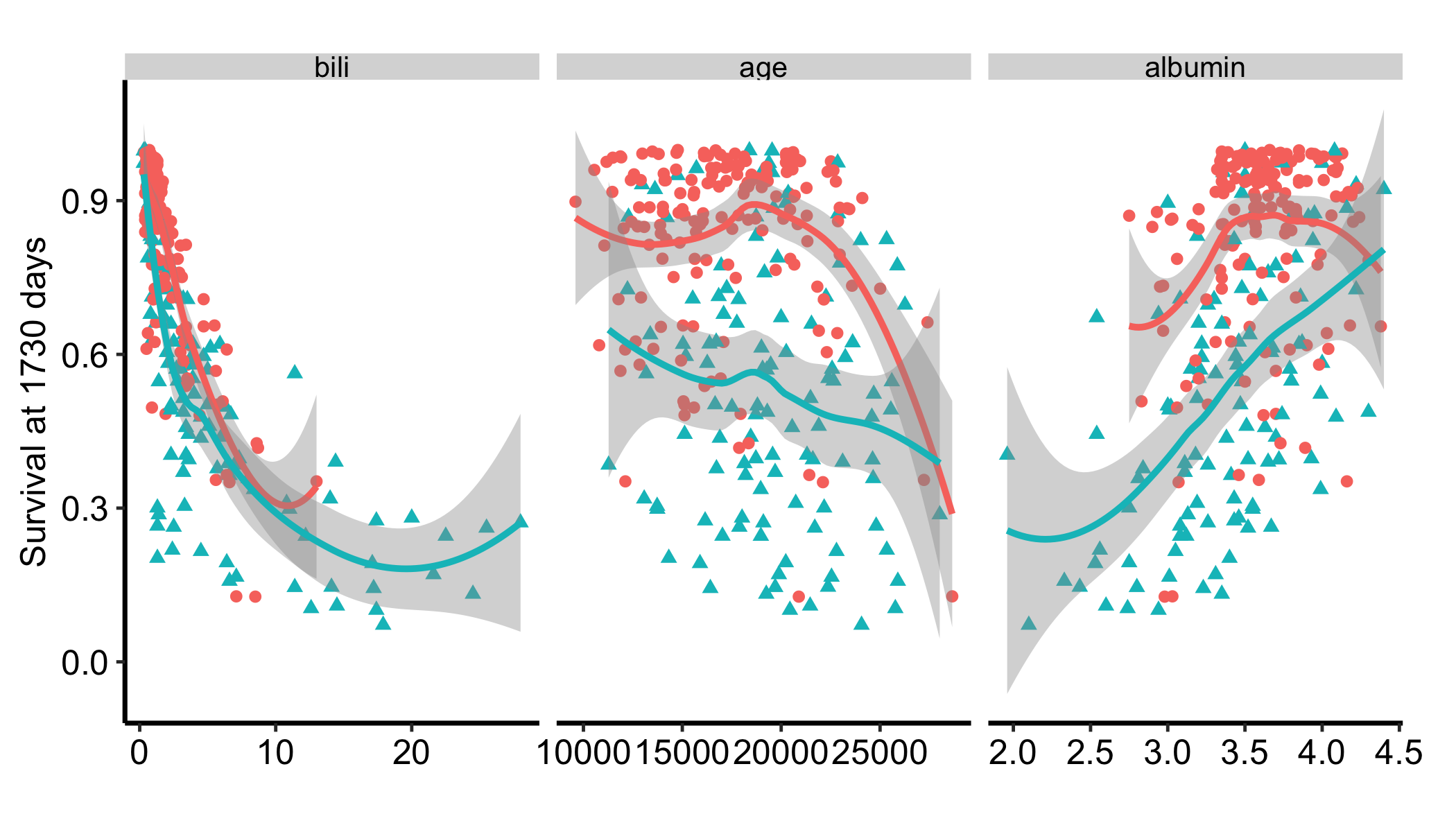
The horizon goes on gg_variable(), not on plot(), and that is the easiest thing to get wrong here. gg_variable() slices the predicted survival matrix at a time when it builds the frame, and it defaults to the median of the forest’s own event-time grid (median(rf$time.interest), which is 1191 days here) when you do not give it one. Passing time only to plot() therefore selects a horizon that was never extracted, and you silently get the forest’s median instead of yours. The two differ: t_eval is 1730.
That labs() call is not decoration. plot.gg_variable() builds its survival y-axis label as paste("Survival at", time, "year"), with the unit hardcoded, so on pbc, whose follow-up is recorded in days, the default axis reads “Survival at 1730 year” for a horizon that is 1730 days. Set the label yourself on any survival dependence figure whose time is not in years; here the horizon, with its unit, sits in the subtitle, which a short panel has room for.
Reading the smooths: predicted survival at 1730 days falls steeply as serum bilirubin rises, declines gently with age, and tracks upward with higher albumin. These are the marginal trends present in the data, scatter included, and that scatter is information: it warns you how much patient-to-patient spread underlies each trend.
30.4 Read it
The two plots answer different questions, and reading them well means keeping the difference straight.
- Variable dependence shows the raw trend. The bilirubin panel in Figure 30.1 mixes what the forest does with bilirubin and the fact that high-bilirubin patients also tend to differ in age, albumin, and the rest. The scatter tells you how tight the relationship is once you account for that spread.
- Partial dependence shows the averaged model trend. The partial-dependence plot (Figure 30.2) keeps the other predictors at their observed values and varies bilirubin alone, so the curve is how the forest’s predicted survival moves with bilirubin, averaged over everyone else’s covariates. When the two plots disagree, the gap comes from how bilirubin travels with the other predictors in these data. The scatter carries that correlation and the average does not. Neither plot is a causal estimate.
- The shape is the message. Look for whether the curve is monotone (steady in one direction), thresholded (flat then steep, or steep then flat), or genuinely flat (the variable has little marginal pull at this time point even if VIMP ranked it). Report the time you read it at, because a different horizon can give a different shape.
To see partial dependence, gg_partial_rfsrc() drives randomForestSRC’s partial-prediction machinery directly. For a grid of bili values it predicts every patient as if they had that value, then averages, giving the marginal effect of bili with everything else held at its observed distribution. This is the slow step, so we restrict it to a single variable at the median time and a modest evaluation grid (n_eval) to keep the render quick.
gg_p <- gg_partial_rfsrc(rf, xvar.names = "bili",
                         partial.time = t_eval, n_eval = 25)
plot(gg_p) + geom_point() + theme_hv_manuscript(base_size = 12)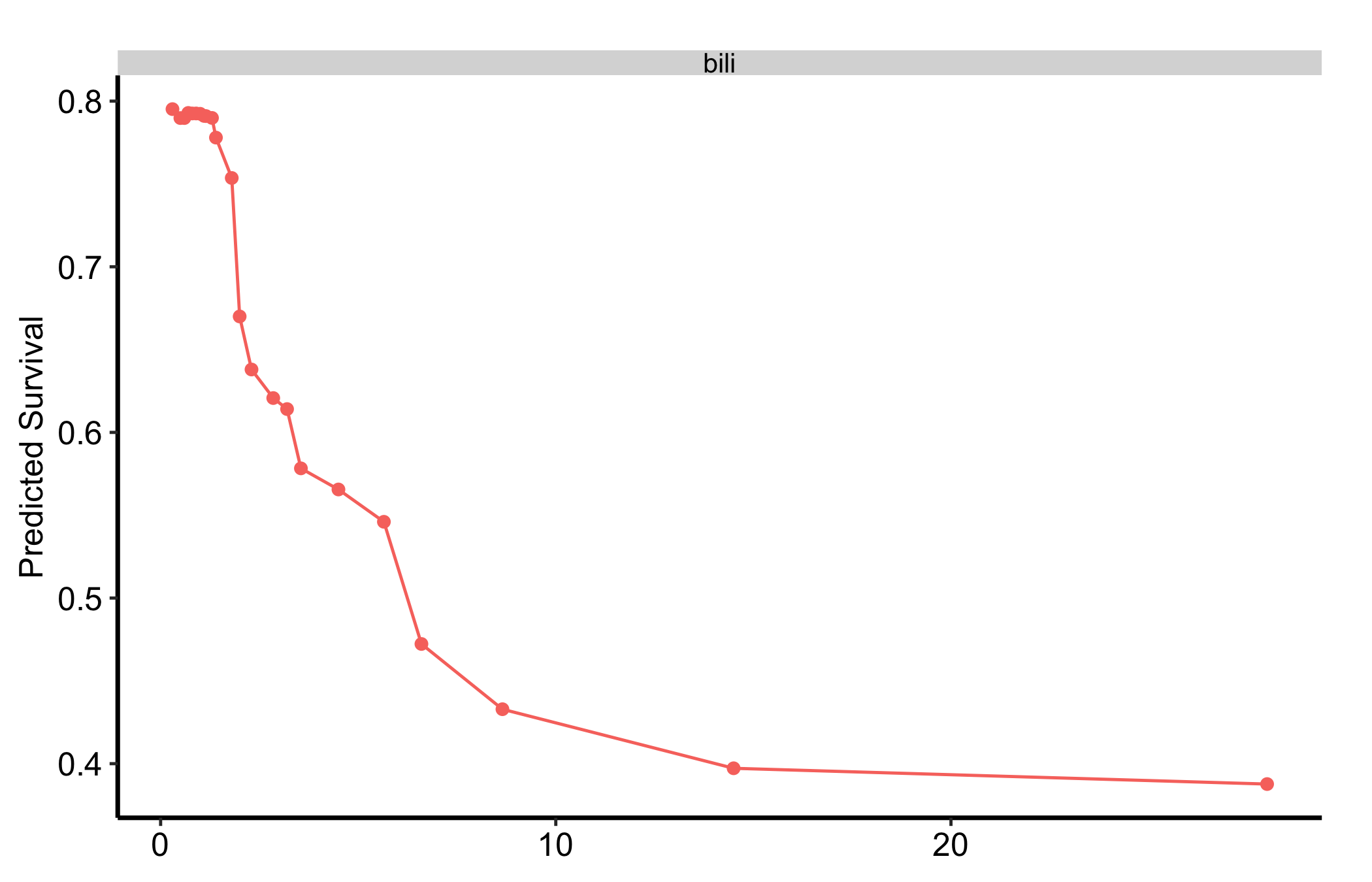
The partial-dependence curve is the averaged version of the bilirubin panel in Figure 30.1: the same downward trend, with the scatter collapsed into a single line for how the forest’s predicted survival moves with bilirubin. Read it as a summary of the model, not as what would happen to a patient whose bilirubin changed.
30.5 Variations
30.5.1 A different follow-up time
Because survival dependence is read at a horizon, the natural variation is to read it at another one. Swap t_eval for an early landmark and the same variable can show a flatter or steeper effect, since the predictors that drive early events are not always the ones that drive late ones. Whenever you change the time, change the caption too.
30.5.2 Readable variable names
The panels above are labelled bili, age, and albumin, which is what the data frame calls them and not what a manuscript reader calls them. Pass labels a named character vector and the facet strips take the readable name instead. Variables you do not name keep their raw column name, so you can label only the ones a reviewer will see.
pbc_labels <- c(
  bili    = "Serum bilirubin (mg/dL)",
  age     = "Age (days)",
  albumin = "Serum albumin (g/dL)"
)

p_dep_labels <- plot(gg_v, xvar = c("bili", "age", "albumin"), time = t_eval,
     panel = TRUE, labels = pbc_labels) +
  # The time goes in a subtitle: panels about 1 inch tall cannot hold it in the axis title.
  labs(y = "Survival", subtitle = paste0("Predicted at ", t_eval, " days")) +
  theme_hv_manuscript(base_size = 12)
# About three ticks per panel: at under 2 inches wide, age's five-digit labels run together.
p_dep_labels <- p_dep_labels + scale_x_continuous(n.breaks = 3)
# Facets of one plot: hv_panel_size() gives each a 3 by 2 inch panel, shrunk to fit the page.
dims_p_dep_labels <- hv_panel_size(p_dep_labels)
p_dep_labels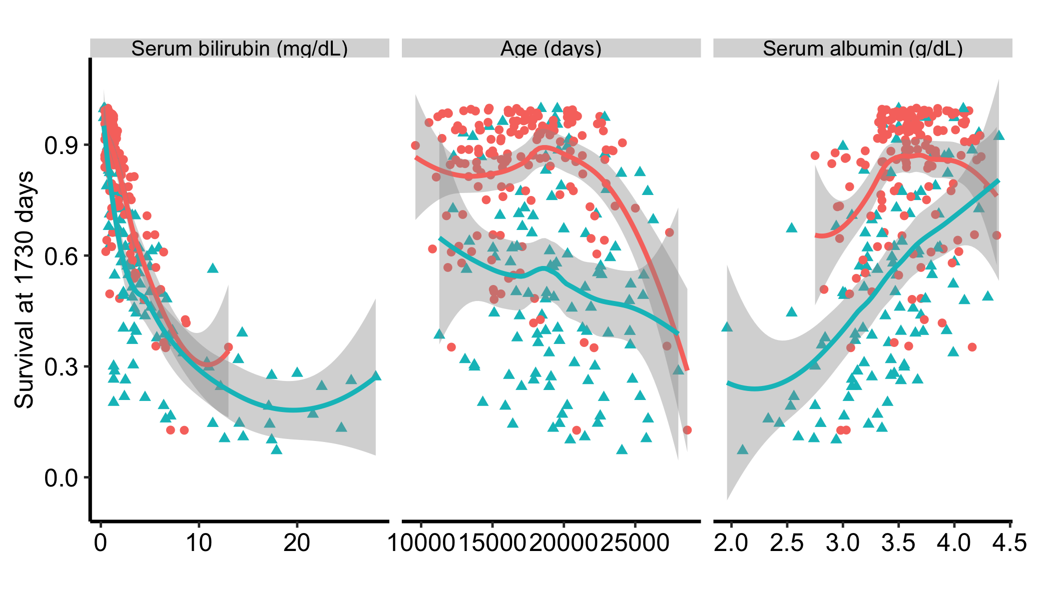
Labelling is where unit errors surface, which is a good reason to do it early. age in pbc is recorded in days, not years: the median is 1.8628^{4}, which is about 51 years. A figure labelled “Age (years)” would have been wrong on an axis nobody would think to re-check.
labels also accepts a labelled data frame, in which case it reads each column’s label attribute, or a two-column key/label frame. The same argument works on gg_udependent(), gg_sdependent(), gg_vimp(), gg_shap(), and the varPro plot methods, so one label vector can carry across every figure in a manuscript.
30.5.3 Lowering the cost of partial dependence
Partial dependence refits predictions across the whole grid, so it scales with n_eval, the number of variables, and ntree. If a figure is too slow, lower n_eval first (a coarser grid still shows the shape), then restrict to the one or two variables you need to discuss, and only then reduce ntree.
30.5.4 How sure is the curve?
The partial-dependence curve comes from one forest, and the forest is itself an estimate. Grow it on a slightly different sample of patients and the curve moves. ggRandomForests does not draw that movement. randomForestSRC’s own plot.variable(partial = TRUE) draws dotted lines at two standard errors, but those measure something else. They are the spread of the per-patient predictions divided by the square root of the number of patients, which says how precisely the average over these patients is known for this forest. They narrow as the cohort grows, however unstable the forest is, so they are not a confidence band for the curve.
To see how much the curve depends on the sample, you refit. We draw subsamples of patients without replacement, grow a forest on each, compute the same partial-dependence curve on each, and rescale the spread back to the full sample. We borrow the sampling and the rescaling from randomForestSRC’s subsample(), which computes VIMP confidence intervals this way (Ishwaran and Lu 2019). With subsamples of m out of n patients, the standard error of the full-data curve is estimated as \(\sqrt{m/n}\) times the standard deviation of the subsample curves. subsample() draws \(e^{-1} \approx 37\%\) of the rows when n is under 1,000, and for a survival forest it draws that share separately from the patients who had the event and those censored, so every subsample keeps the cohort’s event rate. We do both.
Three details keep the refits comparable. Pass the full-data predictors as newx, so every refit evaluates bilirubin at the same grid points (the average is still taken over each refit’s own training rows). Subsample the rows the forest actually trained on: rfsrc() drops incomplete cases, so rf holds 276 of the 418 rows in pbc. And read every refit at the same horizon. Each refit has its own event times, and partial.time snaps to the nearest of them, which can land on a different day from the full curve’s. The forest’s survival estimate is a step function that only moves at event times, so reading a refit at its last event time on or before the full curve’s horizon gives its survival at exactly that horizon.
dat    <- na.omit(pbc)                      # the rows rf trained on
n      <- nrow(dat)
strata <- split(seq_len(n), dat$status)     # events and censored, apart
size   <- floor(exp(-1) * lengths(strata))  # subsample()'s ratio, n < 1000
m      <- sum(size)
B      <- 25
t_full <- unique(gg_p$continuous$time)      # the horizon the curve was read at

set.seed(20260929)
draws <- sapply(seq_len(B), function(b) {
  idx   <- unlist(Map(function(i, k) i[sample.int(length(i), k)],
                      strata, size))
  fit_b <- rfsrc(Surv(days, status) ~ ., data = dat[idx, ], ntree = 100)
  ti    <- fit_b$time.interest
  gg_partial_rfsrc(fit_b, xvar.names = "bili", newx = rf$xvar,
                   partial.time = max(ti[ti <= t_full]),
                   n_eval = 25)$continuous$yhat
})

se   <- sqrt(m / n) * apply(draws, 1, sd)
band <- transform(gg_p$continuous,
                  lower = pmax(yhat - 1.96 * se, 0),
                  upper = pmin(yhat + 1.96 * se, 1))
draws has one column per refit and one row per grid point, the same rows as gg_p$continuous, so the band sits on the curve’s own grid. The limits are clipped to \([0, 1]\) because the curve is a survival probability. The band then goes on the plot as one more layer. inherit.aes = FALSE keeps it from picking up the plot’s own mappings, and it lands in the right panel because band carries the same name column the plot facets on.
plot(gg_p) +
  geom_ribbon(data = band, aes(x = x, ymin = lower, ymax = upper),
              inherit.aes = FALSE, alpha = 0.2) +
  theme_hv_manuscript(base_size = 12)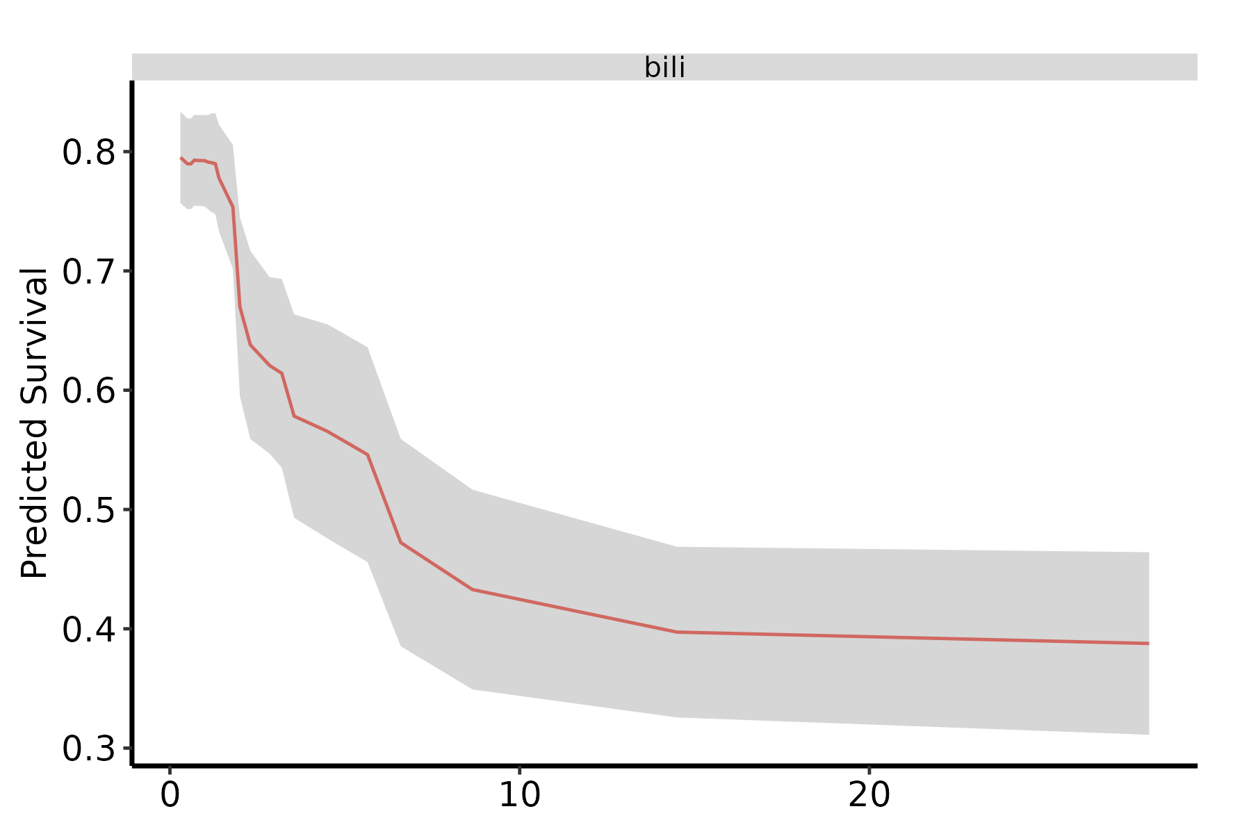
Read the band as a statement about the forest. It is narrow where most patients sit and widens to the right, where few patients carry a bilirubin that high and each refit sees only a handful of them. A change in the curve larger than the band is wide survives resampling. A wiggle smaller than that does not, and should not be described in a manuscript. The band is pointwise, so it bounds the curve one grid point at a time, not the whole curve at once.
The cost is B forests plus B partial-dependence runs. Here that is quick, because pbc is small and each refit trains on 100 patients; we used 25 draws to keep the render fast, where subsample() defaults to 100. On a registry cohort, time one refit before choosing B. The levers from the previous section apply to every refit, so a coarser n_eval and fewer variables pay off B times over.
30.6 Pitfalls
- Set the horizon on
gg_variable(), not onplot(). Predicted survival is undefined without a time, sogg_variable()slices the prediction matrix as it builds the frame. Give it notimeand it quietly falls back tomedian(rf$time.interest), the median of the forest’s event-time grid, which is not the median follow-up and is rarely the horizon you meant.plot()then labels whatever was extracted, so atimepassed only toplot()produces a figure that disagrees with your own caption. Pass it to both and they agree.panel = TRUEstill needs itsxvarselection. - Pick the time deliberately and report it. Changing
timeorpartial.timecan change the shape of the curve. Choose a clinically meaningful horizon, state it, and do not quietly compare a figure read at the median with one read at five years. - Order of operations. Use VIMP to choose which variables to profile here. There is no point spending a slow partial-dependence run on a variable the forest already told you it ignores.