dta_trends <- sample_trends_data(n = 600, seed = 42)
p_base <- plot(hv_trends(dta_trends))36 Color templates for consistency
hvtiPlotR plots carry no colour scale by default. ggplot2’s (Wickham et al. 2026) scale_colour_* controls line and point colours; scale_fill_* controls filled areas (ribbons, bars). Both take the same name (legend title) and guide (legend display) arguments. Set them together so the two scales stay in sync.
36.1 When to use it
Colour is the fastest way to separate groups on a figure, and the easiest to overuse. Reach for a manual colour scale when the groups have a convention you want to honour (a brand colour, red for the high-risk arm) or when you have one series and want it off the default grey. Reach for a ColorBrewer palette when the groups are arbitrary and you want a set of hues that stay distinct in print and for colour-blind readers. Reach for a journal palette when a co-author wants the figure to look like the target journal’s own. And reach for legend suppression whenever the figure already names its groups some other way, since a colour that needs no key earns back panel space.
The guiding question is what the colour is for. If it carries information, the distinct group it marks, it has to survive a black-and-white printer and a colour-blind reader, which is where palette choice and a second visual channel come in. If it is decoration, keep it to one or two restrained hues. We use a grouped trends plot below so the colour mapping is visible across levels.
36.2 Manual colours
Use scale_colour_manual() / scale_fill_manual() to assign specific brand or convention colours to known levels. Here a single-stratum KM curve is set to one colour.
dta_km <- sample_survival_data(n = 500, seed = 42)
km     <- hv_survival(dta_km)

plot(km) +
  scale_color_manual(values = c(All = "steelblue"), guide = "none") +
  scale_fill_manual(values  = c(All = "steelblue"), guide = "none") +
  scale_y_continuous(breaks = seq(0, 100, 20),
                     labels = function(x) paste0(x, "%")) +
  scale_x_continuous(breaks = seq(0, 20, 5)) +
  coord_cartesian(xlim = c(0, 20), ylim = c(0, 100)) +
  labs(x = "Years after Operation", y = "Freedom from Death (%)") +
  theme_hv_manuscript(base_size = 12)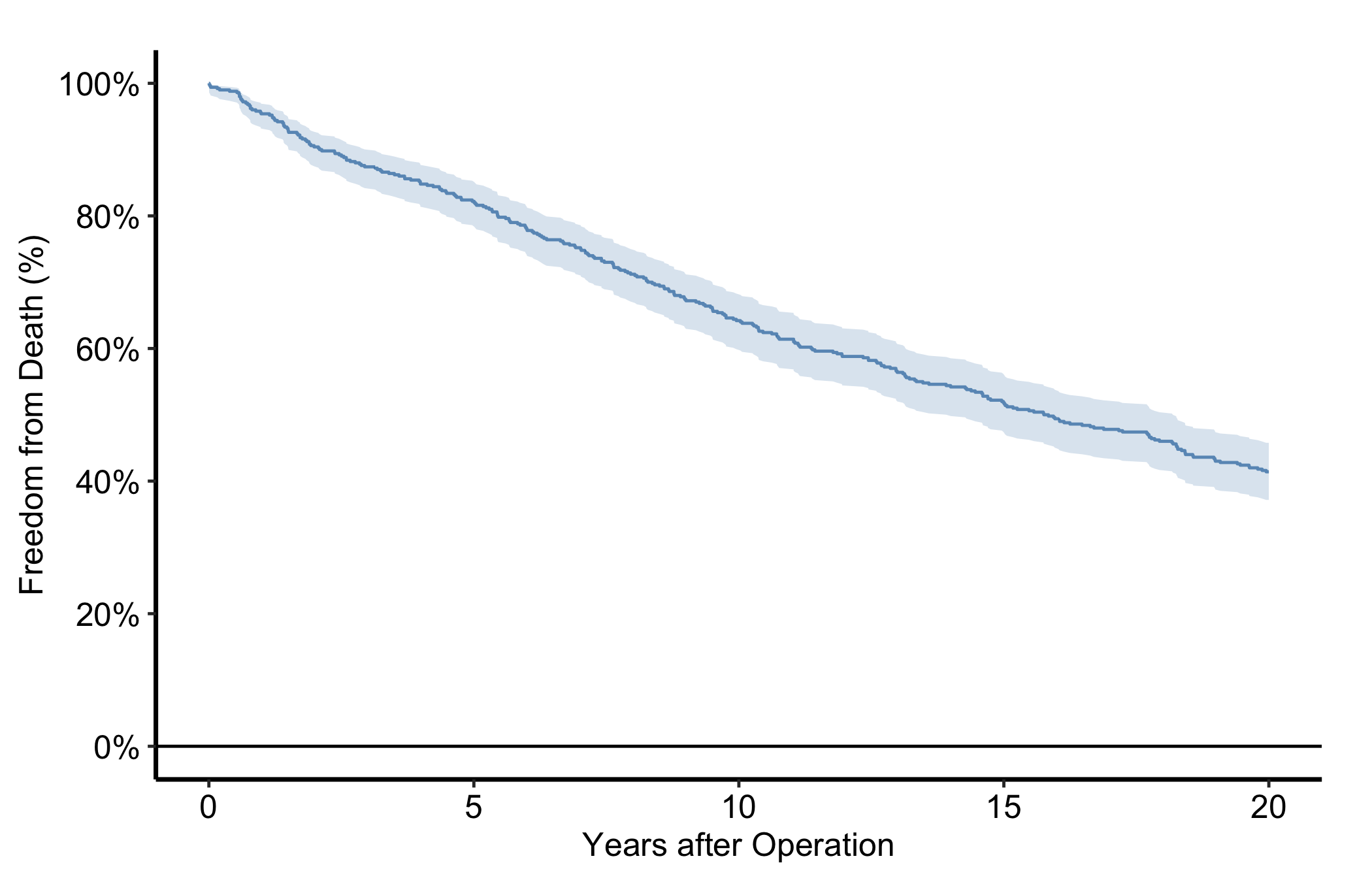
36.3 Choosing a palette
Every figure in this book uses a colour-blind-safe palette, and so should yours. About one man in twelve has some red-green colour deficiency, which is enough that a reviewer, a co-author or a conference audience will include one. The house rule has three parts.
- Categorical groups take the house palette,
hv_palette(): the Okabe-Ito hues, ordered for a white background. It returns the same six colours ashv_ppt_palette("light")under a name that does not tie a manuscript figure to slides, and the next section explains the order. - Ordered or diverging scales take ColorBrewer’s
"RdBu"or"PuOr", and sequential scales take"Blues", throughscale_fill_brewer(). - Avoid
"Set1"and"RdYlGn". Both put red against green, the one contrast colour blindness most often erases.
Colour is still not enough on its own, because none of these palettes survive a greyscale printer. Pair it with a second channel, point shape or line type, as the figure below does.
p_base +
  scale_colour_manual(values = hv_palette(), name = "Group") +
  scale_shape_manual(
    values = c("Group I" = 15, "Group II" = 19,
               "Group III" = 17, "Group IV" = 18),
    name = "Group"
  ) +
  labs(x = "Surgery Year", y = "Outcome") +
  theme_hv_manuscript(base_size = 12)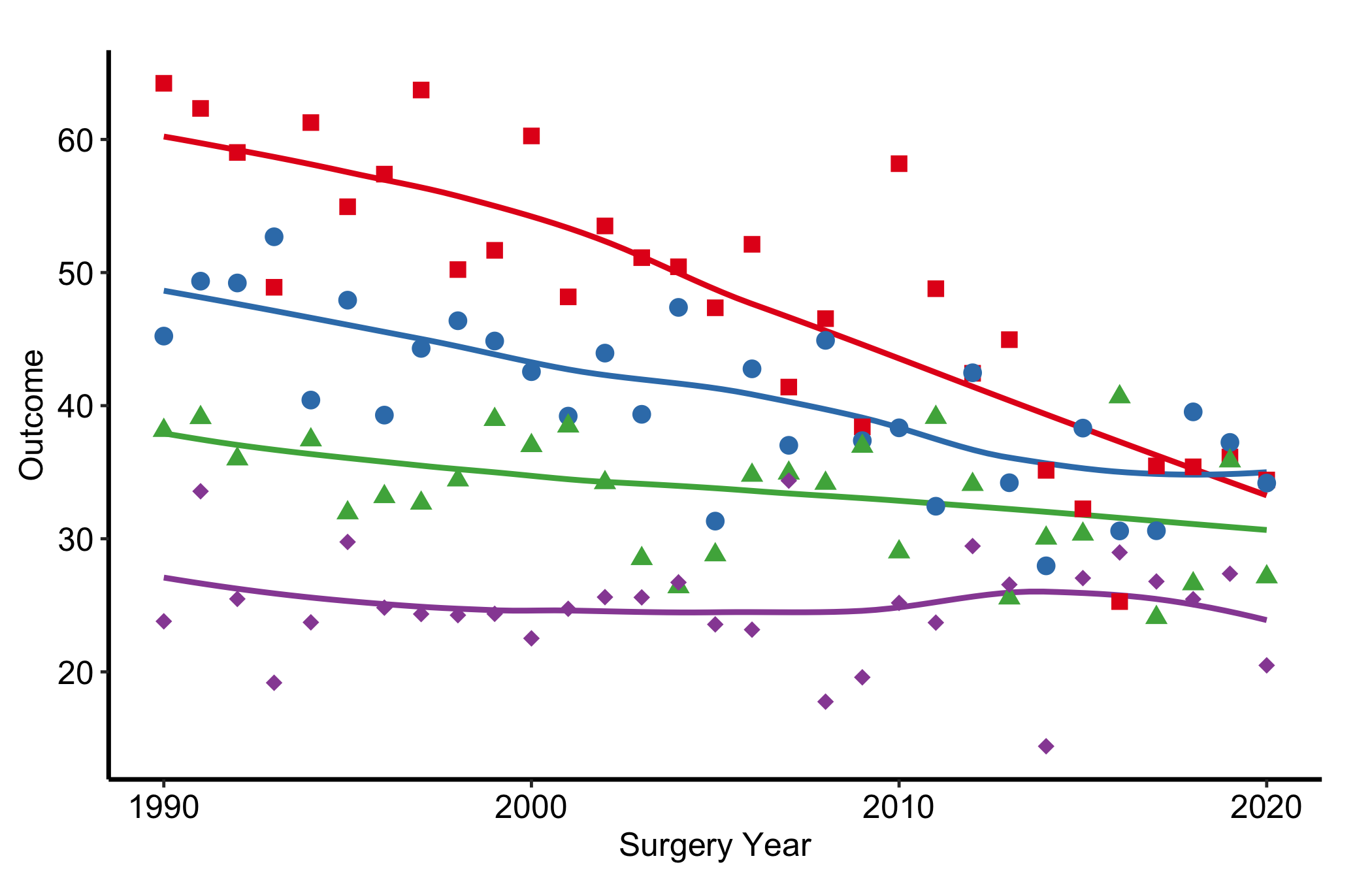
36.4 The house slide palette
hv_ppt_palette() hands back the six colours hv_ppt_series() assigns across a deck, as a plain character vector. Reach for it when a figure needs those colours outside the decorator, so the script uses the one definition instead of hex codes pasted out of an older script, which go stale the first time the palette changes.
hv_ppt_palette("dark")[1] "#F0E442" "#56B4E9" "#E69F00" "#009E73" "#CC79A7" "#D55E00"hv_ppt_palette("light", n = 4)[1] "#0072B2" "#D55E00" "#009E73" "#CC79A7"These are Okabe-Ito colourblind-safe hues, with one exception in the light ordering (below), reordered for the background the figure will sit on. The high-luminance ones lead on a dark slide, where yellow sits at more than 15:1 against a black panel, and the darker ones lead on a light slide. So the first two or three series, the ones a figure most often needs, separate hardest from the surface behind them.
Read that as a tendency, not a guarantee. The orderings are not strictly sorted by contrast. Black is the clearest case: it appears only in the light ordering, where it has the strongest contrast of the six against white by a wide margin, and it is nonetheless held back to sixth. Keeping it out of the leading positions is worth it, because a black series on a light panel reads as axis ink rather than as data, which is the same reason annotation takes black there. They are not CORR brand colours either, and nothing stops a project from handing its own set to scale_colour_manual() instead.
Contrast is a separate question from order. WCAG 2.2 asks for 3:1 against the background for any chart mark a viewer needs to read the data (World Wide Web Consortium 2023), and as of hvtiPlotR 2.8.3 every color in the light ordering clears it on white.
hv_ppt_palette("light") as of hvtiPlotR 2.8.3, in palette order, computed with the WCAG relative-luminance formula.
| Position | Color | Hex | Contrast on white |
|---|---|---|---|
| 1 | Blue | #0072B2 |
5.19:1 |
| 2 | Vermilion | #D55E00 |
3.87:1 |
| 3 | Bluish green | #009E73 |
3.42:1 |
| 4 | Reddish purple | #CC79A7 |
3.06:1 |
| 5 | Darkened yellow | #9D952B |
3.10:1 |
| 6 | Black | #000000 |
21:1 |
The fifth color is the one departure from stock Okabe-Ito: their yellow, darkened at the same hue to #9D952B. Orange used to sit there at 2.25:1, and orange darkened far enough to reach 3:1 came out too close to vermilion under a deuteranopia simulation. The guarantee assumes a white slide. theme_hv_ppt_light() leaves the figure background transparent, so it holds on the white house template and not on a tinted one. The dark ordering is unchanged and clears 3:1 on the black panel of theme_hv_ppt_dark(). Why contrast matters on a projected slide, and how the stock Okabe-Ito set fares on white, is in designing slides.
Six colours are the entire supply, which covers a grouping variable up to six levels. Ask for a seventh and you get an error rather than a quietly recycled palette, on the reasoning that two series sharing a colour is worse than a stopped script.
Pair the "light" ordering with theme_hv_manuscript() and a journal figure takes the same hues the deck does, so one analysis looks like itself in both places.
p_base +
  scale_colour_manual(values = hv_ppt_palette("light")) +
  scale_shape_manual(values = c(16, 17, 15, 18)) +
  labs(x = "Surgery Year", y = "Outcome") +
  theme_hv_manuscript(base_size = 12)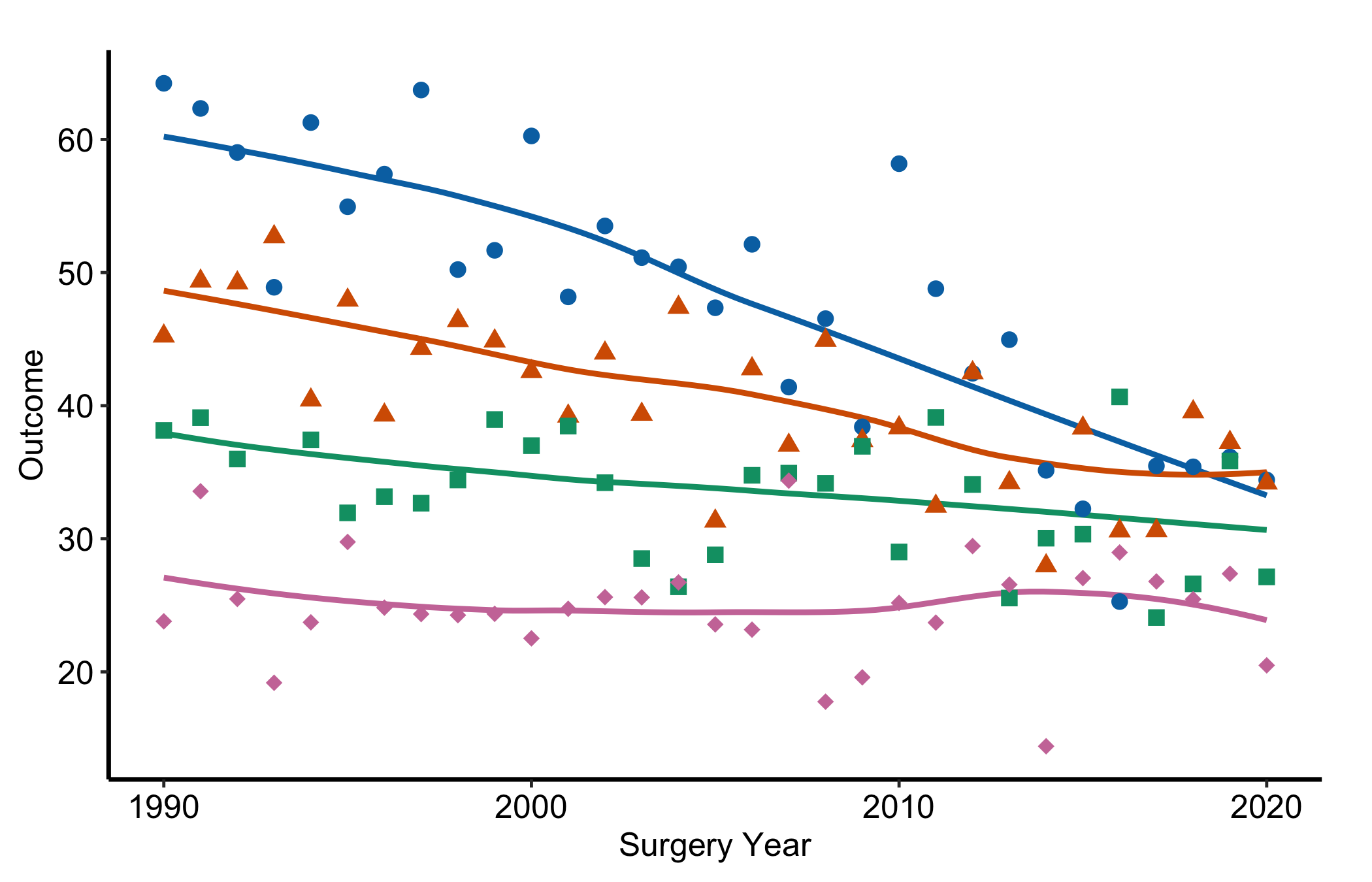
The shape scale is not decoration here. Okabe-Ito is built to survive colour blindness, which is not the same thing as surviving a greyscale printer, so the second channel still has work to do. And the colours are only half the recipe. The deck-wide decorator that assigns them, and the theme that rides along with them, are in slides and presentations.
36.5 Journal palettes
Sooner or later a co-author asks for a figure “in the NEJM colours”. The ggsci package (Xiao 2026) packages those looks: each palette is a list of hues taken from figures a journal has published, wrapped as a pair of ggplot2 scales. Eight of its palettes are journals.
ggsci, with the number of colours each holds.
| Journal | Colour scale | Fill scale | Colours |
|---|---|---|---|
| New England Journal of Medicine | scale_colour_nejm() |
scale_fill_nejm() |
8 |
| The Lancet | scale_colour_lancet() |
scale_fill_lancet() |
9 |
| JAMA | scale_colour_jama() |
scale_fill_jama() |
7 |
| BMJ | scale_colour_bmj() |
scale_fill_bmj() |
9 |
| Journal of Clinical Oncology | scale_colour_jco() |
scale_fill_jco() |
10 |
| Science (AAAS) | scale_colour_aaas() |
scale_fill_aaas() |
10 |
| Nature (NPG) | scale_colour_npg() |
scale_fill_npg() |
10 |
| Frontiers | scale_colour_frontiers() |
scale_fill_frontiers() |
10 |
The rest of the package’s palettes are not journals (genome browsers, web frameworks, television), and none of the cardiothoracic journals we publish in most, JTCVS, The Annals of Thoracic Surgery or EJCTS, has one. For those the house palette stays the default.
A journal scale drops in exactly where the house palette went. Keep the shape scale, for the reason the next paragraphs give.
library(ggsci)

p_base +
  scale_colour_nejm(name = "Group") +
  scale_shape_manual(
    values = c("Group I" = 15, "Group II" = 19,
               "Group III" = 17, "Group IV" = 18),
    name = "Group"
  ) +
  labs(x = "Surgery Year", y = "Outcome") +
  theme_hv_manuscript(base_size = 12)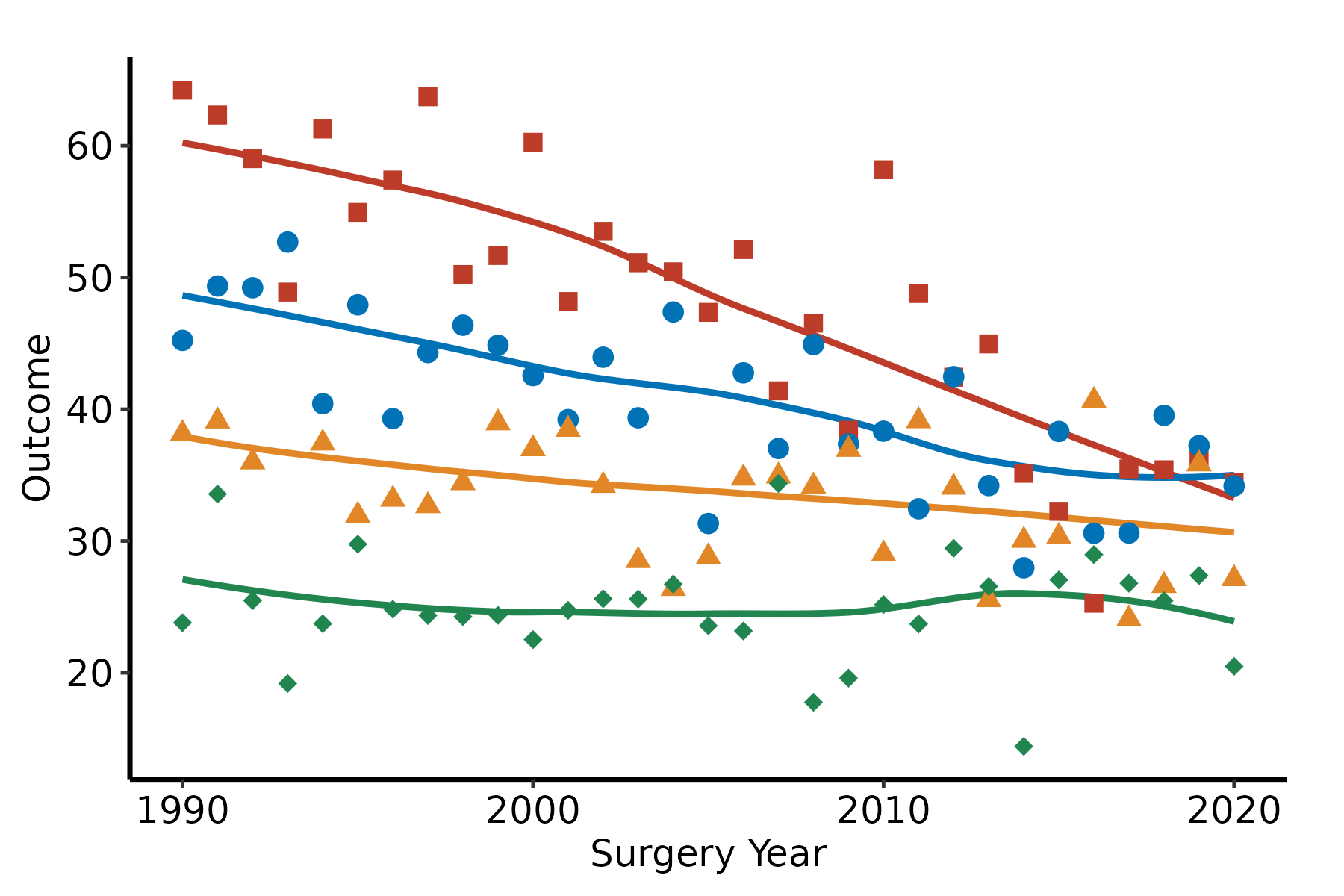
When you need the colours themselves, for an annotation or a table cell, each scale has a pal_*() twin. pal_nejm()(4) returns the first four NEJM hex codes, in the order the scale assigns them. They carry an eighth and ninth digit, FF, which is the opacity, and ggplot2 takes them as they are. Figure 36.5 lays the journal palettes side by side in that order.
swatch <- function(journal, pal, n) {
  data.frame(journal = journal, position = seq_len(n), hex = pal()(n))
}
swatches <- rbind(
  swatch("NEJM", pal_nejm, 8),   swatch("Lancet", pal_lancet, 9),
  swatch("JAMA", pal_jama, 7),   swatch("BMJ", pal_bmj, 9),
  swatch("JCO", pal_jco, 10),    swatch("AAAS", pal_aaas, 10),
  swatch("NPG", pal_npg, 10),    swatch("Frontiers", pal_frontiers, 10)
)
swatches$journal <- factor(swatches$journal, levels = rev(unique(swatches$journal)))

ggplot(swatches, aes(position, journal, fill = hex)) +
  geom_tile(colour = "white", linewidth = 1) +
  scale_fill_identity() +
  scale_x_continuous(breaks = 1:10) +
  labs(x = "Position in palette", y = NULL) +
  theme_hv_manuscript(base_size = 12)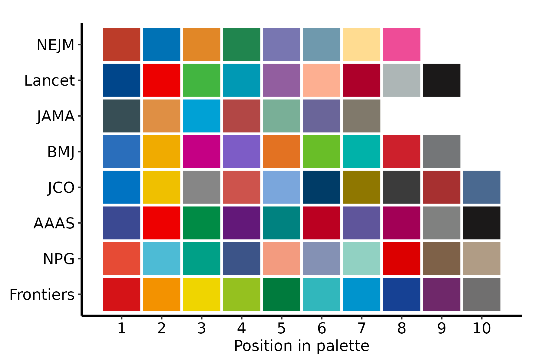
None of this relaxes the rule from choosing a palette. These palettes were picked to match a journal’s look, not to survive colour blindness, and they differ a good deal. We ran the first four colours of each, the ones a two-to-four group figure uses, through colorspace’s simulations of the two red-green deficiencies. Lancet puts its red second and its green third, the exact pairing the house rule bans. BMJ’s first and fourth colours, a blue and a purple, become almost the same colour under deuteranopia, and AAAS’s navy and purple come close. Frontiers opens with red, orange, yellow and green, a run of neighbouring hues that crowd together under either deficiency. JAMA, JCO and NPG held up about as well as the house palette, and NEJM nearly so. So a journal palette is a choice to check, not one to trust, and the shape channel stays on either way.
Last, a journal look is not a journal requirement. What author guidelines ask of a figure is usually resolution, file format and legibility rather than particular hues, and some journals redraw accepted figures in their own style regardless. Read the target journal’s figure instructions before choosing a palette on looks.
36.6 Suppressing legends
Pass guide = "none" to any scale and that aesthetic drops out of the legend. Do this when axis labels or an annotation already name the group, so a redundant legend does not eat panel space.
p_base +
  scale_colour_manual(values = hv_palette(), guide = "none") +
  scale_shape_manual(
    values = c("Group I" = 15, "Group II" = 19,
               "Group III" = 17, "Group IV" = 18),
    guide = "none"
  ) +
  labs(x = "Surgery Year", y = "Outcome") +
  theme_hv_manuscript(base_size = 12)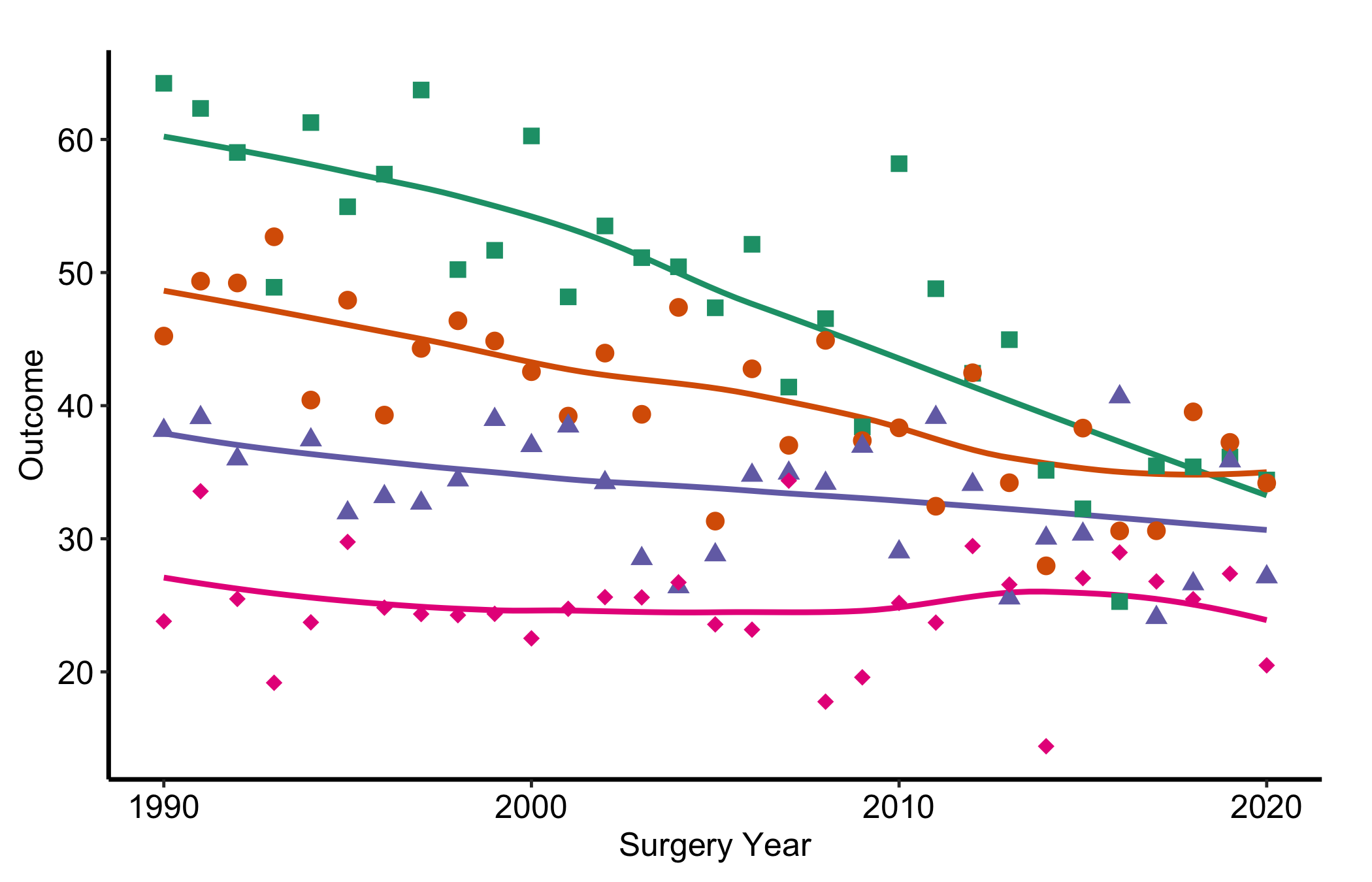
Figure 36.6 pairs colour with a distinct point shape per group. That redundancy is deliberate, and it is the heart of the first pitfall below.
36.7 Pitfalls
- Colour as the only channel. If the only thing separating two groups is their hue, the figure fails for a sizeable fraction of readers (red-green colour blindness alone affects roughly one man in twelve) and for anyone who prints it in greyscale, where two mid-tone colours collapse to the same grey. The fix is cheap: give each group a second channel as well, a point shape or a line type, so the distinction survives even when the colour does not. The recipes here map
scale_shape_manual()alongside the colour scale for exactly this reason. A quick check is to convert the figure to greyscale and confirm you can still tell the groups apart. - Too many hues. A palette with eight saturated colours does not help a reader; it asks them to memorise a legend and hunt for matches. Past about four or five groups, distinct colours stop being distinct and the figure turns to confetti. When you have many series, consider showing fewer at once, faceting into small panels, or muting the background series in grey and colouring only the one or two you are making a point about.
- Running a journal palette past its length. Each
ggscipalette is a fixed list (Table 36.2). Give the seven-colour JAMA scale an eighth group and it warns, then leaves that group with no colour at all. Unlikehv_ppt_palette(), it does not stop the script, so the warning is the only sign. Check the group count against the palette before you trust the figure.