A hazard ratio is a relative comparison. It does not tell a patient how much survival changes at five years, and it can hide when that change occurs. The absolute survival difference answers that first question: how many more patients out of 100 are alive in group 2 than group 1 at time \(t\). Number needed to treat (NNT) asks a different question by inverting the benefit: how many patients must receive group 2 rather than group 1 to prevent one event by that same time.
Direction is part of both estimands. In this chapter the difference is \(S_2(t)-S_1(t)\). A positive value favors group 2, and when the value is expressed in percentage points, \(NNT(t)=100/[S_2(t)-S_1(t)]\). If group 2 has lower survival, call that harm and reverse the contrast before reporting an NNT.
Reach for the survival difference when you want to show the size and timing of a benefit and whether its confidence band clears zero. Reach for NNT when you want the bedside number, the figure that makes a small absolute benefit feel concrete or an over-hyped one feel modest. Both constructors, from hvtiPlotR (Ehrlinger 2026), take a pre-computed data frame. Build and inspect the S3 object first; then plot() returns the ggplot you decorate.
21.2 The data it needs
Both functions expect one row per time point with an estimate column and explicit lower/upper CI columns that you name in the call. sample_nnt_data() generates two survival curves from a hazard-ratio contrast and computes NNT and ARR (absolute risk reduction) at each time point with CI bounds. The groups argument names the arms and sets their hazard multipliers; here the internal thoracic artery graft (ITA) carries 0.75 times the hazard of the saphenous vein graft (SVG) reference.
        time         arr   arr_lower  arr_upper      nnt nnt_lower nnt_upper
1 0.01000000 0.001548865 -0.03849194 0.04158967       NA        NA        NA
2 0.05006012 0.017341632 -0.13725732 0.17194059       NA  581.5963        NA
3 0.09012024 0.041863418 -0.22369142 0.30741825       NA  325.2897        NA
4 0.13018036 0.072628007 -0.30691800 0.45217401       NA  221.1538        NA
5 0.17024048 0.108520503 -0.38909707 0.60613807 921.4849  164.9789        NA
6 0.21030060 0.148855060 -0.47112585 0.76883597 671.7944  130.0668        NA
The NNT object stores the pre-computed estimate and its CI columns. The default estimate_col is "nnt", so we named only the bounds above. The helper uses a 500-point time grid, which does not land exactly on 5 or 10 years. The report code therefore shows each requested target_time beside the actual nearest grid_time; it does not relabel a nearby observation as an exact horizon. The plotted contrast is ITA minus SVG survival: a positive benefit and finite NNT favor ITA.
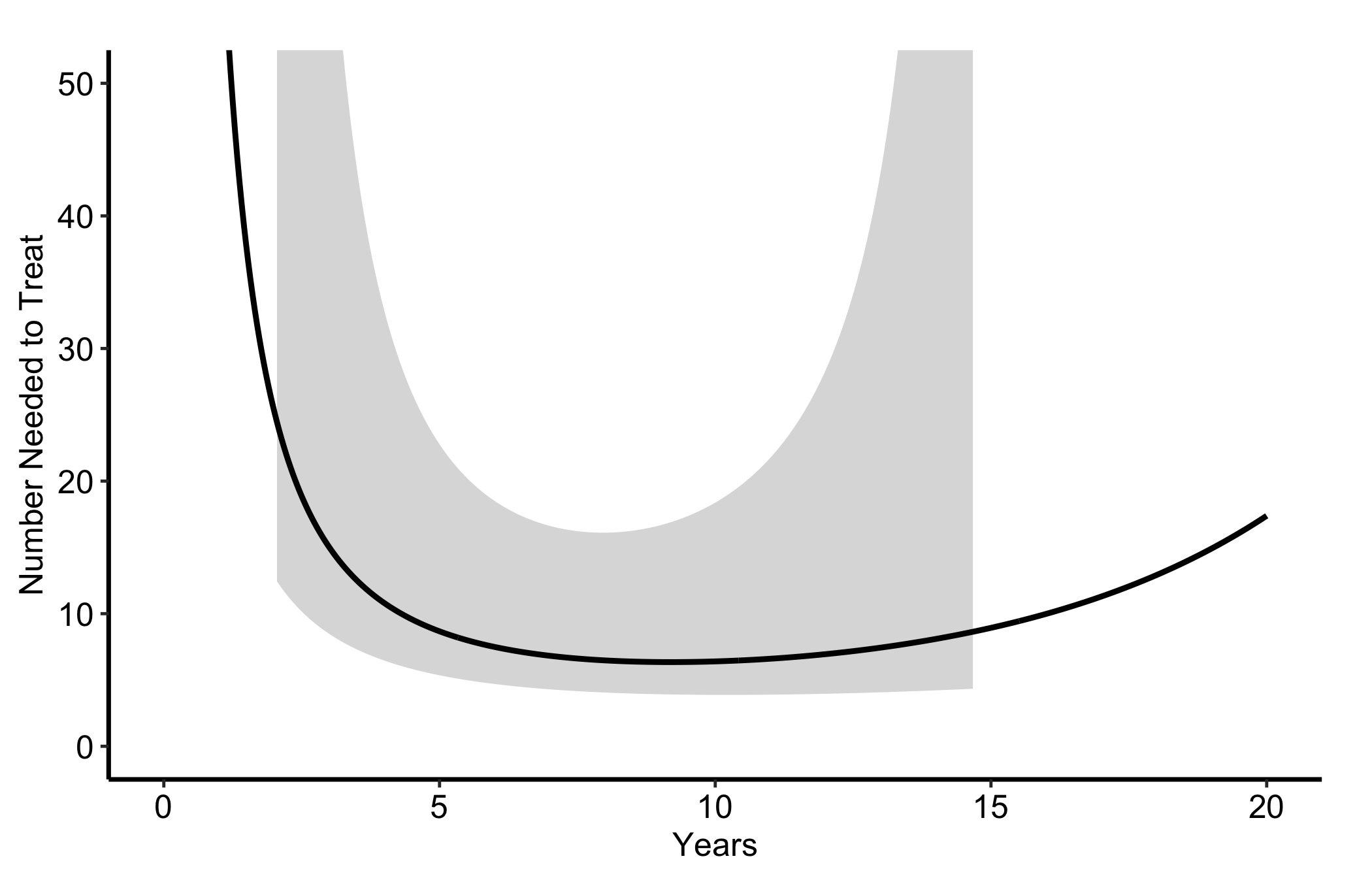
Figure 21.1: Number needed to treat with ITA rather than SVG; NNT falls as the benefit grows to about 10 years, then rises as that benefit narrows. The thick black solid line is the NNT and the grey band its confidence interval.
21.4 Read it
This simulated NNT curve falls while the ITA survival benefit widens, reaches about 6 near 10 years, then rises to about 17 at 20 years as that benefit narrows. The report table above shows the requested horizon and the nearby grid time used for each reading. Look for:
The direction of change. Early in follow-up the two arms have barely diverged, so you must treat a great many patients to prevent one event and the NNT is large. NNT drops while the survival gap widens and rises if that gap later narrows. Read the value at the time horizon that matters for your decision, not at the visual minimum or endpoint by default.
The confidence band. A wide band, especially early when NNT is large and unstable, means the count is poorly determined. When the survival-difference interval includes zero, a finite two-sided NNT interval does not exist; the ribbon may therefore be one-sided or absent at those times.
The y-axis scale. NNT is a ratio and blows up when the absolute benefit is near zero. A capped axis (here 0 to 50) keeps the figure readable, but remember the curve is heading to infinity at time zero, not flattening.
21.5 Numbers at risk under the curve
Read the curve above and the next question is how many patients stand behind the 20-year number. The helper cannot answer it. sample_nnt_data() computes its curves from a Weibull model, so no patients sit behind them, only a formula, and a risk table has to count people. So this recipe starts from records instead, which is also how you would build the figure from your own data.
sample_hazard_cohort() draws one row per patient, a time and a status (1 = event, 0 = censored), from the same model and the same hazard multipliers. We fit a Kaplan-Meier curve to each arm, take the ITA minus SVG difference on a quarter-year grid, and give it a normal interval from the two arms’ Greenwood standard errors. Then we invert it to NNT the way the helper does, leaving NNT undefined wherever the difference is 0.1 percentage points or less. hv_nnt() takes the result like any other pre-computed data frame, and hv_atrisk() counts the same records.
# Free size: two stacked panels (curve above a numbers-at-risk table).km_nnt_obj <-hv_nnt(km_dat, lower_col ="nnt_lower", upper_col ="nnt_upper")curve_nnt <-plot(km_nnt_obj) +scale_x_continuous(breaks =seq(0, 20, 5)) +scale_y_continuous(breaks =seq(0, 50, 10)) +coord_cartesian(xlim =c(0, 20), ylim =c(0, 50)) +labs(x ="Years", y ="Number Needed to Treat") +theme_hv_manuscript(base_size =12)risk_nnt <-hv_atrisk(coh_nnt, time ="time", status ="status",group ="group", report_times =seq(0, 20, 5))hv_atrisk_compose(curve_nnt, risk_nnt, heights =c(3, 1.2))
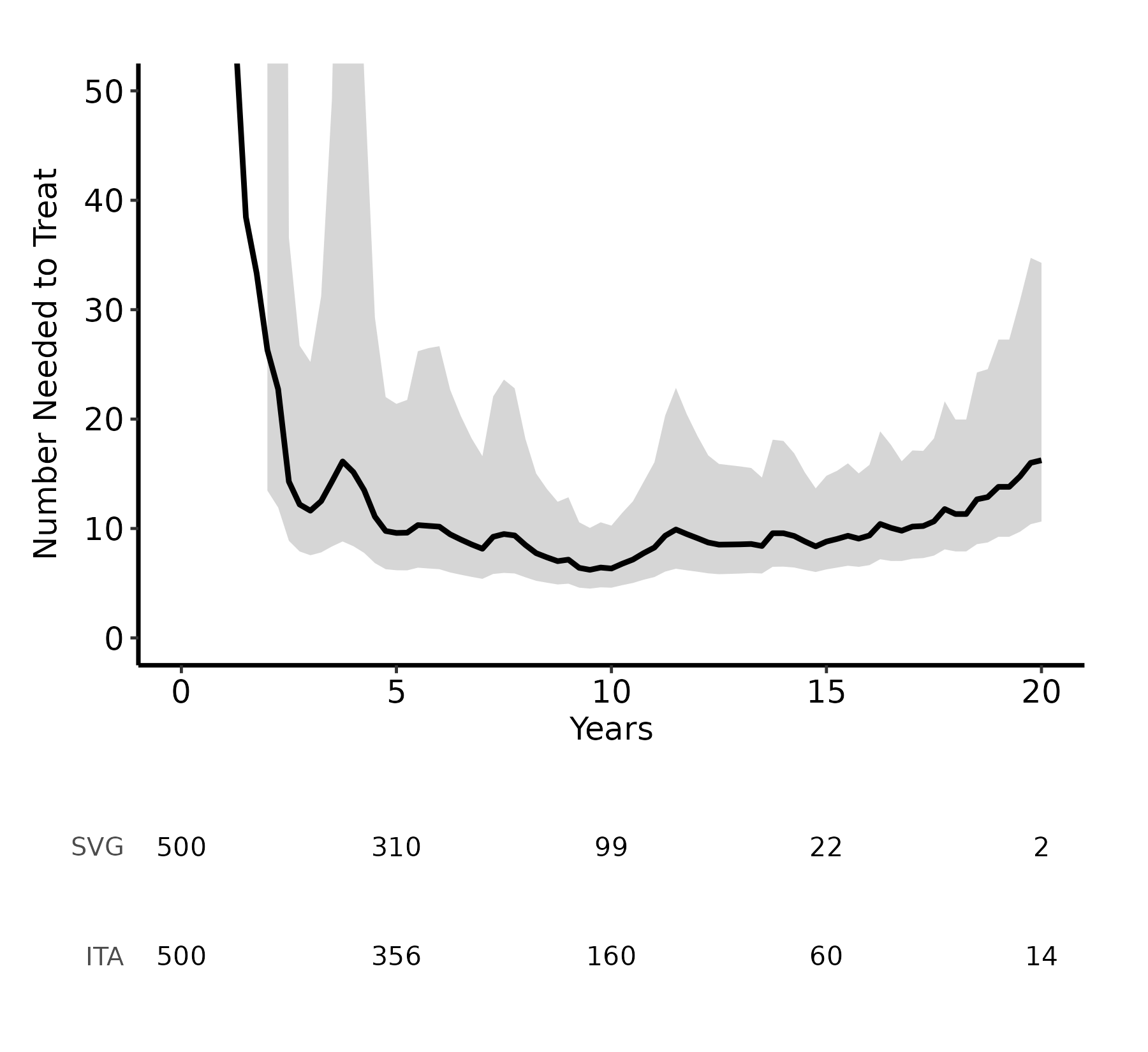
Figure 21.2: Number needed to treat with ITA rather than SVG, estimated from Kaplan-Meier curves, with the numbers at risk in each arm counted from the same records. The thick black solid line is the NNT with a grey confidence band, and the table below gives the numbers at risk in each arm.
The curve tracks the model curve above, since the records were drawn from that model; the wobble is sampling noise, and it is what real data look like. The table changes how you read the right-hand end. Near 10 years, treating about 6 patients with ITA rather than SVG prevents one death, and 99 SVG and 160 ITA patients are still at risk behind that estimate. At 20 years the curve reads about 16, but only 2 SVG patients remain. The interval widens there, to roughly 11 to 34, yet it still looks better determined than two patients can support. A Greenwood standard error shrinks as survival approaches zero, so the band reflects how small SVG survival has become (under 1%) rather than how few patients are left to estimate it. Quote NNT at a horizon where the table still shows a meaningful number in both arms, and keep the table under the figure so the reader can check that too.
21.6 Variations
21.6.1 Absolute risk reduction
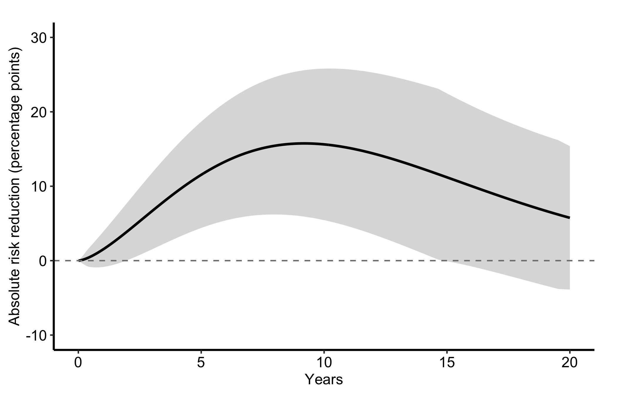
The same data can show absolute risk reduction (ARR) in percentage points by setting estimate_col = "arr" and naming the matching CI columns. Here ARR is the ITA minus SVG survival difference, which is also the reduction in event risk. NNT equals 100 divided by ARR, not the raw reciprocal of the plotted percentage-point value.
Figure 21.3: Absolute event-risk reduction for ITA versus SVG in percentage points; positive values favor ITA. The thick black solid line is the reduction, the grey band its confidence interval, and the dashed grey horizontal line zero, no difference.
21.6.2 Survival difference
hv_survival_difference() plots the difference S_2(t) - S_1(t) between two groups over time with an optional confidence band. sample_survival_difference_data() generates the point-wise difference and an approximate normal interval from a hazard-ratio contrast. It recovers a standard error from each component survival band, combines the two standard errors as \(\sqrt{SE_1^2 + SE_2^2}\), then applies the requested normal quantile. Both arms are simulated at the same n to keep the band width comparable.
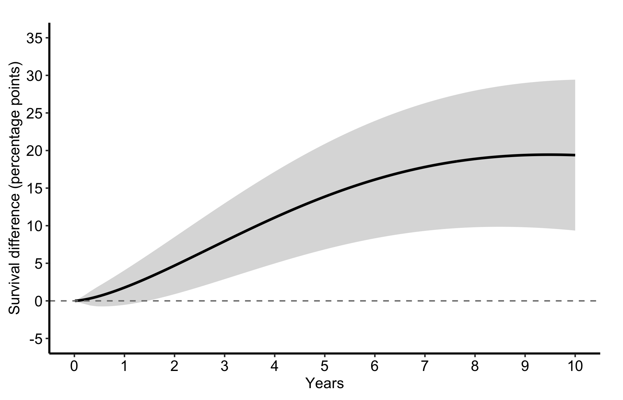
The dashed line at zero is the no-difference baseline. Because Control is group 1 and Treatment is group 2, a positive value means higher Treatment survival; a negative value would favor Control. No grouping argument is needed for this two-group case. Read the figure two ways: the height is the percentage-point difference at each time, and the lower edge of the 95% band shows whether the data remain compatible with no difference.
Figure 21.4: Treatment minus Control survival difference in percentage points with its 95% confidence band; positive values favor Treatment. The thick black solid line is the difference, the grey band its confidence interval, and the dashed grey horizontal line zero.
21.6.3 Multiple comparisons
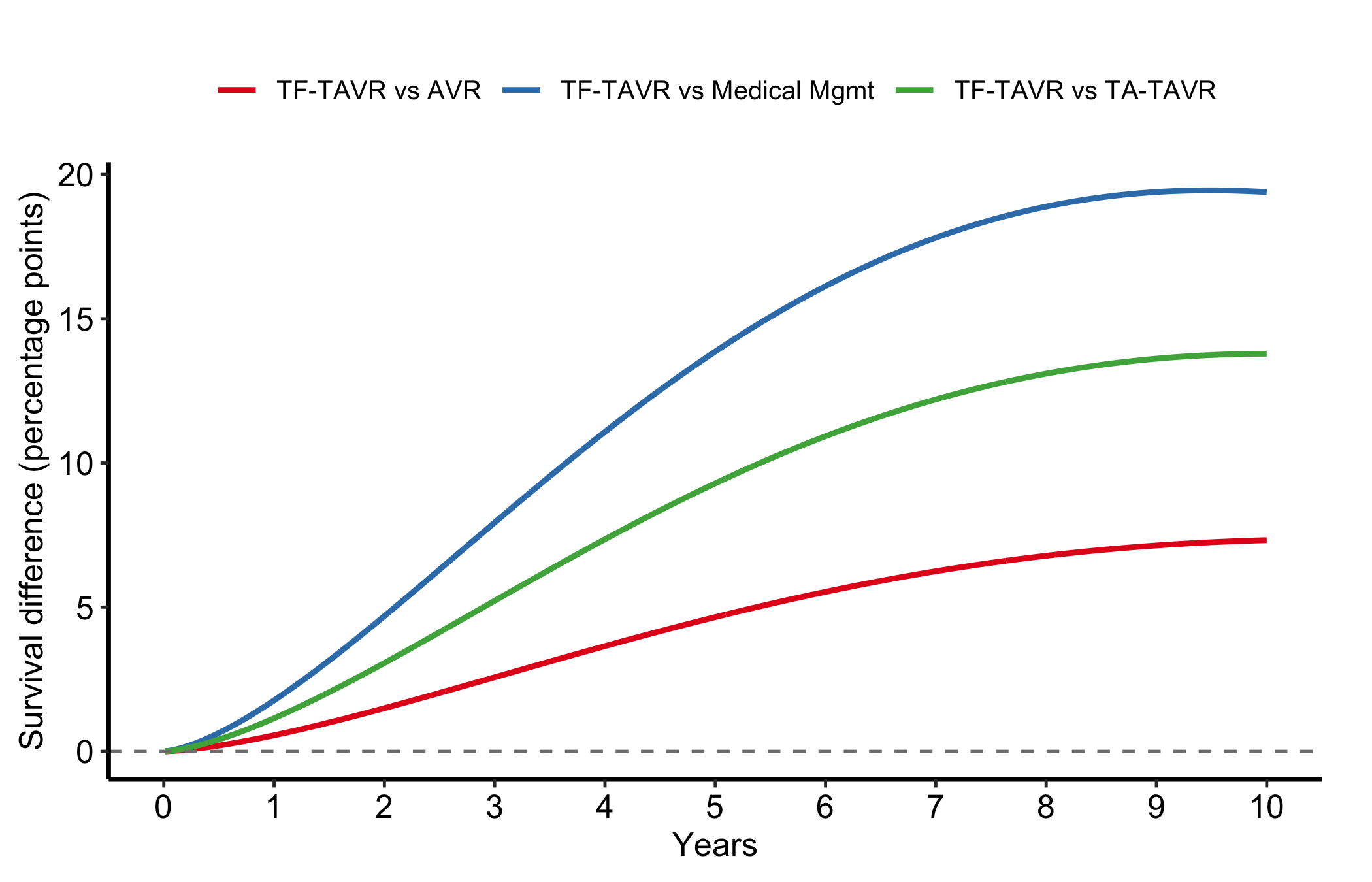
Combine several two-group differences into one long data frame and use group_col to overlay them. This is how we compare one arm against several alternatives in a single panel. Here TF-TAVR is group 2 in every contrast, so each line is TF-TAVR survival minus a different comparator’s, and a positive value favors TF-TAVR. The lines that sit highest and clear zero earliest are the comparators TF-TAVR improves on most.
Figure 21.5: TF-TAVR minus each comparator’s survival in percentage points, one line per contrast; positive values favor TF-TAVR. Solid lines are blue (versus AVR), vermillion (versus Medical Mgmt) and green (versus TA-TAVR), and the dashed grey horizontal line is zero.
21.7 Pitfalls
Quoting NNT at time zero. NNT is a reciprocal, so it explodes near the start of follow-up where the arms have not yet diverged. Always report it at a named horizon, never as a single headline number with no time attached.
Mismatched CI columns. NNT and ARR each have their own pair of bounds. Plot ARR with the NNT bounds and the band will be wrong. Name the CI columns that go with the estimate you are showing.
Reading the survival difference where the band straddles zero. A positive point estimate whose confidence band still includes zero is compatible with no difference. Keep the estimate and interval together.
Leaving the contrast unnamed. The sign means nothing until the reader knows which survival curve was subtracted from which. Put “group 2 minus group 1” in the text or caption, and reverse the labels if you want positive values to mean benefit.
A risk table from the wrong records. The counts must come from the records the curve was estimated from. The model curve at the top of this chapter has no records, and pairing it with a cohort of the same size would look entirely plausible and mean nothing.
Forgetting the zero line. The dashed reference at zero is what makes the survival-difference figure readable. Add the geom_hline() every time; without it the eye has no anchor for “no benefit”.
Ehrlinger, John. 2026. hvtiPlotR: HVTI Ggplot2 Themes and Clinical Plot Functions for the Cleveland Clinic Heart & Vascular Institute. https://github.com/ehrlinger/hvtiPlotR.