dat <- sample_eda_data()
num <- "ef"
grp <- "valve_morph"
c(numeric = num, group = grp)
numeric group
"ef" "valve_morph" How do the centre and spread of a continuous measurement compare across clinical groups? A box plot makes that comparison compact, provided we remember what its summary leaves out.
When you want to compare a continuous measurement across a handful of groups, the box plot is the compact summary that fits in a single panel. It draws the median, the two quartiles, and the whiskers for each group side by side, so the reader can scan across categories and see at once which group sits higher, which is more variable, and which has stragglers. Reach for it when the question is “does this number differ by group?” and the groups number in the low single digits. With twenty groups the boxes get too thin to read; with two groups you might prefer to overlay densities. In the sweet spot of three to six categories, the box plot is hard to beat.
hvtiPlotR does not provide a box-plot helper, so this chapter builds the plot directly with ggplot2’s (Wickham et al. 2026) geom_boxplot() and styles it with the house theme theme_hv_manuscript() so it stays visually consistent with the rest of the book. As with the other bare-ggplot recipes, you write the ggplot() call yourself and finish with + theme_hv_manuscript().
A box plot needs a categorical column for the x-axis and a continuous column for the y-axis. We use hvtiPlotR::sample_eda_data() with valve_morph (valve morphology: Bicuspid, Tricuspid, or Unicuspid) as the group and ef (ejection fraction) as the measurement. Naming both columns directly keeps the example tied to one clinical question.
dat <- sample_eda_data()
num <- "ef"
grp <- "valve_morph"
c(numeric = num, group = grp) numeric group
"ef" "valve_morph" The .data[[grp]] idiom is how ggplot2 reads a column whose name lives in a variable, so the same recipe runs after you replace grp or num with another column name.
Because this recipe creates a ggplot directly, inspect the group counts and numeric summary before collapsing the observations into boxes.
table(dat[[grp]], useNA = "ifany")
 Bicuspid Tricuspid Unicuspid
114 167 19 summary(dat[[num]]) Min. 1st Qu. Median Mean 3rd Qu. Max. NAs
20.00 45.50 56.00 54.72 62.83 80.00 24 The grouped box plot is the base case: one box per level of the categorical variable, all on a shared y-axis.
ggplot(dat, aes(x = .data[[grp]], y = .data[[num]])) +
  geom_boxplot() +
  labs(
    title = "Numeric distribution by group",
    x = "Valve morphology",
    y = "Ejection fraction (%)"
  ) +
  theme_hv_manuscript(base_size = 12)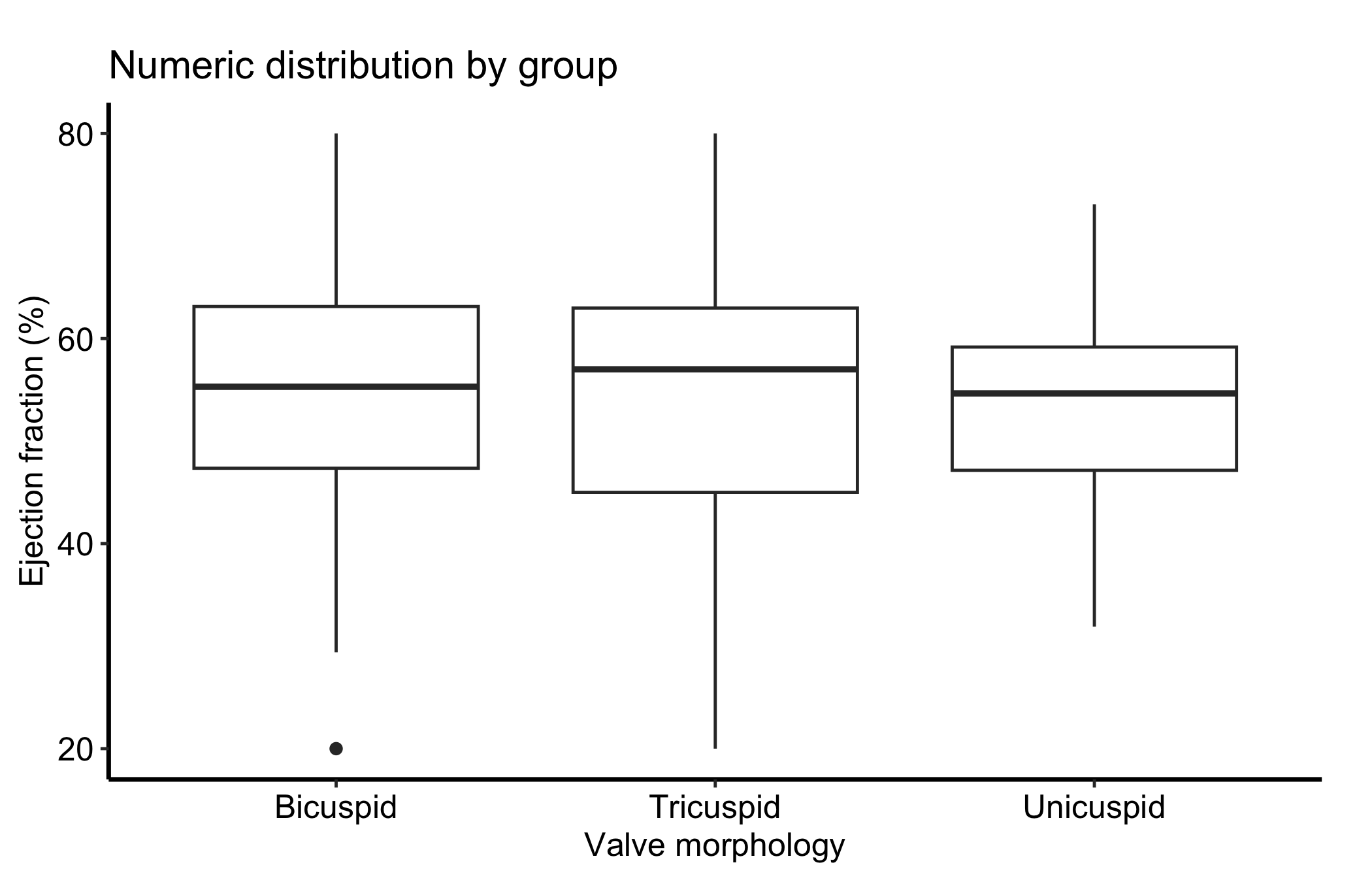
Each box packs a lot in. The line inside the box is the median; the box edges are the first and third quartiles (the 25th and 75th percentiles), so the box spans the middle half of the data, the interquartile range or IQR. The whiskers reach out to the most extreme points within 1.5 times the IQR of the box, and anything past the whiskers is drawn as an individual outlier point.
Read a box plot one box at a time, then across. Valve morphology is on the x-axis and ejection fraction is on the y-axis. Each box summarizes the nonmissing values in its group, with no weighting or model adjustment. Compare medians and IQRs, but do not read their separation as a causal morphology effect or as a formal test of a group difference.
What a box plot does not show is the shape inside the box. Two groups can have identical boxes while one is a single clump and the other is two separated clusters. That blind spot is the reason for the next variation.
Overlaying the raw observations with geom_jitter() shows the underlying sample size and spread that a box plot alone hides. We turn off the box’s own outlier points (outlier.shape = NA) so they are not drawn twice, then scatter the points with a little horizontal jitter and low alpha so dense regions read as darker. Jitter is random, so give it a seed through position_jitter(), or the points land somewhere new on every render.
ggplot(dat, aes(x = .data[[grp]], y = .data[[num]])) +
  geom_boxplot(outlier.shape = NA) +
  geom_jitter(position = position_jitter(width = 0.15, seed = 42),
              alpha = 0.3, size = 0.7) +
  labs(
    title = "Box plot with jittered observations",
    x = "Valve morphology",
    y = "Ejection fraction (%)"
  ) +
  theme_hv_manuscript(base_size = 12)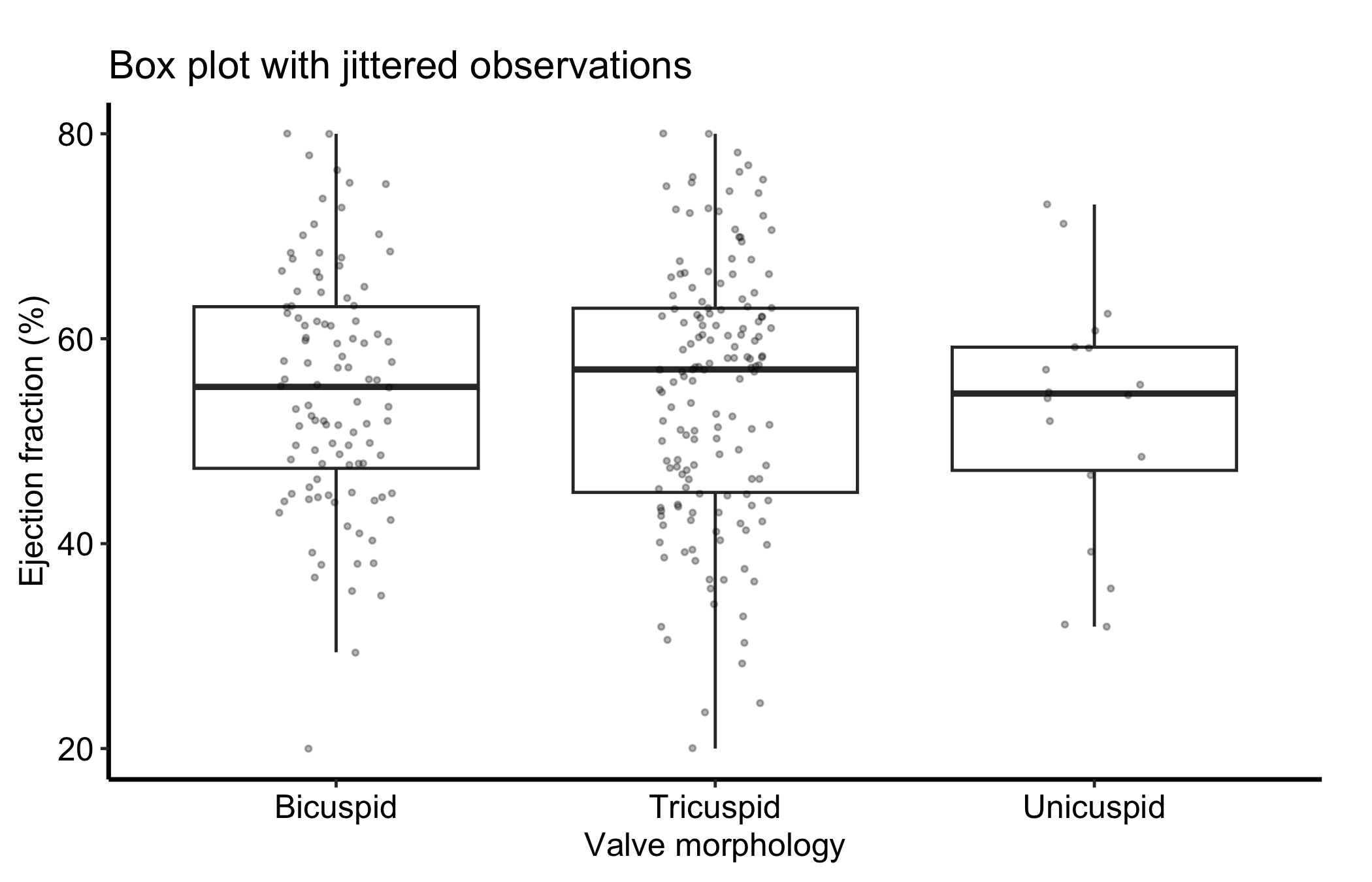
Now you can see how many patients sit behind each box, and whether the points under a box form one cloud or two. For the small group in this sample, the handful of points makes plain how little the box is summarising.
A box plot draws every box the same width regardless of how many patients it summarises, which can mislead. Setting varwidth = TRUE makes each box’s width proportional to the square root of its group size, so a thin box is a visual warning that it rests on few patients.
ggplot(dat, aes(x = .data[[grp]], y = .data[[num]])) +
  geom_boxplot(varwidth = TRUE) +
  labs(
    title = "Box width scaled to group size",
    x = "Valve morphology",
    y = "Ejection fraction (%)"
  ) +
  theme_hv_manuscript(base_size = 12)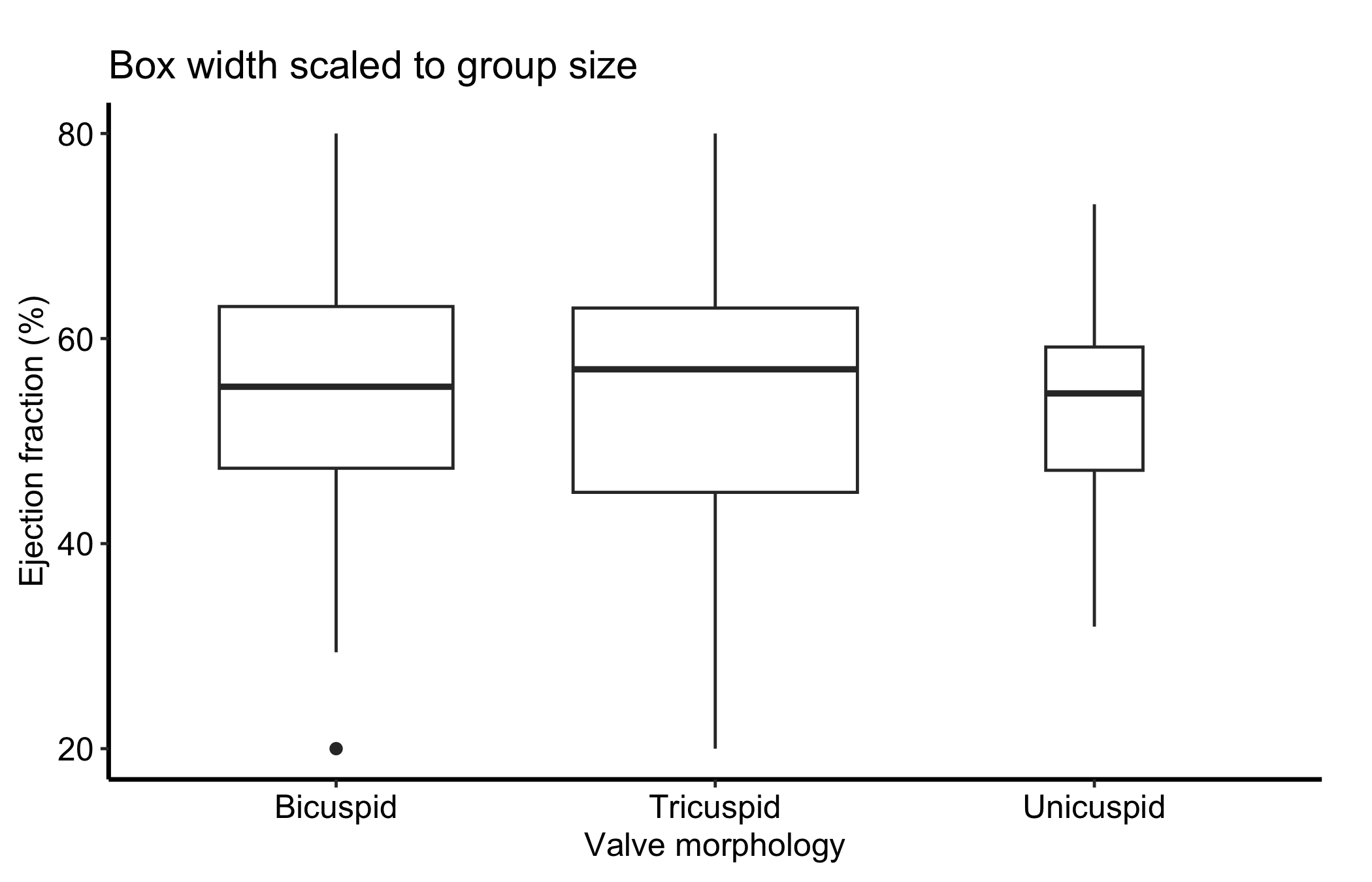
A grey box plot is honest but plain. Mapping fill to the group colours each box from a palette, which makes a busy panel easier to scan and ties the boxes to the same colours the group uses elsewhere in a figure. Because the x-axis already names the groups, the fill only reinforces them, so we drop the redundant legend with guide = "none" rather than spend panel space on it.
ggplot(dat, aes(x = .data[[grp]], y = .data[[num]], fill = .data[[grp]])) +
  geom_boxplot() +
  scale_fill_manual(values = hv_ppt_palette("light"), guide = "none") +
  labs(
    title = "Numeric distribution by group, filled",
    x = "Valve morphology",
    y = "Ejection fraction (%)"
  ) +
  theme_hv_manuscript(base_size = 12)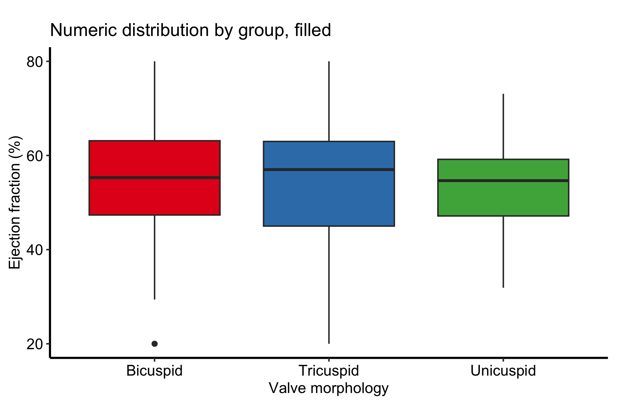
When the fill encodes a second variable the boxes are dodged by, not the x-axis group, the legend earns its place; keep it then, placed inside the panel so it does not crowd the boxes.
Everything above is a Tukey box, which is what geom_boxplot() draws. Our house box is a different one. Its hinges sit at the 15th and 85th percentiles, its whiskers run to the 5th and 95th, and it draws no outlier points. The percentiles match the median (15th, 85th) summary our manuscript tables report, so a figure and its table describe a group with the same numbers. It is also the box gg_varpro() draws in the variable priority chapter, whose plot carries the caption “Not a Tukey boxplot”.
geom_boxplot() has no argument for other percentiles, so we compute the five numbers per group and hand them over with stat = "identity".
pct <- do.call(rbind, lapply(split(dat[[num]], dat[[grp]]), function(y) {
  q <- quantile(y, c(0.05, 0.15, 0.50, 0.85, 0.95), na.rm = TRUE)
  data.frame(ymin = q[1], lower = q[2], middle = q[3], upper = q[4], ymax = q[5])
}))
pct$group <- rownames(pct)

ggplot(pct, aes(x = group, ymin = ymin, lower = lower, middle = middle,
                upper = upper, ymax = ymax)) +
  geom_boxplot(stat = "identity") +
  labs(
    title = "Percentile box by group",
    x = "Valve morphology",
    y = "Ejection fraction (%)",
    caption = "Hinges: 15th/85th percentiles; whiskers: 5th/95th. Not a Tukey boxplot."
  ) +
  theme_hv_manuscript(base_size = 12)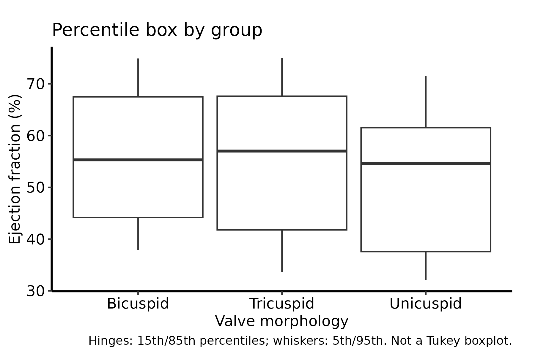
Two things change in how you read it. The box now holds the middle 70% of the group rather than the middle half, so it is taller than a Tukey box drawn from the same data. The whiskers are fixed percentiles with no outlier rule behind them, so 10% of the group lies beyond them by construction, and nothing past the whiskers is singled out. Say so in the caption every time, as the caption here does, because a reader will assume Tukey otherwise.
When the group definition and box rule are clear in the caption, continue to Finish and deliver the result for the manuscript, poster, or slide export path. If sample size affects the interpretation, deliver the jittered or variable-width version rather than the bare box alone.
geom_boxplot() and the house percentile box. They look the same and summarise different things. State the rule in every caption, and keep to one rule within a figure.