The survival chapter starts with patient-level follow-up and asks what the observed cohort experienced. This chapter starts one step later: you already hold a grid of fitted values and want to show what a model says between the observed event times. A smooth line is a model summary, not a more precise Kaplan-Meier curve.
Name the quantity before you choose its column. Survival probability asks what proportion remains event-free beyond a time. Cumulative hazard asks how much event intensity has accumulated through that time. Hazard rate asks when events are occurring fastest among patients still at risk. They can be derived from one fitted model, but their scales, units, and clinical readings differ.
Reach for hv_hazard() when you have a parametric prediction grid and want to show the smooth curve, often with the empirical Kaplan-Meier points overlaid so a reviewer can judge how well the model fits. Reach for the nonparametric temporal-trend curve (hv_nonparametric()) when your outcome is a prevalence or a continuous measurement tracked over follow-up with a formula-based confidence band rather than a survival function. Reach for the ordinal curve (hv_ordinal()) when the outcome has graded levels (regurgitation grade, severity class) and you want one probability curve per grade. All three take pre-computed data and hand back an S3 object. Inspect that object first, then call plot() to get the bare ggplot you decorate. If the empirical hazard shape suggests distinct early, constant, or late phases, continue to fit an additive hazard model; these displays come before that modeling decision.
20.2 The data it needs
hv_hazard() takes a parametric prediction grid: one row per time point, with an estimate column (survival, hazard, or cumhaz) and explicit lower/upper CI columns that you name in the call. Two helpers generate the demonstration data. sample_hazard_data() builds the prediction grid; sample_hazard_empirical() builds the binned Kaplan-Meier overlay (the discrete empirical estimate the smooth curve is meant to track). Using the same cohort size for both keeps the overlay aligned with the curve.
A third helper, sample_hazard_cohort(), returns the subject-level records the overlay was computed from: one row per patient with a time and a status (1 = event, 0 = censored, the same coding as the survival chapter), rather than a curve. hv_atrisk() reads that indicator to decide who leaves the risk set, so a cohort coded the other way round silently counts censoring as events. Called with the same arguments it describes the same cohort, which is what lets the next section put an honest numbers-at-risk table under the figure.
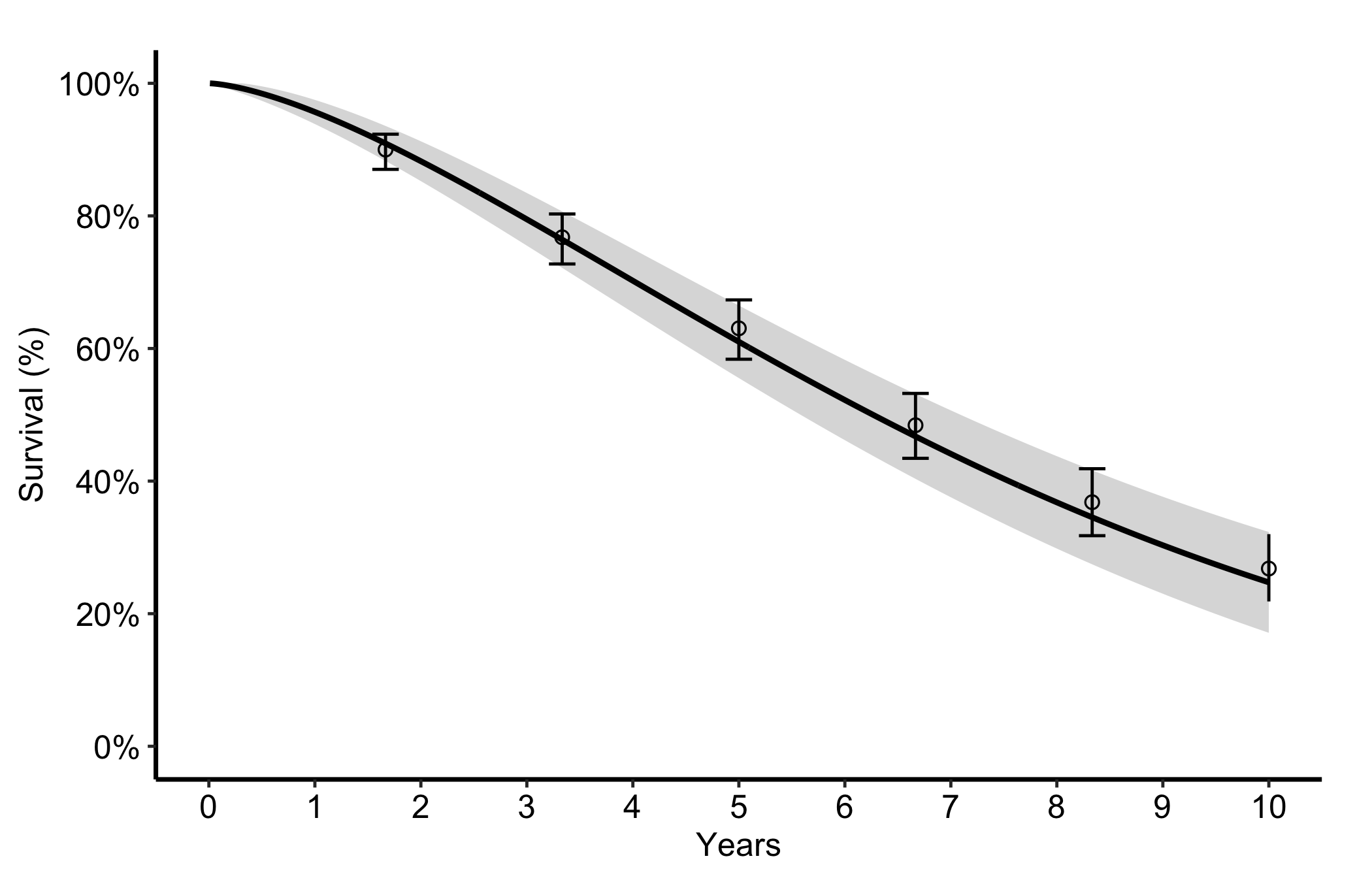
The most common figure is a smooth parametric survival curve with its confidence band plus discrete Kaplan-Meier points and error bars. We named the estimate and CI columns when we built haz_surv; now plot() uses those stored roles. The curve is on the percentage scale, so 80 means 80% surviving, not 0.80.
Figure 20.1: Smooth parametric survival curve with its confidence band and overlaid binned Kaplan-Meier points with error bars. The solid black line is the parametric survival curve, the gray ribbon its confidence band, open black circles the binned Kaplan-Meier estimates, and the vertical black bars their confidence limits.
20.4 Read it
The point of the overlay is the comparison between the smooth curve and the discrete points. Look for:
Points sitting on the curve. If the empirical Kaplan-Meier estimates fall on or very near the parametric line, the model is describing the data well. If the points wander systematically off the curve (above it early, below it late), the parametric form is the wrong shape and you should reconsider it.
The error bars against the band. The empirical error bars and the smooth confidence ribbon should tell a consistent story. Where the cohort thins, both widen; a point with a huge error bar is a region the figure cannot support.
The curve shape itself. A survival curve falls and flattens; a hazard curve often peaks early then settles; a cumulative hazard only rises. A shape that contradicts the biology is a signal to check the model before the figure.
20.5 Numbers at risk under the curve
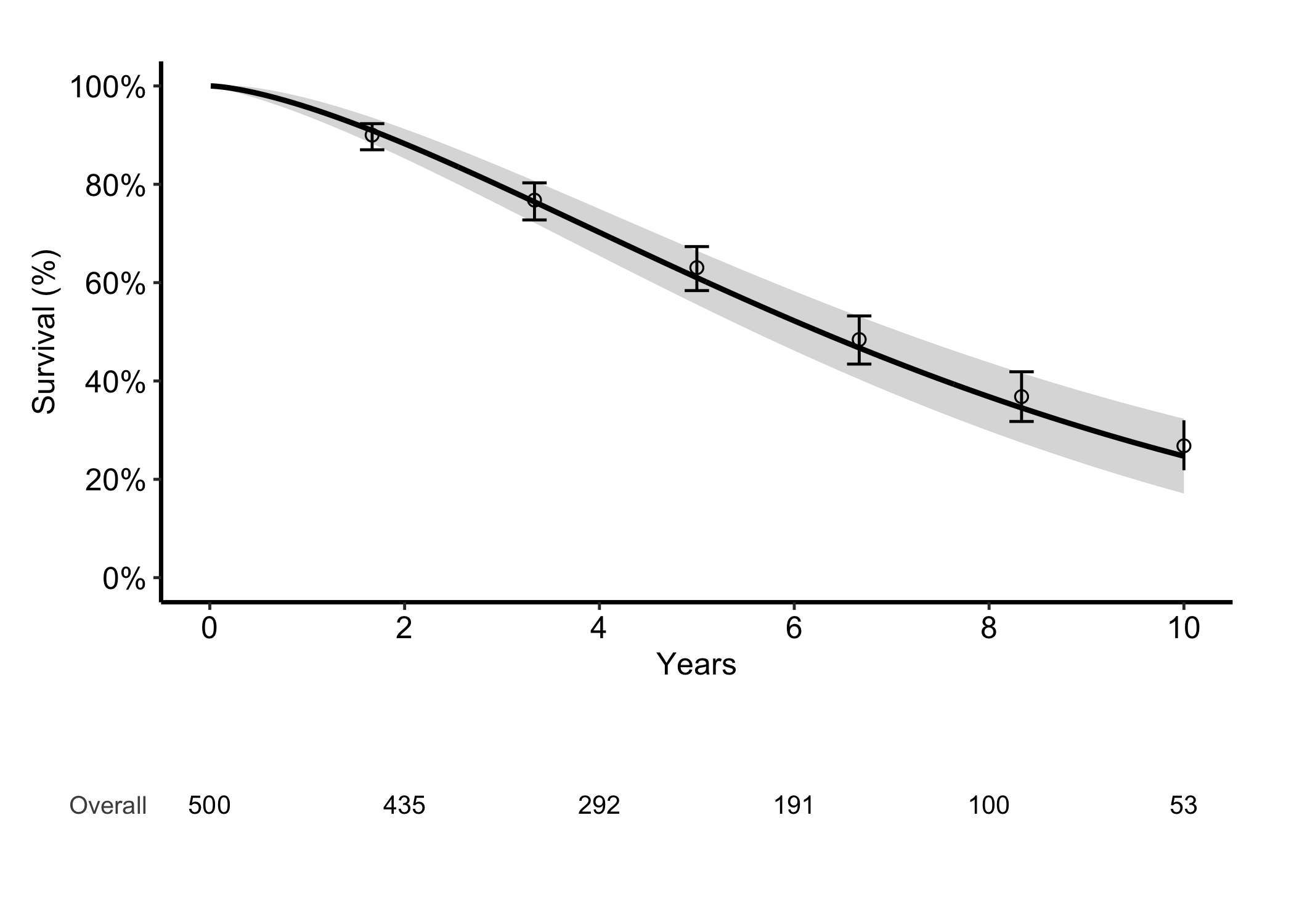
A survival figure without a risk table asks the reader to take the right-hand tail on trust. hv_atrisk() counts the risk set at times you choose and hv_atrisk_compose() stacks it under the curve on a matched axis.
The table needs subject-level records, which is why coh_hp exists: a curve cannot tell you how many patients stood behind each part of it.
Figure 20.2: The parametric survival curve and its Kaplan-Meier overlay with an aligned numbers-at-risk table, counted from the subject-level cohort the overlay was computed from. The solid black line is the parametric curve, the gray ribbon its confidence band, open black circles the binned Kaplan-Meier estimates with vertical black confidence bars, and the black numbers below the axis the patients still at risk at each time.
Be precise about what the counts describe, because two things are drawn here and they are not the same object. The counts and the Kaplan-Meier points both come from coh_hp: refit a Kaplan-Meier to that cohort and you recover the overlay exactly. The smooth curve is the parametric model, and it sits up to about two percentage points away from those points across this range. So the table describes the observed cohort, which is the relationship you want. A risk table always counts patients, never the model.
The counts have to come from the data the figure is about; a table generated from some other cohort of the same size would look entirely plausible and be meaningless. If your own curve comes from a fitted model, take the risk table from the records you fitted it to.
20.6 Variations
20.6.1 Hazard rate
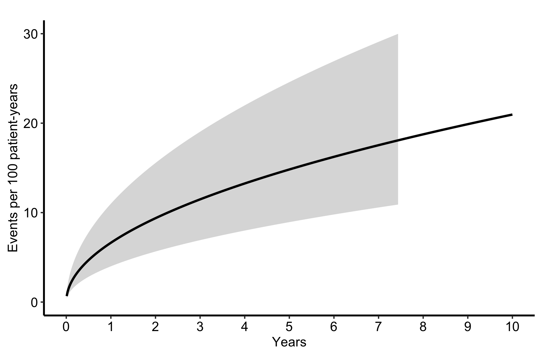
Switch estimate_col to "hazard" and the matching CI columns for the instantaneous event rate. The sample stores \(100h(t)\), so its units are events per 100 patient-years. This is the curve to show when the question is when events occur fastest rather than how many survive.
Figure 20.3: Instantaneous event rate per 100 patient-years, showing when post-operative events occur fastest among patients still at risk. The solid black line is the hazard rate and the gray ribbon its confidence band.
20.6.2 Cumulative hazard
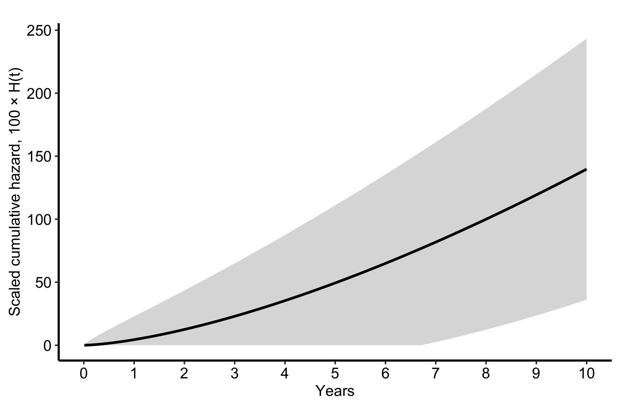
The "cumhaz" column equals \(100\{-\log[S(t)]\}\). Cumulative hazard \(H(t)\) is dimensionless; the helper multiplies it by 100 for display, but that scaling does not turn it into a percentage or a count per 100 patients. The local slope of \(100H(t)\) is the event rate per 100 patient-years. Reach for cumulative hazard when the question concerns accumulated event intensity rather than the surviving fraction.
Figure 20.4: Scaled cumulative hazard, 100 × H(t), a dimensionless quantity whose local slope is the event rate per 100 patient-years. The solid black line is the scaled cumulative hazard and the gray ribbon its confidence band.
20.6.3 Stratified by group
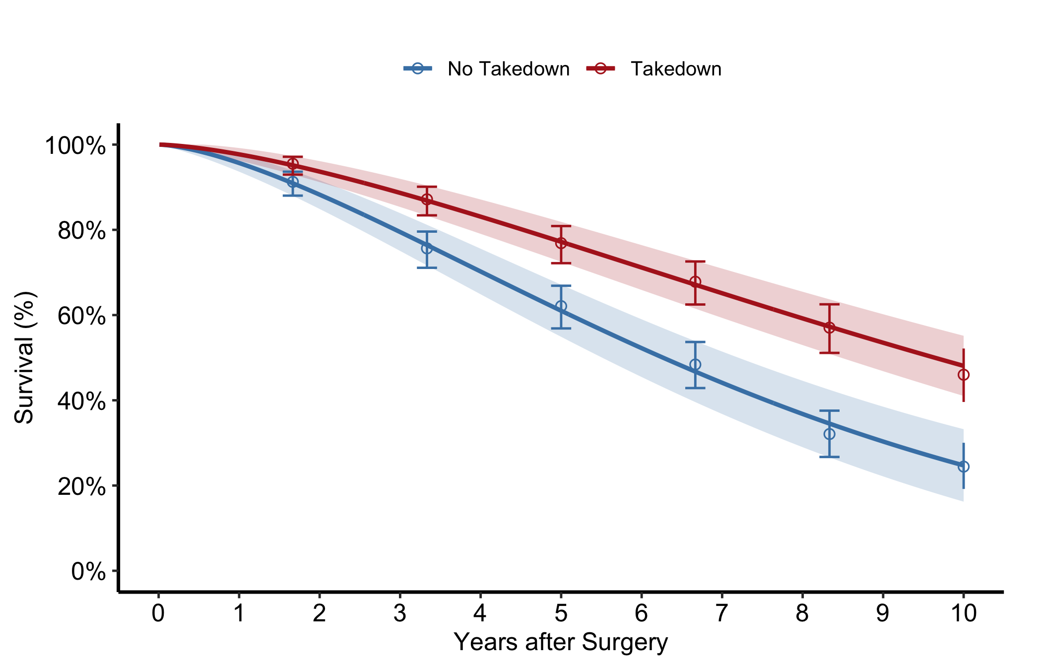
Pass group_col to compare two or more groups in one panel, each with its own curve, band, and empirical overlay. Look for curves whose bands stop overlapping in the windows where the treatment difference matters.
Figure 20.5: Survival curves, bands, and empirical overlays for two groups in a single panel. Solid lines are the parametric survival curves with light ribbons for their confidence bands, and open circles with vertical bars the binned Kaplan-Meier estimates and their confidence limits; steel blue marks No Takedown and firebrick marks Takedown.
20.6.4 Population life-table overlay
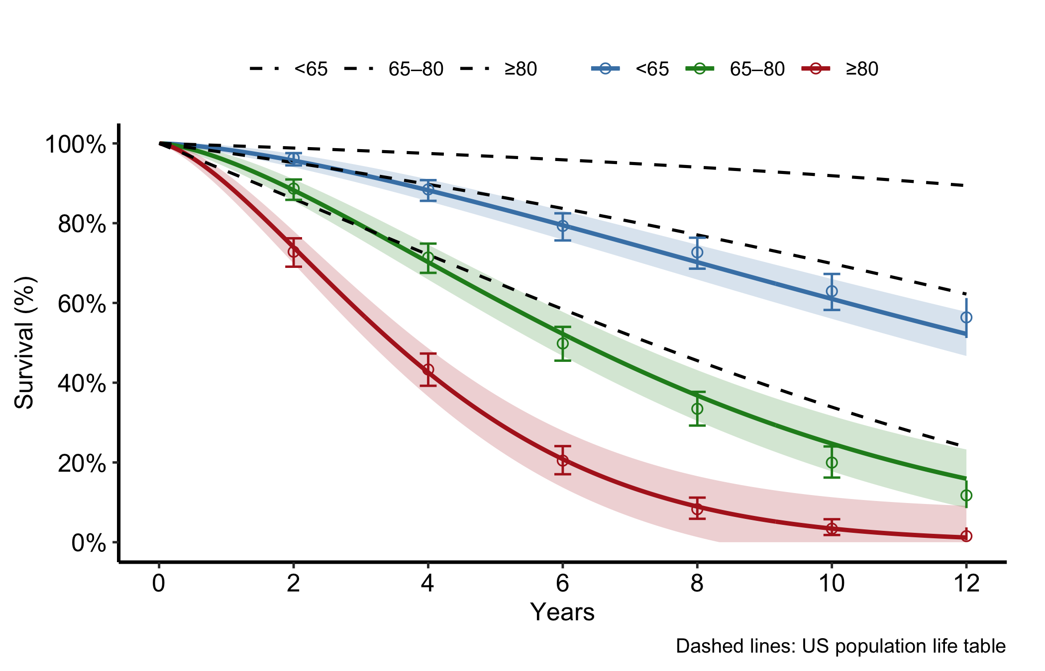
For age-stratified survival you often want to set the study curves against what the general population would do. Pass a life-table data frame to reference and set ref_group_col to draw the population survival as dashed lines per age group. The gap between a study curve and its dashed reference is the excess mortality attributable to the condition rather than to ageing.
Figure 20.6: Age-stratified study survival curves set against dashed population life-table references. Solid lines with light ribbons are the study survival curves and their confidence bands, open circles with vertical bars the binned Kaplan-Meier estimates and their limits, and black dashed lines the population life table; steel blue marks under 65, green 65 to 80, and firebrick 80 and over.
20.6.5 Nonparametric temporal-trend curve
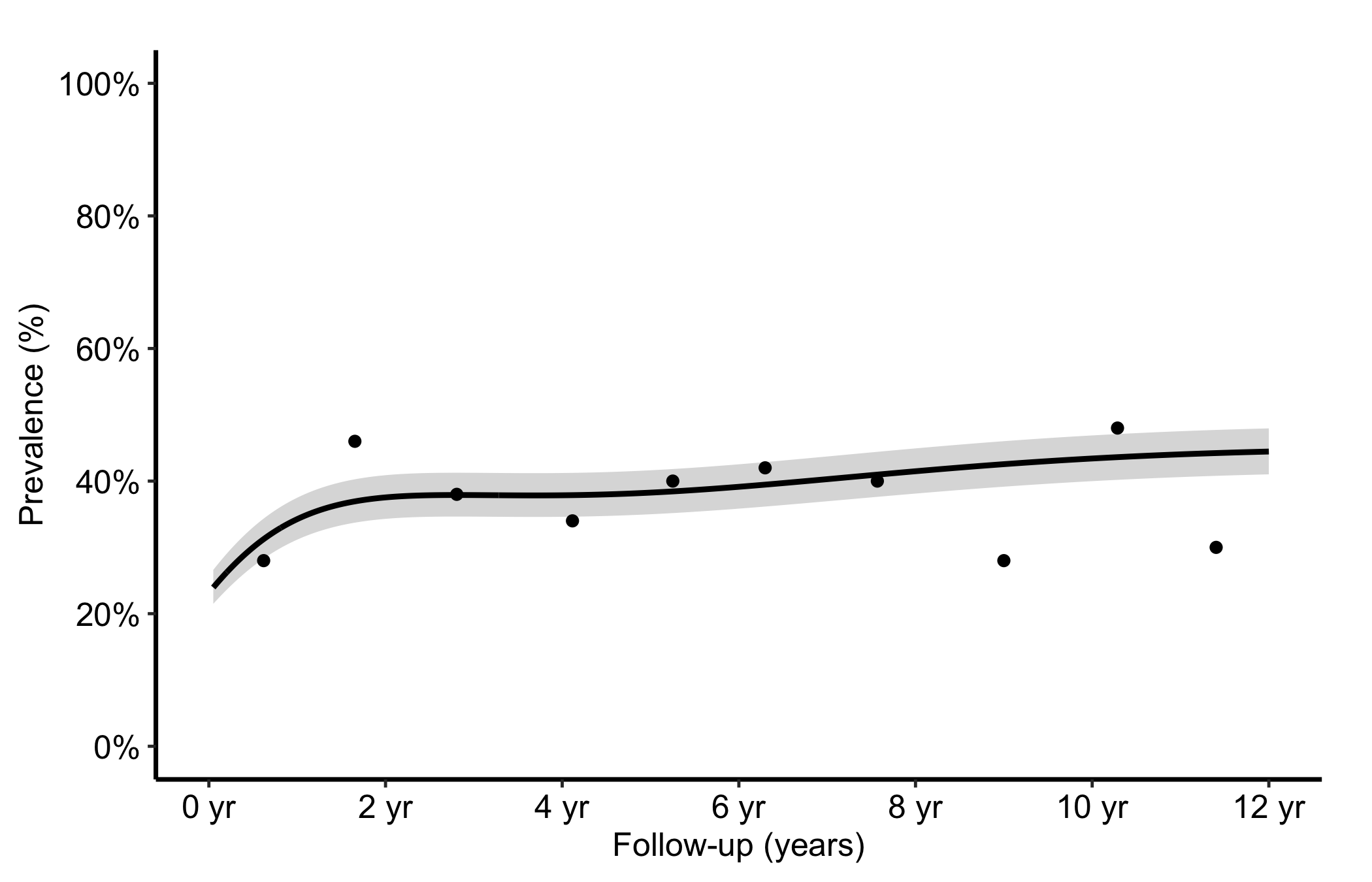
When the outcome is a prevalence or a continuous measurement tracked over follow-up rather than a survival function, hv_nonparametric() prepares the average curve with a formula-based CI ribbon. For probability outcomes, sample_nonparametric_curve_data() computes an effective-sample-size standard error and applies a normal quantile on the logit scale. For continuous outcomes, it applies the normal quantile to a fixed residual standard error divided by the square root of the effective sample size. sample_nonparametric_curve_points() generates the binned summary points that overlay the curve. Build the S3 object once with the matching lower_col/upper_col and optional data_points, then plot().
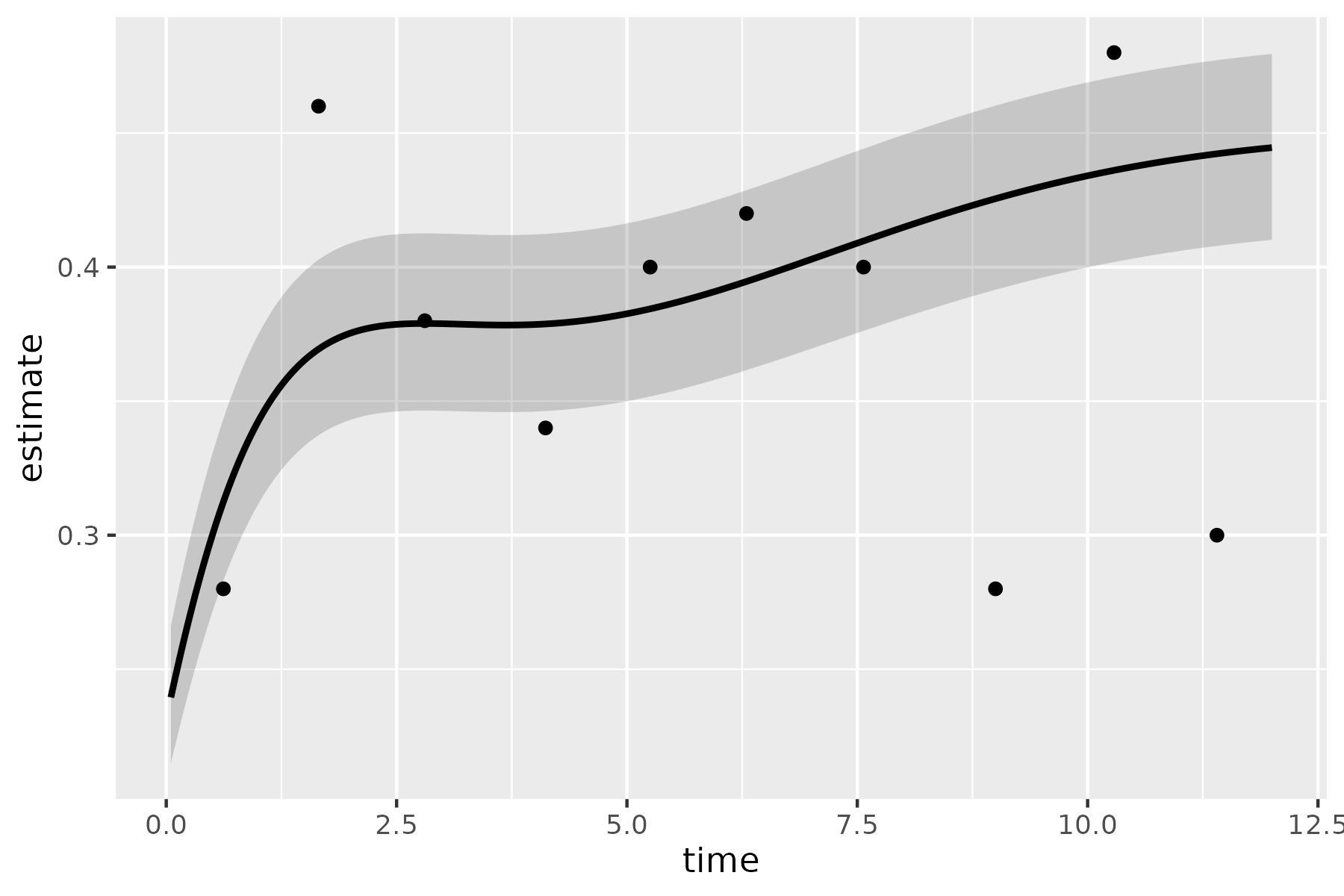
The bare panel shows the average curve, its CI ribbon, and the binned summary points in default colours. Read it the same way you read the empirical overlay in Figure 20.1: the curve should pass through the binned points. The ribbon reflects the helper’s formula-based standard error, not a changing at-risk count or a bootstrap distribution. A flat curve where you expected a trend is a hint that the outcome_type or CI columns are misspecified.
plot(np)
Figure 20.7: The bare nonparametric temporal-trend curve in default colors. The solid black line is the average curve, the grey ribbon its 68% interval, and black filled circles the binned summary points.
The shaded ribbon here is a 68% normal-quantile interval, approximately one standard error on the scale used by the helper. Pass ci_level = 0.95 to sample_nonparametric_curve_data() for a 95% interval.
Figure 20.8: Nonparametric temporal-trend curve with its 68% formula-based normal-quantile interval and binned summary points. The solid black line is the average curve, the gray ribbon its interval, and black filled circles the binned summary points.
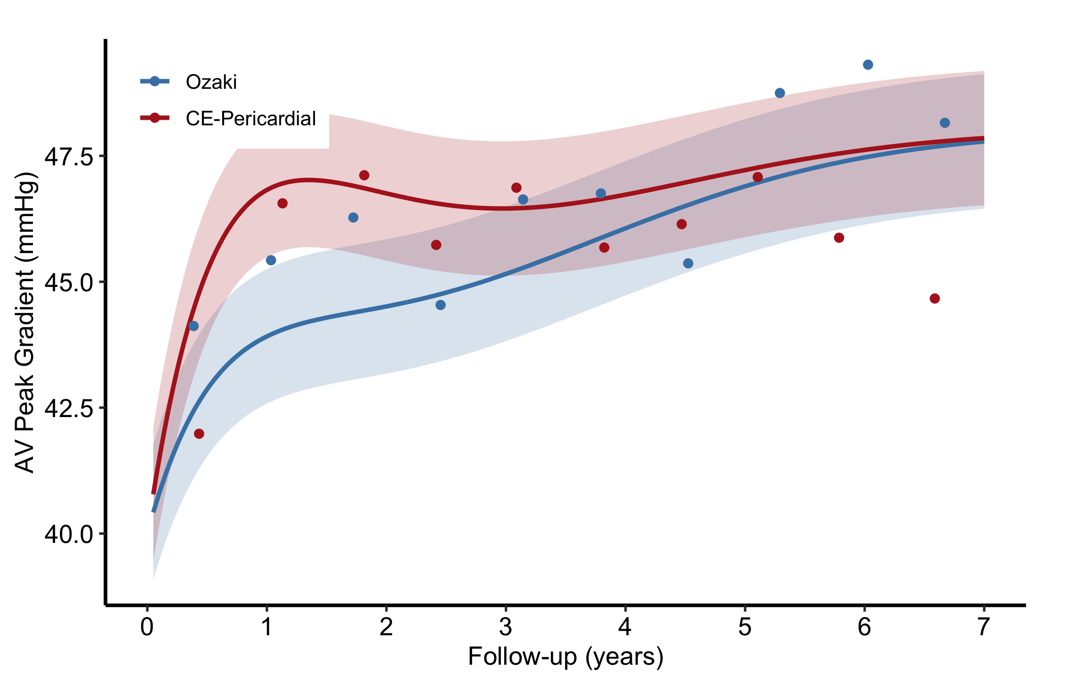
Pass group_col to the constructor to compare two average curves in a single panel; each group gets its own CI ribbon.
Figure 20.9: Two nonparametric average curves compared in one panel, each with its own formula-based normal-quantile interval. Solid lines are the average curves, light ribbons their intervals, and filled circles the binned summary points; steel blue marks Ozaki and firebrick marks CE-Pericardial.
20.6.6 Nonparametric ordinal-outcome curve
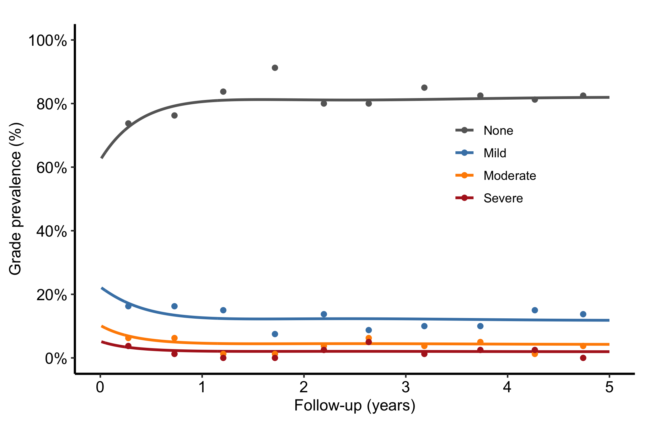
When the outcome has graded levels, hv_ordinal() prepares one probability curve per grade from a cumulative proportional-odds model (the prevalence of each regurgitation grade over time, say). The curve data is long format, one row per time by grade. sample_nonparametric_ordinal_data() generates the curves and sample_nonparametric_ordinal_points() the binned summary points.
Build the object with both curve data and summary points. Each line is one grade level; because every patient has exactly one grade at each time, the lines sum to roughly 1.0 at every time point. Read the figure as a stacked story: the "None" line starts high and declines as patients drift into worse grades, and the severe line creeps up. Colours run from grey for None through graduated severity to firebrick for Severe so the eye reads worsening as warming.
Figure 20.10: One probability curve per regurgitation grade over time, colored from grey to firebrick as severity worsens. Solid lines are the grade curves and filled circles the binned summary points; grey marks None, steel blue Mild, dark orange Moderate, and firebrick Severe.
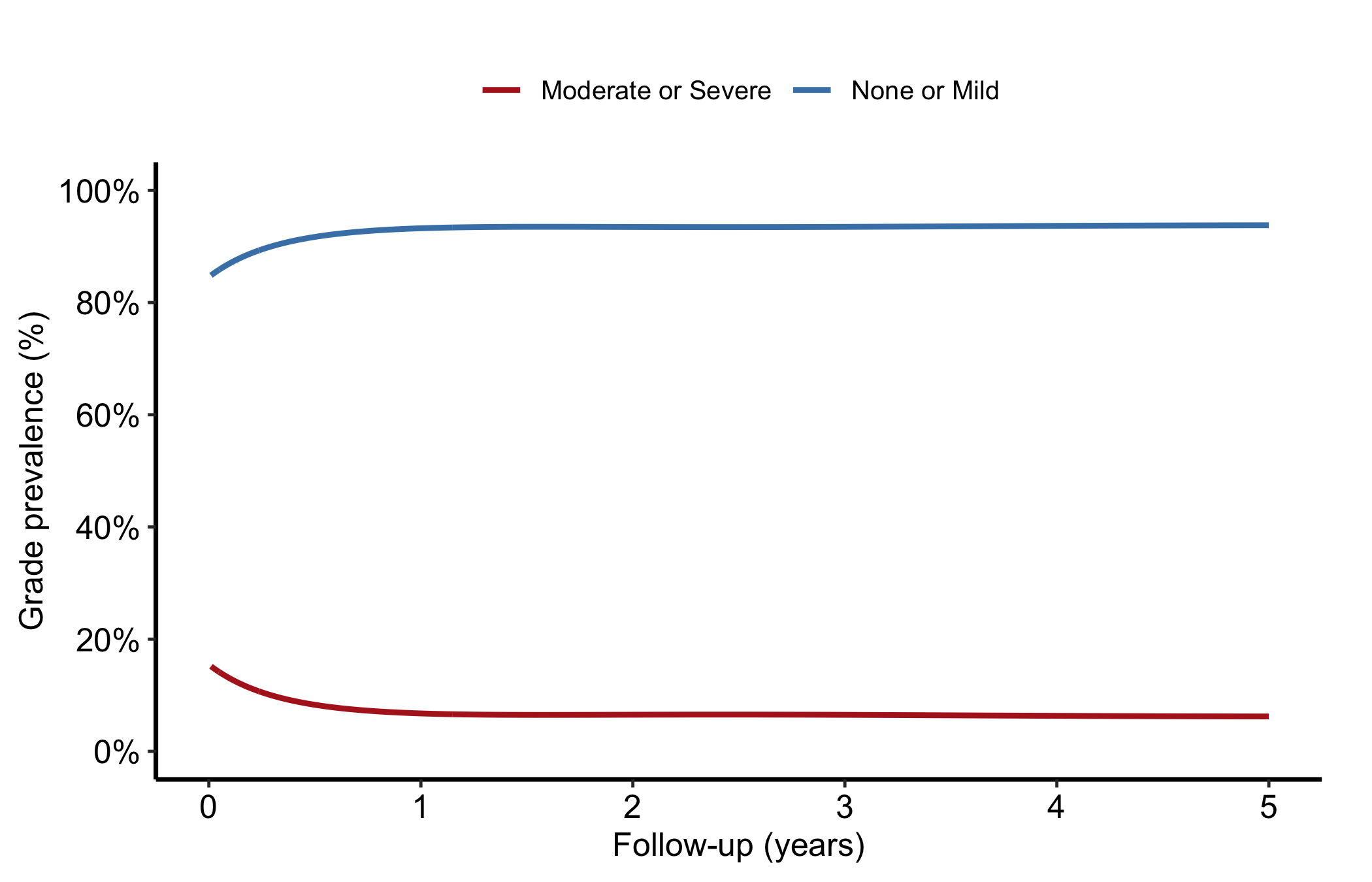
To collapse adjacent grades, add their probabilities at each time before passing the data to the constructor. Do not drop the middle rows; then the displayed levels no longer account for every patient and will not sum to one. Here we combine None with Mild and Moderate with Severe.
ord_two <-transform( ord_dat,grade =ifelse(grade %in%c("None", "Mild"),"None or Mild", "Moderate or Severe"))ord_two <-aggregate(estimate ~ time + grade, data = ord_two, FUN = sum)np_ord_two <-hv_ordinal(curve_data = ord_two)plot(np_ord_two) +scale_colour_manual(values =c("None or Mild"="steelblue","Moderate or Severe"="firebrick"),name =NULL ) +scale_x_continuous(limits =c(0, 5), breaks =0:5) +scale_y_continuous(limits =c(0, 1), breaks =seq(0, 1, 0.2),labels = scales::percent) +labs(x ="Follow-up (years)", y ="Grade prevalence (%)") +theme_hv_manuscript(base_size =12) +theme(legend.position ="top")
Figure 20.11: Two-level ordinal version after summing adjacent grade probabilities; the two curves account for the full cohort at each time. Solid steel-blue line marks None or Mild and solid firebrick line marks Moderate or Severe.
20.7 Pitfalls
Mismatched CI columns. Every estimate column has its own pair of CI columns. Plot hazard with the survival bounds and the band will be nonsense. Name the matching lower_col/upper_col for the column you are plotting.
Forgetting the empirical overlay. A smooth parametric curve always looks convincing. Without the Kaplan-Meier points a reviewer cannot tell whether the model fits, so include empirical whenever you have it.
Ordinal lines that do not sum to one. If your grade curves drift above 1.0 or cross oddly, the wide-format grade columns were probably reshaped to long format incorrectly. Each time point’s grades should add to about 1.0.
Over-reading the CI level. The nonparametric ribbon defaults to a 68% normal-quantile interval, approximately one standard error on the helper’s scale. It is narrower than the 95% interval readers expect and is not a bootstrap interval. State the level and construction in the caption, or switch to ci_level = 0.95.