Reach for a set-membership figure whenever a patient can belong to more than one group at once and you want to show how those groups overlap. The classic cardiac-surgery case is concomitant procedure: a single operation might be an aortic valve replacement, or a valve replacement plus a CABG, or all three of a valve replacement, a CABG, and an aortic repair. The question is not “how many had each procedure” (a bar chart answers that) but “which combinations actually occur, and how often.”
The Venn diagram is the familiar answer, and for two or three sets it is the right one: overlapping circles, the eye reads the intersections directly. At four sets, switch to an UpSet plot. The number of possible regions has already outgrown what the eye can compare reliably in overlapping shapes.
That is where the UpSet plot takes over. Instead of drawing every region as a patch of a circle, it lists each observed combination as a column and draws a bar for how many patients fall in it, with a matrix of filled and empty dots below showing which sets that column represents. It reads like a bar chart with a key, and it scales cleanly to seven sets or more.
16.2 Venn diagrams
For two or three overlapping groups, a Venn diagram is still the clearest display: the reader sees the intersections without a legend. At a fourth set, switch to the UpSet plot below, which is built to carry larger intersections.
hv_venn(), from hvtiPlotR (Ehrlinger 2026), builds one from the same kind of set-membership data the UpSet plot uses: pass the data frame and the columns to treat as sets, then plot(). We pick three procedures that can co-occur. A Venn is coordinate-free, so we do not add a house theme. plot.hv_venn() styles the diagram itself, and theme_hv_manuscript() would only paste spurious x/y axes back onto it.
# 4.2 mm is 12 pt, the book standard; at 5 mm the two replacement set names collide on a 6 in figure.plot(venn, set_name_size =4.2)
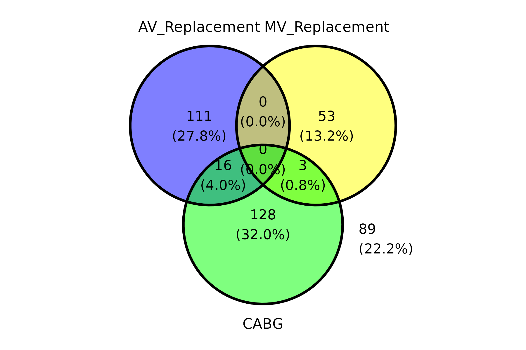
Figure 16.1: Three-set Venn of co-occurring procedures, each region labelled with its patient count and percent. Black-outlined circles shaded blue (aortic valve replacement), yellow (mitral valve replacement) and green (CABG) mark the three procedures, and the overlaps show patients who had more than one.
Each region carries its patient count and percentage. The empty replacement-on-replacement overlap (0) is the clinically expected finding. Patients rarely have both valves replaced in one operation, while CABG overlaps both. With four or more sets, use the UpSet plot.
16.3 UpSet plots
hv_upset(), from hvtiPlotR (Ehrlinger 2026), builds an UpSet diagram via ggupset::scale_x_upset() to visualise surgical procedure co-occurrences or any set-membership data. Use it for four or more sets, when the question is which exact combinations occur and how large they are.
plot.hv_upset() returns a ggplot when set_size = FALSE, or a patchwork composite of an intersection-bar plot plus a set-size sidebar when set_size = TRUE (the default). For the bare ggplot path, themes apply via +; for the patchwork path, use patchwork’s & operator to theme every sub-panel.
16.3.1 The data it needs
sample_upset_data() returns a binary indicator matrix: one column per procedure, one row per patient, with 1 indicating the procedure was performed. Pass the column names to intersect to define the set-membership axes. Run colSums() first to confirm the marginal counts; those totals are exactly what the set-size sidebar reports, so seeing them now makes the finished figure easy to sanity-check.
Inspect the returned object before plotting. Its printed summary and set_counts are the marginal totals; the table built from .Procedures is the exact-intersection audit. These are different denominators. A patient with both an aortic valve replacement and CABG contributes once to each marginal total, but once to the single AV_Replacement + CABG intersection.
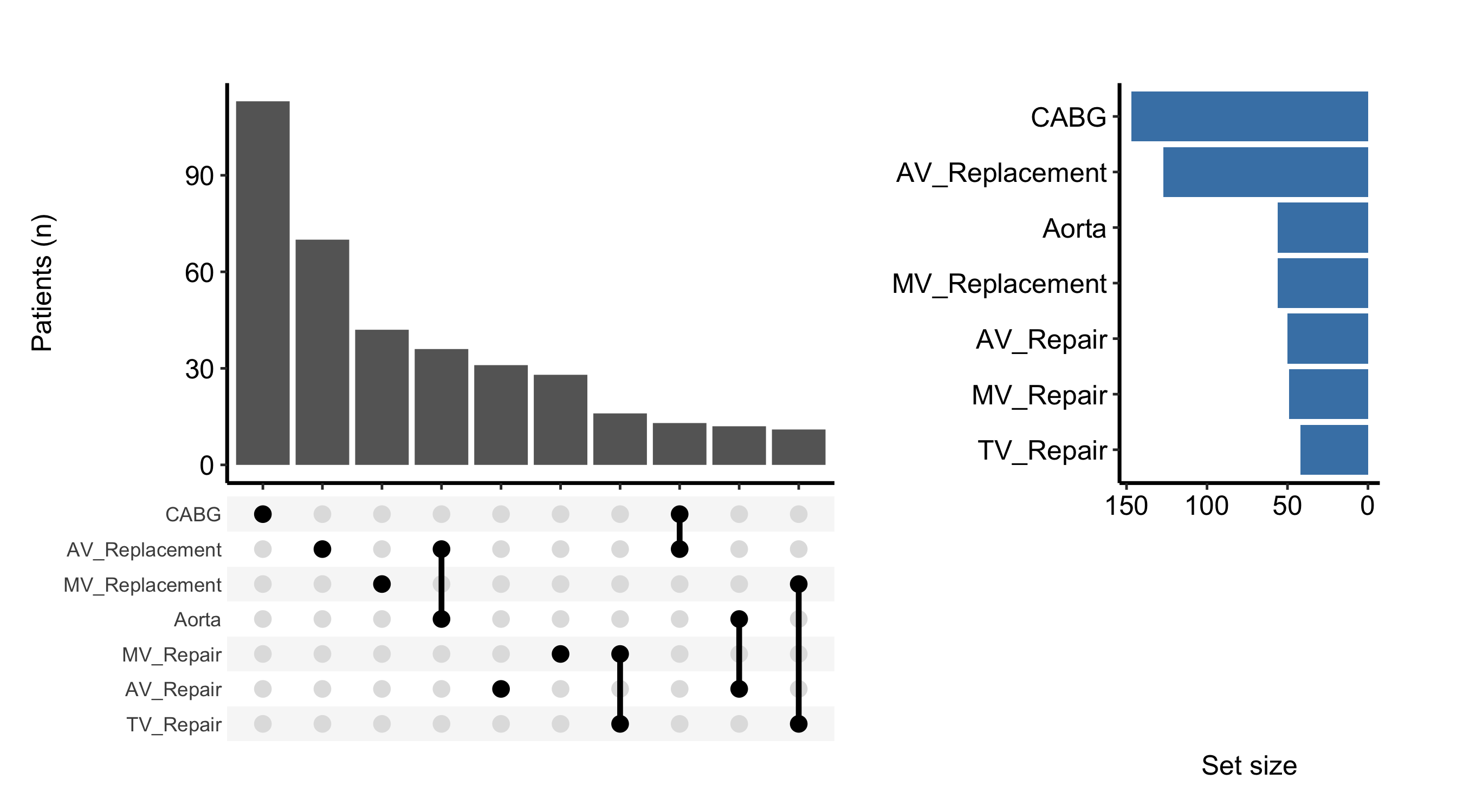
The default plot shows intersection bars (the ten most frequent combinations) with a set-size sidebar on the right. Because set_size = TRUE is the default, plot() returns a patchwork composite, so theme it with & to reach both sub-panels at once.
# Free size: matrix plot with intersection bars, dot matrix and sidebar.plot(hu) &theme_hv_manuscript(base_size =12)
Figure 16.2: The ten most frequent procedure combinations as intersection bars, with a set-size sidebar of marginal totals. Dark gray bars give the patients in each combination, black dots joined by vertical lines mark the procedures in it, and steel-blue bars in the sidebar give each procedure’s total.
16.4 Read it
An UpSet plot is read from the top down, then from left to right. Look for:
The bars, in order. The columns are sorted by frequency, so the tallest bar on the left is the single most common combination of procedures in the cohort. The dot matrix beneath each bar tells you which combination: a filled dot means that set is present, an empty dot means it is absent, and a vertical line joins the filled dots in a multi-set combination.
Singletons versus combinations. A bar over a single filled dot is patients who had only that one procedure. A bar over two or more joined dots is the concomitant cases. The balance between the two is often the point of the figure: are most aortic valve replacements isolated, or do they travel with a CABG?
The set-size sidebar. The horizontal bars on the right are the marginal totals, the same numbers colSums() printed above. A set with a large margin but few tall intersection bars is one that spreads thinly across many rare combinations.
What is missing. UpSet shows only the combinations that actually occur, and only the top ten by default. A combination you expected to see and do not is genuinely absent (or rare enough to fall below the cutoff).
16.5 Variations
16.5.1 Custom intersection bar colour
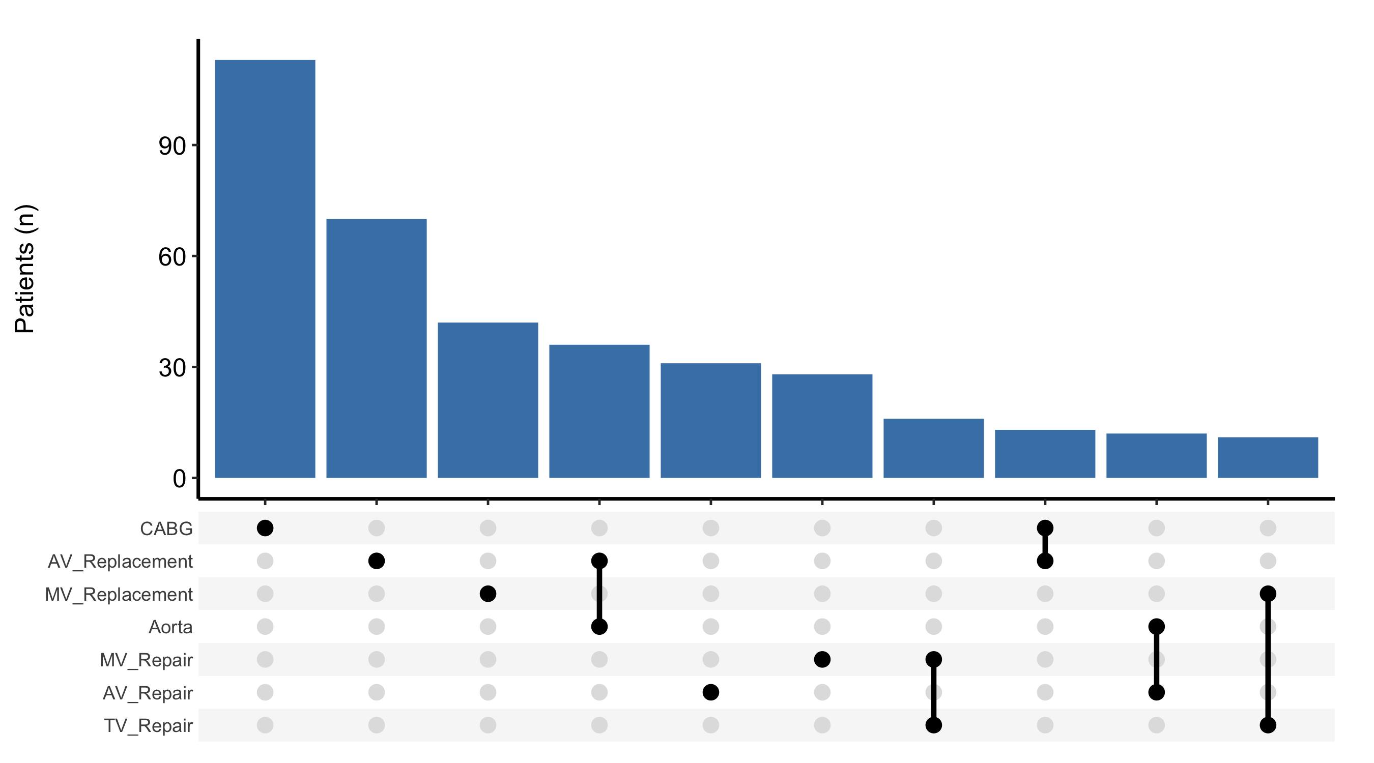
The intersection bars are a standard geom_bar(), so you can recolour them with the bar_fill argument. Setting set_size = FALSE drops the sidebar and returns just the intersection-bar ggplot, which you then finish with the usual +.
Figure 16.3: The intersection bars alone, recolored and with the set-size sidebar dropped. Steel-blue bars give the patients in each combination and black dots joined by vertical lines mark the procedures in it.
16.5.2 Colour bars by era
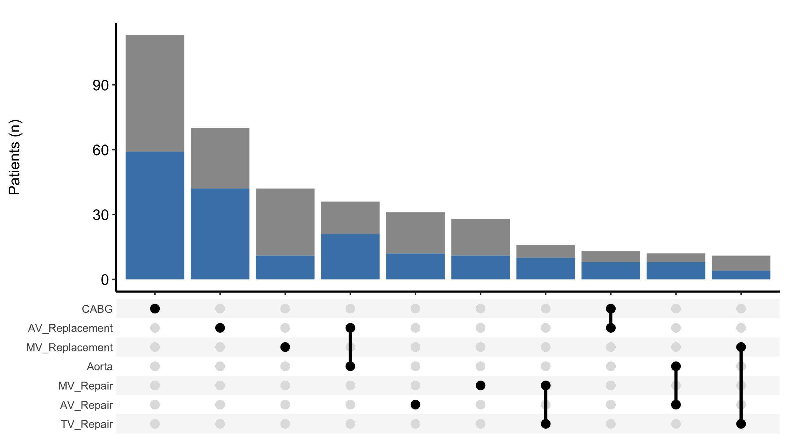
To split each intersection by a grouping column, pass fill_col. The bars are then stacked by that column’s levels, which lets you ask whether the mix of procedure combinations shifted over time. Combine it with scale_fill_manual() to assign the colours explicitly.
Figure 16.4: Each intersection bar split and stacked by era, showing whether the mix of procedure combinations shifted over time. Gray segments mark early-era patients and steel-blue segments recent-era patients, and black dots joined by vertical lines mark the procedures in each combination.
16.6 Pitfalls
Theming the wrong way for the wrong object. When set_size = TRUE (the default) the plot is a patchwork composite, and + theme_hv_manuscript() styles only one sub-panel, leaving the sidebar mismatched. Use & for the composite and + only when you have set set_size = FALSE.
Reading the top-ten cutoff as the whole story. The default shows the ten most frequent combinations. The long tail of rarer combinations is real and may carry the unusual cases you care about; if so, raise the cutoff with n_intersections rather than assuming the figure is exhaustive.
Over-stuffing the Venn. Two or three sets belong in a Venn. Four or more belong in an UpSet plot, not another ellipse.
Confusing a margin with a combination. The sidebar totals count every patient who had a procedure, regardless of what else they had; the intersection bars count exact combinations. A set can have a large margin and still appear in no tall intersection bar because its patients scatter across many combinations.
Ehrlinger, John. 2026. hvtiPlotR: HVTI Ggplot2 Themes and Clinical Plot Functions for the Cleveland Clinic Heart & Vascular Institute. https://github.com/ehrlinger/hvtiPlotR.