dat <- sample_eda_data()
num <- "ef"
grp <- "valve_morph"
c(numeric = num, group = grp)
numeric group
"ef" "valve_morph" Is a continuous measurement symmetric, skewed, or hiding more than one cluster? A density curve answers that shape question without tying the answer to one set of histogram bins.
A histogram answers “how many patients fall in each bin,” and that is often enough. But the moment you want to compare the shape of two distributions, or you want a smooth curve to put in a figure rather than a staircase of bars, the kernel density estimate is the cleaner tool. A density plot draws a continuous curve whose height at any value reflects how concentrated the data are there, and the area under the whole curve is one. Reach for it when the question is about the form of a single continuous variable: is it roughly symmetric, is it skewed toward high values, does it have one peak or two?
hvtiPlotR does not provide a density helper, so this chapter builds the plot directly with ggplot2’s (Wickham et al. 2026) geom_density(). We still style it with the house theme theme_hv_manuscript() so a density panel sits comfortably next to the survival curves and scatter plots in the same paper. The pattern is the one you will use for any bare-ggplot recipe in the book: write the ggplot() call yourself, then finish with + theme_hv_manuscript().
A density plot needs one continuous column. To compare groups you add a categorical column to map to colour. We use hvtiPlotR::sample_eda_data() with ef (ejection fraction) as the measurement and valve_morph (valve morphology: Bicuspid, Tricuspid, or Unicuspid) as the comparison group. Naming the columns directly makes the clinical question clear when you copy the recipe.
dat <- sample_eda_data()
num <- "ef"
grp <- "valve_morph"
c(numeric = num, group = grp) numeric group
"ef" "valve_morph" The .data[[num]] idiom you will see below is how ggplot2 reads a column whose name lives in a variable rather than typed out as a bare symbol. It lets the same recipe run after you replace num with another continuous column name.
There is no constructor object to inspect in this direct ggplot2 recipe, so inspect the measurement and the rows each curve will actually use before smoothing. geom_density() drops a row with a missing ejection fraction; the grouped version also needs a nonmissing group. These nonmissing counts are the information a normalized curve will otherwise hide.
single_curve_rows  <- !is.na(dat[[num]])
grouped_curve_rows <- single_curve_rows & !is.na(dat[[grp]])

summary(dat[[num]][single_curve_rows])
Min. 1st Qu. Median Mean 3rd Qu. Max.
20.00 45.50 56.00 54.72 62.83 80.00 c(single_curve_n = sum(single_curve_rows),
grouped_curve_n = sum(grouped_curve_rows)) single_curve_n grouped_curve_n
276 276 table(dat[[grp]][grouped_curve_rows], useNA = "ifany")
 Bicuspid Tricuspid Unicuspid
104 154 18 Start with a single curve so you can see the estimate before any grouping. The fill gives the curve a soft body and alpha keeps it from reading as a solid block.
ggplot(dat, aes(x = .data[[num]])) +
  geom_density(fill = "grey70", alpha = 0.7) +
  labs(
    title = "Distribution of a single numeric variable",
    x = "Ejection fraction (%)",
    y = "Density"
  ) +
  theme_hv_manuscript(base_size = 12)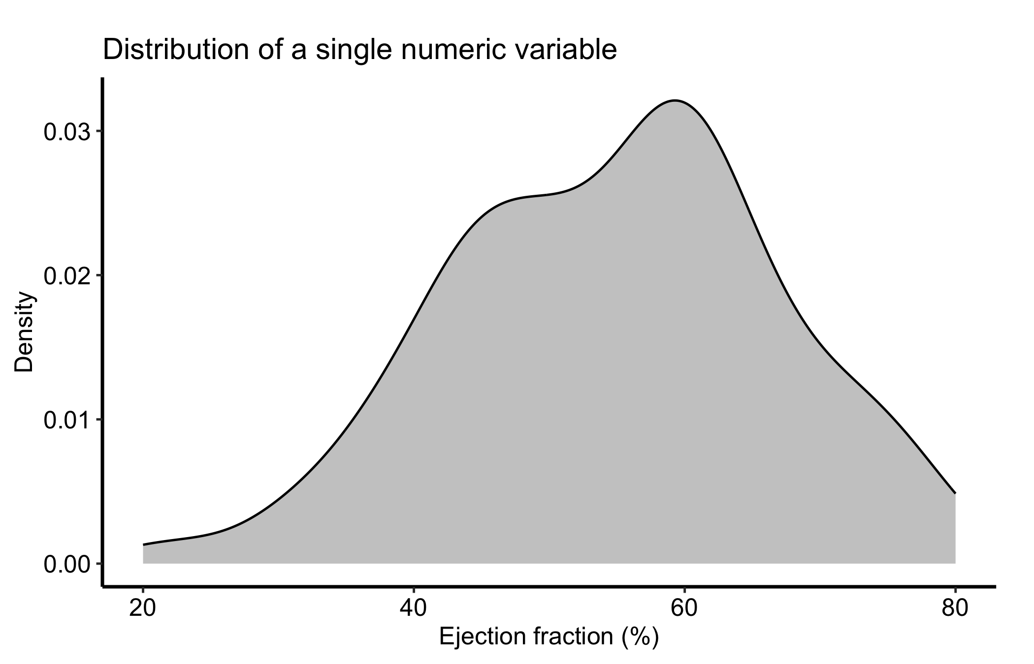
That curve is a smoothed version of the histogram you would otherwise draw. The y-axis is density, not count: it is scaled so the total area is one, which is what lets you put two of these on the same panel and compare them fairly even when the groups have different sizes.
A density curve gives you the shape of the distribution at a glance. The x-axis is ejection fraction and the y-axis is normalized density, so the area under the curve is one. Compare concentration across the x-axis, not curve height as a patient count. The smoother describes this sample; it does not establish a clinical effect or explain what caused the shape. Look for:
One thing to keep in the back of your mind: the curve depends on a smoothing choice called the bandwidth, and the same data can look smoother or bumpier depending on it. We come back to that in the pitfalls.
Mapping the grouping variable to fill overlays one density curve per group, with transparency so the overlapping regions stay readable. This is the comparison you want most of the time: not “what does this variable look like” but “does it look different across valve morphologies?”
ggplot(dat, aes(x = .data[[num]], fill = .data[[grp]])) +
  geom_density(alpha = 0.5) +
  labs(
    title = "Density by group",
    x = "Ejection fraction (%)",
    y = "Density",
    fill = "Valve morphology"
  ) +
  theme_hv_manuscript(base_size = 12) +
  theme(legend.position = "right")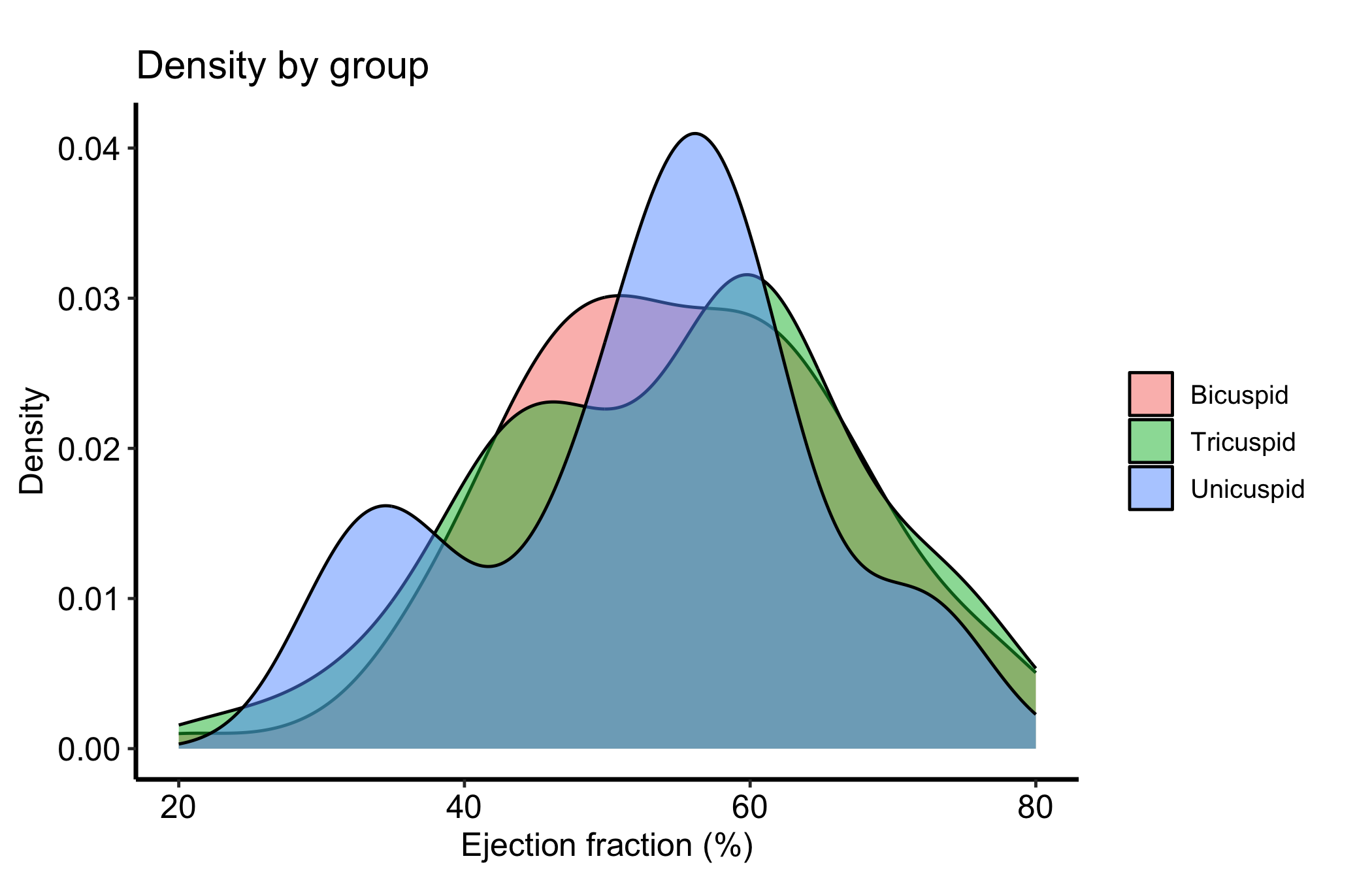
Because each curve integrates to one, a small group and a large group are drawn on the same footing. That is the right default for comparing shape, but it also hides how many patients sit under each curve, which is the trap we flag below. The comparison is descriptive and unadjusted; separation between curves does not show that morphology caused a difference in ejection fraction.
The single most consequential knob is the bandwidth, passed through adjust (a multiplier on the automatic bandwidth). Drawing two settings side by side is the honest way to show how much of a bump is signal and how much is the smoother.
ggplot(dat, aes(x = .data[[num]])) +
  geom_density(aes(colour = "wiggly (adjust = 0.4)"),
               adjust = 0.4, fill = NA, linewidth = 0.8) +
  geom_density(aes(colour = "smooth (adjust = 1.5)"),
               adjust = 1.5, fill = NA, linewidth = 0.8) +
  scale_colour_manual(values = c("wiggly (adjust = 0.4)" = "firebrick",
                                 "smooth (adjust = 1.5)" = "steelblue"),
                      name = "Bandwidth") +
  labs(
    title = "Same data, two bandwidths",
    x = "Ejection fraction (%)",
    y = "Density"
  ) +
  theme_hv_manuscript(base_size = 12)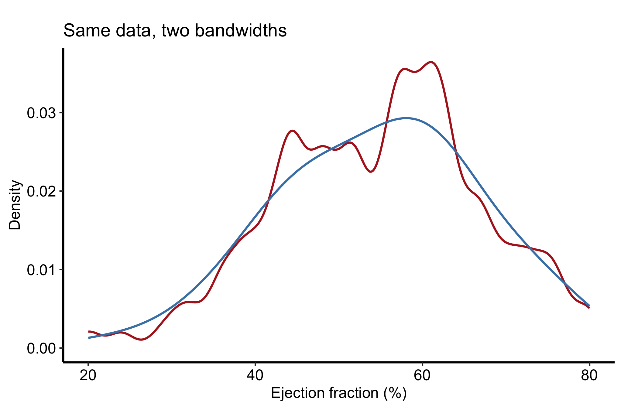
If a feature survives both settings it is less sensitive to the smoothing choice. A feature that appears only at the small bandwidth needs more checking; the two curves are a sensitivity display, not a test of whether a peak is real.
Carry the finished panel to Finish and deliver the result for manuscript, poster, or slide output. Put the group sizes and the bandwidth choice in the caption whenever the grouped shape is the result.