When you want to compare a continuous measurement across a handful of groups, the box plot is the compact summary that fits in a single panel. It draws the five-number summary, the median, the two quartiles, and the whiskers, for each group side by side, so the reader can scan across categories and see at once which group sits higher, which is more variable, and which has stragglers. Reach for it when the question is “does this number differ by group?” and the groups number in the low single digits. With twenty groups the boxes get too thin to read; with two groups you might prefer to overlay densities. In the sweet spot of three to six categories, the box plot is hard to beat.
hvtiPlotR does not provide a box-plot helper, so this chapter builds the plot directly with ggplot2’s (Wickham et al. 2026)geom_boxplot() and styles it with the house theme theme_hv_manuscript() so it stays visually consistent with the rest of the book. As with the other bare-ggplot recipes, you write the ggplot() call yourself and finish with + theme_hv_manuscript().
15.2 The data it needs
A box plot needs a categorical column for the x-axis and a continuous column for the y-axis. We use hvtiPlotR::sample_eda_data() and detect a numeric column and a categorical grouping column programmatically. The first numeric column here is year (the surgery year) and the first categorical is valve_morph (valve morphology: Bicuspid, Tricuspid, or Unicuspid).
dat <-sample_eda_data()num <-names(dat)[vapply(dat, is.numeric, logical(1))][1]grp <-names(dat)[vapply(dat, function(x) is.factor(x) ||is.character(x), logical(1))][1]c(numeric = num, group = grp)
      numeric         group
       "year" "valve_morph"
The .data[[grp]] idiom is how ggplot2 reads a column whose name lives in a variable, so the same recipe runs against whatever columns the detection step selected.
15.3 Build it
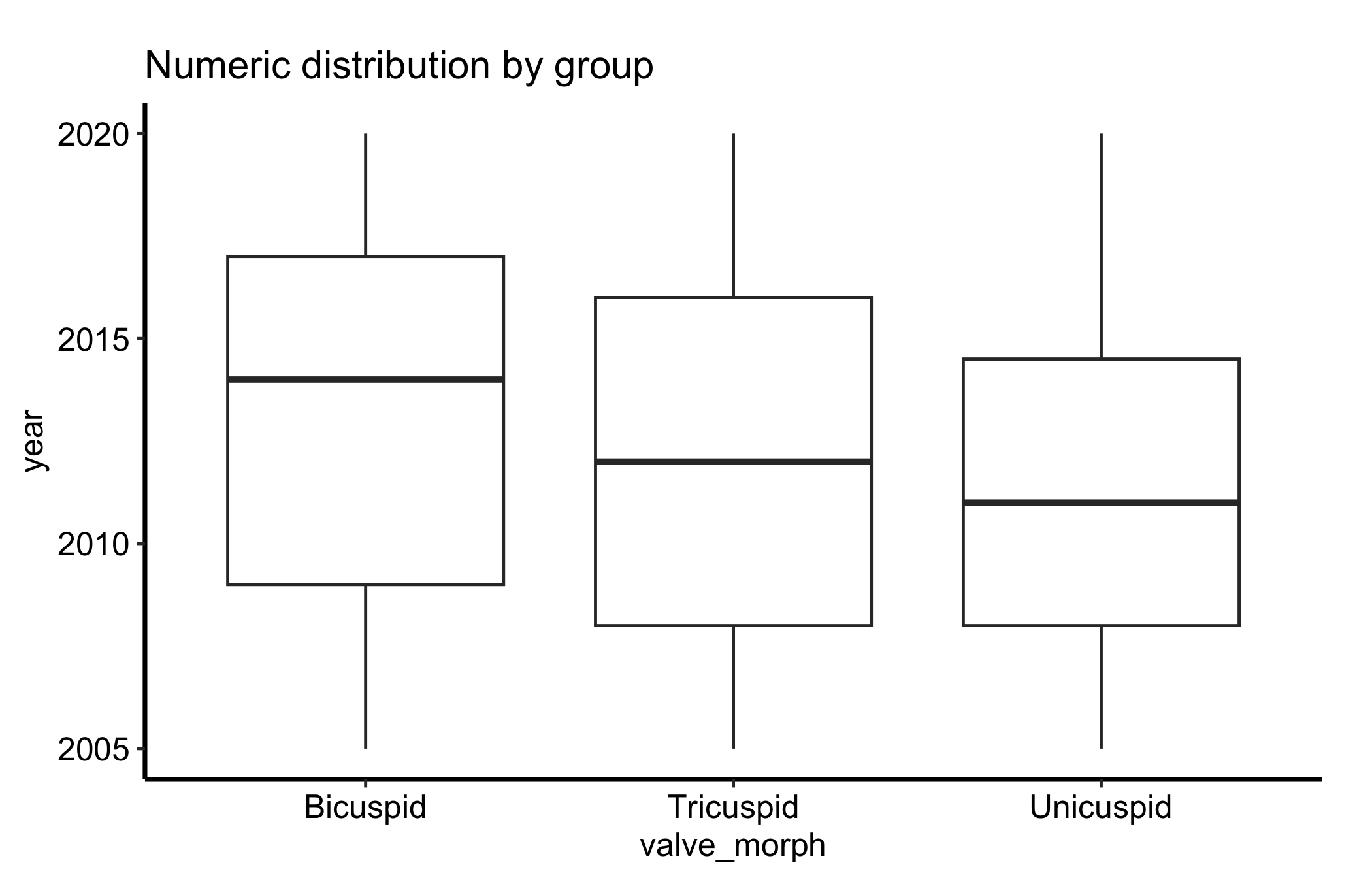
The grouped box plot is the base case: one box per level of the categorical variable, all on a shared y-axis.
ggplot(dat, aes(x = .data[[grp]], y = .data[[num]])) +geom_boxplot() +labs(title ="Numeric distribution by group",x = grp,y = num ) +theme_hv_manuscript()
Figure 15.1: Box plot of a continuous measurement by group, showing the median, quartiles, whiskers, and outliers for each category
Each box packs a lot in. The line inside the box is the median; the box edges are the first and third quartiles (the 25th and 75th percentiles), so the box spans the middle half of the data, the interquartile range or IQR. The whiskers reach out to the most extreme points within 1.5 times the IQR of the box, and anything past the whiskers is drawn as an individual outlier point.
15.4 Read it
Read a box plot one box at a time, then across.
The median line. This is the typical value for the group, and comparing median lines across boxes is the first thing your eye should do. A box that sits higher has a higher typical value.
The box height (IQR). A tall box means the middle half of patients are spread out; a short box means they cluster. This is the spread you compare across groups, and it is more stable than the whiskers.
The whiskers and outliers. The whiskers show the reach of the bulk of the data, and they extend to 1.5 times the IQR, not to the minimum and maximum. Points drawn beyond them are flagged as outliers by that same rule. They are candidates for a second look, not automatically errors.
Asymmetry. If the median sits low in the box and the upper whisker is long, the group is right-skewed; the box plot shows skew even though it hides the finer shape.
What a box plot does not show is the shape inside the box. Two groups can have identical boxes while one is a single clump and the other is two separated clusters. That blind spot is the reason for the next variation.
15.5 Variations
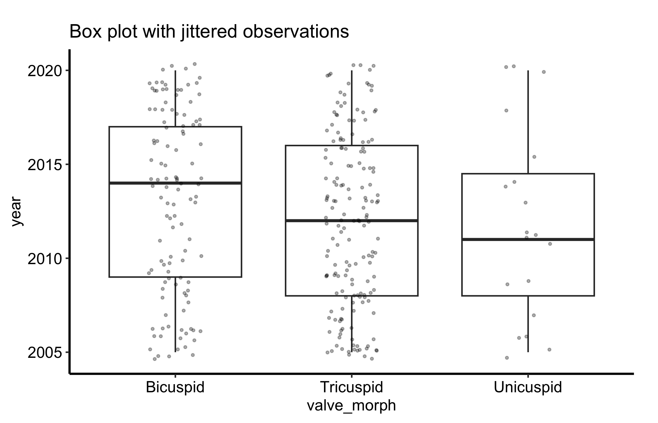
15.5.1 Box plot with jittered points
Overlaying the raw observations with geom_jitter() shows the underlying sample size and spread that a box plot alone hides. We turn off the box’s own outlier points (outlier.shape = NA) so they are not drawn twice, then scatter the points with a little horizontal jitter and low alpha so dense regions read as darker.
ggplot(dat, aes(x = .data[[grp]], y = .data[[num]])) +geom_boxplot(outlier.shape =NA) +geom_jitter(width =0.15, alpha =0.3, size =0.7) +labs(title ="Box plot with jittered observations",x = grp,y = num ) +theme_hv_manuscript()
Figure 15.2: Box plot with the raw observations jittered over each box, exposing the sample size and spread the summary hides
Now you can see how many patients sit behind each box, and whether the points under a box form one cloud or two. For the small group in this sample, the handful of points makes plain how little the box is summarising.
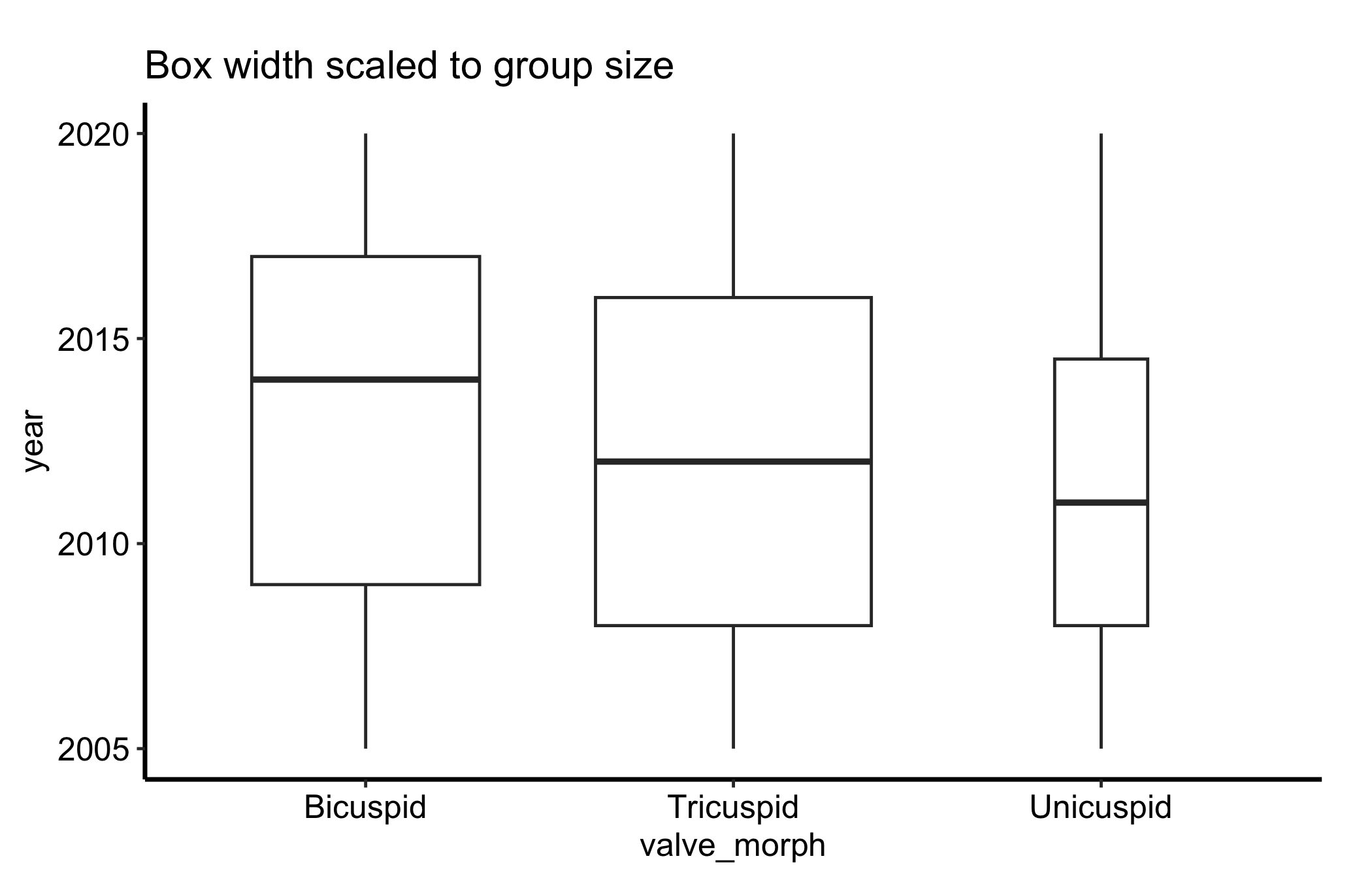
15.5.2 Letting the box width show the group size
A box plot draws every box the same width regardless of how many patients it summarises, which can mislead. Setting varwidth = TRUE makes each box’s width proportional to the square root of its group size, so a thin box is a visual warning that it rests on few patients.
ggplot(dat, aes(x = .data[[grp]], y = .data[[num]])) +geom_boxplot(varwidth =TRUE) +labs(title ="Box width scaled to group size",x = grp,y = num ) +theme_hv_manuscript()
Figure 15.3: Box plot with box width scaled to the square root of group size, flagging boxes that rest on few patients
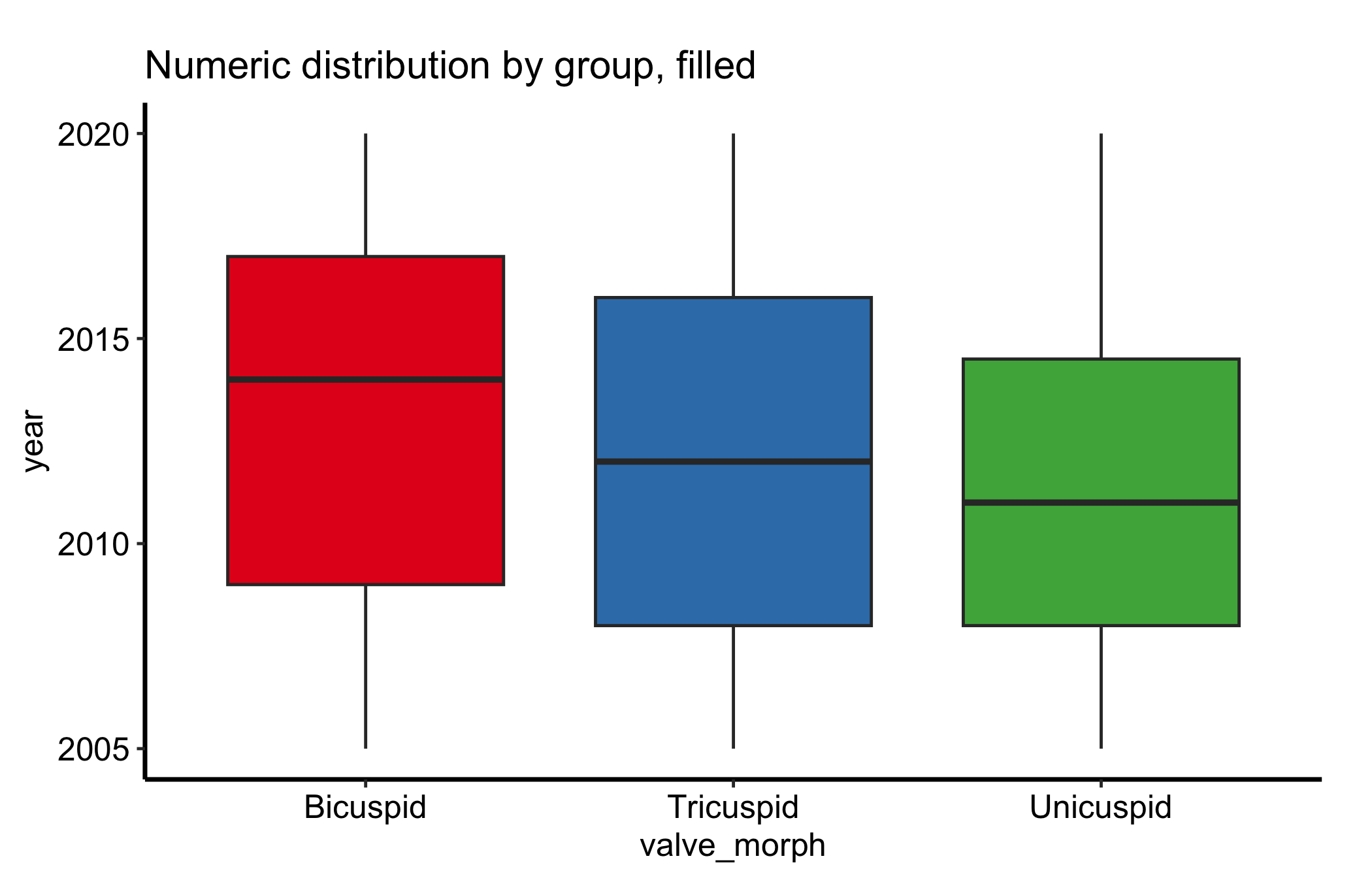
15.5.3 Filling the boxes by group
A grey box plot is honest but plain. Mapping fill to the group colours each box from a palette, which makes a busy panel easier to scan and ties the boxes to the same colours the group uses elsewhere in a figure. Because the x-axis already names the groups, the fill only reinforces them, so we drop the redundant legend with guide = "none" rather than spend panel space on it.
ggplot(dat, aes(x = .data[[grp]], y = .data[[num]], fill = .data[[grp]])) +geom_boxplot() +scale_fill_brewer(palette ="Set1", guide ="none") +labs(title ="Numeric distribution by group, filled",x = grp,y = num ) +theme_hv_manuscript()
Figure 15.4: Box plot with each box filled by group from a palette, with the redundant legend dropped
When the fill encodes a second variable the boxes are dodged by — not the x-axis group — the legend earns its place; keep it then, placed inside the panel so it does not crowd the boxes.
15.6 Pitfalls
Hiding the shape. A box plot collapses the distribution to five numbers, so a bimodal group (two clusters with a gap between them) looks the same as a single clump centred at the same median. When the shape might matter, overlay the points as in the jitter variation, or draw a density alongside.
Small-n boxes. A box computed from a dozen patients has quartiles and whiskers that can swing on one or two values, yet it is drawn with the same authority as a box from hundreds. Treat a box over a small group with caution: scale the width to n, overlay the points, or just report the numbers.
Misreading the whiskers. The whiskers are not the minimum and maximum. They reach to the most extreme point within 1.5 times the IQR, and points past them are flagged as outliers by that rule. A long whisker does not mean the data run exactly that far, and an “outlier” point is a statistical flag, not a verdict that the value is wrong.
Too many or unordered groups. Past five or six categories the boxes get too narrow to compare; and leaving them in alphabetical order when the variable has a natural order (severity, era) makes the trend harder to see than reordering the factor would.
Wickham, Hadley, Winston Chang, Lionel Henry, et al. 2026. Ggplot2: Create Elegant Data Visualisations Using the Grammar of Graphics. https://ggplot2.tidyverse.org.