Many manuscript figures are paired with a small numeric table: a numbers-at-risk strip below a Kaplan-Meier curve, or the count panel beneath a longitudinal participation bar chart. The hvtiPlotR plot objects carry these companion tables alongside the plot data, so we can pull the numbers straight out and render them with gt(Iannone et al. 2026). As with the publication tables chapter, these tables will migrate to the planned hvtiRtables package once it is available.
32.1 When to use it
A figure shows the shape of a result; the companion table gives the reader the numbers the shape rests on. The two go together when a curve hides how much data backs each region of it. The clearest case is the numbers-at-risk strip beneath a Kaplan-Meier curve: the curve might look confident out at ten years, but if only eight patients remain at risk there, the at-risk row is what tells the reader to read that tail with caution. Reach for a companion table whenever the figure invites a question the plot cannot answer on its own (“based on how many?”) and you want the answer on the same page rather than buried in the text.
We work through two cases the package already supports: the at-risk strip that a survival curve needs beside it, and the participation counts that sit beneath a longitudinal bar chart. In both, the numbers already live on the plot object, so we never recompute them and risk a table that disagrees with its own figure.
32.2 Numbers at risk
hv_survival() stores its companion tables in the object’s $tables slot. The numbers-at-risk strip lives in $tables$risk (one row per strata × report-time) and the per-time-point summary in $tables$report.
km <-hv_survival(sample_survival_data(n =500, seed =42))names(km$tables)
We render the at-risk table directly with gt, relabelling the columns for presentation.
km$tables$risk |>gt() |>tab_header(title ="Numbers at Risk",subtitle ="Patients remaining under follow-up at each report time" ) |>cols_label(strata ="Stratum",report_time ="Time (years)",n.risk ="At risk (n)" )
Numbers at Risk
Patients remaining under follow-up at each report time
Stratum
Time (years)
At risk (n)
All
1
478
All
5
412
All
10
322
All
15
260
All
20
207
All
25
207
The companion report table carries the survival estimates and confidence limits at the same report times — useful as the figure caption’s numeric backing.
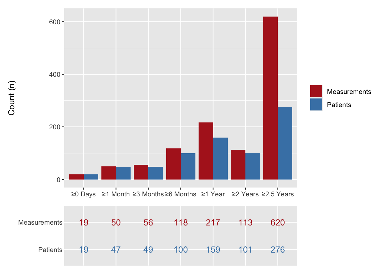
hv_longitudinal() produces a two-panel figure: a grouped bar chart of participation counts and a numeric table panel below it. The underlying counts live in the object’s $data slot in long format (one row per time-window × series), with the column roles recorded in $meta.
We reshape the long counts into a wide table (one row per follow-up window, one column per series) and render it with gt. This is the tabular companion to the bar chart’s table panel.
# A tibble: 7 × 3
  time_label Patients Measurements
  <fct>         <int>        <int>
1 ≥0 Days          19           19
2 ≥1 Month         47           50
3 ≥3 Months        49           56
4 ≥6 Months       100          118
5 ≥1 Year         159          217
6 ≥2 Years        101          113
7 ≥2.5 Years      276          620
lc_wide |>gt(rowname_col ="time_label") |>tab_header(title ="Longitudinal Participation Counts",subtitle ="Patients and measurements at each follow-up window" ) |>fmt_number(columns =where(is.numeric), decimals =0) |>tab_stubhead(label ="Follow-up window")
Longitudinal Participation Counts
Patients and measurements at each follow-up window
Follow-up window
Patients
Measurements
≥0 Days
19
19
≥1 Month
47
50
≥3 Months
49
56
≥6 Months
100
118
≥1 Year
159
217
≥2 Years
101
113
≥2.5 Years
276
620
The gt version above is for a standalone table, say in the manuscript body or a supplement. When the numbers belong inside the figure, the package draws them as a table panel you stack under the chart. For reference, the same counts rendered as the in-figure table panel appear below the bar chart when the two are composed with patchwork. Building both from the same lc$data keeps the standalone table and the in-figure panel telling one story.
At-risk counts must match the curve’s time axis. The risk strip is only useful if its columns sit under the same time points the curve uses. If the plot runs 0 to 20 years on a five-year grid, the at-risk table needs the same grid, or the reader cannot line a count up with the part of the curve it describes. Because $tables$risk is computed by the same constructor that drew the curve, the report times already agree; the trap appears when you hand-edit one axis or crop the plot with coord_cartesian() and forget the table still shows the full range. Change the axis in one place and check the other followed.
Keeping the table and figure in sync. The reason we pull numbers off the plot object rather than recomputing them is to keep a single source of truth. The moment you summarise the cohort separately for the table, the two can drift: a filter applied to one and not the other, a different handling of missing follow-up, a stale data load. If you must build a companion table by hand, derive it from the exact frame the figure was built from, and re-derive both whenever the data change. A figure and a table that disagree are worse than either alone, because a reader cannot tell which to believe.
Iannone, Richard, Joe Cheng, Barret Schloerke, et al. 2026. Gt: Easily Create Presentation-Ready Display Tables. https://gt.rstudio.com.