You measured the same thing on the same patients more than once, and you want to see how it moves. That is the case for a spaghetti plot. Each patient becomes one line connecting their repeated measurements over time, and the tangle of lines (the “spaghetti” the name promises) gives you the shape of the cohort: where the values cluster, how much individual patients swing, whether the bundle drifts up or down as the years pass. A serial echo measurement (aortic valve gradient, valve area, regurgitation grade) is the natural candidate.
This chapter covers two related displays. The spaghetti plot, hv_spaghetti(), keeps every patient’s trajectory visible, so you see the spread as well as the trend. Its companion, hv_trends(), throws the individual lines away and plots a single summary per time point (a mean or median per year), which is what you want when the question is the population-level drift and the per-patient detail is noise. You reach for the spaghetti when individual variation is the story, and for the trend curve when the annual summary is.
Both return a bare ggplot you finish with scales, labels, and a house theme.
18.2 The data it needs
hv_spaghetti() expects long-format data: one row per measurement, with an id column identifying the patient, a time column, and the value being tracked. Optionally, a grouping column lets you colour trajectories by stratum. sample_spaghetti_data() generates 150 patients with up to 6 observations each, split by a named proportion vector that stands in for a sex stratification. Build both the plain and the colour-stratified objects up front so the variants below can reuse them.
dta_sp <-sample_spaghetti_data(n_patients =150,max_obs =6,groups =c(Female =0.45, Male =0.55),seed =42L)head(dta_sp)
  id time value  group
1  1 0.44 22.12 Female
2  1 0.67 27.20 Female
3  1 0.91 29.24 Female
4  1 1.29 18.95 Female
5  1 1.96 24.00 Female
6  2 2.04 25.16 Female
hv_trends() works the other way: you hand it patient-level data and it computes the annual summary internally, so you do not pre-aggregate. The year_range and groups arguments set the study window and group structure.
18.3 Build it
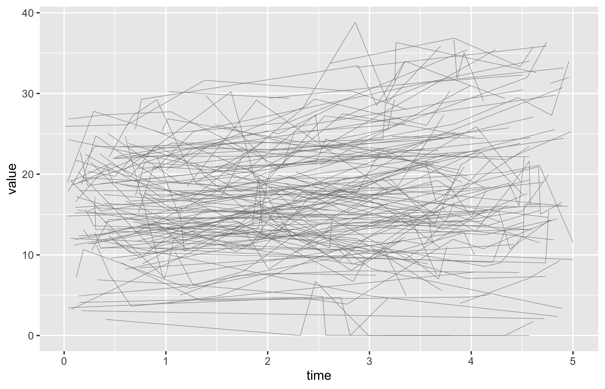
Start from the bare spaghetti panel so you can see what the constructor produced before any styling: one thin trajectory per patient over time, no colour, no axis limits, no theme.
p_sp <-plot(sp)p_sp
Now set sensible axis limits and breaks with the usual scale layers, then add a theme. The y-axis here covers the full range of AV mean gradient.
Figure 18.1: One trajectory per patient for AV mean gradient over five years of follow-up
18.4 Read it
A spaghetti plot is read as a cloud first and individual lines second. Look for:
The shape of the bundle. Where the lines are dense is where most patients sit; where they fan out is where patients diverge. A bundle that drifts upward across the x-axis is a cohort whose measurement is rising over time, even if no single line makes that obvious.
The crossing lines. A patient whose trajectory cuts across the bundle, from the bottom to the top or back, is a patient whose value changed a lot. A few of these are normal; a whole sheaf of steep lines means the measurement is volatile and a single summary will hide more than it shows.
Where the lines stop. Trajectories that end early are patients lost to follow-up. If the lines that drop out tend to sit high or low in the bundle, your later time points are a biased sample of the early cohort, and the apparent trend there may be attrition rather than change.
18.5 Variations
18.5.1 Spaghetti, stratified by group
Build the object with colour_col = "group" so each patient’s line is coloured by its stratum, then assign colours with scale_colour_manual(). Now you can read two bundles at once and compare their shapes.
plot(sp_col) +scale_colour_manual(values =c(Female ="firebrick", Male ="steelblue"),name =NULL ) +scale_x_continuous(breaks =seq(0, 5, 1)) +scale_y_continuous(breaks =seq(0, 80, 20)) +coord_cartesian(xlim =c(0, 5), ylim =c(0, 80)) +labs(x ="Years", y ="AV Mean Gradient (mmHg)") +theme_hv_manuscript()
Figure 18.2: Trajectories coloured by sex stratum, so the two bundles can be compared side by side
18.5.2 Spaghetti, with a LOESS overlay
When the bundle is too dense to read by eye, pass add_smooth = TRUE to overlay a LOESS trend line per group (locally weighted regression, a flexible curve that follows the data without assuming a straight line). The individual trajectories stay as faint context while the smooth carries the trend.
Figure 18.3: Stratified trajectories with a per-group LOESS overlay carrying the trend while the individual lines fade to context
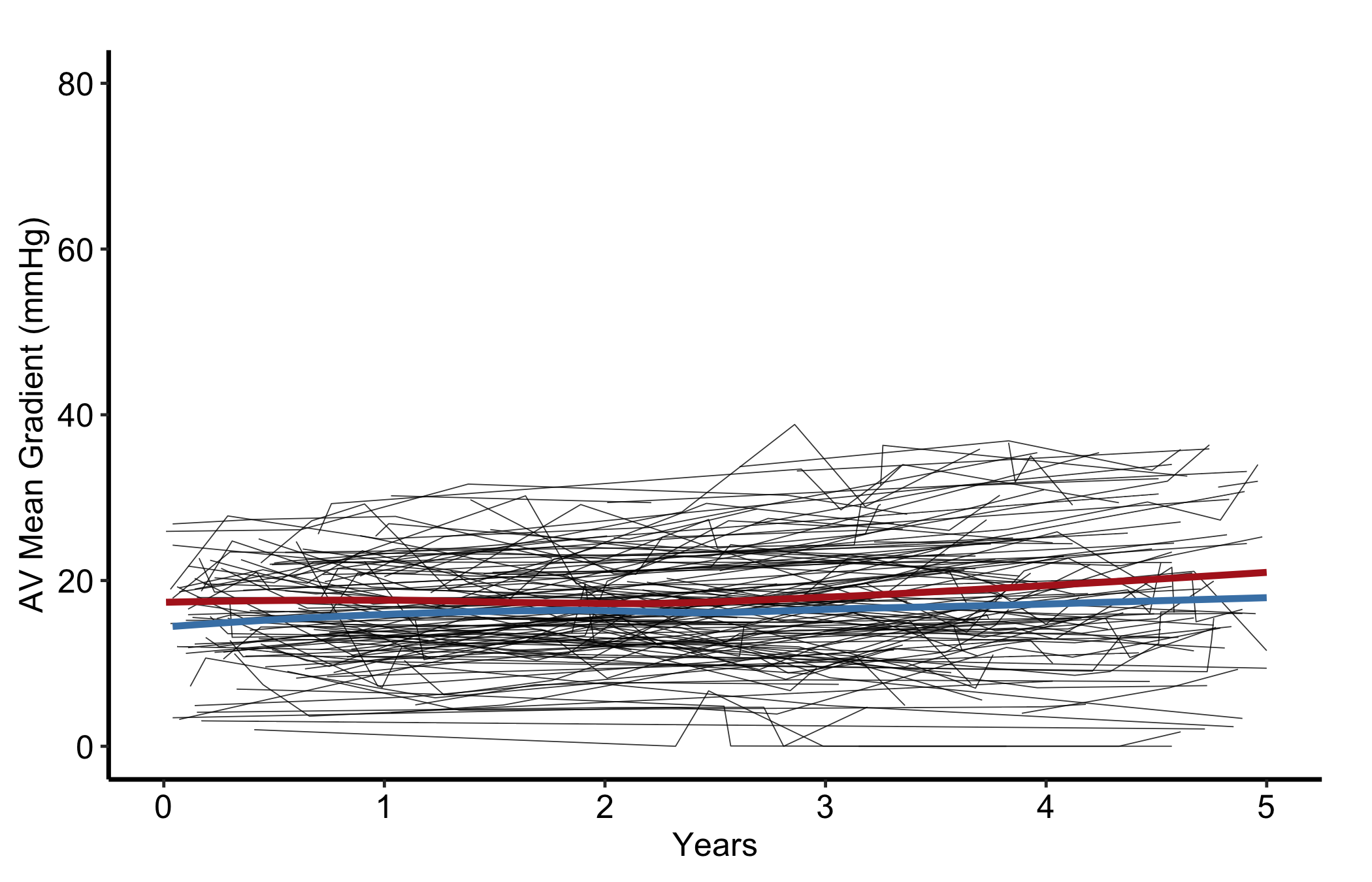
18.5.3 Labelling the comparison: trajectories vs trend
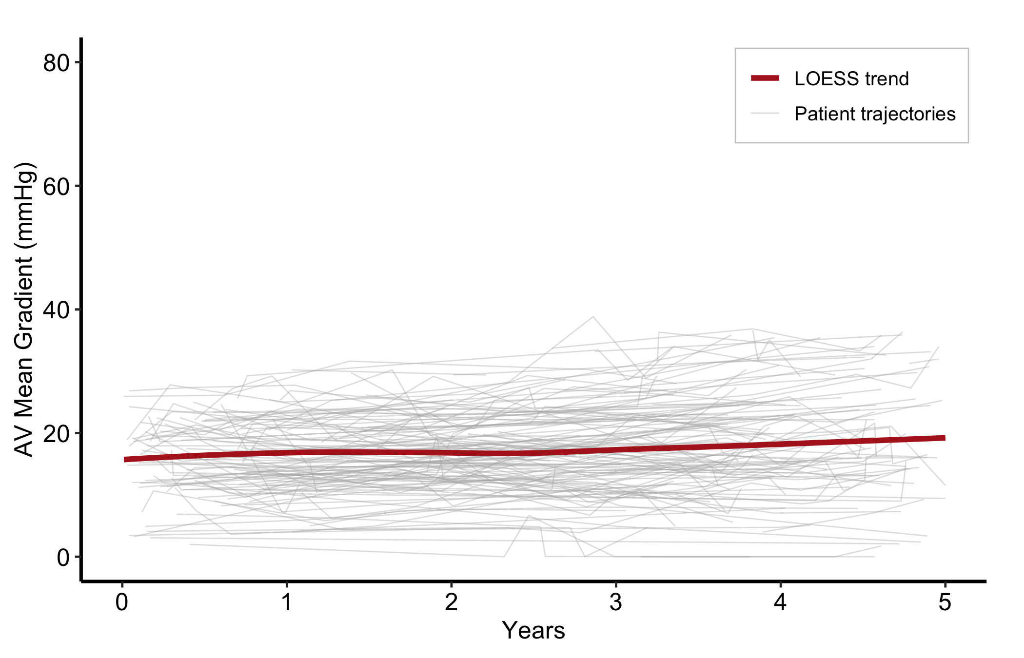
A plain spaghetti plot needs no legend — every line is the same kind of thing, a patient trajectory, so there is nothing to tell apart. Adding a LOESS overlay changes that: the panel now shows two different things, the raw trajectories and the smoothed trend, and the reader needs to know which is which. That is a comparison, so it earns a legend. Map a constant label to each layer and place the key inside the panel.
p_sp <-ggplot(dta_sp, aes(x = time, y = value)) +geom_line(aes(group = id, colour ="Patient trajectories"),linewidth =0.3, alpha =0.4) +geom_smooth(aes(colour ="LOESS trend"),method ="loess", se =FALSE, linewidth =1.3) +scale_colour_manual(name =NULL,values =c("Patient trajectories"="grey70", "LOESS trend"="firebrick") ) +scale_x_continuous(breaks =seq(0, 5, 1)) +coord_cartesian(xlim =c(0, 5), ylim =c(0, 80)) +labs(x ="Years", y ="AV Mean Gradient (mmHg)") +theme_hv_manuscript()# hv_legend_inside() picks the emptiest corner automatically (here, top-right);# the background box keeps the key legible over the trajectories.hv_legend_inside(p_sp) +theme(legend.background =element_rect(fill ="white", colour ="grey80",linewidth =0.3))
Figure 18.4: Patient trajectories and a LOESS trend on one panel, with a legend naming the two series
Without the key a reader cannot be sure the bold curve is a fitted trend and not just one more patient. With two series on a panel, name them.
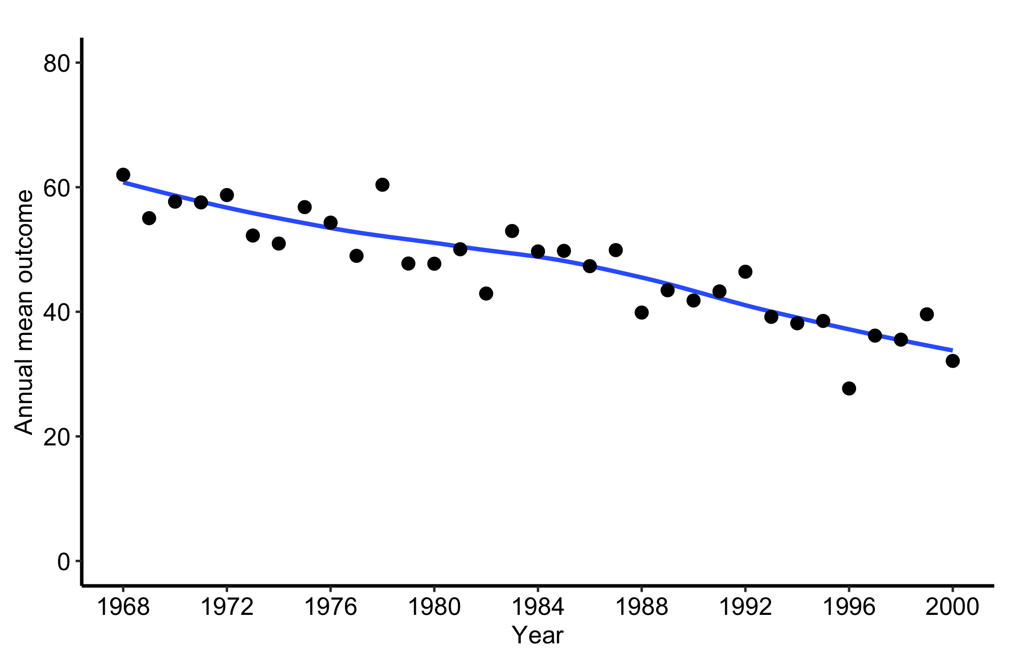
18.5.4 Temporal trend: a single annual series
When the per-patient detail stops being the point, hv_trends() collapses the cohort to one summary per year. Subset to a single group and fit with group_col = NULL for a single annual series. hv_trends() plots the annual mean of the continuous value column, so set the x-axis to the study window and let the y-axis span the observed range of the mean (here roughly 20 to 70). One detail to watch, called out again in the pitfalls below: setting limits tighter than the data, for instance c(0, 10), silently drops every point and line and leaves a blank panel. The c(0, 80) limits here comfortably contain the series.
Figure 18.5: A single annual mean series from hv_trends() for one group across the study window
18.5.5 Temporal trend: multiple groups
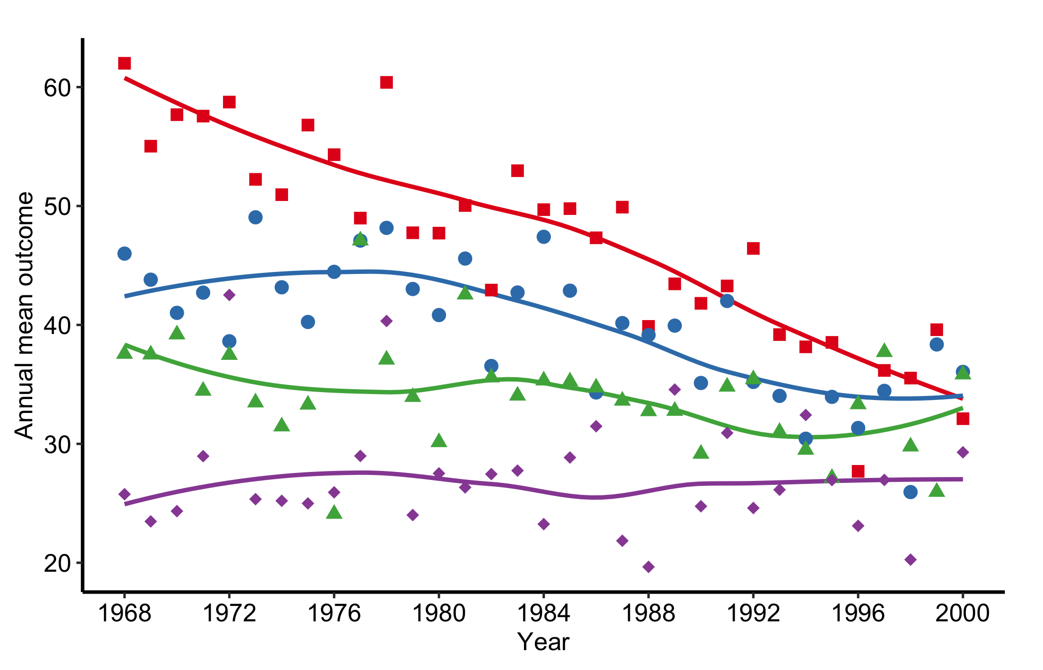
When group_col is set, the constructor computes per-group annual means and plot() draws one line per group. Pairing scale_colour_brewer() with scale_shape_manual() gives each group both a distinct colour and a distinct marker, so the figure stays readable when it is printed or photocopied in greyscale.
tr <-hv_trends(dta_tr)plot(tr) +scale_colour_brewer(palette ="Set1", name ="Group") +scale_shape_manual(values =c("Group I"=15L, "Group II"=19L,"Group III"=17L, "Group IV"=18L),name ="Group" ) +scale_x_continuous(limits =c(1968, 2000), breaks =seq(1968, 2000, 4)) +labs(x ="Year", y ="Annual mean outcome") +theme_hv_manuscript()
Figure 18.6: Annual mean series for four groups, each given a distinct colour and marker so the figure survives greyscale printing
18.5.6 Temporal trend: with a confidence ribbon
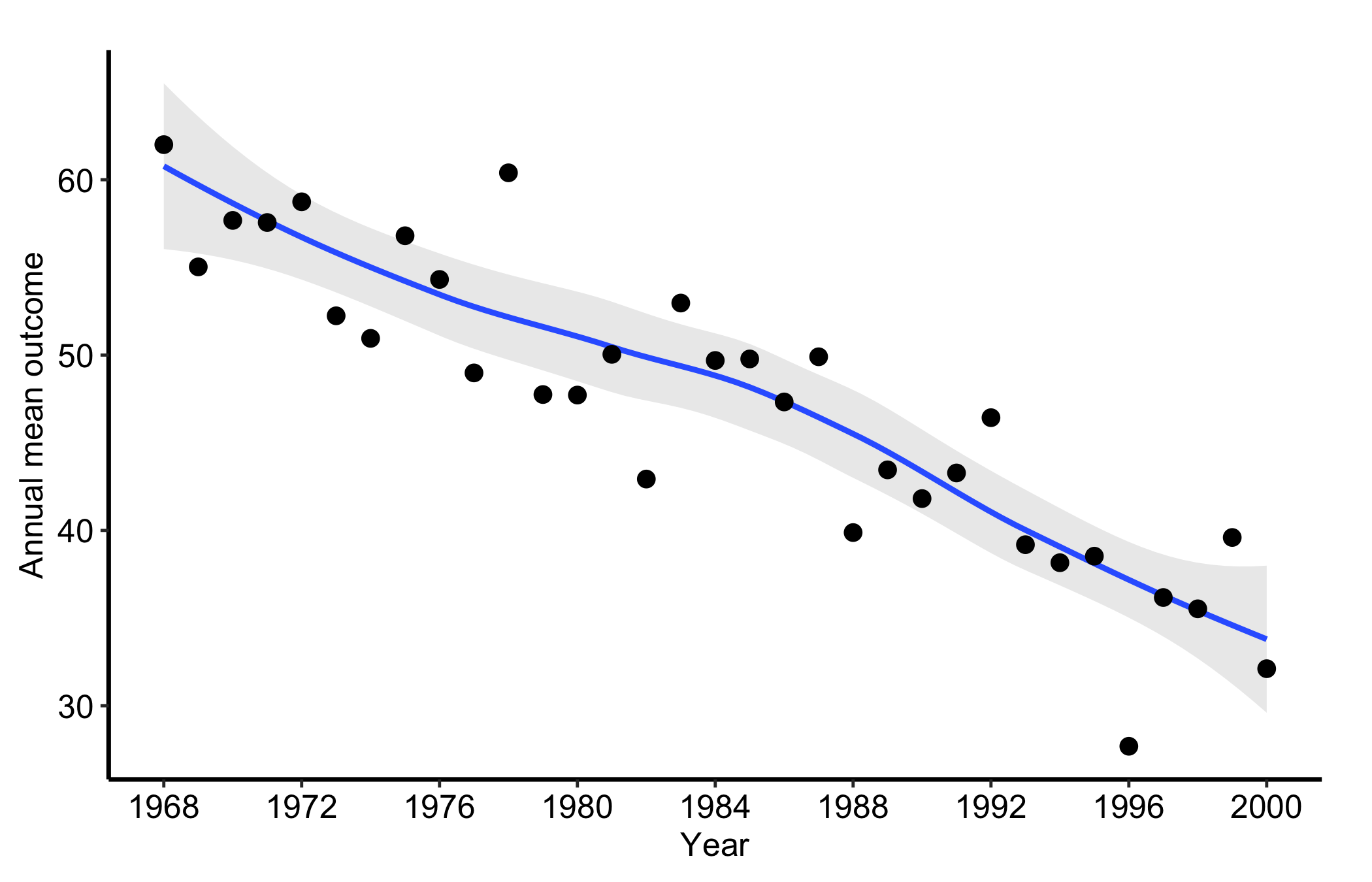
Pass se = TRUE to add a geom_ribbon() around the mean line, and alpha to control its opacity. The ribbon turns a bare trend line into an honest one: it shows where the annual mean is well determined and where it rests on too few patients to trust.
plot(tr1, se =TRUE, alpha =0.2) +scale_x_continuous(limits =c(1968, 2000), breaks =seq(1968, 2000, 4)) +labs(x ="Year", y ="Annual mean outcome") +theme_hv_manuscript()
Figure 18.7: The annual mean series with a confidence ribbon showing where the estimate is well determined and where it thins
18.6 Pitfalls
Axis limits that blank the panel. This is the one that catches everyone. scale_*_continuous(limits = ...) does not zoom, it filters: any point outside the limits is dropped before plotting. Set the limits tighter than the data, say c(0, 10) on a series that runs to 70, and the trend line silently vanishes, leaving an empty panel with no warning. When a panel comes back blank, check the limits against the data range first. Use coord_cartesian() when you want to zoom without discarding points.
Too many lines. Past a few hundred patients the spaghetti turns into a solid block and the individual trajectories stop being legible. At that point lower the line alpha, or switch to the trend curve, which is built for exactly this.
Reading a trend line without its ribbon. A bare hv_trends() line looks equally confident at every year, but the early and late years of a study often rest on a handful of patients. Add se = TRUE so the reader can see where the estimate is thin.
Mistaking attrition for change. Both displays connect only the patients who were measured. If sicker patients drop out, the surviving bundle drifts toward the healthy end, and the trend line follows. A trend is only a trend if the same kind of patient is being measured throughout.