km <- hv_survival(sample_survival_data(n = 300, seed = 42))

p_km <- plot(km) +
  scale_y_continuous(breaks = seq(0, 100, 20),
                     labels = function(x) paste0(x, "%")) +
  labs(x = "Years after Operation", y = "Freedom from Death (%)") +
  theme_hv_manuscript()

cb <- hv_balance(sample_covariate_balance_data(n_vars = 12))

p_cb <- plot(cb, alpha = 0.8) +
  scale_color_manual(
    values = c("Before match" = "red4", "After match" = "blue3"),
    name   = NULL
  ) +
  scale_shape_manual(
    values = c("Before match" = 17L, "After match" = 15L),
    name   = NULL
  ) +
  labs(x = "Standardized difference (%)", y = "") +
theme_hv_manuscript()33 Combination figures
Every recipe so far has produced one finished figure. This chapter is about the last step many manuscripts need: taking two or three of those figures and setting them side by side as a single labelled exhibit. Journals ask for it constantly. “Figure 1. Panel A shows survival; Panel B shows covariate balance” is one figure with one caption and one number, even though you built each panel separately. The patchwork package (Pedersen 2025) is how we assemble them, and because the panels stay independent until the final line, you can re-style any one of them without disturbing the rest.
33.1 When to use it
Compose a combination figure when the panels are stronger together than apart. That is not the same as “whenever you have more than one plot.” A good reason to combine: two views of the same cohort that the reader should compare at a glance (the outcome and the balance check that justifies it), or a main plot paired with a companion strip (a survival curve above its numbers-at-risk table). A bad reason: cramming unrelated figures together to save a figure number. If a reader would not look back and forth between the panels, they belong in separate figures.
The mechanics are deliberately small. patchwork gives you two operators (| puts plots in a row, / stacks them in a column), plot_layout() to set the relative sizes, and plot_annotation() to add the shared title and the A, B, C panel tags. Everything else is the ggplot you already know.
33.2 The plots you already built
Where a single-figure recipe needs a data frame, a composition recipe needs the finished plots. So the “data” here is two hvtiPlotR (Ehrlinger 2026) plots built the way the earlier chapters built them: a survival curve and a covariate balance panel. We assign each to a name (p_km, p_cb) and do nothing else to them yet. That naming is the whole trick, each panel is a self-contained object we compose later.
33.3 Build it
Start with the simplest composition: two panels in a row. The | operator places p_cb and p_km next to each other, sharing the figure height. We widen the chunk (fig-width: 10) so neither panel is squeezed.
p_cb | p_km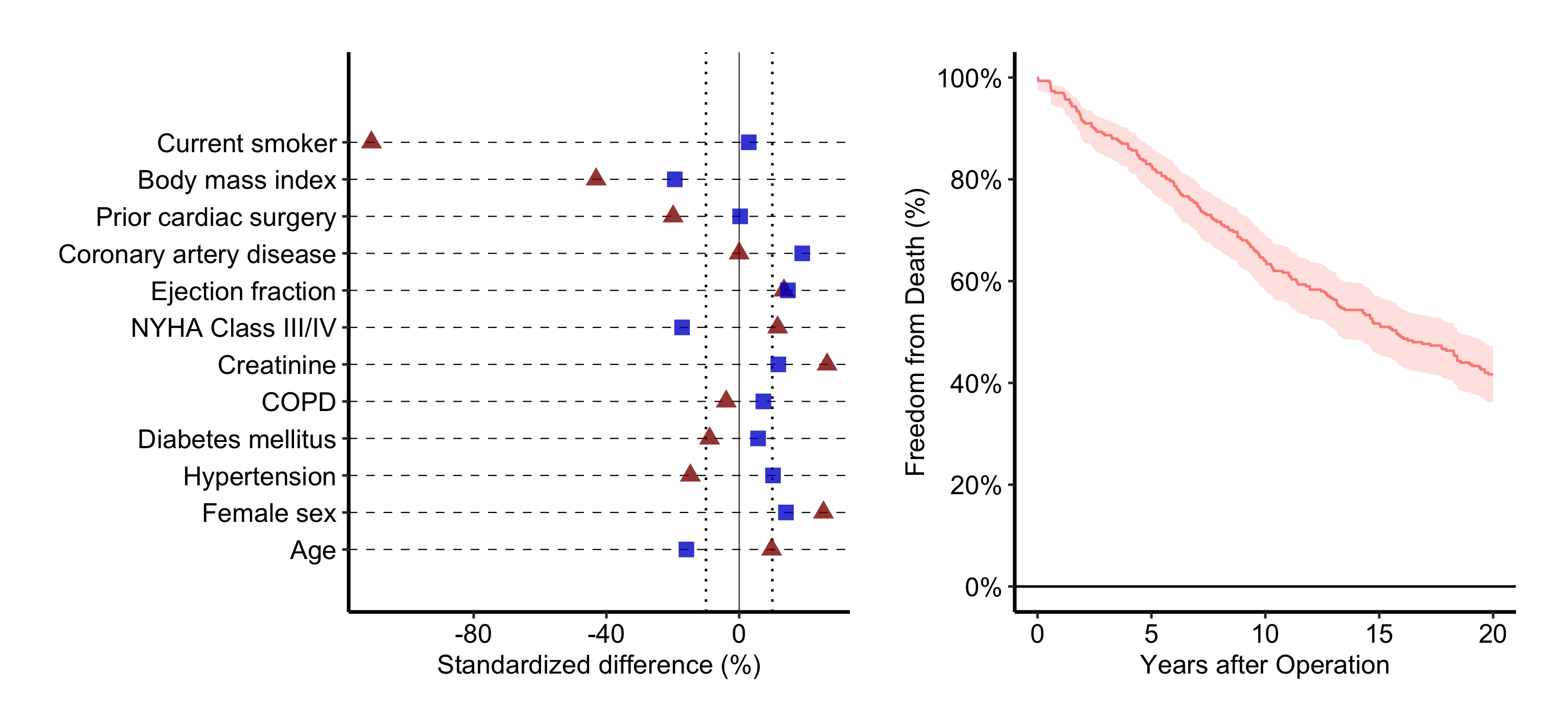
That is the bare composite. It reads, but the two panels split the width evenly even though the balance plot has long covariate labels that want more room. Most real combination figures need three more things layered on: a deliberate size split, panel tags, and a shared title. We add them in the sections below, the same way you decorate a single plot, one layer at a time.
33.4 Read it
A combination figure asks the reader to do something a single panel does not: move between panels and connect them. Whether that lands is about the composition, not the data. Look for:
- Panel tags that match the caption. The A, B, C labels are how the caption points at a panel (“Panel B shows…”). If the tags are missing or out of order, the caption has nothing to anchor to. Set them once and check they read left-to-right, top-to-bottom.
- A size split that follows the content. When one panel carries long axis labels or a tall legend, an even split crushes it. The relative widths should give each panel the room its content needs, not a reflexive fifty-fifty.
- Shared structure doing shared work. Stacking a plot above its own numbers-at-risk strip works because they share an x-axis; the reader’s eye drops straight down from a curve to its at-risk count. If two stacked panels do not share an axis, stacking implies a relationship that is not there.
33.5 Variations
33.5.1 Controlling relative widths and heights
plot_layout(widths = ...) takes a numeric vector of relative widths. c(2, 1) makes the left panel twice as wide as the right, which suits the balance plot’s long labels. heights does the same for stacked layouts.
(p_cb | p_km) +
  plot_layout(widths = c(2, 1))   # left panel twice as wide as right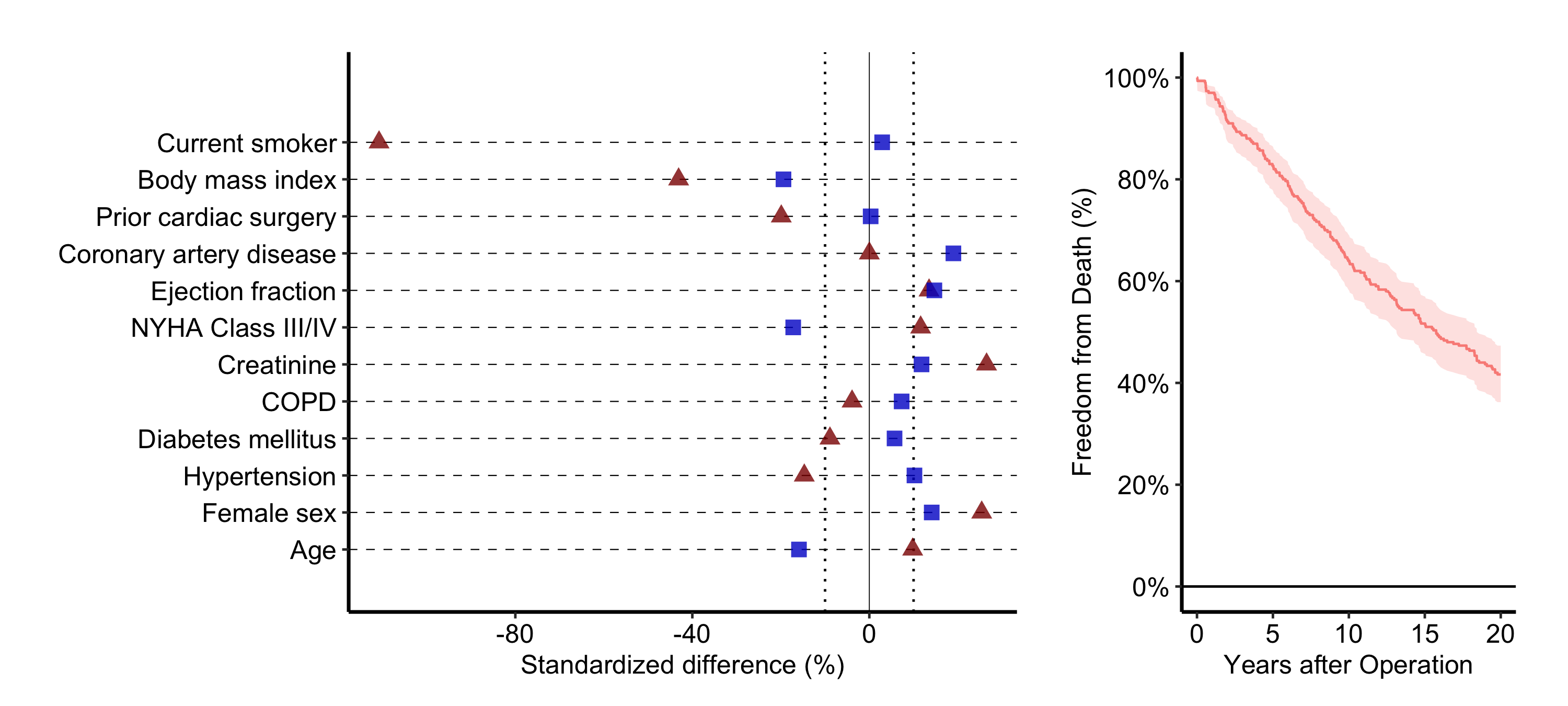
33.5.2 Stacking a plot above a risk table
A survival curve reads best with its numbers-at-risk strip directly below, the two sharing an x-axis. hv_survival() stores that table as a data frame at km$tables$risk (columns strata, report_time, n.risk), so we build a thin ggplot text panel from it and stack with /. The plot_layout(heights = ...) keeps the table strip short.
risk_df <- km$tables$risk

rt_panel <- ggplot(risk_df,
                   aes(x = report_time, y = factor(strata),
                       label = n.risk)) +
  geom_text(size = 3) +
  labs(x = "Years after Operation", y = NULL) +
  theme_hv_manuscript() +
  theme(
    axis.line  = element_blank(),
    axis.ticks = element_blank()
  )

p_km / rt_panel +
  plot_layout(heights = c(4, 1))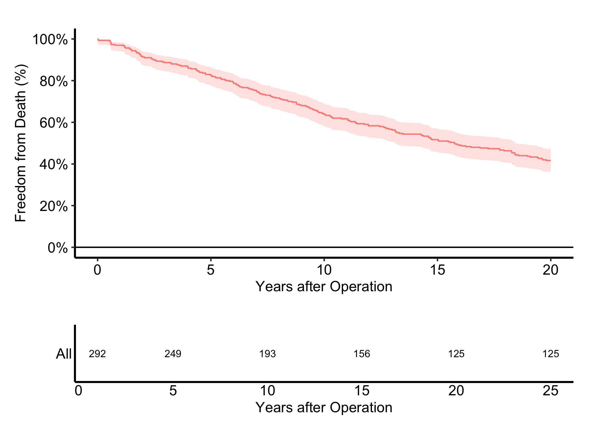
33.5.3 Shared panel tags and a figure title
plot_annotation() adds the shared title and the panel tags most journals require. tag_levels = "A" numbers the panels A, B, C… automatically. The & operator applies a theme() to every panel at once, so you format the tags in one place rather than per panel.
(p_cb | p_km) +
  plot_annotation(
    title = "Figure 1. Outcomes after cardiac surgery",
    tag_levels = "A"
  ) &
  theme(plot.tag = element_text(size = 12, face = "bold"))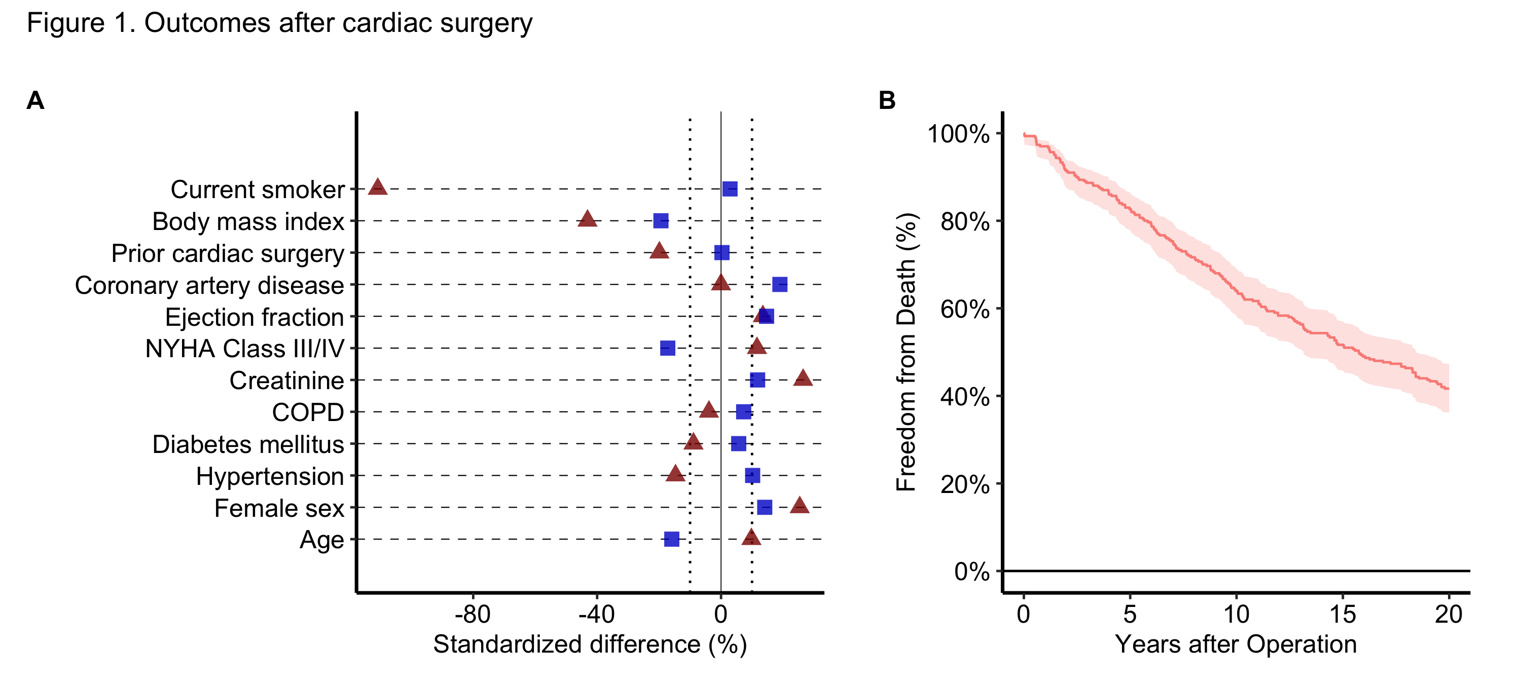
33.6 Pitfalls
- Compose last, style first. Finish each panel as its own figure before you combine. Trying to fix a panel’s axes or theme after composition means reaching back through the patchwork, which is harder than re-styling the named object and re-composing.
- Even splits crush uneven panels. The default 50/50 width ignores that one panel may carry long labels or a legend. Reach for
plot_layout(widths = ...)whenever a panel looks pinched. - Tag once, at the composition. Set
tag_levelsinplot_annotation(), not by hand inside each panel. Hand-set tags drift out of order the moment you reorder the panels. - Stacking implies a shared axis. Putting one panel directly above another tells the reader the x-axes line up. If they do not, either give the panels a genuinely shared axis or set them side by side instead.
- One caption, one story. A combination figure gets one caption. If you cannot write a single sentence that ties the panels together, that is the signal they should be separate figures.