You have fit a random forest and it predicts well, and now a co-author asks the obvious next question: which variables are actually carrying the prediction? That is what a variable importance plot answers. Reach for it whenever you want to rank predictors by how much the forest leans on them, whether you are trimming a wide cohort down to a workable model, sanity-checking that the clinically expected markers rise to the top, or building the figure that opens the results section of a CORR paper.
The standard random forest answer is permutation variable importance (VIMP). The idea is simple to picture. For one predictor, take the out-of-bag patients (the cases each tree never saw during fitting), shuffle that predictor’s values among them so it no longer lines up with the outcome, and re-run those patients down the forest. If prediction error jumps, the forest was relying on that variable; if error barely moves, the variable was doing little work. The size of that jump is the variable’s importance.
gg_vimp(), from ggRandomForests (Ehrlinger 2026), pulls the VIMP for every predictor out of a fitted forest, sorts it, and hands back a tidy object whose plot() method draws the ranking. As with the rest of the recipes here, what comes back is a bare ggplot you finish with a house theme and the usual +.
26.2 The data it needs
VIMP is computed from a fitted forest, so the real input is an rfsrc object, not a data frame. The one thing to get right at fit time is importance itself: pass importance = TRUE so the forest stores permutation VIMP as it builds. Skip it and gg_vimp() still works, but it has to auto-calculate the scores on the fly and warns you that it did so.
We use the primary biliary cirrhosis (pbc) survival data that ships with randomForestSRC: one row per patient with a follow-up time, an event indicator, and a panel of liver-function lab values. The outcome is time to death, so this is a survival forest, but VIMP reads the same way for regression and classification forests too.
                         Sample size: 276
                    Number of deaths: 111
                     Number of trees: 100
           Forest terminal node size: 15
       Average no. of terminal nodes: 13.83
No. of variables tried at each split: 5
              Total no. of variables: 17
       Resampling used to grow trees: swor
    Resample size used to grow trees: 174
                            Analysis: RSF
                              Family: surv
                      Splitting rule: logrank *random*
       Number of random split points: 10
                          (OOB) CRPS: 539.30918582
             (OOB) standardized CRPS: 0.1286827
   (OOB) Requested performance error: 0.22825526
The summary confirms the family (survival) and the predictors the forest had to work with. A small ntree keeps this example fast; for a real analysis you would let it grow to the default and confirm the error curve has flattened before trusting any ranking built on top of it.
26.3 Build it
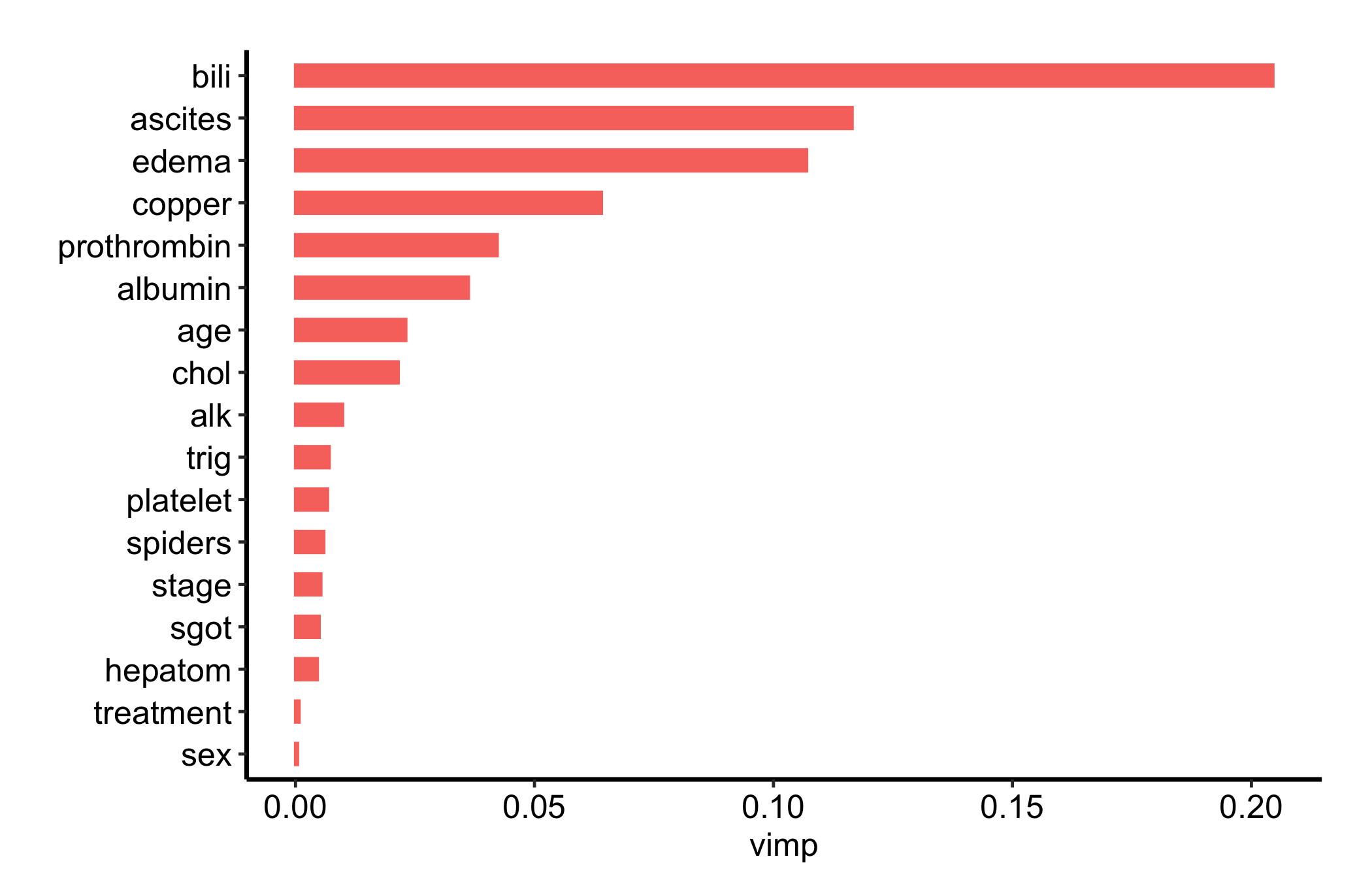
gg_vimp() extracts the VIMP for every variable and orders them from most to least important. The plot() method draws a horizontal bar per predictor, so the ranking reads top to bottom.
plot(gg_vimp(rf)) +theme_hv_manuscript()
Figure 26.1: Permutation variable importance for every predictor in the pbc survival forest, ranked from most to least important
Bars are coloured by the sign of the importance. A handful of clinical markers, bilirubin, albumin, prothrombin time, separate clearly from the pack, which is exactly what we would expect for liver disease. Swap theme_hv_manuscript() for theme_hv_poster() when you want the larger-text version.
26.4 Read it
A VIMP plot is a ranking, and that framing is the whole skill of reading one. Look for:
The break in the ranking. Scan top to bottom for the gap where a few high-importance predictors give way to a long flat tail of near-zero variables. The handful above that gap are the ones the forest actually uses; the tail is mostly noise.
The sign of each bar. Importance is colour-coded by sign. A negative VIMP means permuting the variable improved out-of-bag error, a fairly strong signal that the variable is noise the forest was better off ignoring.
Ranking, not effect size. VIMP tells you whether a variable matters to the forest, never the direction or shape of its effect. Bilirubin sitting at the top says the forest leans on it heavily, not that higher bilirubin means worse survival (it does, but the plot does not show that). For the shape of an effect, see the variable- and partial-dependence plots in the next chapter.
26.5 Variations
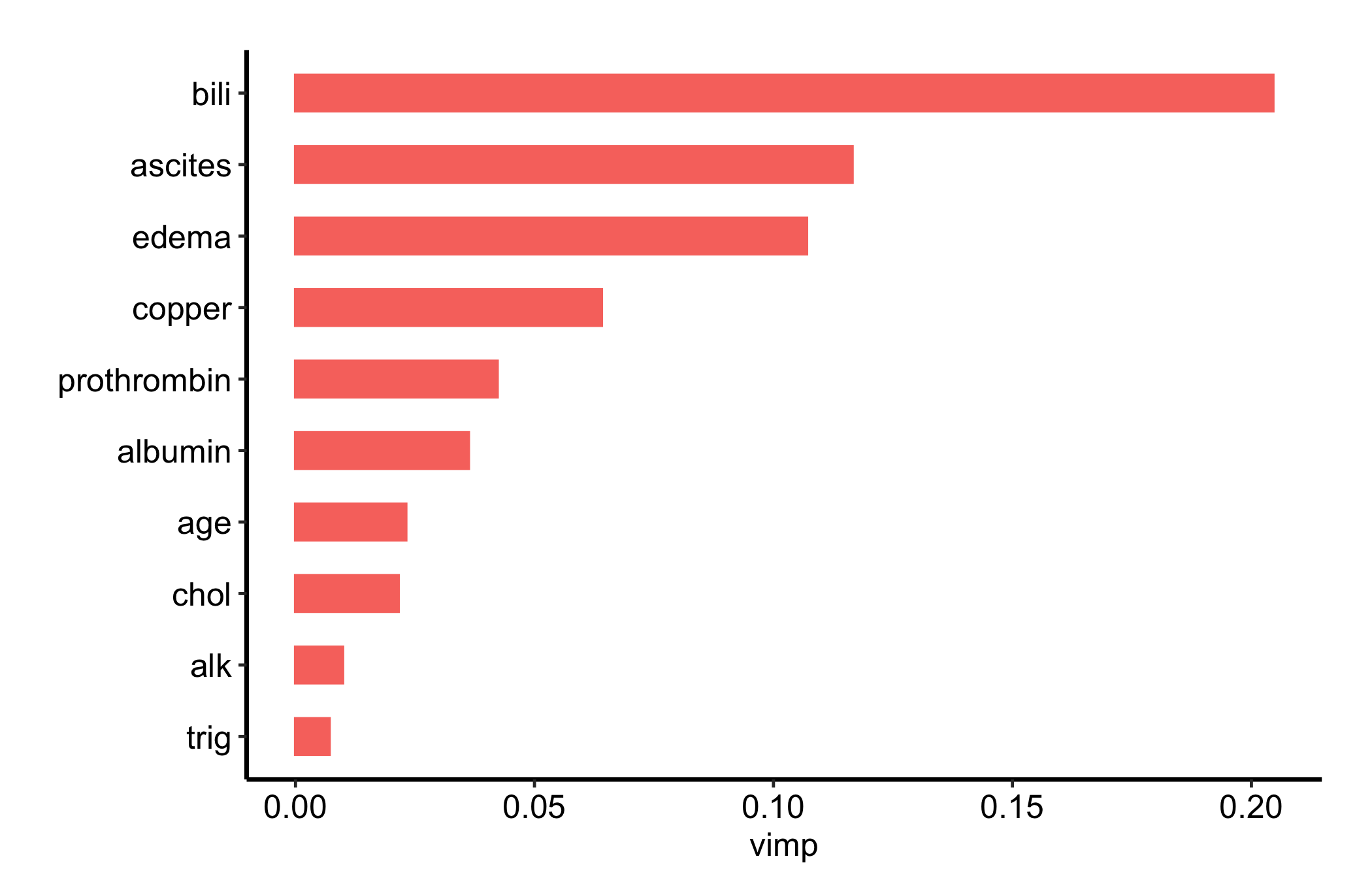
26.5.1 Show only the top predictors
For a manuscript figure you rarely want every variable cluttering the panel. The nvar argument keeps just the top-N, giving a clean, focused figure that puts the eye straight on the predictors that matter.
Figure 26.2: The same variable importance ranking restricted to the top ten predictors for a cleaner manuscript figure
Ten is a sensible default for a results figure; the full ranking is better kept as a supplement so a reader can confirm nothing surprising hides in the tail.
26.6 Pitfalls
Fit with importance = TRUE. If you do not, gg_vimp() auto-calculates VIMP on the spot and warns you. The result is the same numbers, but the warning is easy to miss and the extra pass is wasted work. Set it at fit time and the scores are already there.
VIMP is relative ranking, not a causal claim. A high bar means the forest found the variable useful for prediction given everything else in the model. It is not an effect size and it is not evidence that the variable causes the outcome. Two correlated predictors can split their importance between them, and dropping one can lift the other; read VIMP as a ranking within this forest, not a verdict on any single variable.
Stability. VIMP inherits the forest’s randomness, so adjacent low-importance variables can trade places between fits. Confirm the forest has converged (gg_error()) before you trust the ranking, and resist reading fine distinctions near the bottom of the list.